Among the recurring color concepts that helped create the sumptuous look of Walt Disney's animated features, the quasi single-colored costume - all parts in different shades of the same basic hue - is particularly powerful. In these two posts I will have a look at the concept of analogous costume colors, its precursors and how it became so prominent during the 1950s.
During the classical Hollywood era, the lavish look of Disney features did not only stem from fluid three-dimensional animation (in contrast to most other studios experimenting or simply giving in to limited animation). More than anything, Disney's trademark richness of texture relied on highly detailed (i.e. labor-intensive, thus expensive) character designs and sumptuous (Techni)color coordination well grounded in 19th century illustration styles.
With its rich textures and opulent costumes, SLEEPING BEAUTY (1959) is doubtlessly the epitome of this style. It has mostly been praised for Eyvind Earle's medieval background stylings with their finely chiseled wood textures and angular designs. The character/costume colors, however, are equally important to our impression of the images.
 |
| Shapes and colors define the composition more than dimensional lighting and perspective. |
And while the Disney artists usually integrated flatly painted characters into
highly detailed, dimensional backgrounds by way of empty spaces
and pools of light, the slightly more two-dimensional world of SLEEPING BEAUTY required a more graphic approach based on shape and color to match the more evenly lit background patterns.
 |
| Storybook illustration from the prologue of SLEEPING BEAUTY (1959) |
From the very beginning, Disney was very conscious of the cheapening effect of garish or random "circus poster" colors. Therefore, he urged his employees to more restricted palettes and concepts. By the time SLEEPING BEAUTY was conceived in
Technirama70, his artists were able to use the whole spectrum of hues in a shot without making it look all over the place.
If you squint at those screenshots above (or look at them without your glasses), you will still be able to distinguish different characters and groups of characters because their costumes are mostly painted in analogous colors. This is even the case in the crowded image at the bottom. Even though these aristocrats are drawn so richly detailed we can easily see their overall shapes thanks to the unifying coloring approach.
 |
| FLOWERS AND TREES (1932): the first 3-strip Technicolor cartoon ever, already restricted palettes: depending on their personalities, tree trunks were painted warmer or colder (the villain even gray!). |
Basic Color Concepts and Methods
This costume concept, more than anything else, embodies the marriage of two key concepts the Disney artists were after ever since the adoption of color in FLOWERS AND TREES (1932): clarity and opulence. The early Silly Symphonies already sported carefully limited palettes of subdued colors with sparingly applied primaries. Even a rainbow-happy Easter film like FUNNY LITTLE BUNNIES (1934) was thoughtfully color coordinated.
 |
| Color for the bunnies' costumes were carefully chosen: primaries for the workers, pastels for the artists, some even wear suits. |
Mickey. Donald and Goofy, however, had very simple costumes based on the primary colors red, blue and yellow, as can be seen in these screenshots from MOVING DAY (1936). Mickey being the oldest and "strongest" is wearing primary red and yellow (toned down considerably for this film). Donald's sailor suit is blue (considered a weaker hue for centuries because it is receding compared to red) and contrasts strongly with his yellow/orange beak and feet. Unpredictable Goofy is dressed in complementary colors orange and blue.
 |
| Mickey, Donald and Goofy vs Pete in MOVING DAY. |
 |
| Simple color schemes for the protagonists. Mickey's yellow shoes are subdued. "White" is slightly blue (not necessarily on purpose, though). |
Behind these colors is a color scheme based on the primary colors red, blue and yellow according to
Johannes Itten's color wheel. From these three colors, a painter could mix any color of the rainbow - in theory, that is. It never works completely with real pigments. Those primary colors were also available early on for comic strips in newspapers. In the movies, both Donald's (I count his beak as a costume color because it is so dominant) and Goofy's colors are opposites on the color wheel which means that they are complementary colors. Complementary colors are often used to reinforce each other.
 |
| How these colors are arranged on Johannes Itten's influential color wheel. |
In contrast, Pete's old west sheriff costume (no peg-leg here) is made up of natural browns and beiges. Because their basic hues are very close to each other on the color wheel, they are called analogous colors.
 |
| Top row: actual colors of Pete's sheriff costume; bottom row: corresponding hues. |
As can be checked in photoshop (see below), the hues of these five colors (top row) are all within a range from 22 to 49ø which is pretty narrow. If I adjust brightness and saturation to 100% we can easily see, how close they are to each other (bottom row of color swatches) on the color wheel.
 |
| top: the actual color; bottom: adjusted saturation (S) and brightness (B) show what the hue of 24° looks like. |
This might be easier to recognize in this multidimensional color wheel that adds saturation and brightness (but not their combination). Although all of these colors are basically muted variations of yellow-orange, strong contrasts are achieved by varying saturation and brightness.
 |
| Left: the range of hues on the color wheel; right: on a multidimensional color wheel. |
To compare different costume color schemes I have created a template based on Keira Knightley's ANNA KARENINA gown that has all the fancy parts including a lush waistbelt and a feather on the hat. If we apply Pete's costume colors to her, she looks like a stepping out of a western saloon. Against this background, the "white" taken from Pete's shirt looks deliberately bluer than in the original screenshot* and (accidentally?) serves as a spot of complementary contrast.
 |
| The generic "Anna" template for color comparisons. Right: in Pete's colors. |
Because we always perceive color in context, I have limited the surroundings in my template strictly to neutral grays and browns. This makes it easier to see hues without
color constancy interfering. In fact, Disney often balanced spots of saturated primary, secondary and even pastel colors with neutral grays, browns and natural greens. Those backgrounds and props appear matter-of-factly and boringly devoid of any artistic decisions. But such unobtrusive background colors seldom seem to be randomly chosen.
 |
| Left: Silly Symphony title card in primary colors; middle and right: to make the costume colors stand out, a lot of the image was kept in natural browns and grays. |
However gorgeous Disney's first two features SNOW WHITE (1937) and PINOCCHIO (1940) may look, the studio's typical color styling only fully came into being with FANTASIA and BAMBI, in my opinion. Since animation did not seem to be worthy of
Technicolor's "color director"
Natalie Kalmus' close surveillance, Disney's color department experienced more freedom than most American live-action cinematographers and production designers.
Nevertheless "Walt's people" discovered many of the same principles probably because they were, on the one hand, cross-influenced by live-action films and, on the other hand, came from the same painting and illustration background as Kalmus**. In some areas, they had to solve technical issues unique/innate to cel animation.
In color, the jarring difference between the organic textures of gouache backgrounds and flatly painted objects on cels became more noticeable. To make the moving trees in FLOWERS AND TREES match the dimensionality of their background counterparts, the animators added two separate lighting layers, one for the shadow, one for the glow. As any animator knows from experience, this makes convincing animation more difficult and time-consuming.
 |
| Both trunks and tree tops had additional layers for shadows and light reflections. |
With smaller shapes, a similar effect could be achieved without so many additional lines to the animation process. In order to create a sense of depth to a curtain of leaves in FUNNY LITTLE BUNNIES, the leaves were randomly painted in different shades of green.
 |
| Left: simulated depth by adding shadows and different shades of green; right: had all the leaves been painted in the same green, the hedge curtain would look pretty flat like in this digitally simplified mock-up. |
With four shades of green and shadows on less than a third of the leaves, the hedge looks pleasingly detailed and textured than in the digitally simplified mock-up on the right. This concept was successfully applied to add natural variety to groups of animals in BAMBI (1942) or FUN AND FANCY FREE (1946) about which
I have written some time ago.
 |
| Thumper's family in BAMBI (left), the wild bears in BONGO (FUN AND FANCY FREE). |
As can be seen in the examples above, this same visual idea was employed to individual animals (just look at the many shades of gray on Thumper). The overall forms of birds and rodents had been divided up into brighter and darker areas that were far easier to animate than shadow layers. Starting with the more
realistic tone-on-tone schemes of BAMBI, many forest animals were painted in more closely related analogous colors that are less contrasting but feel more sophisticated than those in earlier features. Even on birds that are made up of different hues the colors look much more unified than in the SNOW WHITE examples:
 |
| The 1930s: Clearly distinct colors in SNOW WHITE. |
 |
| The 1940s: closely related tone-on-tone schemes, natural browns against grays... |
 |
| ...as well as closely related soft colors in BAMBI. |
This certainly increased the ink and paint budget, but that money showed up on the screen. While the subdivision into smaller shapes make the animals look more sophisticated or delicate, their overall shapes are easily readable because the parts are unified by one basic hue.
 |
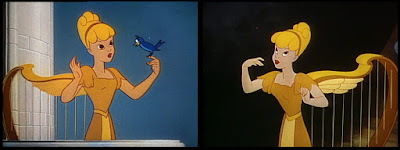
| The 1950s: the animals are still very monochrome (different shades of one single hue) in more stylized colors and wearing hats and scarves in spot colors (CINDERELLA and PETER PAN). |
In fact, the same concept can be observed in the much maligned Pastoral segment of FANTASIA, but only for mythological fantasy creatures like Pegasi or Centaur(ette)s in art deco colors:
 |
| FANTASIA: completely stylized art deco colors: tone-on-tone with spots on the Centaurette. |
All this may have initially come to the artists intuitively. But gradually, they started to adapt the same concept to monochromatic fantasy characters and props. In THE GOLDEN TOUCH (1935) - Walt's failed return to the director's chair - everything that turned into gold was animated with both shadow and glow layers (below left). To distinguish golden props on a golden table, each shape was painted in a different shade of yellow (below right).
 |
| THE GOLDEN TOUCH |
Eleven years later in FUN AND FANCY FREE, the golden surface of a magic harp was evoked simply by dividing the overall shape into many different shades of yellow/orange without relying on lighting effects at all.
 |
| Instead of animating shiny effects, the harp was divided into many different shades of yellow. |
If we apply these two concepts to "Anna", the main difference becomes clear very easily: in the left version with shading and highlight, she looks like lifeless golden statue, in the right multi-colored version on the right (which would be less complicated to animate but more laborious to paint), we see a woman wearing yellow or golden clothes. The key difference, in my opinion, is the addition of a more or less organic skin color that is within the same range of hue as the shades of gold.
 |
| "Anna" as the golden harp: 1. only shadow and glow (MAGIC TOUCH version), 2./3. using the harp colors from FUN AND FANCY FREE screenshots above. |
The importance of such natural skin tones to Disney realism will be further discussed in
Part II: Rare Experiments.
* This may be due to the fact that gray tended to lean to the blue side in three-strip Technicolor. But in this shot, we cannot actually tell because it is not even clear if the DVD transfer came from an original Technicolor print. However, I prefer to leave images untinkered so as to analyze what we actually find on current DVDs. In any case, it is important to remember that these colors could have been looking quite differently due to several factors. This, however, does not change the basic concepts at work.
** According to screen credits, Natalie Kalmus expanded her rigid color dictate to the studio only in live-action segments starting with THE RELUCTANT DRAGON (1941).


No comments:
Post a Comment