Showing posts with label painting. Show all posts

Friday, May 8, 2020

Lockdown Paintings

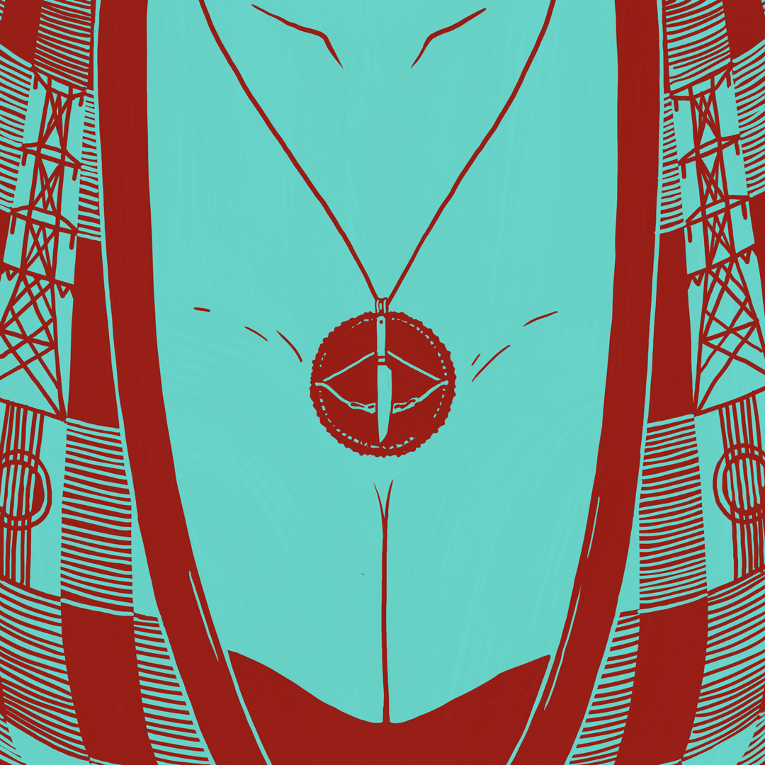
Since I've never managed to commit to challenges like Inktober for more than three or four drawings, I challenged myself to post a double feature movie recommendation (available on VOD in Switzerland) accompanied by a digitally painted mashup of the two films for 33 consecutive days on instagram. Needless to say that this limited my own time for watching movies to a bare minimum.

Not everything turned out the way I imagined it, but overall, it was a satisfying exercise/project. So here are the 33 pictures in order of appearance. Hopefully, you'll see some of the films' elements and why I combined them.

Parents: MOTHER (2009) and VATERS GARTEN (2013).
The latter is not in the picture as I did not think of the mashup until after I posted the first one.

Magical island life: LA VIDA ES SILBER (1998) / SONG OF THE SEA (2014)

Parallel dimensions inside the computer:
WELT AM DRAHT (1974) / SUMMER WARS (2009)

Rhythm in your veins: WHIPLASH (2014) / BABY DRIVER (2017)

Bakeries in Tokyo and Zurich: AN (2015) / BÄCKEREI ZÜRRER (1957)

Colorful and naughty: THE FLORIDA PROJECT (2017) / ZAZIE DANS LE MÉTRO (1960)

Tangled up in the past - two masterpieces about country vs city life:
LAZZARO FELICE (2018) / ONLY YESTERDAY (1991)

April fools - exceptional conditions:
LE PRÉNOM (2012) / TURIST - FORCE MAJEURE (2014)

Far from the city: THE RIDER (2018) / SAMEBLOD (2016)

Unseen revelations: DEN SKYLDIGE (2018) / ABOUT ELLY (2009)

Party nights gone astray: VICTORIA (2015) / THE NIGHT IS SHORT, WALK ON GIRL (2017)

Shoplifters, oranges and substitute families:
SHOPLIFTERS (2018) / PADDINGTON 2 (2017)


Love in systems of oppression:
BARBARA (2012) / PHOENIX (2014) / TRANSIT (2018)

Tiny budget, incendiary speeches: ZÜRI BRÄNNT (1981) / BORN IN FLAMES (1983)

Italianitá in contemporary Roman bohemia in LA GRANDE BELLEZZA (2013) ...

...vs working class migrant workers in Basel in SIAMO ITALIANI (1964)

Self-empowerment: WOMAN AT WAR (2018) / VOLVER (2006)

Good Friday. ABOUT ENDLESSNESS (2019) / LEVIATHAN (2014)

Desire in isolation: PORTRAIT DE LA JEUNE FILLE EN FEU (2019) / HÖHENFEUER (1985)

Easter Sunday: AMAZING GRACE (1972/2018) / LA FAMILLE BÉLIER (2014)

It's never too late to engage with James Baldwin:
IF BEALE STREET COULD TALK (2018) / I AM NOT YOUR NEGRO (2017)

Beyond civilisation, between human and animal:
MONOS (2019) / LA TORTUE ROUGE (2016)

(Dys)functional families with a lot of heart:
MA VIE DE COURGETTE (2016) / LITTLE MISS SUNSHINE (2006)

Unreliable narrators in uncomfortable literary adaptations:
BURNING (2018) / NO COUNTRY FOR OLD MEN (2007)

Drawn into war: CHRIS THE SWISS (2018) / LES MISÉRABLES (2019)

Hairy characters: TONI ERDMANN (2016) / DÄLLEBACH KARI (1970)

Trying to connect:
THE FAREWELL (2019) / ON BODY AND SOUL (2017) / ALOYS (2016)

On and off in black and white: COLD WAR (2018) / FRANCES HA (2012)

More than prison films:
LES HIRONDELLES DE KABOUL (2019) / THE SHAWSHANK REDEMPTION (1994) / LA GRANDE ILLUSION (1937)

Growing up in different neighborhoods:
EIGHTH GRADE (2018) / DIVINES (2016)


Falling in love: CAROL (2015) / CALL ME BY YOUR NAME (2017) / GOD'S OWN COUNTRY (2017)

Family ties: MIDNIGHT FAMILY (2019) / STILL WALKING (2008)

Shifting Sympathies: A SEPARATION (2011) / MARRIAGE STORY (2019)

Back to the first theme "parents" in films about the filmmakers' own parents:
VERGISS MEIN NICHT (2012) / RAY & LIZ (2019)

Wednesday, July 5, 2017

Introduction to SUNSET SONG and Terence Davies

Terence Davies is one of those masters of cinema who is still struggling to find the audience he deserves. Even such a beautiful literary adaptation like SUNSET SONG (2015) did not make it to cinemas or even blu ray around here (Switzerland, Germany...).

However, it is available with English (for those who are put off by the Scottish accents) or French subtitles. Since SUNSET SONG is relatively conventional compared to Davies's autobiographical masterpieces DISTANT VOICES, STILL LIVES (1988) and THE LONG DAY CLOSES (1992), this more easily accessible narrative serves as an ideal introduction to the cinematic universe of a highly idiosyncratic film maker every cinephile has to know.
This video essay was originally made for filmbulletin.ch where you can find a version with German voice over narration.


An Introduction to Terence Davies's SUNSET SONG from Oswald Iten on Vimeo.

Note: Last year, for the first time (ever?) Terence Davies was able to release two feature films within two consecutive years which means that A QUIET PASSION (2016), his highly acclaimed portrait of poet Emily Dickinson is already available in some territories. Unfortunately, due to the circumstances described above, I have not seen it yet.


Planimetric Shots
If you have ever seen a Terence Davies film you might probably remember his "planimetric" compositions (which is a term that David Bordwell had originally borrowed from Heinrich Wölfflin), i.e. the more or less flat staging of characters in parallel layers with the camera often perpendicular to the back wall of a room. Although this type of shot has become much more common in mainstream movies and especially period pieces, most people associate it with Wes Anderson who has been excessively using it ever since THE ROYAL TENENBAUMS (2001).
THE GRAND BUDAPEST HOTEL (Wes Anderson, 2014)

THE ROYAL TENENBAUMS (Wes Anderson, 2001)

You couldn't mistake Davies's compositions for Anderon's, however. While Anderson's candy color fantasies often look as if they were freshly painted or arranged by a doll house manufacturer, Davies's rooms and costumes are carefully selected to look lived-in and well-worn.

Green Scottish Life
Although he seems to prefer washed out colors (not the digitally desaturated DC kind, of course) in SUNSET SONG his director of photography Michael McDonough captured with his 65mm (exteriors) and large format digital (interiors) cameras a wide range of subtle shades of green...


...that in the second half are often balanced with red garments:


Monday, June 26, 2017

Annecy 2017 Impressions

Annecy always reminds me how thriving the animation community is and this year's edition was no exception. In the end, I may not have seen as many films as I would have liked but the combination of wonderful people, sunshine and two pedalo rides more than outweighed that, especially looking back eight days later.

As always, I also discovered bandes dessinées I have never heard of and was introduced to the works of inventive animation directors that had previously slipped under my radar. For example, I wouldn't have chosen to go to a screening of Crystal winner LU OVER THE WALL (Yoake tsugeru Rû no uta) if my friends had not already had tickets and knew what they were in for with Masaaki Yuasa.
Overwhelming water animation in LU OVER THE WALL.

Some 2017 Favorites

My favorite film was certainly MIN BÖRDA (Niki Landroth von Bahr, 2017) from Sweden in which a couple of lonely animals "sing" about their isolation. If you're not sold after seeing the singing fish in the trailer below (how could anyone not be), then surely the prospect of an animated Roy Andersson short film will get you interested.

The Burden (Min Börda) - trailer from Niki Lindroth von Bahr on Vimeo.

MIN BÖRDA was one of several stop motion films that included a long shot showing the whole set from an outside perspective. In contrast to the more meta-level versions (akin to Fellini's E LA NAVE VA, 1983) in several other puppet films, in MIN BÖRDA it actually was a diegetic shot, though.

NEGATIVE SPACE (Ru Kuwahata/Max Porter), another stop motion short, stood out to me not only because the tone of the storytelling was just perfect but also because I really admired the careful animation, especially the make-believe wave on the beach.

Negative Space - Trailer from Tiny Inventions on Vimeo.

With the advent of digital cinema, the once extravagant cinemascope aspect ratio (1:2.39) is available to even the most underfunded film maker and therefore increasingly popular. What does not automatically come with a wider frame are the skills it takes to make such compositions work (as has been already proven during the 1950s in live-action cinema). Thankfully, Michelle and Uri Kranot mastered the format in NOTHING HAPPENS, a film "about watching and being watched". And as I have learned on vimeo, the film that with all its fixed camera setups looked so non-digital on the big screen is also a virtual reality experience:

Nothing happens- an animated virtual reality experience from Michelle & Uri Kranot on Vimeo.


Being always alert to color trends, I noticed how many of the films I liked made heavy use of blue either in conventional terms of cold v warm, orange - teal or more boldly like in MATERIAL WORLD (Anna Ginsburg) that won the Annecy Crystal for best commissioned film.

The beauty of instructional videos: MATERIAL WORLD
In that light, it certainly fitted perfectly well that in the very same commissioned film program a CNN explainer addressed the very color:

Blue - CNN from Moth on Vimeo.

The commissioned films program was a real delight because it provides a nice usually give you a nice overview of current styles popular in the more inventive sections of advertising. And for me, getting an overview is one of the things that also draws me to internationally renowned annual short film competitions like Annecy.

Some concerns about short film compilations

The programming of this section, however, is highly problematic. If you saw only one or two screenings instead of all six, you would come to an extremely distorted conclusion about current trends in animation. Because:
A) not only are many of the more experimental films lumped together into one single "off-limits" program (which both makes it harder to process them all and turns away many a viewer who normally would not mind a challenging experiment in between more easily accessible films), but also
B) the films in the five "normal" competition compilations seem to be increasingly segregated as well by style/technique and even content (I wasn't alone with the impression that I saw a program full of meta-stop motion films and one full of either handpainted or pixilation/live-action-animation combinations). It may make sense from a critic's point of view to compare three similarly themed stop motion films that feature invisible imaginary walls, but to the audience the effect is more like "oh, another one of those" which does not do the individual films justice.

Brush strokes and the power of voice acting

But to close on a more positive note: a packed Bonlieu, Grande Salle is still the most exciting place to see a film on the big screen simply because it produces the most enthusiastic audience I have ever seen. And this, of course, was the case on my first day, when I thoroughly enjoyed the first "public" screening of LOVING VINCENT and contributed to a ten minute standing ovation that made it into Variety.


Writer-director Dorota Kobiela had the crowd on her side right from the beginning when she emotionally dedicated it to her grandmother. What most surprised me - and ultimately convinced me despite the film's many flaws - was the fact that the concocted mystery plot worked so smoothly. Maybe a bit too smoothly and certainly too rushed at times when everything that vaguely resembled a reflective moment was plastered with Clint Mansell's far too obtrusive score before I had time to catch a breath.

But - and that is a much more serious problem - the film, well-acted as it is by the likes of Chris O'Dowd and Soairse Ronan, would easily work as an Irish radio play which literally means that apart from a few imaginative scene transitions the filmmakers failed to make use of the visual potential of a feature film consisting exclusively of oil paintings and simply illustrate talking heads. For sure, the paintings are expertly executed, the flow is a lot better than in almost any rotoscoped feature I have seen and the colors alone are a fantastic treat. But narratively, there is nothing gained from the brush strokes, no new insight into the characters that is not already in the dialogue. Stylistically, despite the unifying rotoscoping, the well-proportioned actors walking through off-perspective backdrops often reminded me of the Dali dream sequence in Hitchcock's SPELLBOUND where Gregory Peck stumbles through deliberately unbalancing expressionist/surrealist sets.
LOVING VINCENT: live-action v rotoscoped in oil.
But still I enjoyed it and I warmly recommend seeing it. Even if mostly for pulling this feat off and hopefully making people all around the world re-discover an artist who is so popular today that we take him for granted. And if that comes through a combination of eye candy and tv style murder mystery, so be it. I'd rather see that one again over yet another superhero origin story.

Speaking of origin stories: the basic parent - child relationship inherent to any origin story seems to have replaced the love story as the primary emotional trajectory of mainstream films from BEAUTY AND THE BEAST (Condon, 2017) to LOGAN (Mangold, 2017) or ROGUE ONE (Edwards, 2016). Thus, it came as no surprise that many films in the shorts competition dealt with remembering a recently deceased parent. A special treat was PÉPÉ LE MORSE (Lucrèce Andreae): a prime example of fluid, atmospheric storytelling - at 15 minutes it never dragged - and strong voice acting which I am very partial to yet which is not so easily found in animated short films.


Pépé le morse - Teaser from Lucrece Andreae on Vimeo.

Tuesday, December 25, 2012

Red and Green: Merry Rockwell Christmas!

Merry Christmas to all of you!

Typical Rockwell Santa before Sundblom's Coke ads. 
Norman Rockwell is well-known for many a Christmas cover painting featuring Santa Claus. However, he also liked to compose his other pictures around complementary contrasts. To mark the occasion I have compiled ten Christmas covers without Santa Claus that are nevertheless based on red and green.

In Christian color canonization green stands both for mercy and hope. It is therefore no surprise that Christians brought green christmas trees into their homes to celebrate the anniversary of their Redeemer's birth. Especially during the 20th century, red and green have become associated with Christmas to such an extent that any product logo composed of these complementary colors reminds us of christmas.

Nowadays most Americans are aware that their conception of Santa Claus as a red dressed man hearkens back to a series of Haddon Sundblom's ad paintings for Coca Cola starting in 1931 that referred to Thomas Nast's earlier Santa depictions.

If you mix red and green (pigments, not light, that is) you usually end up with a muddy brown that leans toward either of the two colors depending on which dominates the mixture proportionately. For easier study of the color combinations I have added three swatches at the bottom of every painting indicating the tonality of the defining areas of red, brown and green.

Rockwell Christmas Paintings Beyond Santa In Chronological Order

Norman Rockwell seems to have organized his paintings mainly on tonal values and not around the combination of different hues. When it came to color however, it looks like he favored complementary contrasts (possibly because they were less prone to printing deficiencies than analogous color schemes). Many of his magazine illustrations are composed around blue-yellow or red-green complementary contrasts.

In celebration of his Christmas covers, I have gathered ten of his Christmas paintings without Santa Claus that are mainly composed of red and green.

All of these composition are relatively flat and graphical, just look at the three full frontal characters from the 1930s. Before WWII the characters are vividly modelled with strong contrast of values and thus read equally well in black and white. However, he employs high-key lighting in all of the post-war paintings below. Thus, the flat staging is even more conspicuous.

Note: There are always two "originals": the oil paintings and the first print covers (reproducing colors differently). Most of these digitized pictures (below) look probably very different in reality. I didn't adjust white balance or any such thing because I don't have enough knowledge of the printing techniques or paper used for these covers.


1923

1928

1931

1932

1938
1948

1950

1951

1955
1956
This inferior reproduction (above) demonstrates how different colors can influence our perception of an artwork: Gone is the red-green contrast and thus the Christmas allusion. The heightened saturation also minimized the contrast between the brown drawers and the red dress