
When Christian Renaut (author of „Les héroïnes Disney“) asked me for a comment on color in the stag fight scene in BAMBI (Hand, 1942), I felt the need to illustrate it with screenshots. Hence, my first color analysis post in years...
Although Walt Disney was predominantly striving for dimensionally believable, naturalistic settings (in the vein of 19th century illustrations) when it came to animated features, during the golden age (1937-1942) his overall emotional approach to storytelling allowed for expressionistic use of shape and color during tense/subjective moments.
The resulting, less detailed backgrounds are easily integrated, however, since the characters (the focus of audience attention) keep their dimensionality, shape and proportions at all time. No flat shapes, no graphical abstraction. In addition, the Disney „dogma“ of value separation (i.e. either light character colors against dark background colors or vice versa) is closely followed, no matter how stylized the lighting gets.
 |
| Left: light character on dark BG / right: dark character against light BG. |
 |
| Concept art by Tyrus Wong (left via michaelbarrier.com, right via colossal.com) |
 |
| Visible brushstrokes and less details in more impressionistic approach. |
Thanks to Tyrus Wong's suggestive concept art, BAMBI generally feels much more impressionistic than the other films of that era. Besides atmospheric color choices, this impression mainly stems from a very selective degree of detail resulting in suggestive shapes of color and visible brush strokes. This is closely maintained throughout the two fantasy sequences when Bambi follows Faline through the clouds and during their stroll through the night.
[Side note: the fantasy sequence immediately before the stag fight has the deer float among more or less realistically painted clouds that resemble the snow only with pink instead of yellow highlights.]
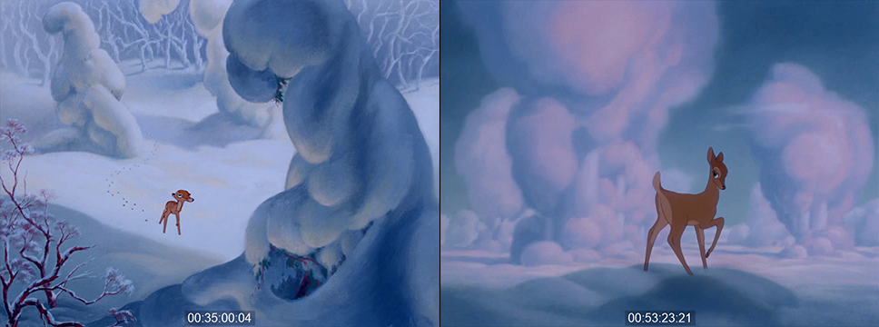 |
| Snow: light blue with yellow highlights / love clouds: with pink highlights |
Right between these two love scenes, however, Bambi has to fight his rival Ronno who suddenly appears behind a cloud and brings Bambi back down to earth.

The actual stag fight takes only one minute, it leaves a strong impression not least because of its bold color design. In the backgrounds, there are a lot of expressionistic color transitions with a general arc from green and blue towards red and golden orange. But although the „story meeting commentary“ on the blu-ray insinuates that those color choices were guided by „symbolism throughout“, I believe that what made it to the screen works primarily on an emotional level without too much rationalizing. So in this analysis of the latest blu-ray transfer (which may differ from what the film looked like in Technicolor), I primarily look at how these color combinations work and how they affect me.
The transition
When the cloud setting transitions back to the forest, the familiar brown vs green contrast makes the deer stand out quite naturally. Furthermore, the shades of brown adhere to the well-established Hollywood convention of value-coding: the skin of the female love interest is paler (less saturated) than the hero's skin and in this scene leaning more towards violet. The villain Ronno is deliberately darker than Bambi, especially around the eyes, looking almost like a shadow version of Bambi with more dangerous antlers.
 |
| Ronno the Rival |
 |
| different skin tones according to convention. |
 |
| Faline paler, Bambi "default", Ronno darker... |
While the scene starts out in a naturalistic way, the transition happens step by step. First, a brisk change in lighting after a cut indicates a subjectively heightened perception of the situation. The story notes mention a sunset, what we actually see is heightened contrast and saturation in the green background and glowing golden rim light on Faline and Ronno. This may not look natural but makes for a bold color contrast. The sunset impression also comes from the fact that during the whole stag fight, Bambi and Ronno are always dark against light (except for one short shot). Even in less extreme backlighting, this effect is supported by the rim light that is brighter than the white of the deers' eyes.


During Bambi's attack from the right, the transition is taken further within a shot over the course of which Bambi's body becomes a dark silhouette against a backdrop of broad brush strokes and blue and green shapes devoid of detail (54:19:13).
 |
| Bambi from the right, smooth lighting change against broad shapes. |
 |
| Ronno from the left. |
We then see Ronno's counter-attack from the left with hard lighting from the right (aka the expressionist sunset). Contrast is now so high that parts of the image remain pitch black.
What is more, although perspective and dimensionality are maintained, in the following long shot the level of detail is extremely low. A sketchy brown branch on the left and a silhouetted branch on the right provide the necessary depth cues with dramatic lighting setting the stage for the action.
 |
| Cut from high contrast, high saturation to similar, more stylized background. |
 |
| This setup (right) resembles the style of the first hunting scare (left). |

And since Ronno's half of the background is a lot darker (above), this is the one shot where he is much lighter than Bambi and everything else in the shot. Thus, it looks like two contrasting forces (bright orange Ronno and pitch black Bambi) are about to collide.
Ignoring color continuity
However, when the actual collision happens in the next shot, both deer are equally dark against an abstract dark blue background.
In this elaborately animated shot, Ronno takes Bambi on his antlers and throws him to the left setting up the basic left-right-orientation for the remainder of the fight. At the same time, three basic concepts of the sequence are established:
since the editing adheres to meticulous action continuity, the artists applied colors freely without paying attention from shot to shot. No matter how much the colors change from one shot to the next, there is always at least one element that remains stable across cuts.
While the characters appear in „expensive Disney silhouettes“ (my own expression) – almost black but still with slight differences in color for lighter body parts and eyes – often against dark backgrounds, the movement is suggested a layer of fierce rim lights, sometimes containing additional highlights in an even brighter color.
The degree of detail in the background varies greatly from just a direction of brushstrokes and gradient to some sketchily defined piece of vegetation or even fully rendered leaves and blades of grass. This way, we don't really see these color flashes as abstract backgrounds because like with the rim light on the characters, there are always enough representational elements in the frame to suggest a full setting.
Stage-managing emotional color changes
During Bambi and Ronno's initial clash, both are defined by the harsh orange sidelight (and fierce white highlights) of a heated confrontation. But during Bambi's fall to the left, his rim light turns cold as he enters a zone of fictitious blue light from above. Like in most of Disney's more expressionist sequences, this is much more reminiscent of elaborate stage lighting rather than abstract painting.


This notion seems to be confirmed by the fact that when Ronno approaches Bambi he is also bathed in blue overhead lighting and only re-enters the hot orange zone when the action moves to the right (a prime example of the old orange vs teal contrast, if ever there was one).


Then we get the first brief shot from Bambi's point of view: Ronno's orange/white rimmed silhouette runs straight at the camera against a non-representational gradient made of broad diagonal brush strokes.

Now the darker rim light on both characters is green, somewhere inbetween the blue and green of the background. This overall green look is extended to a shot of Faline watching the action in an almost unicolored setup.

Bambi's next attack begins with orange top light but only adds the white highlight in the spot where the two stags meet. Again, the background colors flip across an axial continuity cut from green to orange vs blue (54:37:07) with Ronno on the orange side and Bambi against a dark blue background looking up at Ronno attacking him yet again from a bright background (maybe looking up at a cloud or light source?) that emphasizes the darkness of Ronno's silhouette.

 |
| BG colors change with hard cuts |
 |
| BG colors change with hard cuts |
 |
| BG colors change with hard cuts |
During the next wrestling match (54:45.10), by way of a pan, the green background turns to blue while the blue rimlight gradually transitions to red and orange, which is again reflected in a unicolored shot of Faline watching the action (now staged as shadows over her face and the rock behind her)
 |
| continuous color change of rim light. |

The sunset justification
Taking into account that all this was supposedly happening while the sun was setting on the right (the typical narrative pretense for colored lighting in Hollywood films at the time), we have now entered the final stage: the lower half of the backgrounds are already in the dark, devoid of warm sunlight.


As we cut from a wide shot to a close-up of the wedged heads, the background snaps to a fully saturated diagonal gradient from dark blue over magenta to red reminiscent of the fierce red glow that occurs shortly after the sun has set (and foreshadows the forest fire).
 |
| The sky is now burning... |
Emotionally, the fully saturated red seems to tell us that we have reached the apex of the stag fight.
 |
| With red fury on his side, Bambi is getting the upperhand |
Indeed, the two clash one last time. Only this time around, Bambi is strong enough to through Ronno off the cliff into the cold violet water (down below, so technically not in the warm part of the background any more). Remarkably, those last few shots have been defined by just enough representational detail that the fully dimensional background during Ronno's fall doesn't attract our attention.

 |
| Again entering the striking highlight zone... |
 |
| Suggestive, leaving much to the imagination, but still representational. |

 |
| BG colors change with a hard cut. |
 |
| the final POV shot of Ronno attacking. |
 |
| The same BG in different colors, early expertise or later tampering? |
[Side note: BAMBI has been heavily "restored" for DVD and again for Blu-ray. Without getting into all the things that don't feel right to me, I am very curious about the original colors of this POV background (55:01:16, above). It is certainly the same painting. And although there were indeed procedures that allowed for these kinds of color changes, I am not sure if it really fit the sunset part as well on Technicolor or if it was "fixed" in order to smoothly match the original vision as opposed to what ended up on screen.]
 |
| It's interesting how the same BG works for two different size relations! |
 |
| Generally, the diagonal left-to-right dynamics (Bambi's direction) are adhered to in abstraction as well. |


The iconic shot
After this predominantly red climax, for the aftermath – and real payoff – the sky turns gold as Bambi towers over his rival in a simple but strong composition. By this saving-a-damsel-in-distress-and-proving-himself moment, Bambi seems to have earned the „prince of the forest“ staging. He may not yet be ready to succeed the old prince in all aspects, but it is certainly the first time, he is seen in this iconic pose that is backlit so the characters appear as clear silhouettes against a lighter backdrop.

 |
| The Great Prince of the Forest (Bambi's father?) |
And yes, in the end, Bambi himself becomes the Great Prince (or so it is visually suggested) taking over not only the pose and direction but the very spot of his predecessor (who is never verbally alluded to as his father).
 |
| Bambi succeeds the Great Prince and looks back over "his" realm. |
All screenshots taken from the European blu-ray edition (time code based on 23.976fps).
Click on the images for larger versions.


 Posts
Posts

