Showing posts with label Michael Sporn. Show all posts

Tuesday, January 21, 2014

Michael Sporn (1946-2014)

Sad news indeed. One of the strongest voices of the independent animation scene has become silent last sunday. If, like me, you had made it a daily ritual to read Michael Sporn's Splog, you may have noticed in his writing over the course of the last few months that something was seriously wrong. But still it came as a shock to hear that Michael has lost his battle with pancreatic cancer last sunday.
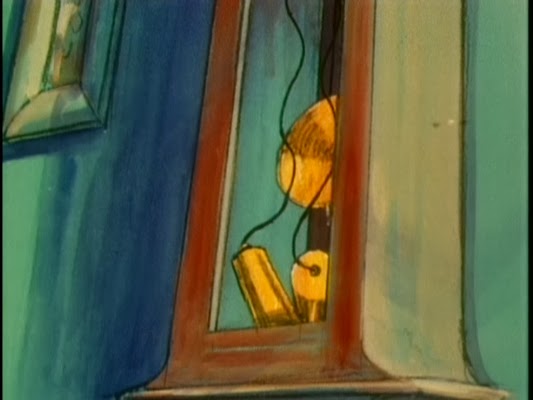

"And time went on without him..."

I have never met him in person, just had a few e-mail conversations. The last one about his current POE-project I was eagerly looking forward to. I am grateful for the vast amount of artwork and insight he so generously shared on his blog. And most of all, I am indebted to him for putting me on the map when he spread the word about this site even before I wrote about Walt Peregoy's color design.
"The thing to do is simply hold on..."

Michael Barrier and John Canemaker as well as Mark Mayerson have already put together obituaries. May he rest in peace.

Thanks for the inspiration!

All screenshots and quotes are from Michael Sporn's poetic animated HBO-special THE MARZIPAN PIG (1990), featuring soothing voice-over narration by Tim Curry.

Friday, December 5, 2008

Dalmatians and The Nightingale

One of the newly available LIFE photographs

Walt Disney’s Birthday
(December 5th, 1901) seemed a good day to me to relaunch my series on 101 Dalmatians. Even though The Old Man himself wasn’t too pleased with this film, the people working on it greatly benefitted from his absence.

However, I finally received my copy of The Films of Michael Sporn today and thus couldn’t resist watching The Nightingale tonight. So instead of a new analysis, I’ll just recapitulate what I’ve already analysed so far:

The introduction was mainly concerned with general thoughts about color styling and art direction focusing on the concept of Disney’s familiar “pool of light” lighting scheme.
In the first post I compared the different rooms of the Radcliffes’ (and Roger’s bachelor) apartment. Although each room’s predominant color reflects the inhabitant’s character and general mood, at this time everything seems to be lit naturally. Green is the unifying color here. Although Anita is a little underdeveloped story-wise, she usually wears colors that are complimentary to the backgrounds (more than those of any other character so far). This becomes clear in the theatrically staged birth sequence.
Post 2 was about different lighting setups of the kitchen and the living room as well as about shadows and silhouettes. We saw that life and color fades after the puppies have been stolen. The warmth returns in the end with even richer saturation. In all these scenes (up to Sq. 6), established color schemes are consistent throughout whole sequences. Inside lighting doesn’t seem to affect skintones too much (hue-wise).
Only in the third post Cruella has her big entrance shoving everybody else out of the spotlight. For once a Disney villain is not associated with darkness – her henchmen certainly are, however. So much so, that they even stand in the shadow at home. Cruella introduces the elements of pink and flashes of red.

The next post will be about the
theme of observing.