Near the end of his career at Warner Brothers Bob Clampett confronted Porky with four hostile felines in one of his most garish and shrill cartoons. In this third and last installment of "Black Cats in Technicolor" I focus on layout and lighting experiments. A closer look at KITTY KORNERED (made in 1945, released 1946) reveals surprisingly restraint color palettes behind the crowded and ugly compositions.
The cartoon starts out fairly common with a
blue winter night setting contrasted by spots of yellow. This has already been established in the title sequence.
Basically,
yellow stands for artificial light within the houses. It also highlights the clock on the church tower that corresponds to the narrator's claim that the cats are put out at nine o'clock every night.
As can be seen in this desaturated version of the pan
contrast and sculpting on the buildings is mostly achieved by hue instead of value. The walls facing the camera are all blue because they are in the shadow which is indicated by the cast shadows on the snow. The object colors are indicated on the side walls of the buildings. When robbed of the hue it is harder to see which walls are in the shadow (see especially the reddish house, second from right).
Likewise, the clock does not stand out from the tower when robbed of its hue (yellow).
Within seconds red and green are also introduced. On the traditional color wheel green lies between primary colors blue and yellow and fits well into the overall scheme.
It is probably no coincidence that Porky wears dark red in the title card (top image). In the actual film, an extra wears that color while Porky himself is in his white pijamas.
Fully saturated
All of these "black cat" Clampett cartoons stage colorless characters against colorful backgrounds.
THE HEP CAT (1942) applied a tastefully muted night time palette with spots of primary colors. In
A TALE OF TWO KITTIES (1942) the colors have been determined by different times of day and thus consisted of natural earth tones and strong sky colors rooted in reality.
The choice of garish neon colors in KITTY KORNERED, however, takes the
concept of colorless characters against colorful backgrounds one step further. Gone are most of the earth tones. Flamboyant hues prevent the backgrounds from receding and feel much more expressionist than realist. The room colors also seem to change occasionally for no other reason than variety.
The characters however are
even less colorful than before. Skin tones are limited to the "human" pig Porky. Details like eyes and noses are fully saturated.
[Note: Part of this is probably due to digital restoration, but judging from the overall appearance the image might not have been that bright on film but fully saturated with even more contrast.]
Lighting experiments
Porky's house is in keeping with the already established blue-yellow color scheme with blue leaning towards green (the fence) and towards red (blinds and right walls).
In the close-up that follows the glass-less window is not illuminated by yellow artificial light. Instead we can see that the wall inside is green. Porky and the cats' tails are in strong silhouette that looks great but is not consistent with the rest of the frame image.
All the
silhouettes in the film coincidentally read against a green background. The most expressionist (non-realist) version is in the one where the cats' eyes are even visible in silhouette.
The threshold between exterior and interior color scheme is rendered rather expensively: On the outside the door is seemingly white and therefore reflects the light of its surroundings. When it is opened the inside lighting affects it strongly. Since any gradient from blue to yellow (reflecting artificial light and yellow walls) includes green in the middle, the door changes gradually on each frame from light blue to green to yellow.
 |
| Background perspective is already a little forced, the closed door however is wonky and outright wrong! |
Looking at the single frames the supposed lighting effect does not seem
natural because the colors - especially neon green - are far too
heightened. As an experiment of integrating inside light sources and
connecting the exterior and interior by its common denominator (green),
this very brief effect is an astonishing experiment.Of course, it could have all been achieved by simply having a door that is green inside and outside. But the saturated color change adds a lot to the impact of opening or closing this door (as can be seen below).
It is typical of Clampett's way of rushing through productions that a lot of energy is devoted to slamming the door but the lighting on the snow does not change and we still see Porky in the pool of light created by an open door when he hammers against the close door.
Again opening the door results in a harsh change from a monochrome background to a momentarily gaudy one:
Expressionist perspective experiments
The rest of the "pig and cats" games take place inside Porky's house. Analyzing the following screenshots I will focus 1) on the warped perspective and 2) on the different color schemes of the four chase scenes.
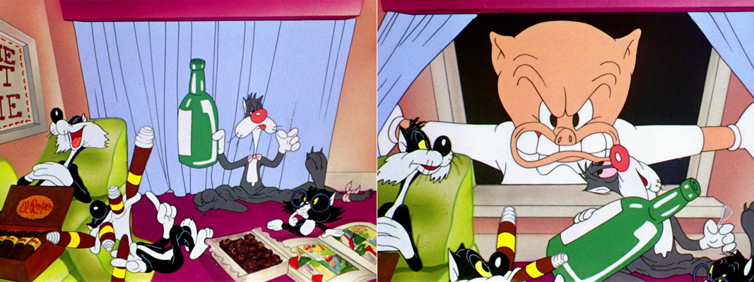
Before Porky enters the house through a pane-less window, Clampett overstrains us with a cluttered composition of all four cats without visual hierarchy. As if this wasn't enough, the room seems to lean towards the spectator. The background colors look random (probably because of the dominant lavender-blue drapes). Upon closer inspection the underlying color scheme seems to be magenta (wall and floor) vs green (couch). Size relations vary a lot in Clampett's expressionistic cartoons as can be seen when Porky's oversized head enter the frame from behind the cats.
While all the other backgrounds of this scene adhere to the magenta-green contrast, there is a glitch in the beginning when the smallest cat jumps into the "old-man" jug (blue walls).
Green and magenta
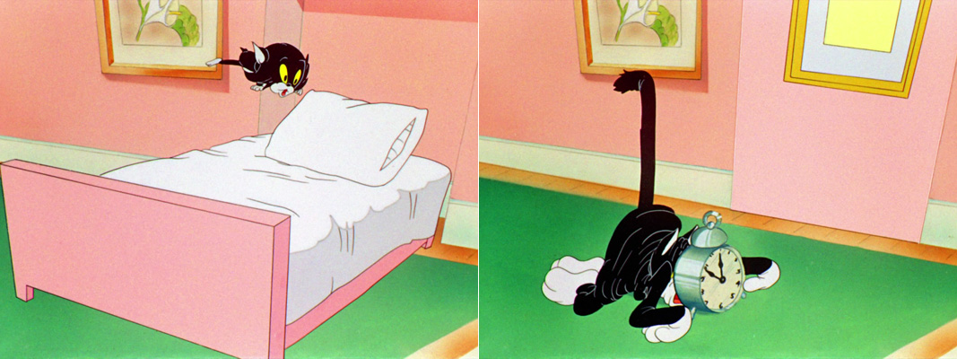
In this strange bedroom the the floor is green and polished:
 |
| Perspective on the wall is wonky and supports the pan to the right with vertical lines leaning to the right. |
 |
| Here the background perspective is from slightly above while the cat is seen from the side. |
In the room where the alcoholic cat is hiding the colors are reversed. But even in the fishbowl, the magenta-green contrast is maintained.
Green and blue
Just in case you thought that room colors were consistent in order to garantuee orientation, think again... As soon as Porky arrives on the scene, the floor has changed from green to dark blue and from polished to carpet.
 |
| Probably the higher angle on the left was chosen to not give away the green walls just yet - to make the change more gradual. |
Again the perspective of background and character in motion are inconsistent. After the cut, however, there is a relatively flat pan that ends in a tilt wall:
To emphasize the tension of dragging cat and mice across the room, we cut to a visually elongated room (below left) and then to a tight corner that once again features characters that are aligned straight in front of a tilt (or wonky) wall.
The camera again pans several times across a geometrically flat background that completes the triad of neon green, dark blue and purple.
It does not matter whether these are the same rooms we have seen before. And it does not matter that the lighting effect only applies to the shadow dog and nothing else in the picture, either. With all the garish green and expressionistic changes of color schemes, this cartoon seems to scream: I am hysterical and I am eager to inflict the same on you!
Red, yellow and neon green
Interestingly, the doorway colors are indeed consistent with the beginning of the film: red floor, yellow walls, green door.
Although perspective is warped in every background, the angles seem to be chosen carefully. Once again the characters are consistently seen from the side while the entrance area is seen from a different angle. Skew vertical lines support the dynamics of anticipation and jump.
John Kricfalusi has analyzed this scene in great detail and has been pointing out the following cut on action (or rather impact):
"right in the middle of the action Clampett changes the background to the more extreme angle of the door.
This gives the crash way more impact than if he had done the logical thing and used the same background." (John K.)
In my opinion this cut not only gives the crash more impact but is completely necessary for two reasons: 1) the mismatching character and background angles of the jump could not result in a convincingly drawn crash. 2) After the crash, the cat's fall is limited by the frame. Although its lying position is by no means consistent with the angle of the crash, at least this background makes it look like the cat was lying on the floor. This landing on the edge of the frame would be completely off in the first high angle background.
 |
| Both backgrounds are wonky but not in the same way. Note also that Porky still seems to stand in the last scene (or in an upstairs room?). |
Pink and green, magenta and yellow
Then after the cats have conspired to disguise themselves and play an "Orson Welles" (re-imagining his famous "War of the Worlds" radio drama) on Porky, we see Porky's bedroom that combines purple walls with a green blanket and a dark blue floor.
The "martian" characters are depicted in fully saturated colors. Two in hot pink and green and two in magenta and yellow.
 |
| Porky's take is once again limited by the upper frame edge. |
When Porky runs upstairs to get the gun, the wall behind him is blue. During the following showdown the staircase however combines a magenta carpet with slightly muted yellow walls. As can be seen above (Porky's take and blanket in the air) and below, Clampett (or his layout person) often cuts from low-angle to high-angle shots in this dramatic final confrontation.
Perspective is increasingly forced in order to make the distance between the opponents seem huge.
Upstairs the floor and walls look like in Porky's bathroom. For dramatic reasons the outside lighting conditions are reversed when Porky runs towards the window...
...and are finally back to the beginning with a pool of light that is completely inconsistent with the window Porky just jumped out of. Dramatically the glowing red behind the victorious cats feels right although the walls behind them has been shown to be of a different color just seconds before.
Inconsistent by nature
If this cartoon proves anything then it is the fact that inconsistent backgrounds are not consciously noticed as long as the audience is busy following the foreground action. If even a loose continuity of character action is maintained, film makers can get away with almost anything in the background (many a movie trailer makes good use of this effect). There is no doubt however, that perspective and colors subconsciously have a strong effect on how we perceive the action.
In most of these backgrounds there is nothing receding and no muted tones the eye can rest on. Instead the colors seem to jump forward adding to the claustrophobic feeling of this cat-infested house.
I am sure that many inconsistencies in Clampett's cartoons could have
been avoided by handling these scenes more carefully. But that, it
seems, was not what Clampett was after. He wanted to entertain and also
see what he could get away with.
Whoever chose those colors could have gone completely random. But as my breakdown into scenes has proven, they did not. Some of the dominant colors may look unpleasant but they have been applied very restrictively within clearly defined color palettes. There seems to be a long way from the subtle color effects of THE HEP CAT to the outrageous color design of KITTY KORNERED. As you may have guessed I favor the earlier approach. But I also like to study artistic growth and that is what these three posts have been about.






 Posts
Posts

