Showing posts with label Princess and the Frog. Show all posts

Wednesday, May 5, 2010

A "Dumbo" for our times

With the Walt Disney Company obviously celebrating Dumbo’s 70th anniversary a year in advance (at least in Europe) with a lavish Bluray Edition and Hans Perk hopefully starting an ongoing re-evaluation of the animators’ work on that film, I couldn’t help comparing the two DVD editions I have (2001 vs. 2010). Both of them represent contemporary technicians’ interpretations of the original Technicolor film while each version goes into a wholly different direction. 
Never trust DVD colors.

On a side note, a company that has taken all necessary steps to erase production dates from the audiences’ minds in order to sell their timeless and not-so-timeless films indistinguishably from contemporary releases (a preposterous idea in itself) is now celebrating their oldest classics with rather broad interpretations of release dates, in big letters nevertheless.

Suddenly it has become fashionable to sell old movies - the older the better it seems, with Bluray anyway – because then people can appreciate how technically advanced these films must have been back then and most of all: what a marvellous job the restoration team must have done.


Why restorations are products of their time
There are three things I try to keep in mind when studying/reviewing a restored film:
  1. Restorations are commissioned in order A) to keep a work of art from decaying for good and B) to be able to get new audiences interested in it (i.e. widen the range of buyers).
  2. Taking option B) into account, it is the job of restorers (highly skilled artists and technicians) to appeal to current tastes as well. So I assume that they know very well what they are doing when they use state-of-the-art post production techniques to "enhance" technical aspects so that a film superficially looks like it was made today. This usually is done carefully with the supposedly original artistic intentions in mind, trying to make things look like "they were intended to" and "correcting technical flaws" of the original.
  3. This pushing process, of course, has to take into account the specific medium/technical equipment (Youtube, an old television set, a HD display or an IMAX screen) the restored movie has to look good on.
So while not even period movies can successfully conceal their time of making (look at the fashion, haircuts, editing and acting style of a western set in the 1880s and you can at least guess the production decade), restorations are always bound by equally time-dependent restrictions of current technology and taste. Therefore a restored film always tells us something about the period of both production and restoration.

On a superficial level there seems to be a long way from the 2001 DVD and the current Bluray release. It just feels like Super8 compared to a 35mm. Which paradoxically brings us straight to the heart of the matter as Dumbo was shot and released on 35mm in the first place. It just didn’t look like that at all on the 2001 DVD. The new version doesn’t even look like it was shot on film any more. In fact, with the final assembly being made completely digital, it is more accurate to say that elements of the source material were shot on film. The picture has been so thoroughly expurgated of every grain of history that the slightest cel shadow becomes a distraction.

Stunning though it may look to the average BD buyer, to me it’s a mixed blessing. But as I have the same general reservations and objections (removing the grain and everything that held backgrounds and cels visually together) against this that I have already stated concerning recent platinum restorations I will no longer tax your patience about them. I can still enjoy the Bluray, though, in case you wondered.


Back to the roots and beyond
It's the beyond that is of particular interest here. The 2001 version isn't a full blown restoration, but its colors also seem to be quite far from the Technicolor original.

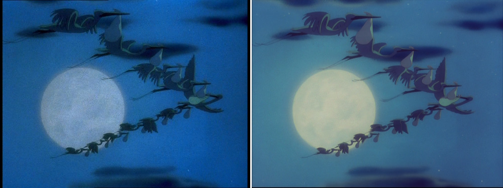
2001 (always on the left)  vs.  2010 (always on the right)

At first glance the left picture is a lot lighter. Looking at the skin color I also notice some greenish yellow tint that looks rather pale and unnatural.
On the other hand the right picture is darker and feels more saturated, although the red uniforms are a lot brighter in the left picture. Instead Mrs Jumbo's pastel cloths are more saturated. The greenish tint is gone so the green parts are in stronger contrast to the brownish yellow tent. Overall the right picture looks somewhat warmer, most notably in the skin colors. Color correction based on white balance doesn't do the job with these restorations as the colors seem to have been adjusted separately.

The obvious difference is the change in value and hue of the purple keepers. I believe what we have here is a case of "correcting" something that served a purpose. It is true that these keepers are in dark colors throughout the sequence and especially the purple ones should never have been pushed to plain red as the ringmaster is always identified by that color among them. There is also a hint in the left image that the blue of the keepers once was different from the pastel blue Mrs Jumbo cape. I also don't think that the purple (now red) keepers were meant to stand out because of that. So the left picture can't be wholly correct on that instant either.
But while the 2010 version "restoring" color continuity (making the keepers dark in ALL shots of the scene), it is disregarding the composition of the shot as a whole. This sequence is an action scene consisting of many short shots that have to read at first glance. Yes, there are many color continuity errors on Dumbo, but this wasn't one of them, I believe.

The value pattern on the right has most certainly been altered for color continuity's sake. A thing that one would never do on a live-action movie. It would never read fast enough in black and white. If you look closely enough you see spots of brighter purple in some areas. Note also that the blue keepers' hems are purple as well and not orange like in the old version and earlier in the film.

So how could the original have looked?
We, who don't have access to the studio archives, will never know (Dumbo hasn't been theatrically re-released for about 30 years around here).

Based on these pictures, does the 2010 version come closer to the original than the 2001?
On the one hand, the right image feels closer to a possible original because of the clear color separation and darkly saturated colors of Technicolor. Remember, in those days, the green layer was still printed in black as well for richer darkness. Also, the Technicolor consultants used to make sure that human skin looked warm and healthy all the time.

On the other hand the "corrected" color continuity destroys an easily readable composition. Also, the inked outlines on the keepers have been partially obscured by digital repainting (a problem of value contrast as well). When seen in motion there is a lot more going against it what with all the grain and organic flickering erased.

But which one looks better then?

Both the 2001 transfer and the digital restoration were prepared for audiences who grew up on animated features colored in the computer. With VHS and DVD visual "richness" used to be "enhanced" by pushing contrast and saturation. Over the years garish TV shows have pushed the boundaries of how many saturated colors next to each other one could bear. So subtle and rich (warm and dark) color schemes have recently been favored to lift the films off TV fare. Just think of The Princess and the Frog with all the glowing New Orleans sets that display subtlety in the form of many different shades of the same color in one image.

On a small standard TV set subtle colors were a matter of luck and the picture had to compete with brighter light sources all around the living room. So pushing the saturation and brightening the image seemed fairly reasonable. As a matter of fact, the target audience were very small children or rather their mothers and they like light and pastel colors, as marketing tells us (and them).
Look at that DVD on a HD display (flatscreen or projection) and your eyes hurt. Light surely isn't the issue with today's displays. Oversaturation is, if anything. So all that had to be pushed for standard television is now already there in the hardware. Again it is only reasonable to pull down the brightness and have darker colors saturated. In that area, the new Dumbo attempts to rival all the Princess-and-Frog-type of richness - earning much praise from critics for it.

Individual shots
Each of these pairs illustrates at least one of the above concepts. They also show that each shot has been worked over individually.

Here the left picture is brightened (look at the burnt out top of the post) while the right is maybe even darkened. All that is playing in the unlit part of the tent is treated that way. The 2010 version just goes much further than previous video versions could have dared. On the left: there's the green tint in the bright areas again. On the right: the keeper colors have not been tampered with.

Left: the straw looks like green grass on the edges and the pool of light is burnt out; right: stronger value contrast, darker like all the tent shots.


Here the left looks warmer and more natural while the right has a bluish green tint. Also Mrs Jumbo's gray trunk reads better in front of the brown sheet.

As the naughty boy's white clothes sport green stripes in all the other shots in both versions, this (on the left) may well be a painting error that was corrected (on the right) for continuity's sake.

Here it seems, the 2001 technicians feared the ringmaster's expressions wouldn't read in silhouette on a tv screen so they pumped up the brightness resulting in unappealing cloth colors. On the right the richer darkness seems to be emphasized.

The garish pushing of primary colors in older Disney DVDs was certainly pulled back in 2010 because on an average HD display red pops out anyway.

On the left, we have standard night time. The whole picture is blue like in many day-for-night scenes. This is clearly optical color grading at work which of course is common in live-action films. It might have been that way in re-release prints yet I doubt that the original was planned as a two-color scheme (blue and pale yellow) and then optically reduced to blue. The 2010 version is a lot brighter, though, showing more subtlety and supporting the thesis that for normal TVs concepts had to be pushed to the extreme to be understandable.


Conclusion: All quibbles aside, this restoration is the one looking best on today's equipment regardless of historical accuracy. Had the 2001 edition been transferred more carefully (no boosting and edge-enhancement) or from the consecutive-exposure-negative (more subtle colors and less grain) rather than from a contemporary print, it might have stood the test of time next to the aseptic Bluray.

I myself prefer the strict historical approach. Wouldn't it be marvellous to have access to the 35mm version as well? Maybe someday resemblance to the original becomes fashionable enough to be a selling point. I can dream, can't I?

the left-hand screenshots are taken from this Special Collection DVD from October 2001,
the right-hand screenshots from the 70th anniversary Bluray + DVD edition from March 2010 (Screenshots taken from the DVD which is identical to the BD except for resolution and compression). Unfortunately, neither of them includes John Canemaker’s great commentary track that is on the American 2006 Big Top Edition which I do not own.

Saturday, December 12, 2009

Nostalgic and contemporary - part 3

What the colors tell us
This has been lying about for some time now and after almost two weeks of color guessing posts, it's a good moment to take a break. The guessing will definitely continue after the weekend. But for now, I'd like to focus on TPATF one last time before going to see the completed film. At the risk of stating the obvious, let me comment on the color schemes visible in that first-five-minutes-preview. In a nutshell: no surprises but lots of polish and warmth.
Nostalgic and contemporary - part 1
Nostalgic and contemporary - part 2

Warm yellow light


left: original still   -   right: with adjusted white balance

All the dolls on the shelves in combination with the dominating pink leave no doubt that we're entering a girl's bedroom. The whole room is bathed in warm yellow light. I have tried to eliminate the golden light (on the right) from the screenshot in order to see the "real" underlying colors. This little experiment tells us a lot about our perception of color constancy. Even in the first picture we instantly identify the top of the small carriage on the lower right as turquoise, when in reality we see a greenish brown (see color swatches below). But in combination with the salmon pink and the beige spotlights our brain immediately takes the warm lighting into account and makes us perceive the hues as they would look like in white light.
These color swatches on the left are taken from the exact same spots on both of these pictures. As abstracts they immediately demonstrate how strong the effect of color constancy can be. It also shows how much colored lighting (left square) unifies colors from different hues. As I have pointed out here, yellow light is always handy if you want the audience to feel nostalgic and warm. Without the yellow light, the picture looks a lot less heavy. After all, yellow light is associated with autumn and golden hour. The fresher impression comes from the delicate pastel colors and all the balancing white in the picture. Needless to say that without the nostalgic effect, the colors look like the standard "little princess" scheme that is exploited in every children's section of department stores as can be seen in the following "Disney princesses shelves".

Princesses are pink and frogs are green, aren't they?
As the title suggests that this is a film about a princess, it leaves us wondering who lives there in this very rich and ornate room.

This picture is interesting for two reasons: It immediately tells us that Charlotte is the one living in this room. In fact, if Charlotte wouldn't move she could be mistaken for another piece of fluffy furniture, she's so tone-in-tone with the room colors. Her face and the kitten are the brightest spots in the picture so our eyes should be immediately drawn to her. But the real contrast in this picture is one of hue and not of value. It's our introduction to Tiana and she's wearing roughly complementary colors. Her dark hair and brown face make her look like the complete opposite of Charlotte.

left half: background, right half: Charlotte  -  left half: background, right half: Tiana

If it hadn't been clear already, this illustration makes the point. 


Tiana is not only the foreign body in this nursery, she's also the one most reluctant to even think about kissing a frog. But her green dress connects her to the frog (or the frog-like cat).

High key lighting


The other reason is lighting: One advantage of yellow light is that it doesn't distort skin color all that much and thus is a lot less distracting than blue light, for example. It's interesting to note that the dolls and teddy bears next to the girls are not competing for attention because their faces are closer to the room color and there is no white in the eyes. This way, they can lie in the light and still don't attract our interest.

This is important because the whole color scheme relies more on contrast of hue than contrast of value. For me, it makes perfect sense because it helps overcome the problem of having dark-skinned characters next to white faces. Traditionally, Disney favored a kind of artificial lighting that based on high contrast of value (an animation equivalent of traditional low key lighting). Of course, within the characters it is not practical to have high lighting ratios, but compared to their immediate background they are either considerably darker or brighter, whatever looks best (think of Alice in Wonderland or even the underwater scenes of The Little Mermaid).

Even on a black and white TV Cinderella would stand out from the background by sheer contrast of value.

The different hue of her princess dress makes for a lot more contrast, but is not indispensable. Note that here the same pastel colors are used without any hint at nostalgia or warmth. She's living in the cold house of her evil stepmother after all.

Here now Tiana's green dress is by no means different from Charlotte's or from the walls behind her.

So rather than having to contrast the dark faces with even darker backgrounds to prevent them from becoming silhouettes, the lighting in these early scenes looks more like high key lighting to me, where everything is more or less evenly lit (not completely flat, of course), so the differences in hue stand out more. This is also underlined by a tendency to have almost monochrome color schemes. The whole high- vs low-value-contrast thing is rather subtle, though.


While Charlotte and her daddy are not too different from the room, Eudora stands out against the wall because of her darkness and because of her olive coat that connects her to the green of Tiana. But as we tend to focus on the bright parts of an image, she's not the main interest. The book under the lampshade is. It's also interesting that the parents' clothes are underlining their difference (white wearing white, dark wearing dark), whereas the children wear clothes of roughly the same values.

Two worlds linked by warm lighting

But there's also the other world, the one where Tiana's family lives on the other side of town. Not unexpectedly browns and greens are dominating over there. Since green is a blend of blue and yellow, the blue clothes of Tiana's parents fit in easily.
Tiana's family seems to be more down-to-earth which is reflected in the more earthly colors as opposed to the highly artificial pastel colors of Charlotte's bedroom. The dim hallway makes for a nice transition from one warm place to another.


 The cable car's warm brown interior is very close to the protagonists' clothes and faces. The whole image is basically confined to two hues. The cold blue of the night is present throughout the whole prologue, if sometimes only seen briefly outside the window.


If you watch closely, you can see the same kind of warm light emanating from Tiana's house as well. Interestingly, this isn't present in the next outside view of the house, where Tiana stands in the door inviting the folks to taste her gumbo. 


These screenshots show that the carpets in Tiana's home are the same colors (salmon and turquoise) as Charlotte's bedroom, only less saturated and here the green/soft turquoise prevails. As you can see from the beige frame of the magazine ad, warm light is still key. With a color scheme that relies on golden light and warmth so hard, it's no wonder Tiana's life's dream is associated with a yellow picture. After all, yellow is close to brown and green. And green under strong golden light results in a nicely tanned color.

Except for the blue of the night, there's a pleasant absence of pure primary and secondary colors throughout the clip. While the trailer still heavily relies on images of the eye-hurting, oversaturated kind, I'm looking forward to that film's color concepts. I'm still not expecting any surprises, though.

I apologize for the quality of the screenshots, they are from online sources as I can't get them directly from BD on my computer yet.

Sunday, November 29, 2009

Nostalgic and contemporary - part 2

What Disney wants us to know up front
When I was a child I would grasp any bit of information about an upcoming Disney movie (mostly re-issues) I could get my hands on. Naturally I knew all about it by the time I saw it for the first time, often I even knew the soundtrack (I actually did sing along during my first Snow White screening which not only alienated my father, as you can imagine). Knowing the story already from books somehow enhanced the experience because I was only able to see "the real thing" once (most of the time twice, thanks to my mother) while it was in theaters and then had to live on those memories of the animation for a few years. Such long anticipated screenings were sometimes more important than Christmas to me.


This holiday season I'm excited about a new Disney movie mainly because I want it to be a success with audiences even if I doubt that it is to my taste. Again, I have grasped at every bit of information I could get while carefully avoiding too many spoilers. After all, when I grew older, not knowing the progression and outcome of a story has become a vital part of the movie going experience. I like to be surprised.

On the other hand, surprises are not what we're in for with The Princess and the Frog. So let's see what amount of information we gather from just the officially available promotional material without looking at interviews and making-of featurettes.


The Teaser (1:02) 
One short scene: Over the iconic evening star (that goes back to Pinocchio and is now part of the Disney logo) Randy Newman sings "the evening star is shining bright, so make a wish and hold on tight...", then a princess on a balcony in New Orleans is kissing a mute frog that looks like a cross between Sebastian the crab and a Don Bluth character. Nothing happens, then the music changes to a characteristic New Orleans brass interlude and the princess hints at that she knows the traditional "frog prince" tale and that this movie will deviate. While Randy Newman sings "dreams do come true in New Orleans" we see the title illuminated by a Cajun firefly. Then the fireflies form the year 2009. It all seems to say: "traditional with a new twist".

So we already know the location, the two main characters (the princess and the frog) and that there will be Dixieland music. It's going to be a retelling of the fairy tale on a meta-level with the characters knowing the outcome of the original tale. And it's definitely going to be an escapist fantasy where "dreams do come true" if you "hold on tight".


Trailer 1
This (first?) trailer emphasizes the magic and majestic atmosphere of the film. There's lots of digital fairy dust and we're reminded of the hand-drawn nature of these "classic" scenes that are all taken from the renaissance features (1989-94), although the writing says "75 years of magic". The princess now meets a blander looking frog on the balcony of a stone mansion. The smug frog now talks and tells the princess that he was a prince called Naveen cursed by a witchdoctor (who we meet in a pink flashback). Until the princess reluctantly kisses the frog the scene played out quietly. From what we see the characters know the original story. The narrator then tells us that this retelling will deviate from the tale and we see the princess being turned into a frog. To a majestic choir arrangement we get glimpses of effects and set pieces from all over the movie arranged to match musical beats. This makes the 90s connection absolutely clear: "In the tradition of Walt Disney's most beloved classics", are the renaissance features really Walt Disney's most beloved classics?


the non-talking frog of the teaser
 
the smug fast-talking frog of the trailer


Trailer 2
While there was no direct indication in the previous trailer that it would be a full-fledged musical, this one emphasizes the song and dance and entertainment parts. We meet a whole cast of animal sidekicks and hear the characters sing songs that are about as classic New Orleans as Sister Act and Hercules (both of which came to mind when I heard the closing gospel-pop chorus). The "don't judge a book by its cover" theme is mentioned by the blind lady. As much as I remember, this is the first time a trailer for an animated Disney feature mentions the directors (not by name but by reputation). This underscores John Lasseter's claims of Disney as a director driven studio.
E.D.Baker's 2002 novel "The Frog Princess" on which the film is supposed to be loosely based isn't mentioned in any trailer I've seen, by the way.


The first five and a half minutes
The film begins with the trademark evening star and a flock of fireflies that act as fine substitutes for old Disney fairy dust. Now the intro is sung by a female voice. Horse drawn carriages and early automobiles coexist, and later a newspaper headline tells us that it's 1912 ("Wilson elected"). Like a moth attracted by the light, the camera enters an open window into a very rich child's nursery. Off screen, we hear a woman tell the tale of the "frog prince". Then we're introduced to her audience which consists of a black girl with a crown on her head and a white girl in a ludicrous princess dress holding a cat. The handsome Eudora who reads the story to them while sewing is introduced as the black girl's mother and in the eyes of the white girl's father "the best seamstress in New Orleans". It's instantly clear that she's only working in this house. The kids behave like kids and Eudora has pity with the cat.

Having seen the trailers (you certainly have if you've managed to navigate through to this preview on the Snow White DVD), we already know, that the princess who's now called Tiana will eventually end up becoming a frog. So it's maybe even funnier when we see that she's most reluctant to kiss a frog while her spoilt playmate Charlotte is a hopeless romantic who desperately wants to become a princess herself. She's the stand-in for so many girls in the audience, or at least for the dreams of these girls (I won't comment on gender roles until I've seen the whole film). But nevertheless they're best friends regardless of their social background.

While Charlotte gets spoiled by her daddy who gives her yet another pet, Tiana and Eudora leave in the shadows of the long hallway and have to travel by cable car to their humble home. Outside you can hear frogs quacking in the background. At home it is revealed that Tiana is not an orphan but has two loving and caring parents. She's also introduced as a self-reliant girl who knows how to cook. Although they certainly aren't rich, they share their gumbo with all the neighbors because "the good thing about food is, it brings people together". Later we learn that Tiana's daddy wants to open a restaurant and that Tiana herself shares that dream of having her own restaurant.

Based on Charlotte's fairy tale book, Tiana believes that the evening star can make her wish come true which is a good excuse to have her daddy spell out his life motto that you "gotta work hard and you can do anything you set your mind to". Then Tiana has to promise him that she never loses sight "of what is really important". This whole quiet scene ends with her making her wish leaning on the windowsill when suddenly a frog appears and scares her. Still wearing her fake crown she leaves the room and the preview ends.

Let's face it, The Princess and the Frog was never meant to be another Snow White, Fantasia or 101 Dalmatians because these films covered new ground in more than one area. Great films, not flawless, but exciting new films. Instead it was meant to be a box office hit in order to renew Wall Street's confidence in hand-drawn animation. It will hit all the right buttons and will appeal to family audiences all over the world. If these first five minutes are in any way representative of the whole movie - and I'm sure they are - it contains all the tried and tested ingredients.

Conclusion
The Little Mermaid was Disney's first classic fairy tale that didn't have an introductory scene with an opening storybook. The introduction of a fairy tale world was more subtle: on a ship coming out of the fog the human characters were introduced without the device of a voice-over narrator. This familiar world of humans (no matter where or when) was the impartial frame of reference for the stories about King Triton's kingdom beneath the sea which these humans didn't really believe existed. With The Princess and the Frog (TPATF) it's pretty much the same.

After Aladdin (1992) (whose oriental narrator only appeared on screen in the beginning) and especially Shrek (2001) and its postmodern pop reference filled successors it seems naive if not impossible to tell a fairy tale straight. Especially because for the first time, a classic fairy tale is set in an actual American city (New Orleans has been redundantly introduced ever since the first teaser). Although enough time has passed since the 1920s to legitimate a nostalgic glow and exotic colors, the setting is considerably closer to our own world and time than all the fictitious versions of medieval Europe of the previous fairy tales. In a sense, New Orleans itself sadly is a city of the past, a fact that David Fincher utilized in a poetic way to conclude The Curious Case of Benjamin Button (2008).

So Eudora reading the rules that define the tale - "only a kiss could lift this terrible spell that was inflicted by a wicked witch" - shows us that the characters do know the story of "the frog prince" and like ourselves believe it to be a harmless fairy tale. It also fuels Charlotte's dream of becoming a real princess.

A lot of expository information is crammed into these five minutes: there are two kinds of people: the rich ones with big rooms and lots of stuff, the others relatively poor but hardworking and always happy. Although these worlds are far apart (think of the long ride on the cable car), people interact and still there doesn't seem to be any social conflict (yet). In fact, African-Americans are all shown as one great family hugging each other constantly. It's in these scenes that we learn that for these people dreams do not come true from wishing alone but essentially from working hard and never losing sight of one's goal in life. But still, they do come true.

These goals are: Charlotte would do anything to become a princess, Tiana wants to become an independent woman managing her own restaurant. It's interesting that she shares the restaurant dream/goal with her father. It's not all too useful to have two non-competing characters who are pursuing the same dream together (think of the cows in Home on the Range, 2004), so to me this suggests that this nuclear family will be torn apart eventually. One overall theme will certainly be that "food brings people together", so it's probably all about overcoming social boundaries and living together in peace. Only that we don't feel that either party is perceived as social outcasts.

It will be a more subtle sort of a rags-to-riches story like Cinderella with the twist that the "ragged" literally fabricate the dresses for the "rich". Tiana doesn't seem to be oppressed by anybody, she's just a kid with dreams from the poorer side of town. As we already know that Tiana is the one going to kiss the frog we also know that there will be overarching themes like "it's what's under the skin that counts" (Mama Odie in the trailer) and with her becoming a frog too: "walk a mile in my shoes".

From what all the promotional material tells us, this film won't be concerned with a black princess but a lower middle class girl turned into a frog. It's all about being green, not black, which is a lot less controversial territory.

Tuesday, November 24, 2009

Nostalgic and contemporary - part 1

For the first time Disney locates a typical princess story in an actual American city, for the first time the princess is of African-American origin, for the first time in its history Disney was virtually able to get any 2D animator they wanted. Nevertheless the notion that comes to mind is "playing it safe". Which is good news for mainstream audiences because they are more eager to spend their money on products (i.e. films) when they know exactly what they are going to get. That's why Hollywood trailers not only reveal the basic premise but also essential plot points. If these films pretend to tackle social issues on the surface, all the better. The best Disney can do with The Princess and the Frog is serve a gumbo that doesn't taste like it was spoilt by too many cooks.

Once upon a time...
When Disney made his first animated feature, he chose the classical European fairy tale Snow White and the Seven Dwarfs (1937). His Americanized version of a fairy tale Europe was not only new and exciting, it was also a big box office hit because people weren't used to cartoon characters that made them cry. Visually it was greatly indebted to Gustav Tenggren's illustration style.

When Disney desperately needed a hit at the box office after the post-war package features, he chose the classical European fairy tale Cinderella (1950) for his comeback. The concept - one might say formula - of Snow White worked all over again. Rags-to-riches stories of unloved stepchildren always touch audiences. And like Snow White, Cinderella was a beautiful but passive girl that had only animals as friends before she found her Prince Charming. Old wine in new kegs, visually exciting because of Mary Blair's contemporary color stylings. At the end of the same decade, Sleeping Beauty (1959) should have become Walt's Opus Magnum, but his heart was clearly not in the animation department any more. This time the abandoned princess Aurora had not only animals but also fairies as friends. So the animals didn't get to be an active part of her personality, just scenery. And Aurora was even more passive than any other princess in history. She wasn't even conscious when meeting the villain and probably nobody would have noticed her sleeping forever. The man of her dreams coincided with the groom of her arranged marriage. Needless to say, it was not a hit, but beautiful to look at (Eyvind Earle's styling still draws attention to itself). No rags to riches story, by the way.

When the Disney studio, now under the reign of Jeffrey Katzenberg and Michael Eisner, desperately needed a box office hit after the disastrous Ron Miller era, the classical Hans Christian Andersen fairy tale The Little Mermaid was chosen as a starting point of a veritable "renaissance" (itself sometimes referred to as a Cinderella story). Of course the ending had to be purified from bitter to bittersweet (if you count Ariel's separation from her family at the end). In 1989, a princess had to be a little more active and like Pinocchio she could also have real conversations with her animal friends. At least, she got herself into trouble all by herself and turned to the villain for a bargain in order to get the prince of her dreams. Though technically no rags to riches story (at least Ariel seems to be a half-orphan like so many Disney protagonists), in the human world, Ariel had to earn Prince Eric's love all over again without her voice the prince initially fell in love with. The issue of forbidden social mobility between "two different worlds" (merpeople vs. humans) was harmlessly disguised in fairy tale conventions. The storytelling was all tried and tested and many people wondered how well the old musical formula worked at the box office. Nevertheless it felt very contemporary and nostalgic at the same time. The follow-up Beauty and the Beast (1991), based on another European fairy tale, was received even more enthusiastic and is the only animated feature to date to be nominated for a best picture Academy Award. Later, the formula became really formulaic and the so-called decline of hand-drawn animation (which had nothing to do with hand-drawn and all with storytelling) at the box office began.

When John Lasseter and Ed Catmull wanted to revive hand-drawn animation they chose the classical European fairy tale "The Frog Prince" (like Snow White, it's Brothers Grimm again) because they desperately needed a hit at the box office. Only this time, the frame of reference didn't seem to be Snow White but The Little Mermaid and 90s Disney animation because the parents of the youngest cinemagoers have grown up on those films and feel nostalgic towards them. To get the fans even more excited, Disney decided to release the entire first five minutes of the almost finished film in high definition on the new Snow White Bluray and DVD. The featured art director this time is Ian Gooding, background and visual development artist of many a Disney 90s feature.

Next: What the first five minutes tell us
So let's see what all the officially available promotional material already tells us about the film (I don't intend to give my opinion here on how I like what I saw so far, I'm just interested in the amount of information that is transported in these first few scenes und trailers)...

Friday, November 20, 2009

Goldberg Variations?


Is it just me or has the avowed Looney Tunes fan Eric Goldberg managed to sneak a "Chuck Jones cheek" into a Disney feature? It's visible in all the official stills of Louis. Anyway, this alligator is the one character I'm really excited about.

left: standard Disney stock smile  -  right: specific Chuck Jones smile


Jones even managed to use it on Daffy's beak,


whereas Disney characters always follow the natural shape of the curved flesh.