Although I am not really a comic book or graphic novel enthusiast myself, I am nevertheless fascinated by and draw inspiration from the way composition and colors are handled in French bandes déssinés. In this post, I analyze the basic color concepts behind one of my favorite covers.
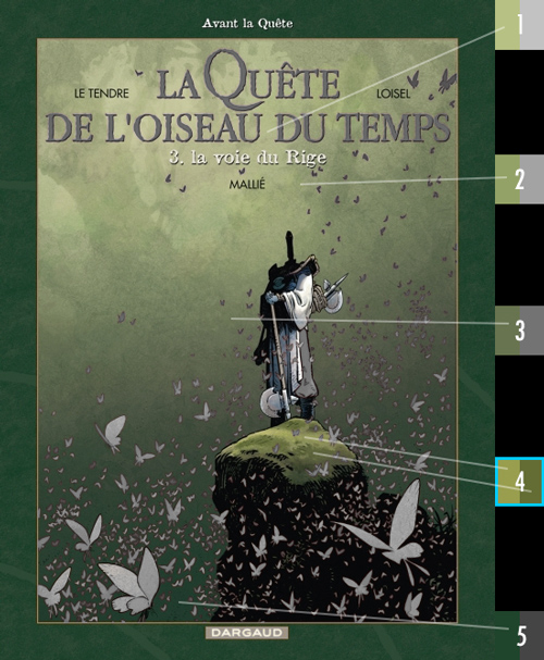
I often revisit this cover (above) by
Vincent Mallié with colors by
François Lapierre (at least he did the great color work inside the book) because it always reminds me how the basics of color theory can be applied in pure form to achieve a striking image. What I love about this picture is its simplicity and its strong sense of focus.
[Note: As always, this does not necessarily mean that the artist consciously thought of these concepts when he applied them.]
Contrast of values
So first of all, let us have a look at values (or brightness, if you prefer) regardless of color information. In Photoshop, there are three ways to strip an image of the other two parameters hue and saturation. Most often people use the "desaturate" algorithm which works for quick comparisons but actually gives a distorted impression because it does not take into account how we perceive brightness of different hues inreality. If you look at my extreme example on the right of this paragraph, you will notice what that means: yellow always looks brighter than red to the human eye, yet simply "
desaturated", yellow and red look exactly the same.
That is why I usually convert the image to "
grayscale mode" which creates an organically weighted version better suited to study values or print a grayscale version of a photo.
There is, however, a third way for purists: create a white layer underneath your image and choose "
luminosity" as blending mode of your color image. By this, you basically extract the luminosity channel. Often this does not differ too much from grayscale and besides, it always depends on the color profiles you are working in, so for most normal images "grayscale mode" is clear enough.
As you can see in the following GIF, even in a "normal" image there are considerable differences depending on the process I applied to achieve a black and white image. Look closely at the value of the Rige's red trousers that change from brighter to darker than the background:
 |
| The black and white representations of the same color image. |
But what I am actually interested in, is how these values relate to each other:
If we ignore the thin-headed character called "le Rige" for a moment, there are basically
two opposing gradients from dark gray to light gray. The one on the left (below) is the basis of a low contrast background that draws no attention to itself, the reverse gradient on the right (of the image below) defines the values of the butterflies. Of course, the butterflies only stand out in front of the background, if they are either lighter or darker. Instead of just keeping the background darker than the butterflies, these opposing gradients give variation...
 |
| opposing vertical gradients (left for background, right for butterflies). |

...and, what's more, they
overlap in the vertical middle of the image which results
in a very low contrast area with butterflies almost blending in with the background regarding their values. This actually emphasizes the focus on the character who stands more or less in the middle.
Since human perception is pulled towards the
strongest contrast (combined with the highest degree in detail), it makes perfect sense that the Rige as our intended
point of focus displays a greater range of values (from pitch black to almost white) compared to anything around him (dark gray to lighter gray). While the trousers are only separated from the background by thick black outlines, the top of the character is dark on light while the axe and the rock he stands on are light on dark. Thus,
by the distribution of values alone, our eyes are drawn to the important part of the image: the character. It further helps, of course, that he stands in the center and the butterflies gravitate towards him.
Contrast of saturation: green

The background is all painted
green with no contrast in hue, just soft differences in value to suggest a hazy forest. In the image below you can see that the yellowish to dark green hues of the background gradient (1, 2, 3, 5) are considerably less saturated than the mossy rock the Rige stands on. Here the contrast is not of hue but of saturation.
The stronger the saturation, the more a color stands out, the closer it feels to the observer. So even if there was no character on top and the bottom would not be as heavily black, the more saturated green would always feel closer to us than the background.
Contrast of hue: red
It then becomes clear that the gradient of the butterflies is not only contrasting against the background by opposing values but also by
complementary colors (more or less). Red/green is among the strongest contrasts of hue. Nevertheless, there is a
unifying element: like in the green background gradient the red gradient (1, 2, 4, 5) is
leaning towards yellow.
 |
| red and green combined: left half of the squares: color as it appears; right half : same color fully saturated. |
|
Since the butterflies are smaller and closer to the spectator, they are more saturated than the background colors. The larger they are, the lighter and less saturated they are painted so as not to upstage the character. The two largest butterflies certainly do attract our gaze yet lead it towards the character because we unconsciously follow the direction the are facing.

The only instance of
pure and strongly saturated red is right in the middle on the Rige's trousers (color patch #3, further above). Since the contrast of hue (red vs green) and saturation (saturated vs almost desaturated) is that strong, it is irrelevant that there is no contrast of value against the background. Thus, the most saturated instances of red and green are the trousers and rock that are part of the same "middle ground layer".

The Rige's outfit certainly contains no green that could blend in with the overall green background. But if you look closely, you will notice that it is actually not just black, white and red. There are also objects in the primary hues of yellow and blue (both dark and desaturated, but none the less),
colors that do not appear anywhere else in the picture and thus contribute to the visual attraction of the character by contrasting with everything else in the picture. The beauty of it is, that blue and yellow are so unobtrusively incorporated that they don't draw our conscious attention.
Summary
The following basic color concepts are visible in this cover image:
- values: opposing gradients
- values: narrow range (from dark to lighter gray) vs wide range (black to white)
- values: soft contrast = further away, hard contrast = closer to spectator
- saturation: low saturation = further away, high saturation = closer
- saturation: the smaller the object, the higher the saturation
- hues: complementary colors reinforce each other (red vs green in our case)
- hues: complementary/opposite colors look unified if they lean towards the same color (yellow in our case)
- hues: primary colors and additional hues are best kept to very limited and small areas
- overall: the area of strongest contrast draws our attention.
The artists
According to French websites, color artist François Lapierre was born in 1970 in Québec (CA) and studied Arts and Graphics and worked on the "Quête" series from 2007 to 2013.
"By a happy coincidence in 1996, François plunges into an animation career where he was responsible for background colors. Besides getting to know wonderful people, his function allowed him to get used to a computer which became a driving element in his creation of comic books (bande dessiné)." (bedetheque.com my own translation)
Other artwork by François Lapierre on "la contrebande".
Illustrator Vincent Mallié (born in 1973) is very strong on composition and a fine color artist himself as can be seen on his own website






 Posts
Posts


