 Ever since GERTIE THE DINOSAUR (Winsor McCay, 1914) tried to pick up a rock and drank so much water that the lakeshore gave in under her feet (as seen on the left) animators have tried to express weight with drawings. While the work of American giants like Vladimir Tytla or Milt Kahl has been analyzed over and over, the work of Japanese feature animators still seems to be ignored or dismissed as less impressive - at least in the West.
However, Studio Ghibli animators - and they are in no way the only ones - master disparate challenges such as weight, size relations and metamorphosis within a style of realistic movements so effortlessly that we tend to overlook their amazing skills and take them for granted.
Since flying, floating and thus overcoming gravitation is such an integral part of Miyazaki's films, indicating the weight of characters is of paramount importance to the success of those fantasy worlds. In yet another scene from LAPUTA - CASTLE IN THE SKY I am looking at the transition from weightlessness to gravity:
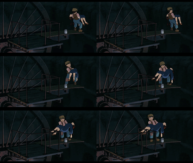
The balancing of weight starts with Pazu almost toppling over on the "spring board". While Sheeta is floating down on 1s, Pazu's violent action is animated on 2s and 3s. The following set of screenshots contains every drawing of Pazu's balancing action. The timing can be seen in the clip above.
Although such violent action on 2s and 3s appears jerky to today's CG-spoiled audiences, the shifting of Pazu's weight is clearly visible in every pose. It seems the film makers rather saved the extra inbetweens in favor of real character animation. After all, he could have simply come to a halt without the little balancing action.
The selected screenshots below are taken from my favorite part of the scene. They illustrate the subtlety of Studio Ghibli's character animation (it's essential to click on the images to see them more clearly).
Pazu is so stunned that it only occurs to him at the last minute that he should put down the kettle first. And when he does he briefly looks at it and then while putting it down he already looks at Sheeta again:
As you can see in the following GIF, Pazu is moving upwards (white lines indicate space between waistlines) about as slowly as Sheeta is floating down.
But when they finally touch there is a cut to a medium close up so that we are able to see that Sheeta is still floating and not leaning on Pazu's arms with her weight:
But as soon as the power of her crystal is vanishing (indicated by a dramatic change in lighting), her heaviness seems to increase...
...to the point of shifting her weight completely on Pazu's arms at which moment we get a cut on action back to a wider shot that reminds us (and Pazu) of the tenuous situation.
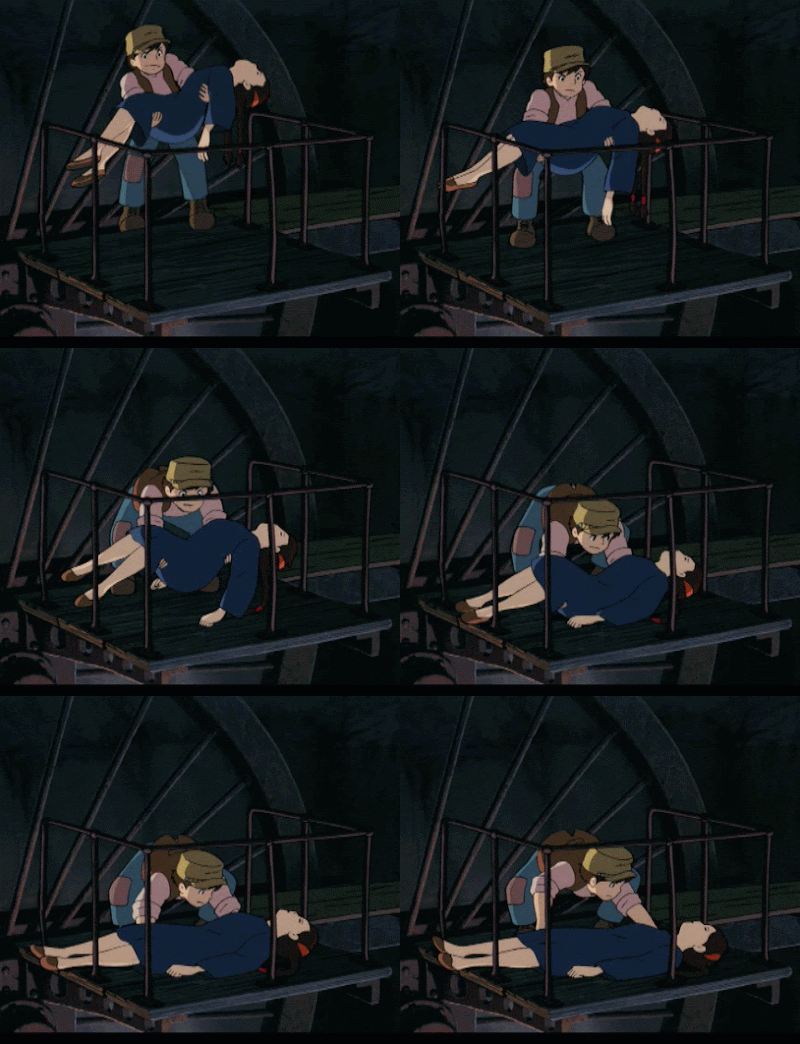
In the next GIF, I have omitted many inbetweens to uncover the hierarchy of movements of different body parts that indicate Pazu's struggle with Sheeta's full weight (is she even heavier because the crystal is dragging her down?).
Overlap while going down: (1) arms first, then head (2) in a rather fast move down, as the lagging cap indicates (3-4).
Lifting weight: Head goes first (6-7), lifting movement alternates between force in shoulders and head (8-11) with legs pushing slightly inward and down. Once the weight is carried by the muscles of Pazu's straight back (12), he is able to stretch his legs (13).
We feel Sheeta's unnatural heaviness because Pazu is not even able to lift his feet. He merely shuffles them along the planks:
The slight rebound (gray line) of these spring board like planks adds to the feeling of weight:
And although Sheeta appears to be as heavy and lifeless as a bag of cement, Pazu is putting her down very slowly and gently:
After such an exhaustive task, he doesn't even seem to have the strength to stand up again. So after looking at Sheeta, he remains in a ducked position to regain his breath.
Clearly, at first glance, all of this looks very realistic, "normal" even. And since there is very little in the vein of exaggerated squash and stretch, we are inclined to overlook the true mastery behind it. In fact, it works so well that we do not admire the animator's feat but simply look at a struggling character. With all those subtle action like putting down the bucket it feels so natural and well observed. Nevertheless, this scene showcases all the tools an animator can rely on to express weight and gravity without sacrificing realism.
As a contrasting illustration of a (deliberately) weightless landing, here is a scene from HOWL'S MOVING CASTLE which (accidentally?) depicts the flying wizard with a blue crystal around his neck:


5 comments:
Wonderful!!!
All of the things you mentioned about this film are exactly the reasons why I show my friends who scoff at anime's 'limited animation' Studio Ghibli movies. Castle in the Sky is one of my favorites too!
Really great post. Thanks for this!
Nice I also share with you something hope this helpful for you my friends Read the literature from each college on what they need to see for your digital portfolio in terms of number of images, file size (memory kb etc.) and image size (pixels) – all will be different so you might not be able to use the same images for all the colleges you’re applying to. Check that you’ve got enough work that sits in each category if they specify how many of each they want to see – for example in research, development, final images, time based work. Check to see how they want to see time based work in your digital portfolio (video, film, animation), do they want stills or can you upload a link to Youtube, Vimeo or similar? Check it out thanks.
Those little details that give personality and expression to Ghibli characters and make you feel it's natural.
Great post, thanks for sharing.
Post a Comment