
RAIDERS OF THE LOST ARK is one of those movies that never cease to inspire me and it proves that even action blockbusters can be made of only good - or rather cinematically interesting and consistent scenes. And remember, this comes from someone who counts Farhadi, Fassbinder and Fellini among his favorite directors.
Since I am giving a lecture on Spielberg's use of choreography, editing and music (the one element he claims he has no control over) to achieve the specific rhythm of RAIDERS next Thursday, I have once again accumulated much more material than could ever be incorporated into a 35 minute introduction.
Based on the notion that RAIDERS is consciously based on serials, adventure films and noir classics, there are already some supercuts about the twelve minute introductory scene on the internet (some of them rather far fetched but still entertaining). So as a starter I have compiled a random side-by-side comparisons of influencing scenes most of which have been mentioned by Spielberg, Lucas or Kasdan at some time or other.
The only reference I couldn't find any first hand account of is KISS ME DEADLY (Aldrich, 1955). But since it is so obvious and may have triggered the reading of the "ark" as a metaphor for "the bomb" (after all, Brody says that any army carrying the "ark" will be invincible), I have included it anyway.
RAIDERS sources comparison from Oswald Iten on Vimeo.
Saturday, November 5, 2016
Friday, October 21, 2016
Moving POV in TOY STORY
Now with English subtitles at last!
Moving Point-of-View in TOY STORY (english subtitles) from Oswald Iten on Vimeo.
This is a video essay I did in celebration of the 20th anniversary of TOY STORY last year for Swiss German language magazine filmbulletin.ch.
For this version, I have added English subtitles to make it more widely available.
Full text and information can be found here.
Monday, October 17, 2016
FROM HERE TO IMMORTALITY
One of the short films I worked on is officially available online! FROM HERE TO IMMORTALITY had quite a long and sometimes exhausting production history, but writer/director Luise Hüsler showed an extraordinary amount of perserverance and kept the project on track with her positive and collaborative spirit.
From the distance of a few years, I think a lot of her initial ideas actually came through in this mockumentary interview with two aging cartoon stars who never really reflected on their violent relationship. But see for yourself - and share it if you like it:
 I animated about 80 seconds of the hand-drawn final act: 6:10 - 6:18 and 6:40 - 7:55 and did some effects animation (smoke and fire) for the cut-out part. All the other hand-drawn animation is by the great Simon Eltz. We approached the hand-drawn part (from 5:55 on) the old fashioned way with bar sheets which we then turned over to Jorge Riesenfeld who - in addition to lending his voice to Jeremiah - did all the music.
Besides doing the layouts and painting all the backgrounds I worked on the final compositing in close collaboration with Luise to preserve the hand-held single-take look she originally envisioned for the interview. On the right, you can see some of the very fast whip pans from one background to the other.
Tuesday, September 13, 2016
Fantoche Impressions

So here, in no particular order, is a non-representative list of films that stuck in my mind because of their color work or simply because I liked them:
Shorts
 |
| A whole new way of creating stop motion water for AU REVOIR BALTHAZAR |
Anete Melece's ANALYSIS PARALYSIS ("Swiss High Risk" award) tells the story of a man whose head is about to explode from dealing with the many everyday decisions one has to make. At the same time he is not really able to connect with other people. What sounds like a depressing story is in fact a thoughtfully funny and refreshingly child-like colored cut-out film.
 |
| ANALYSIS PARALYSIS |
I also really liked Fela Bellotto and Etienne Kompis' HYPERTRAIN ("Swiss Youth Award") which I had a chance to see twice. Driven by an energetic soundtrack, the very short film relies on a whole array of original visual ideas revolving around the dimensionality of drawings.
 |
| CODA by Alan Holly, 2014 |
Within a "Cartoon d'Or" best-of screening I discovered the lavish colors of the beautifully lit 2D film CODA (Alan Holly, 2014) that reminded me of 1950s cartoons like MELODY (1953).
Just see for yourself:
 |
| OBEN by Frederic Siegel |
THE BOY AND THE BEAST
 |
| There is so much to behold that even such a detailed long shot can be glimpsed for only a few seconds. |
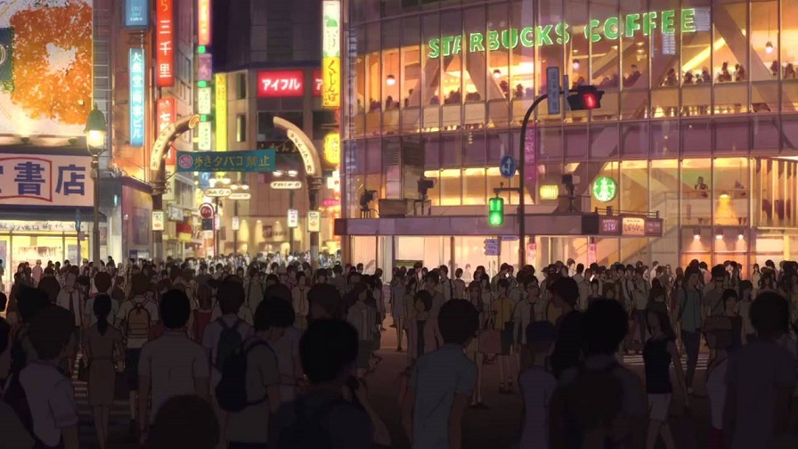 |
| Incredibly atmospheric: THE BOY AND THE BEAST |

There is a series of recurring shots of the "beast's" house including the surroundings. The camera angles are always the same but the background paintings which are based on one or more likely two slightly different layouts are completely new everytime the characters pass by as can be seen in these comparison pictures:
 |
| Six different backgrounds based on the same camera angle/layout. |


Saturday, August 27, 2016
Refined Minimalism in LA TORTUE ROUGE / THE RED TURTLE

Michael Dudok de Wit's mostly hand-drawn animated feature LA TORTUE ROUGE/THE RED TURTLE is not only Studio Ghibli's first international co-production (they even coaxed the Dutch master animator into creating it) but also a poetic masterpiece and one of my (if not the) greatest cinematic experiences this year. It should absolutely be seen in a cinema, if only to immerse yourself in the engulfing sound design.
In the following video essay I focus on Dudok de Wit's specific style of visual minimalism that already worked so well in LE MOINE ET LE POISSON (THE MONK AND THE FISH, 1994) and FATHER AND DAUGHTER (2000) which are among my favorite animated short films. Since THE RED TURTLE has only just begun its theatrical run and is not available on DVD, I completely rely on images and clips from the official promotional material in order to illustrate concepts that I have found during the two times I was able to see the whole film. There are no allusions to the story and therefore no spoilers. By the way, this is my first video essay with a commentary spoken in English which - as you will notice - is not my native language.
Refined Minimalism: an analysis of visual composition in THE RED TURTLE from Oswald Iten on Vimeo.
Coinciding with the films Swiss premiere at FANTOCHE a German version can be found here on filmbulletin.ch
There is so much more to savor and write about in THE RED TURTLE that I will probably return to it in a future post for a review or a discussion of artistic producer Takahata Isao's influence. I certainly would want to ask Michael Dudok de Wit whether THE NAKED ISLAND (Shindo, 1960) was an inspiration at all.
The incredibly subtle, highly consistent character animation that - unexpectedly for a silent film - relies on very small, realistic movements instead of grand gestures deserves a detailed analysis itself. But this must wait until I have the film available in digital form once the Blu ray/DVD is out.
And last but not least, if you have not seen LE MOINE ET LE POISSON or FATHER AND DAUGHTER yet, see them before you see THE RED TURTLE! Also check out THE AROMA OF TEA, TOM SWEEP and Dudok de Wit's commercials. They are all on youtube.
Subscribe to:
Posts (Atom)


