Saturday, June 26, 2010

Annecy 2010 (2/2): short films and Andreas Hykade

Short film selection
The heart of the Annecy animation festival has always been the short film competition. This year I only saw three out of five programs. I was surprised that these 90 minute reels only contained seven to nine shorts whereas usually there were up to 15 within the same amount of time. The relative length of these shorts affected my ability to concentrate heavily. I really wished for the occasional two or three minute film that would ease the suffering of having to fight sleep during many an overlong film that began so promising. I do prefer slow-building movies over fast and flashy ones, but there has to be substance to justify the length.

Rumour has it that about 800 films had been submitted for the short film competition alone (not counting graduate films). As a result, one would expect a pretty strong competition. But it’s important to keep in mind that the preselection of films that make it into the competition (only 39 this year) is based on personal decisions by a specially designated selection committee. This year’s competition represented the selection by Isabelle Favez (Swiss director), Jennifer Oxley (American director) and Alexis Hunot (French journalist). I’m not saying that they chose the wrong films but that any other selection committee might have presented us with a totally different competition.

On a more positive note, this selection still provided a wide variety of different techniques and storytelling approaches which is why animation festivals are so inspirational. Aspects of vastly different films leave a lasting impression even if I don’t like a movie as a whole.


Strong primary colors
The vibrant color and background design of Old Fangs is one such example. One of the most important aspects for me is a film’s ability to evoke a certain mood. In recent years, excess filters and textures tended to obscure great design and flattening initially dimensional animation. I didn’t see enough films this year to say something about current trends but at least film makers are now handling textures more economically.

While the story about a cat, a fox and a wolf didn’t intrigue me much I adored the glowing evening and night colors that communicate a certain gravity that is inherent to the story. Although this kind of nostalgic color treatment has become an annoying staple in American feature animation, it looks fresh in this Cartoon Saloon produced short mainly because it was combined with non realistic water color backdrops and ornamental tree designs.

The integration of backgrounds and characters seemed more organic than in Tomm Moore’s bold Brendan feature.


My favorite film of the festival however was a short I have already seen online a few weeks before: Love and Theft by Andreas Hykade. (Watch a full-lenght version here.) With its original treatment of animation/comic history it also served as a suitable 50th anniversary celebration clip.

In my opinion it Hykade's best film to date. All his films are available online under www.hykade.de . Not all of his films are my cup of tea but their artistic brilliance can’t be denied (some of them are not safe for work, by the way). In German speaking countries, Hykade may be most well-known for his video clip for 10 kleine Jägermeister by Die Toten Hosen.

Although Love and Theft is an almost seven minute experimental film, its initial rhythmic drive never breaks down. You couldn’t tell if the music or the image came first, they feel so unified.

The progression of morphing “characters” is tightly structured. The individual steps vary in complexity of “character” design, morphing technique and color. Background colors alone divide the film in white, yellow, orange (which he calls red), blue and black segments. He seems to have a preference for the primary colors red, yellow and blue which can also be seen in his other color films.


We lived in grass (1995)

 10 kleine Jägermeister (1996)


The Runt (2005)

Love and Theft (2010)

He never used the hues as pure and saturated before, though. Love and Theft proves that flat primary colors don’t have to look cheap when handled by a master. Despite all the red there is no need for complimentary green or earthtones to balance it.
 

Sunday, June 20, 2010

Annecy 2010 (1/2): features and old fashioned 3D effects


This year’s Annecy experience was a little different for me. Not because with its 34th edition the festival celebrated its 50th anniversary, but because I came relatively late to the party (not too many tickets left) and was only able to stay for two days due to current work assignments. This is also the reason why my promised Dumbo posts have been postponed. They are just delayed, not forgotten though, so please keep coming back here.


Traditionally I like to see as many animated features in competition as possible because most of them are not getting an international cinema release afterwards. This year I’ve only managed to see The Fantastic Mr. Fox (which still isn’t available in Switzerland), so I cannot tell if its award for best feature in competition was justified. I liked it although it somehow fell short of my expectations.

I finally saw Don Hahn’s Waking Sleeping Beauty (missing the first 15 minutes due to a misunderstanding). Hahn did a fine job even if he didn’t have time to explore some of the more interesting issues. There’s nothing much for me to say about it except that I agree with most of what Michael Barrier and Michael Sporn have written about it. I was probably most surprised that animators were not labelled yet every executive was. Or as Michael Sporn writes:
“Yet the story being told - without an iota of fat - is the story of the above-the-line players and how they felt about each other. […] Only a couple of times do we really get to imagine how the artists felt about what was going on. There’s a meeting called by Katzenberg to talk about how the people felt about the period. They explained that they weren’t able to spend appropriate time with their families because of all the excess overtime that was demanded of them. Katzenberg tears up and promises that things will get better. They don’t; things get worse.“
3D backlash sold as state of the art
Then I attended the avant-première of a Belgian children’s film called Les aventures extraordinaires de Samy. The director’s claims that this film was exclusively made to be seen in 3D were more than justified. Just when you think that 3D has finally grown out of throwing things at the audience, a veritable “fourth-wall breaker” comes along that works much better as an overdimensioned rollercoaster than the uneventful story about the coming-of-age of a cutesy ocean turtle would suggest. And yes, there are these moments where a small fish is swimming towards you out of the screen (Jaws 3-D, 1983, came to mind) or a harpoon is causing you to wince in your seat.
But the 3D really works in communicating size relations: for a long stretch the turtles are out on the ocean with little else to compare their sizes to. In these scenes the three-dimensional images not only emphasize the camera position close to the water surface but also show how small these turtles are.

It was no coincidence that Samy resembles an overlong IMAX-presentation because its production company nWave Pictures and director Ben Stassen have been doing exactly that kind of IMAX show films for years (Wild Safari 3D, Fly me to the moon). While the turtles swim all over the world and still always meet the same few characters, environmental issues are present in several scenes but never really affect the protagonists or the audience, for that matter. Spilling oil and the destruction of the Amazon forest just serve as colorful backdrops. Overall, the narrative contains no real obstacles, it all just floats along without real conflict. Seeing that without the benefits of 3D-effects would be about as interesting as seeing Magic Journeys (1975) or Captain EO (1986) in 2D. Besides, it was obvious that the presented French language track was dubbed and not the original version.

French Dubbing was also the reason why I didn’t catch the first two Toy Story movies although I would have been able to get tickets. Even though I enjoyed Samy for what it was, the fact that this year’s main 3D attractions were upgraded regular movies and an old-fashioned effects-rollercoaster made me about as enthusiastic about the future of 3D like the prospects that Brad Bird is leaving animation for MI:IV and Pixar’s next few movies are sequels. I'm still looking forward to Toy Story 3 however, if only for its Michael Arndt screenplay.

To get an impression of what makes Annecy so special, read this official blog entry.

Wednesday, May 26, 2010

Brown Bears

Originally planned as a possible follow-up to Dumbo, Bongo is one half of the 1947 package film Fun and Fancy Free. Bongo’s circus scenes are of interest in connection with Dumbo but are not the subject of this post. Here, I investigate artistic choices in superficially realistic background colors.

Studying background paintings I often wonder why certain colors were chosen and not others. The obvious answer would be: because they make the picture look good. But why does it look good, what thoughts could have led the artist to favor certain colors? The artist might have followed his intuition, but it's still possible to deduce underlying concepts. There are color schemes of all kinds, some of them expressionistic, some impressionistic. But even realistic looking backgrounds are not composed by simply copying nature. The thinking behind these color choices is just not as obvious.


When I revisited Bongo I noticed how much more expensive the artwork in this film looked compared to Dumbo. Although it is still essentially an overlong cartoon, the backgrounds are painted in a more realistic style. The funny thing is that Bongo dreams in a slightly more stylized way. Once he is free, the forest backgrounds are drawn more realistically. There are cast shadows throughout, though.
dream vs. reality

Brown bears and grey trees
Bongo himself is plain brown with red clothes (balanced by primary yellow and blue).

The subdued background colors are based on yellow, green, blue and grey, leaving room for both brown and red. There are hints of warm red (and therefore brown) in many colors (as always we don’t really know what the original prints looked like), but the absence of full warm brown becomes evident especially in the tree trunks. In front of these grey trees the saturated brown bears and squirrels are easily distinguished. Basically the characters are more saturated than the backgrounds. Note that Disney's 1940s and 1950s backgrounds almost always have a strong pool of light and some very dark receding areas with little detail that provide the picture with a sense of depth.
original frame as it appears on the DVD
oversaturated frame in order to distinguish the hues more clearly

warm colors (Bongo) against colder colors (tree)

Grey trees also provide a desaturated backdrop for the more saturated characters and blend in with the rest of the neighboring background colors.
Note that the tree trunk in the foreground is brown in contrast to the grey unimportant background parts. The contrast to Bongo is merely a case of value and saturation. It’s not important how well we see his feet here, the interesting part is his sad overall expression with the focus on the face.

The more blue the grey contains the colder and more distant does it feel.
In shots without visible blue sky this aerial perspective separates the planes beautifully. The blue background also provides better contrast of hue to the surrounding brown bears.

In the end when the bully Lumpjaw (according to Borge Ring via Michael Barrier a caricature of Dave Hand) is conquered, the forest is depicted in warm evening light that is far more saturated.
In the end, blue mountains and the sky provide the image with cold-warm hue contrast. Color-wise Bongo and Lulubelle are united with the warm trees. This is the first time Bongo succeeds in climbing a tree - with the help of his little forest friends, of course. On the right, the darker Bongo is on the brighter side of the tree making for nice contrast of value.

Since pink is the color associated with Bongo's love dreams there is one instant where pink is part of a background:
When Bongo sees Lulubelle for the first time, he is not sure if he's dreaming. It also makes sense that a girl wearing a pink flower is first seen framed by such flowers. The yellow and white flowers are everywhere but they don't stand out the same way because of their closeness to the general background hues.


Variations on a theme
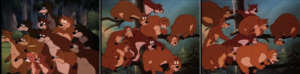
There are many mass scenes with assorted bears. Their design varies to a certain degree but is never consistent from shot to shot. Essential in giving the impression of a large variety of bears is their different coloring. To unite them they are all different shades of brown ranging from Lumpjaw’s cliché darkness to Lulubelle’s salmon color.
It goes unnoticed that the colors change in every shot because they are always in the same range. Although the middle and right image are shots from the same scene the bears differ greatly.
Sometimes the darker bears are those in the shadow that shouldn’t attract our attention (see further above where they circle Bongo and Lulubelle), sometimes the darkness is a means of separating dance groups. 
When Lumpjaw is not in the shot they are often intermingled for balanced variety. They are male or female according to what’s called upon. Males seem to be darker.


If you are interested in the thinking that went into "naturalistic" backgrounds of Bambi and Lady and the Tramp I suggest you visit Hans Bacher's Animation Treasure Blog

All screenshots taken from the 2003 DVD edition

Friday, May 21, 2010

Dumbo: Voice Over Narration

By now, Hans Perk has posted all available Dumbo drafts and Mark Mayerson is already busy doing the mosaics. Michael Sporn has started reposting earlier Dumbo storyboard and frame comparisons. Work is currently absorbing me more than I expected limiting my time devoted to joining this Dumbo celebration.

In Dumbo, the first few lines spoken by an off-screen announcer trigger many associations yet seem to be there simply to play a trick on our expectations.
Like later Disney movies that begin with a few lines of voice over narration, Dumbo never resumes this framing narrator during the rest of the film. The delivery of the opening lines works as a gag rather than as a narrative device.

Through the snow
And sleet and hail
Through the blizzard
Through the gale
Through the wind
And through the rain
Over mountain, over plain
Through the blinding lightning flash
And the mighty thunder crash
Ever faithful, ever true
Nothing stops him
He’ll get through!


The words themselves don’t contain any information essential to the story (note that the word “flying” isn’t mentioned at all). But their delivery in the manner of a commercial or trailer sets the tone. Or in other words: it sounds like someone announcing a circus act.
And based on what audiences of the time have learned from posters and trailers in advance, they probably expected: A FLYING ELEPHANT and not a flock of storks.

Frame of reference
The circus announcer voice also triggers other associations: the arrival of a superhero, for example. While it’s true that the first Fleischer Superman cartoon premiered only about a month before Dumbo on December 26, 1941 and the 2nd draft of this Dumbo sequence as posted by Hans Perk dates from May 26, 1941 I still believe the connection to Superman’s famous opening lines is no accident.

In fact, the highly influential radio series of the same name premiered on February 4, 1940 with Bud Collyer as Bruce Wayne. The classic announcement was normally delivered by Jackson Beck, as can be heard in this first episode of the original radio series: The Baby from Krypton

Faster than a speeding bullet!
More powerful than a locomotive!
Able to leap tall buildings at a single bound!
[different in this first episode]
Look! Up in the sky!
It's a bird!
It's a plane!
It's Superman!


There are also the wind sounds in both versions. But in Dumbo right after the last word we hear an airplane motor that evokes the arrival of a daredevil pilot like Geoff Carter (Cary Grant) in Only Angels Have Wings (Howard Hawks, 1939) or Jim Lane (Clark Gable) in Test Pilot (Victor Fleming, 1938). The weather conditions here do have a lot in common with those in Only Angels Have Wings where a series of post delivery flights from Barranca over the Andes is perturbed by equally bad weather.

Aircraft themed adventure films were en vogue back then. The famous line “Calling Barranca” even made it into a Tex Avery Warner Bros. cartoon from 24.08.1940 (Ceiling Hero) that parodies the then current airplane craziness. It is available on youtube here.

Although such pop culture references were quite common in short cartoons, Walt Disney was always careful not to let them slip into his features so they wouldn’t feel dated when re-released. Dumbo - being more of an extended cartoon than a “normal” feature film - contains unusually many of them (the quintuplets, the war in Europe, the strike even). It is also Disney's first full-length feature set in the present and in the US.

Plant and Payoff

Images from the 1941 Dumbo trailer
 
But back to the airplane sound: In the 1941 trailer we see Mr. Stork in front of a background that doesn’t hint at the bad weather. Later, when Dumbo is falling from the tall red building the sound of a descending airplane is drowning out Timothy’s dialogue about the magic feather (announced as “the most sensational climax ever filmed”). What’s more, we never actually see Dumbo fly with his ears.
In the finished film the payoff to the plant (or set-up) of the airplane sound comes indeed during the climactic scene when Dumbo falls off the red building. Dumbo has been flying before with the help of the magic feather. But only after he has lost the feather and gained confidence in his own abilities (or superpowers as Harvey Deneroff puts it). So it is only consistent that he doesn’t sound like a soaring aircraft until he spreads his ears and starts to fly all by himself.

For a different perspective on Dumbo as a superhero read
Harvey Deneroff’s controversial 2009 article.

Thursday, May 13, 2010

The Milky Waif – cheating continuity – part 4: screen directions

Let’s start on a detour: The Axial Cut
An axial cut is defined as a connection of two camera setups with identical camera-object-axis. The difference between shots is then, how close the camera is to the object. This device has been used heavily in the early silent years but has been relegated to special occasions in later years (just think of Alfred Hitchcock’s The Birds or Stanley Kubrick’s 2001).

The Birds: Jessica Tandy finds farmer Dan Fawcett killed by birds. This is not a truck or zoom in but a series of three shots without any sound at all.

In animation the axial cut is useful because there is no perspective change, so it isn’t necessary to draw a new background. Classic cartoons have very clear and simple screen directions, so axial cuts hardly noticed at first view.

There is a special kind of axial cut that is motivated by the nature of the hand drawn animation medium. I usually call it:

The Cheat Cut

Here we have a standard zoom on Jerry (left and middle image) which ends with a “cheat cut” (an axial match cut that is intended to go unnoticed) to a closer BG and cel setup of the same room that is more practical (right image). In the first setup the details have to be drawn and animated smaller which causes large fuzzy, wiggly lines when optically enlarged. As everything can be drawn in larger proportions the lines are clearer and steadier in the second setup.

This seems to be standard practice for golden age shorts and can be observed in cartoons of any studio of the time. The transition would be smoother with a cross-dissolve but this usually implies a leap in time.

Cheating On Screen Directions
The light source is on the left. The perspective on the room and on Jerry is three-quarters. Jerry’s face is already to the right.
Waking up because somebody was knocking he looks to the right. We then see the green door on the right.
It is revealed as the outside door. Gazing straight into the camera is fairly common for both Tom and Jerry without ever distracting from the story.
Remember the light source inside is on the left, so light from the artificially lit kitchen seems to illuminate Jerry’s apartment. From the outside the door is brown working better with the basic cold-warm setting. In contrast to the cold outside world, Jerry’s apartment is seen as warm from the outside…
…which must be quite attractive for Nibbles in the nutshell. So here it comes: Jerry looks back in but what he sees is a different part of the room. In this supposedly warm part of the apartment the carpet has a large yellow part which is not existant in any of the round carpets in dark/nighttime backgrounds.

Jerry then runs around Nibbles so that he is again on the left side. But when they go to the right, the green outside door has been substituted with a mousehole to the kitchen as we see in one of the very few point of view shots.

Flat Panels
In spite of backgrounds that almost always imply diagonal camera angles, the action is basically staged on a flat right to left axis on a right angle to the camera. A concept that has already become evident in the long pans (previous posts) is also applied to most of the other shots.

In other words: the characters’ perspective is not congruent with the perspective of the background but it works because we are only paying attention to the characters’ eyes.

There are some obvious advantages there: the characters don’t have to be drawn from different angles, they don’t have to increase or shrink in size within shots and more important from a storytelling point of view, it’s easier to show the line of action on these silhouettes than on almost full frontal characters in over-shoulder-shots.

As can be seen from numerous Tom and Jerry poses these silhouettes work best when the body is depicted in 3/4 with the head in profile. Very often the ears are slightly cheated into ¾ as well so as to prevent the head from appearing overly flat. It’s not always as extreme like in these examples. Many times the head itself is not completely shown in profile. Eye (pupil) positions are always very clear so that there is no question if a character is looking to the left, the right, up or down or straight at us.

Preston Blair educational poses from the first edition of “Advanced Animation” 1945.

This basic spatial disposition (Jerry’s safe harbor on the left, Tom’s realm on the right) is maintained throughout the whole film. So although rooms and backgrounds (and the position of the bowl of milk) change according to the film makers’ convenience the once established 180° rule is never violated, at least superficially.
So whenever Jerry is running to the left he is running away from Tom. This is even maintained when Nibbles has hit Tom with a hammer and they are running away from the mousehole. Tom himself is mostly kept to Jerry’s right.

This is different with Nibbles whose interest in milk is stronger than that in survival.

Short Cuts
Although the distance from the mousehole to the bowl of milk has been thoroughly established, Jerry obviously takes a short cut when he is trying to rescue Nibbles. There is no time (and therefore no space) inbetween these two shots whereas we have seen a long pan just prior to that connecting the to places.

 This is also the case when Nibbles is blown back to the mousehole.

On Jerry’s way back from Tom, however, the path seems to be dangerously long. This not only heightens the tension, but also exaggerates the concept of right to left as an easy progression and left to right as harder.

Breaking The Flatness
Special camera angles and difficult perspectives on characters are reserved for the climactic fight. Forced into the corner, Nibbles suddenly becomes aware of his vulnerability.
 Jerry again comes from the left to the rescue. Most often Nibbles is inbetween Tom and Jerry…
…although Jerry tries really hard to stand between Tom and Nibbles at all times.

In the end, Jerry is triumphing over Tom by being located both higher and on his right. In fact, Tom sits now between Jerry and Nibbles.