Friday, January 12, 2024

My Year in Film 2023

The ten new releases that either impressed me the most or stayed with me the longest in no particular order:

  • TÁR (Field)
  • R.M.N. (Mungiu)
  • PAST LIVES (Song)
  • AFTERSUN  (Wells)
  • LA CHIMERA (Rohrwacher)
  • ANATOMIE D'UNE CHUTE (Triet)
  • THE ZONE OF INTEREST (Glazer)
  • 20.000 ESPECIES DE ABEJAS (Urresola Solaguren)
  • LE OTTO MONTAGNE (van Groeningen/Vandermeersch)
  • SPIDER-MAN: ACROSS THE SPIDER-VERSE (Dos Santos/Powers/Thompson)

Noteworthy Runners-Up: THE QUIET GIRL (Bairead), RETOUR À SEOUL (Chou), ALL THE BEAUTY AND THE BLOODSHED (Poitras), THE BANSHEES OF INISHERIN (McDonagh), HOW TO HAVE SEX (Manning Walker), SHEN HAI (Tian), SAINT OMER (Diop), MONSTER (Kore-eda)

I do not usually break down my film list into numbers, but Olivier Samter’s statistics inspired me to superficially dabble in that. So I find that exactly half of the films mentioned above have been directed by women (one of them co-directed with a man). Judging from the sheer amount of films I liked within the past twelve months, 2023 was a very good year. Looking at it as a cinephile in the literal sense that I prefer to see movies in a theater, it was less so. I had even prematurely claimed that it might have been my lowest cinema attendance in over a decade. But in reality, I had not thought of 2020 when canceled film festivals and closed cinemas resulted in only 49 theatrical experiences (an average of less than once a week). In comparison, I have watched about a third of the feature films I have seen in 2023 and a total of 76 screenings (including short film reels in festivals) in cinemas. Of all the streaming services, I have watched the most films on Mubi, followed by Apple (no subscription, pay per view), Disney+, Netflix, and the Swiss public-law platform playsuisse. 31% of all the feature films I watched were directed (or co-directed) by women (37.5% of the films seen in a cinema), whereas animation made up 23% (18.75% of the films seen in cinemas).

In a year when the painterly CG look definitely went mainstream, the most famous company celebrated its 100th anniversary desperately wishing for inspiration. But since that didn't happen, here is a mashup of the six animated features that I enjoyed* the most in 2023, drawn in the style of Milt Kahl (ca. 1973)
Animated Features

The share of animated features was probably higher than ever because I was part of the feature film selection at the Fantoche International Animation Festival (here is a list of all the features/mini-series/medium-length-specials I have watched last year). My favorites among the new releases – those that I either enjoyed the most or that stayed on my mind the longest, in no particular order – are the following:
LINDA VEUT DU POULET (Laudenbach/Malta)
TMNT: MUTANT MAYHEM (Rowe/Spears)
SUZUME (Shinkai)
SPIDER-MAN: ACROSS THE SPIDER-VERSE (Dos Santos/Powers/Thompson)
DEEP SEA / SHEN HAI (Tian)
THE BOY AND THE HERON / KIMITACHI WA DÔ IKIRU KA (Miyazaki)
Miyazaki’s (latest) swan song also prompted me to read “How do you live?” by Genzaburo Yoshino, a touching pre-WWII novel I wish I’d had when I was a teenager.

Special Mentions go to Pablo Berger’s ROBOT DREAMS (a gentle ode to friendship without dialogue), Jaebeom Park’s MOTHERLAND (the first Korean stop-motion feature in decades, unhurried, small-scale, tactile), KNIT’S ISLAND (a documentary by Barbier/Causse/L’Helgouac’h shot inside a virtual online community), and Marjolaine Perreten’s PEBBLE HILL (a charming tv special that never talks down to its target audience of young children).

Coinciding Restorations

I have also had the pleasure to seeing two brand-new restorations of Cinderella adaptations made in 1950, both of which adhere more or less closely to Perrault’s source material (not the Grimms’ version that is more popular in German speaking countries), embellishing the narrative in their unique ways. While the Disney restoration (4K, no less) pleasantly corrected some blunders of the previous digital releases by going back to the wonderful original colors and grain structure, the uncanny image stability and the lack of an original mono mix still make it look and sound a bit frankensteiny. It’s definitely the best thing next to an IB Tech print, though.

With the Catalan version ÉRASE UNA VEZ… (Escobar/Pellicer) the pleasure was more in seeing this rarity at all, especially after an insightful introduction by one of the researchers involved in a restoration process that took eight years because all they had to work with was a beat-up black and white 16mm print. Thanks to some surviving fragments, artworks, and photograms, they attempted to digitally reconstruct the cinefotocolor version that was shown at the Venice Film Festival.

Japanese Film History
During summer, I immersed myself in the works of Satoshi Kon all over again, re-evaluating his four features and the tv series PARANOIA AGENT for two lectures one of which was part of an extensive retrospective that also included film that inspired Kon and some that were most likely inspired by his films. A special focus on the mostly fictitious film history of MILLENNIUM ACTRESS gave me a reason to finally watch genuinely Japanese classics like TWENTY-FOUR EYES (Kinoshita, 1954) with Hideko Takamine and revisit some of my favorite Ozu films, among them LATE SPRING (1949) and LATE AUTUMN (1960) in which Setsuko Hara graduates from the unmarried daughter to the mother of an unmarried daughter within only eleven years. The relationship between parents and their grown-up children had been on my mind in real life a lot in 2023, so it was only natural that this theme also stood out to me in films as diverse as KING CREOLE (Curtiz, 1958) or TALK TO ME (Philippous, 2022).

Coincidental Selectrospectives
Apart from a deliberate retrospective of Wong Kar-Wai’s partly re-cut Criterion releases, I also happened to watch quite a big chunk of Sofia Coppola’s work in 2023, seeing SOMEWHERE (2010) and PRISCILLA (2023) for the first time. The latter turned out to be a total delight, confirming Coppola as the chronicler of isolation and loneliness in a golden cage: muted, told in a mostly non-verbal style with close attention to surface details, a star-turning lead performance, and the best Elvis impersonator I have seen in a long time (maybe ever?).

After being floored by ANATOMIE D’UNE CHUTE, I finally watched some of Justine Triet’s back catalog and was surprised how interconnected these partly messy, campy, or hilarious films feel regarding recurring themes and relationships. Lawyers or analysts who are personally involved with the people they represent or meet in court, flashbacks with asynchronous dialogue, piano pieces that are abrasively cut on the soundtrack, and in the midst of it all complex, imperfect, sometimes gloriously annoying female protagonists. The parts often seem to be tailor-made for actresses like Laetitia Dosch, Sandra Hüller, Laure Calamy, Virginie Efira, or Adèle Exarchopoulos whose intriguing presence I enjoyed in PASSAGES (Sachs, 2023), LES CINQ DIABLES (Mysius, 2022), RIEN À FOUTRE (Lecoustre/Marre, 2021), and SIBYL (Triet, 2019) last year.

Of all the older films I have seen for the first time in 2023, this dozen left a lasting impression for various reasons.

As far as retrospectives go, I also tried to catch up with some of the more well-known adaptations of Dickens’ “A Christmas Carol” I had never seen:
A CHRISTMAS CAROL (Marin, 1938): The ghosts of Sliding, Feasting, and Setting Things Done Swiftly.
SCROOGE (Neame, 1970): The Campy Ghosts of Shepperton, West End, and Modern Santa.
THE MUPPETS CHRISTMAS CAROL (Henson, 1992): The Ghosts of Jim Henson, the Creepy Kid, and the American Way.
As someone who cannot see any charm in the lifeless eyes of Muppets, the humbug levels in that last one outweighed the blessings by far. I still liked it better than Damien Chazelle’s BABYLON, a film that peaked pretty early: it was hard not to see that elephant crapping incessantly on the protagonist (and the camera) as a metaphor for what this three-hour concoction was doing to its audience (ok, me!).

Onscreen Singing
But cast members singing (in the rain or otherwise) also remained relatively popular beyond big budget love/hate letters to Hollywood or Mattel. From PEARL’s mom to the girls in EL AGUA to Tomas and Agathe in PASSAGES, the vulnerability and purity of singing a cappella created intimate connections, not unlike singing along at the top of one’s lungs in the safe environment of a car as in TALK TO ME and L’IMMENSITÀ or engaging in hilariously off-key karaoke in AFTERSUN and HOW TO HAVE SEX. In accordance with an overall “embodiment turn”, the trend of recent years to include voices (material and synthetic) into film scores (e.g. MANCHESTER BY THE SEA, THE FAREWELL) seems to here to stay with examples ranging from LA NUIT DU 12 and BEAU to GIRL GANG and ALL THE BEAUTY AND THE BLOODSHED.

Engaging with films hands-on
Speaking of embodied sounds, my video essay “Sensuous and Affective” was not only published by the Zeitschrift für Medienwissenschaft but also turned up in the Sight & Sound Video Essay Poll 2023, many thanks to Barbara Zecchi, Thomas Genevicius, Miklós Kiss, and Kevin B. Lee! 

Sensuous and Affective from Oswald Iten on Vimeo.

In connection with my work as a researcher I got to teach a seminar on video essays in which we engaged with Alice Rohrwacher’s LAZZARO FELICE (2018) in many different ways. It proved once again that establishing a personal relationship with a film, book or piece of music opens up one’s initial perspective on it in ways that often reveal new insight into the themes, structures or stylistics of films, books or media in general. Besides, my emotional engagement deepens with every viewing, at least before I get too used to it, like when I revisit a favorite work. 

Putting together a teaser for the 100 year anniversary of our local cinema, I had the opportunity to re-evaluate quite a few such films. The major discovery came with the restored theatrical international cut of Leone’s THE GOOD, THE BAD AND THE UGLY. I had never been completely convinced by the extended cut that had been the only way to see the film for a few years (after 35mm fell out of fashion). So when Kino Lorber finally released a 4K version of the original international cut, I found that, beyond the "re-inserted scenes" and the new sound mix, the extended cut added redundant shots of a few seconds here and there to classic scenes that worked far better in the theatrical cut.

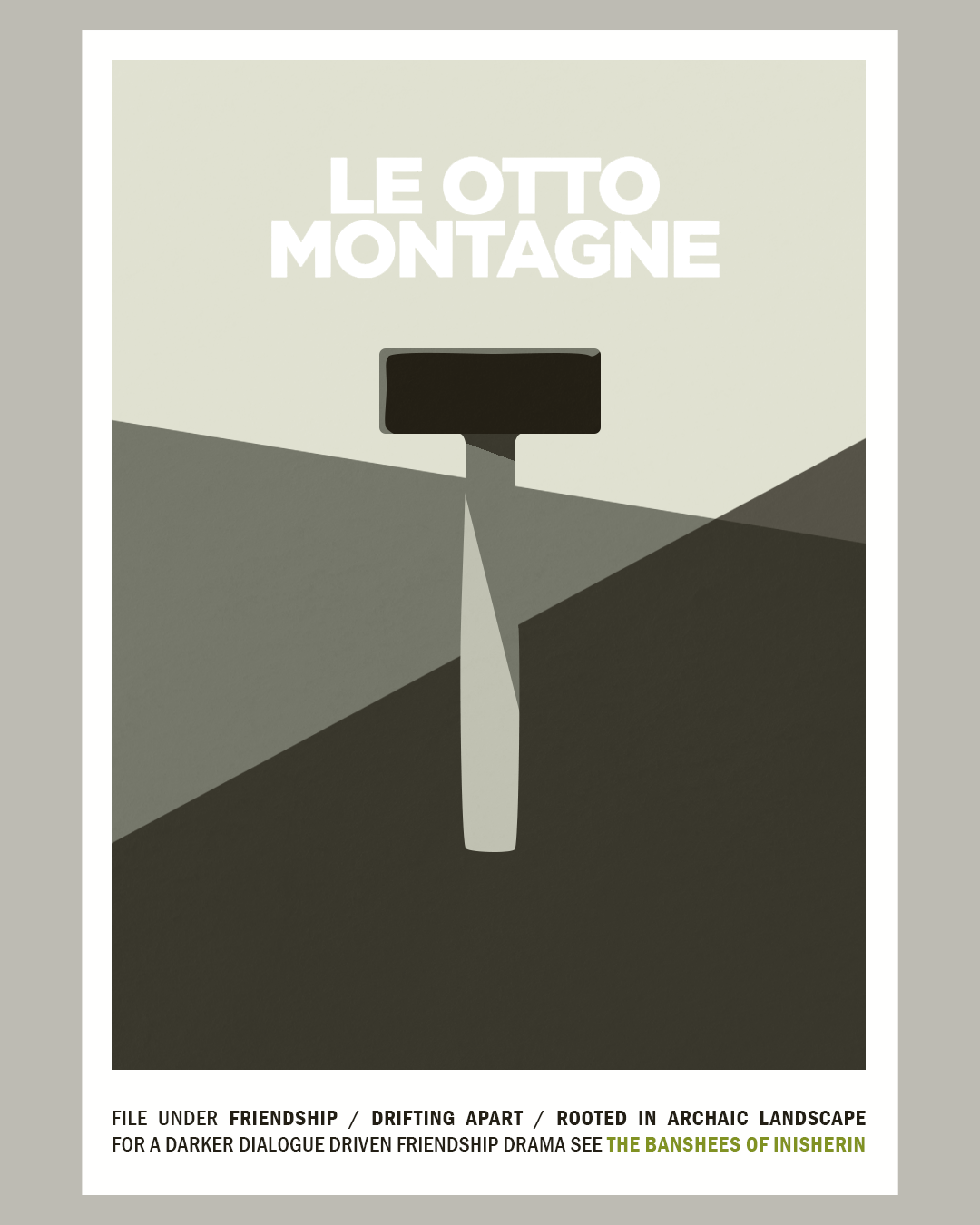
In a similar way, making the fan art posters illustrating this post turned out to be a satisfying mode of engaging with the films that lingered in the back of my memory, especially as most of them have already been written about too often.

Looking forward
In terms of movies, 2024 looks promising. I have already been twice to the Marcello Mastroianni retrospective at the filmpodium where in February, I will introduce THE LONG DAY CLOSES (1992) in honor of the recently deceased Terence Davies, one of my favorite directors. Besides, there are still a lot of films that I have not seen yet either because I missed them in theaters or because they are still waiting for a release around here, among them KILLERS OF THE FLOWER MOON, POOR THINGS, EARTH MAMA, MAY DECEMBER, WAR PONY, GODLAND, ALL OF US STRANGERS, THE ETERNAL DAUGHTER, ORLANDO MY POLITICAL BIOGRAPHY, LOVE LIFE, AMANDA.




Wednesday, September 1, 2021

TV Dictionary - Heidi, Girl Of The Alps from Oswald Iten on Vimeo.

"Arupusu no shôjo Haiji" in one word. For the TV Dictionary Collection by Ariel Avissar: TV Dictionary
Definitions adapted from Merriam-Webster and Collins Dictionary.

For study purposes only.

All excerpts taken from Isao Takahata's 1974 TV series ARUPUSU NO SHÔJO HAIJI (HEIDI, GIRL OF THE ALPS). Subtitles adapted from SilverZeroSubs

Thursday, August 19, 2021

Two New Audiovisual Essays

"Berlin Alexanderplatz" in one word. For the TV Dictionary Collection by Ariel Avissar: TV Dictionary Collection

Switching channels between definitions in English (Merriam-Webster / Collins Dictionary) and German (Duden). 

For study purposes only. 

All excerpts taken from Rainer Werner Fassbinders 1980 TV series BERLIN ALEXANDERPLATZ (A FILM IN 13 PARTS AND AN EPILOGUE).


Colored Lighting in PARIAH from Oswald Iten on Vimeo.

"We weren't about notions of 'real time' so we became mainly concerned with levels of impressionism in our visual style. Basically, how far could we go with coloring characters and spaces before it started to become distracting and take away from the narrative?" Bradford Young on PARIAH
shadowandact.com/the-visual-aesthetic-of-pariah-an-interview-w-cinematographer-bradford-young

When it was released in 2011, Dee Rees’ debut feature PARIAH was ground-breaking and inspiring in many ways. Even ten years later, the thoroughness with which the inner journey of protagonist Alike is expressed via colored lighting remains quite unique. According to several interviews, the striking color concept of PARIAH was devised by Rees and Bradford Young. Heavily influenced by Haile Gerima and cinematographers like Arthur Jafa, Ernest Dickerson or Malik Hassan Sayeed, Young is not only one of the most interesting cinematographers of our time but also an important voice in the ongoing conversation about how to represent and photograph people of color on screen.

In this experimental visual analysis, I am exploring the "levels of impressionism" (Young) in the lighting of Alike’s face. Inevitably, it has also turned into a celebration of Adepero Oduye's remarkable performance in this very specific but universally relatable piece of cinema.

Breakdown:
00:00 Atmosphere
00:50 Chameleon: Painted by the Colors Around Her
01:24 From Darkness to Light
02:08 Contrasting Color vs Blending In
02:43 God Doesn't Make Mistakes
03:32 Butterfly: Life is Possible

Cinematography: Bradford Young
Gaffer: T.J. Alston
DI Colorist: Joe Gawler

While all the visual clips are from PARIAH (Blu-ray Focus Features Spotlight Series 2012), the music consists of excerpts from several compositions by Tamar-Kali who appeared in the film (representing the influence of Alike’s friend Bina) and went on to score the director’s later film MUDBOUND (2017).
- Pearl (Psychochamber Version) 2009
- MUDBOUND (Original Motion Picture Soundtrack) 2017

There are a couple of interviews with Young and Rees that go into more detail about their approach to color, e.g. the interview linked at the top or the following: interviewmagazine.com/film/dee-rees-pariah
If you are interested in more behind the scenes material, there is a great interview with the cast and crew online (Academy Museum, 2021): youtube.com/watch?v=1fhPrs_K0aU

Sunday, April 4, 2021

Silence in THE PASSIONATE FRIENDS

Silence in The Passionate Friends from Oswald Iten on Vimeo.

Audiovisual soundtrack analysis. [Spoiler alert: reveals important plot points and ending]

David Lean's 1949 melodrama THE PASSIONATE FRIENDS never gained the same popularity as its similarly themed predecessor BRIEF ENCOUNTER (1945). Had it not been restored and re-released in 2008*, it might have been all but forgotten by now. And yet, there is a lot to cherish and enjoy within these 90 minutes.

Despite its overall unevenness and unsatisfying ending**, THE PASSIONATE FRIENDS is probably my favourite among all of David Lean's films: the uncanny precision of an editor-turned-director at the top of his game, Guy Green's spectacular cinematography, a standout performance by Claude Rains (upstaging Lean's third wife Ann Todd), the recurring motifs of doors and wind (similar to GREAT EXPECTATIONS, 1946) and a lush soundtrack that is as complex as it is sensual.

And that is what this video essay is all about: silence as a powerful storytelling tool.

It was originally conceived as a companion piece to MELODRAMATIC RAILWAY SOUNDS (see below). But since I have eliminated most of the comparisons to BRIEF ENCOUNTER in the process, it definitely works as a standalone soundtrack analysis. In these essays, I always try to visualise sound objects in a way that is appropriate to the source material. This time, the challenge were sensual sound effects and silence itself.

Except for my voice, all sounds in this video come from the audio track of THE PASSIONATE FRIENDS (and in respective clips from BRIEF ENCOUNTER), no equalizers or filters applied. Please note, that in order to highlight certain parts of the soundtrack, I constantly adjust the volume of the clips. This might go without saying. However, while most viewers notice frame, size or brightness changes in an image, sound changes tend to be less obtrusive. So if you want to get a sense of the full dynamic, there is no way around going back to the original film – which I recommend anyway.

* A wonderful Blu-ray is available from Studio Canal in France (in English, of course).
** It is definitely worth reading up on the troubled adaptation and production process.

Since January 2021, I am proud to be part of www.videoessayresearch.org, a research project at the Lucerne University of Applied Sciences and Arts. 

Melodramatic Railway Sounds - Video Essay from Oswald Iten on Vimeo.

Sunday, January 24, 2021

[SAFE] and THE NEON DEMON in Dialogue

[UPDATE: the work-in-progress version of "Dialogue III: Carol / Jesse" below has been replaced by the completely reconfigured final version.]

Despite their obvious differences in story, theme and era, in my mind, Todd Haynes‘ [SAFE] and Nicolas Winding Refn’s THE NEON DEMON have somehow become tethered to each other. And I still do not know why, exactly.

Do the detox cult in [SAFE] and the predatory fashion scene in DEMON represent two sides of a coin? Is it the protagonists‘ failures to really connect, the many static moments of women sitting in or on a bed? Is it the slightly creepy L.A. setting, the emotional distance, the electronic score, the turquoise/pink bedroom design, the directors‘ predilections for frames within frames?

None of this is very extraordinary. Besides, if you compare two films, you always find both similarities and differences. So to explore those questions, I originally wanted to recreate the [SAFE] trailer with shots from THE NEON DEMON and vice versa. But I soon found that this was indeed too easy. So I decided only to include certain types of shots in order to suggest an alternative narrative based on the unaltered soundtrack of each original trailer. Additionally, I wanted to explore what an actual dialogue between the films‘ protagonists Carol and Jesse might reveal about their personalities and ultimately, how voices and speech patterns shape our impression of a character.


Dialogue I: [DANGEROUS] from Oswald Iten on Vimeo.

„But the basic, almost funny restriction that we placed on ourselves was this restrained coverage and distance from the character. The joke was, okay, let’s move in for a close-up but we never got very close. All of our proportions were appropriately adjusted from the starting point, which was wide. Minimal camera movement. “

Todd Haynes, 1995 in filmmakermagazine.com

Naturally in „Dialogue I“, I relied exclusively on camera movement, from following the characters unobtrusively to more formal and even autonomous motion.

Dialogue II: IT'S OUT THERE from Oswald Iten on Vimeo.

In „Dialogue II“, the focus is on shots devoid of human figures. Cinematography by Natasha Braier.

Dialogue III: CAROL / JESSE from Oswald Iten on Vimeo.

„Dialogue III“ invites the viewer/listener to explore not only the coincidental visual similarities (and the specific differences between them) but also to ask themselves whether they still perceive Carol (SAFE) and Jesse (DEMON) as specific characters when their interactions are reduced to generic situations and conversations. I’m especially interested to hear, how Carol and Jesse come across to viewers who haven’t seen the original films.


Monday, January 18, 2021

Beyond the Catchy Tunes: George Bruns and Craft of Transparent Underscoring

Video essay about George Bruns and the craft of transparent underscoring within Walt Disney's music department during the Wolfgang Reitherman era (Sleeping Beauty 1959, Goliath II 1960, One Hundred and One Dalmatians 1961, The Sword in the Stone 1963, The Jungle Book 1967, Aristocats 1970, Robin Hood 1973). Made as part of the audiovisual section of the NECSUS Autumn 2020 issue #Method, curated by Liz Green.  

More information about my intentions HERE.

Thursday, January 7, 2021

My Year in Film - 2020 Favourites

In 2020, a lot of things were different. And so was my end of year review of films. Instead of the usual lengthy blog post, I did a series of instagram posts (reproduced here more or less unchanged) beginning with this here: "film of the year", only this year it is a collection of five films by Steve McQueen. Even before 2020, they were designed to blur the line between tv and film, as McQueen submitted them to festivals (some filmed in 35mm and 16mm) but wanted them to be as easily accessible as possible through the BBC and Amazon. In Switzerland through play.google.com

But what's far more important: they may stand on their own, but you only get the full impact when you watch them in that order. Because McQueen counts on your remembering the background information provided by the films that came before.
Before I digress into a full blown review: McQueen is still a master of audiovisual storytelling that often requires no dialogue. He does not intrude, but shows us the humanity of so many characters.
There's a lot of era (and community) defining music, but hardly any musical score except for some Mica Levi magic. The filmmakers turn the Old Bailey into a church, let us experience a vintage house party and entertain us as much as they educate us.

If you're from the West Indian community in London, this may be the first time you see yourself and your friends on screen for that long. If (like me) you're from anywhere else, it's basically mandatory viewing. Because, as one character puts it, "education is the key..."

Favourite new releases


My favourite new releases of 2020 (many of them elsewhere released in 2019) in alphabetical order:
BACURAU / EMA / QUEEN & SLIM* / I'M THINKING OF ENDING THINGS / LES MISÉRABLES / NEVER RARELY SOMETIMES ALWAYS* / ROCKS* / SCHWESTERLEIN* / THE ASSISTANT* / THE SOUVENIR*
(* = Female director)

These are not necessarily the "best" films of the year, but the ones that impressed me the most in some way or another.

On the downside, I have only seen half of them in an actual cinema. On the upside - and that really surprises me - it is definitely the first time that more than half of my top ten were directed by women!
No animated film and no documentary has made the list.

Special Mentions

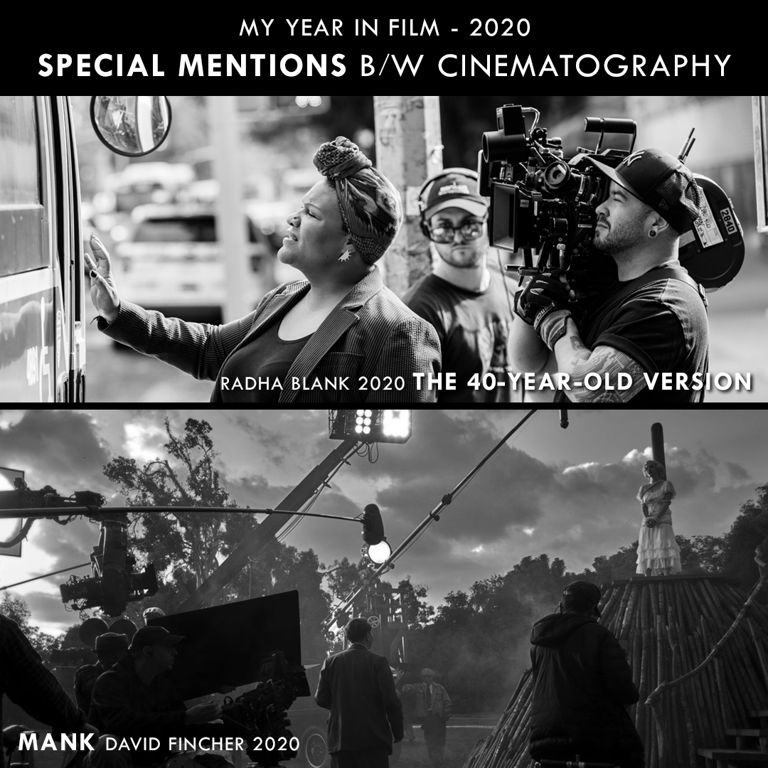
Although these films did not make my top ten, all of them are worth watching for several reasons. Two special mentions go to old favourites Spike Lee and Roy Andersson, the rest reflect my interest in color and lighting. Turns out that Netflix is the place for glorious black and white these days...


Cross Reactions between Revisited Films

Thanks to several analytical projects, I had an excuse to revisit a lot of favourite or at least interesting films in 2020.

Sometimes, I discover unintended similarities between unconnected films simply because I watch them within the same day or week. Thanks to such coincidental cross reactions I often see familiar movies in a different light.
Revisiting Todd Haynes' [SAFE] for a (canceled) lecture I not only found it to be his first masterpiece but also saw it as a great allegory - not for AIDS as is often suggested, but for our own time. Its disconnected protagonist, atmosphere, color concept and drone soundtrack suddenly made it a more realistic companion of THE NEON DEMON.

When I revisited both THE BIRDS and TAKE SHELTER for another canceled lecture about "fear + sound", I saw both films in a new way... For the first time, the café scene in THE BIRDS with all the different opinions about a looming unseen threat felt not funny but too close to home. I also noticed how much Jeff Nichols' film plays like a nightmare you might have after seeing the Hitchcock classic...


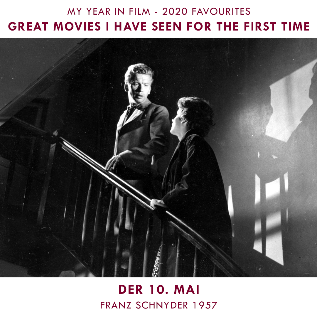
Great Films I Saw For The First Time in 2020

Here are some of my favourite older films I saw for the first time in 2020. The first three were on my imaginary must-see-list for many years - and still floored me!


Thanks to a recommendation by @mulmsie I caught up with LE TEMPS DU LOUP (TIME OF THE WOLF, 2003), one of the few Haneke films I knew nothing about.
Thanks to researching Morricone's music for a public lecture, I had a reason to watch classics like SACCO E VANZETTI (Montaldo, 1971) and guilty pleasures like the more preposterous Morricone-Tornatore-collaborations like THE BEST OFFER (2013). Speaking of preposterous premises: I also caught up with a few Kiyoshi Kurosawa movies.
Thanks to @mubi s Louis Malle selectrospective, I think I finally understood what makes those films tick. Special Mention goes to HUMAIN, TROP HUMAIN (1974) for making me watch how a Citroën car is built for 75 minutes without any notable commentary and not regretting any of it.

In the spirit of the first post about SMALL AXE, the biggest thank you has to go to the @criterionchannel for making seminal works of black cinema available to people outside the US!

Speaking of learning about black history: thanks to the National Theatre I enjoyed their production of "Small Island" including some bonus material on youtube.

Favourite TV Series

As sort of a blog bonus, the following were my favourite TV series of 2020. Since I usually watch TV pretty erratically (I don't really care when something is coming out), the list contains both old and new:

  • BOJACK HORSEMAN (final season, 2020)
  • FRIEDEN (Swiss Mini-Series, 2020)
  • KILLING EVE (season 1, 2018)
  • MIDNIGHT GOSPEL (2020)
  • OZARK (seasons 1-3, 2017-20)
  • ROMAN D'ADOS 2002-2008 (2010) 
  • THE THICK OF IT (all 4 seasons, 2005-2012)
And somewhere in between theatre and tv, there was Simon McBurney's mindblowing stage performance THE ENCOUNTER (2015) designed for binaural headphones.

Saturday, August 8, 2020

Color Analysis: The Stag Fight

When Christian Renaut (author of „Les héroïnes Disney“) asked me for a comment on color in the stag fight scene in BAMBI (Hand, 1942), I felt the need to illustrate it with screenshots. Hence, my first color analysis post in years... 


Although Walt Disney was predominantly striving for dimensionally believable, naturalistic settings (in the vein of 19th century illustrations) when it came to animated features, during the golden age (1937-1942) his overall emotional approach to storytelling allowed for expressionistic use of shape and color during tense/subjective moments.


The resulting, less detailed backgrounds are easily integrated, however, since the characters (the focus of audience attention) keep their dimensionality, shape and proportions at all time. No flat shapes, no graphical abstraction. In addition, the Disney „dogma“ of value separation (i.e. either light character colors against dark background colors or vice versa) is closely followed, no matter how stylized the lighting gets. 

Left: light character on dark BG / right: dark character against light BG.

Concept art by Tyrus Wong (left via michaelbarrier.com, right via colossal.com)
 
Visible brushstrokes and less details in more impressionistic approach.

Thanks to Tyrus Wong's suggestive concept art, BAMBI generally feels much more impressionistic than the other films of that era. Besides atmospheric color choices, this impression mainly stems from a very selective degree of detail resulting in suggestive shapes of color and visible brush strokes. This is closely maintained throughout the two fantasy sequences when Bambi follows Faline through the clouds and during their stroll through the night.


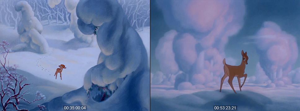
[Side note: the fantasy sequence immediately before the stag fight has the deer float among more or less realistically painted clouds that resemble the snow only with pink instead of yellow highlights.]

Snow: light blue with yellow highlights / love clouds: with pink highlights

Right between these two love scenes, however, Bambi has to fight his rival Ronno who suddenly appears behind a cloud and brings Bambi back down to earth.

The actual stag fight takes only one minute, it leaves a strong impression not least because of its bold color design. In the backgrounds, there are a lot of expressionistic color transitions with a general arc from green and blue towards red and golden orange. But although the „story meeting commentary“ on the blu-ray insinuates that those color choices were guided by „symbolism throughout“, I believe that what made it to the screen works primarily on an emotional level without too much rationalizing. So in this analysis of the latest blu-ray transfer (which may differ from what the film looked like in Technicolor), I primarily look at how these color combinations work and how they affect me.

The transition

When the cloud setting transitions back to the forest, the familiar brown vs green contrast makes the deer stand out quite naturally. Furthermore, the shades of brown adhere to the well-established Hollywood convention of value-coding: the skin of the female love interest is paler (less saturated) than the hero's skin and in this scene leaning more towards violet. The villain Ronno is deliberately darker than Bambi, especially around the eyes, looking almost like a shadow version of Bambi with more dangerous antlers.

Ronno the Rival
different skin tones according to convention.

Faline paler, Bambi "default", Ronno darker...

While the scene starts out in a naturalistic way, the transition happens step by step. First, a brisk change in lighting after a cut indicates a subjectively heightened perception of the situation. The story notes mention a sunset, what we actually see is heightened contrast and saturation in the green background and glowing golden rim light on Faline and Ronno. This may not look natural but makes for a bold color contrast. The sunset impression also comes from the fact that during the whole stag fight, Bambi and Ronno are always dark against light (except for one short shot). Even in less extreme backlighting, this effect is supported by the rim light that is brighter than the white of the deers' eyes.

During Bambi's attack from the right, the transition is taken further within a shot over the course of which Bambi's body becomes a dark silhouette against a backdrop of broad brush strokes and blue and green shapes devoid of detail (54:19:13).

Bambi from the right, smooth lighting change against broad shapes.

Ronno from the left.

We then see Ronno's counter-attack from the left with hard lighting from the right (aka the expressionist sunset). Contrast is now so high that parts of the image remain pitch black. 


What is more, although perspective and dimensionality are maintained, in the following long shot the level of detail is extremely low. A sketchy brown branch on the left and a silhouetted branch on the right provide the necessary depth cues with dramatic lighting setting the stage for the action.

Cut from high contrast, high saturation to similar, more stylized background.
This setup (right) resembles the style of the first hunting scare (left).

And since Ronno's half of the background is a lot darker (above), this is the one shot where he is much lighter than Bambi and everything else in the shot. Thus, it looks like two contrasting forces (bright orange Ronno and pitch black Bambi) are about to collide.

Ignoring color continuity

However, when the actual collision happens in the next shot, both deer are equally dark against an abstract dark blue background. 


In this elaborately animated shot, Ronno takes Bambi on his antlers and throws him to the left setting up the basic left-right-orientation for the remainder of the fight. At the same time, three basic concepts of the sequence are established:

  1. since the editing adheres to meticulous action continuity, the artists applied colors freely without paying attention from shot to shot. No matter how much the colors change from one shot to the next, there is always at least one element that remains stable across cuts.

  2. While the characters appear in „expensive Disney silhouettes“ (my own expression) – almost black but still with slight differences in color for lighter body parts and eyes – often against dark backgrounds, the movement is suggested a layer of fierce rim lights, sometimes containing additional highlights in an even brighter color.

  3. The degree of detail in the background varies greatly from just a direction of brushstrokes and gradient to some sketchily defined piece of vegetation or even fully rendered leaves and blades of grass. This way, we don't really see these color flashes as abstract backgrounds because like with the rim light on the characters, there are always enough representational elements in the frame to suggest a full setting.


Stage-managing emotional color changes

During Bambi and Ronno's initial clash, both are defined by the harsh orange sidelight (and fierce white highlights) of a heated confrontation. But during Bambi's fall to the left, his rim light turns cold as he enters a zone of fictitious blue light from above. Like in most of Disney's more expressionist sequences, this is much more reminiscent of elaborate stage lighting rather than abstract painting.

This notion seems to be confirmed by the fact that when Ronno approaches Bambi he is also bathed in blue overhead lighting and only re-enters the hot orange zone when the action moves to the right (a prime example of the old orange vs teal contrast, if ever there was one).

So rather than separating the two deer by colors, the lighting evokes the emotional involvement in the fight, sometimes using a hard cut to flip from hot to cold as Bambi goes down again (54:28:14).

Then we get the first brief shot from Bambi's point of view: Ronno's orange/white rimmed silhouette runs straight at the camera against a non-representational gradient made of broad diagonal brush strokes.

Now the darker rim light on both characters is green, somewhere inbetween the blue and green of the background. This overall green look is extended to a shot of Faline watching the action in an almost unicolored setup.

Bambi's next attack begins with orange top light but only adds the white highlight in the spot where the two stags meet. Again, the background colors flip across an axial continuity cut from green to orange vs blue (54:37:07) with Ronno on the orange side and Bambi against a dark blue background looking up at Ronno attacking him yet again from a bright background (maybe looking up at a cloud or light source?) that emphasizes the darkness of Ronno's silhouette.


BG colors change with hard cuts

During the next wrestling match (54:45.10), by way of a pan, the green background turns to blue while the blue rimlight gradually transitions to red and orange, which is again reflected in a unicolored shot of Faline watching the action (now staged as shadows over her face and the rock behind her)

continuous color change of rim light.

The sunset justification

Taking into account that all this was supposedly happening while the sun was setting on the right (the typical narrative pretense for colored lighting in Hollywood films at the time), we have now entered the final stage: the lower half of the backgrounds are already in the dark, devoid of warm sunlight.

As we cut from a wide shot to a close-up of the wedged heads, the background snaps to a fully saturated diagonal gradient from dark blue over magenta to red reminiscent of the fierce red glow that occurs shortly after the sun has set (and foreshadows the forest fire). 

The sky is now burning...

Emotionally, the fully saturated red seems to tell us that we have reached the apex of the stag fight.

With red fury on his side, Bambi is getting the upperhand

Indeed, the two clash one last time. Only this time around, Bambi is strong enough to through Ronno off the cliff into the cold violet water (down below, so technically not in the warm part of the background any more). Remarkably, those last few shots have been defined by just enough representational detail that the fully dimensional background during Ronno's fall doesn't attract our attention.

Again entering the striking highlight zone...

Suggestive, leaving much to the imagination, but still representational.

BG colors change with a hard cut.
the final POV shot of Ronno attacking.

The same BG in different colors, early expertise or later tampering?

[Side note: BAMBI has been heavily "restored" for DVD and again for Blu-ray. Without getting into all the things that don't feel right to me, I am very curious about the original colors of this POV background (55:01:16, above). It is certainly the same painting. And although there were indeed procedures that allowed for these kinds of color changes, I am not sure if it really fit the sunset part as well on Technicolor or if it was "fixed" in order to smoothly match the original vision as opposed to what ended up on screen.]

It's interesting how the same BG works for two different size relations!

Generally, the diagonal left-to-right dynamics (Bambi's direction) are adhered to in abstraction as well.

The iconic shot

After this predominantly red climax, for the aftermath – and real payoff – the sky turns gold as Bambi towers over his rival in a simple but strong composition. By this saving-a-damsel-in-distress-and-proving-himself moment, Bambi seems to have earned the „prince of the forest“ staging. He may not yet be ready to succeed the old prince in all aspects, but it is certainly the first time, he is seen in this iconic pose that is backlit so the characters appear as clear silhouettes against a lighter backdrop.

What is interesting about this shot is the direction: here, Bambi still looks to the right (i.e. "ahead" as the convention goes), while the adult Great Prince of the Forest always looks to left ("back" over his subjects, so to speak).
The Great Prince of the Forest (Bambi's father?)

And yes, in the end, Bambi himself becomes the Great Prince (or so it is visually suggested) taking over not only the pose and direction but the very spot of his predecessor (who is never verbally alluded to as his father).

Bambi succeeds the Great Prince and looks back over "his" realm.

All screenshots taken from the European blu-ray edition (time code based on 23.976fps).
Click on the images for larger versions.