Sunday, October 28, 2012

Panorama no Haiji

In the course of analyzing several scenes from Miyazaki films I have recently decided to catch up on those Takahata works (mostly pre-Ghibli) which I have never seen before. Of course, Arupusu no shôjo Haiji [Heidi, Girl of the Alps] (1974) was on the top of the list (even though I hated the mere sight of it when it was ubiquitously broadcast on television).

Now that the first snow has fallen around here, I can't resist posting some Swiss mountain pans - as seen through the eyes of unknown Japanese background painters (based on Miyazaki's layouts).

After heavy snowfall.

I hope you enjoy these reconstructed pans as much as I do (click on the images to see larger versions). Considering the time pressure of creating a 52 episode TV series within one year, these backgrounds are simply amazing.

If you have any information on who painted these backgrounds, please share it in the comments! 

[Update Dec 2023: Thanks to reader Luca Giubertoni, I now know that one of the background painters of these panoramas is Masahiro Ioka!]

Mood - especially weather and lighting - is of paramount importance to the success of Heidi:


Dörfli in summer - credits sequence.
Dörfli in the evening.
A virtual 360° pan, incredibly wide.
The same environment at golden hour.
Springtime.
Autumn.

Bottom-up pan - credits sequence.
Bottom-up pan, connects Dörfli with mountains.

Bottom-up pan, Heidi dreaming of Switzerland (homesick in Frankfurt).
The three firs before dusk...
...and at noon (top-down pan).

Friday, October 19, 2012

Respectful Distance: The Telephoto Lens in Japanese Cinema

Quasi-isometric representation in The Girl Who Leapt Through Time (Hosoda Mamoru, 2006)
Sometimes perspective in highly realistic anime backgrounds looks rather unnatural. The almost isometric view of even large buildings is not due to a lack of knowledge of drawing, though, but adheres to a stylization on display in various Japanese visual arts and seems to have come back to realistic animation by imitating telephoto shots as used in live-action movies.

Deep vs Flat
Perspective in a photograph or painting feels natural when it represents a focal length that matches our own perception. To dramatize, however, artists heavily rely on forced perspective (especially in early widescreen cinematography) that enlarges the space between back- and foreground - size relations are widened as well. Since we feel closer to the action we feel more involved emotionally.

Less dramatic comedy scenes on the other hand tend to work even better when seen from a distance and flatly staged. This way, we are less involved with the characters and can laugh at their actions and reactions. Of course, this does not mean that a story staged this way could not affect us emotionally as well, but the emotional involvement is less based on identification and feeling involved from the point of view of a character.

(Visit Mark Kennedy's post about flatness and depth for some good visual examples.)

Woodblock Printing
Although at some point in history central perspective was known among Japanese painters, traditional Japanese art did not adhere to the Western concept of realism. In many of Utamaro Kitagawa's woodblock prints the backgrounds look rather isometric and there seems to be less visual hierarchy: important characters are not brought forward by painting them closer to the observer and thus larger. All characters seem to be on the same plane. Unlike in Western art there is often not one central focal point but several spread across the image (or the picture scroll).
by Utamaro Kitagawa
Utamaro Kitagawa (from Album of Woodcuts)

Illustrations from "Chushingura"...
...and "Saikaku Ichidai Onna".

This explains extreme examples like the following promotional stills from Otomo Katsuhiro's new short Combustible which is obviously inspired by traditional woodblock prints:


It still does not explain the isometric perspective in otherwise realistically rendered anime backgrounds like the ones from The Girl Who Leapt Through Time. At least to the western observer the answer seems to lie in live-action film technique which has been a stronger influence on anime than on western animation.


Photographic Imitations
Mizoguchi Kenji liked to shoot his films from a distance with hardly a close-up in his earlier films. Kurosawa Akira who initially relied heavily on fast editing and close-ups to involve the viewers increasingly treated the frame as a graphic plane by shooting his films through a long telephoto lens. Although his classic films could serve as textbook examples for dynamic staging and visual hierarchy, especially his later films are almost completely shot from a great distance which minimizes the depth of space to a visually arresting degree.

dynamic staging in Rashomon (Kurosawa Akira, 1950).

Especially the distancing historical epic Kagemusha (1980) comes rather close to the visual representation style of the era depicted in the narrative.
Space is flattened right from the beginning of Kagemusha.
There are many flat shots strictly from a 90° angle...

...where planes only separated by a layer of moving yellow banners.


Visual dynamics are still achieved by putting characters' heads higher and lower in the frame.
However, people's heads in the background are not much smaller than those in the foreground...
...even when the angle is not straight on.


Shot from afar, these roofs come quite close to the woodprint style of parallel lines.


Telephoto lenses as a distancing effect to diminish differences in size of characters closer and farther away are also characteristic of contemporary Japanese films like Kiseki (I Wish) by Kore-eda Hirokazu (2011) whose style I will examine more closely in a future post.
These screenshots are all from a European trailer...

...hence the German subtitles.
There is a shot in Kiseki taken from high above the train station that comes very close to an isometric representation of the stairs. Unfortunately, I don't have it to show here.
Apparently, applying the aesthetics of the telephoto lens to animation is a technique western directors tend to refrain from (at least when architecture is concerned), possibly because it looks unnatural in non-photographic realism. Anime audiences on the other hand seem to be used to animation imitating live-action films.

Another pair of virtual telephoto shots from The Girl Who Leapt Through Time.


Sunday, October 7, 2012

Preview

Kagemusha (Akira Kurosawa, 1980)
I'm currently preparing a few posts on Japanese films the first of which will hopefully be ready by the end of October. 

Since traffic on my recent Miyazaki/Brave post is still higher than on anything else I have written this year, I guess that Japanese cinema is a source of inspiration not only to me but also to many readers of this blog.


Wednesday, September 12, 2012

Couleurs Françaises - Prélude

When I think of beautiful color work in current animated features, I think of French titles first. Last year I was delighted by Sylvain Chomet's Illusionniste and especially the wax crayon style of Folimage's Une Vie de Chat. Last week at the Fantoche Festival in Baden, I have seen more films that confirmed my impression.

It has become a pleasant tradition to see the latest Studio Ghibli production and most often also a new French feature at the International Animation Festival Fantoche in Baden, Switzerland. This year, I was in Baden only one day and I have to admit it was rather a feel-good program I put together: Two Belgian-French features, one reel of shorts in competition, a casual inauguration party on a nearby lawn and finally Goro Miyazaki's nostalgic high school romance Up On Poppy Hill which was advertised exclusively under its original title kokuriko-zaka kara and thus was almost overlooked by many. 

Stop Motion Impressionism
Emma De Swaef receiving her Fantoche award.
Unfortunately I didn't see any of the special programs featuring a wide variety of classic and contemporary Czech films. Incidentally however, I have seen the winning short Oh, Willy... (Emma De Swaef, Marc James Roels, 2012) which I liked a lot. Needless to say that this beautifully lit stop motion film was also Belgian-French.

Even though it lasts for almost 17 minutes and is as slowly paced as Richard Wagner's "Rheingold-Vorspiel" that accompanies Willy's final redemption, these characters and sets made entirely of wool and cloth kept my attention throughout. As you can see in the trailer below, the sets of Oh, Willy come to life through impressionistic lighting that makes full use of the objects strange tactility.


There is a short interview with Emma De Swaef on the Dragonframe Blog (from which I have lifted some of the making-of photos below).


Simulating Soft Watercolor Illustration
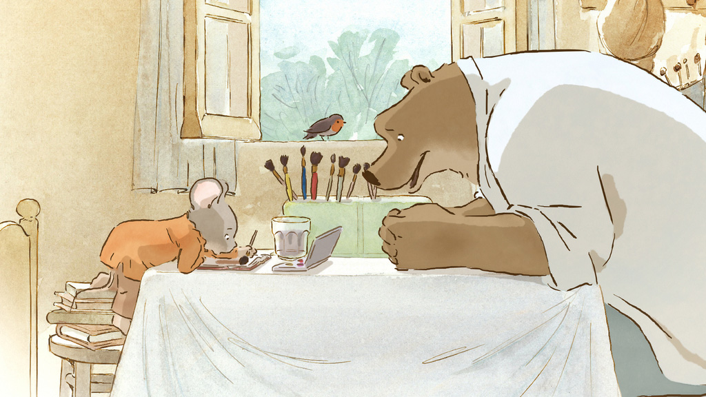
The highly anticipated children's film based on Gabrielle Vincent's beloved picture books about the bear and mouse Ernest & Célestine translates the illustrator's warm drawings into a slightly more animation friendly style of open lines and watercolor textures combining hand drawn animation with the possibilities of digital 2D-technology.

Although the character outlines feel a little too sterile at times, the resulting technique has its own charm. Imaginative underground worlds and a whole bouquet of visual ideas serve a gentle story directed by young Benjamin Renner with help from Panique Au Village creators Vincent Patar and Stéphane Aubier who demonstrate that they can handle less frenetic material with equal grace.
Gabrielle Vincent's original style...

...compared to film stills.


A Threedimensional Painting
Although not as good a film as Ernest & Célestine, Le Tableau (Jean-François Laguionie, 2011) intrigued me more than I had expected. The story of a class struggle among fully painted, half painted and just roughly sketched characters within an unfinished and apparently abandoned painting turned out to be all about color.


It might have worked better if the characters would have been traditionally animated instead of the cel-shaded 3D animation (so painfully telling of a low budget production). The characters themselves would have remained one-dimensional nonetheless since all except one were mainly defined by their state of painting and not much more.

But even so the unfinished characters' desire to meet their creator combines themes of Solaris or Prometheus with reflections on the creation of art and matching colors. Le Tableau has apparently been picked up by GKids for a theatrical release in the United States. A reasonably priced Blu-ray is also available on Amazon France.