 |
| Quasi-isometric representation in The Girl Who Leapt Through Time (Hosoda Mamoru, 2006) |
Sometimes perspective in highly realistic anime backgrounds looks rather unnatural. The almost isometric view of even large buildings is not due to a lack of knowledge of drawing, though, but adheres to a stylization on display in various Japanese visual arts and seems to have come back to realistic animation by imitating telephoto shots as used in live-action movies.
Deep vs Flat
Perspective in a photograph or painting feels natural when it represents a focal length that matches our own perception. To dramatize, however, artists heavily rely on forced perspective (especially in early widescreen cinematography) that enlarges the space between back- and foreground - size relations are widened as well. Since we feel closer to the action we feel more involved emotionally.
Less dramatic comedy scenes on the other hand tend to work even better when seen from a distance and flatly staged. This way, we are less involved with the characters and can laugh at their actions and reactions. Of course, this does not mean that a story staged this way could not affect us emotionally as well, but the emotional involvement is less based on identification and feeling involved from the point of view of a character.
(Visit Mark Kennedy's post about flatness and depth for some good visual examples.)
Woodblock Printing
Although at some point in history central perspective was known among Japanese painters, traditional Japanese art did not adhere to the Western concept of realism. In many of
Utamaro Kitagawa's woodblock prints the backgrounds look rather isometric and there seems to be less visual hierarchy: important characters are not brought forward by painting them closer to the observer and thus larger. All characters seem to be on the same plane. Unlike in Western art there is often not one central focal point but several spread across the image (or the picture scroll).
 |
| by Utamaro Kitagawa |
 |
| Utamaro Kitagawa (from Album of Woodcuts) |
 |
| Illustrations from "Chushingura"... |
 |
| ...and "Saikaku Ichidai Onna". |
This explains extreme examples like the following promotional stills from
Otomo Katsuhiro's new short
Combustible which is obviously inspired by traditional woodblock prints:
It still does not explain the isometric perspective in otherwise realistically rendered anime backgrounds like the ones from
The Girl Who Leapt Through Time. At least to the western observer the answer seems to lie in live-action film technique which has been a stronger influence on anime than on western animation.
Photographic Imitations
Mizoguchi Kenji liked to shoot his films from a distance with hardly a close-up in his earlier films.
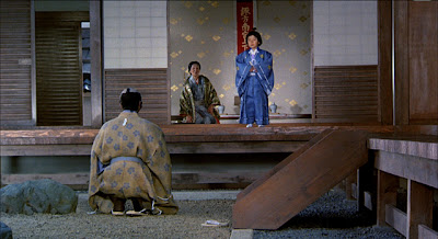
Kurosawa Akira who initially relied heavily on fast editing and close-ups to involve the viewers increasingly treated the frame as a graphic plane by shooting his films through a long telephoto lens. Although his classic films could serve as textbook examples for dynamic staging and visual hierarchy, especially his later films are almost completely shot from a great distance which minimizes the depth of space to a visually arresting degree.
 |
| dynamic staging in Rashomon (Kurosawa Akira, 1950). |
Especially the distancing historical epic
Kagemusha (1980) comes rather close to the visual representation style of the era depicted in the narrative.
 |
| Space is flattened right from the beginning of Kagemusha. |
 |
| There are many flat shots strictly from a 90° angle... |
 |
| ...where planes only separated by a layer of moving yellow banners. |
 |
| Visual dynamics are still achieved by putting characters' heads higher and lower in the frame. |
 |
| However, people's heads in the background are not much smaller than those in the foreground... |
 |
| ...even when the angle is not straight on. |
 |
| Shot from afar, these roofs come quite close to the woodprint style of parallel lines. |
Telephoto lenses as a distancing effect to diminish differences in size of characters closer and farther away are also characteristic of contemporary Japanese films like
Kiseki (I Wish) by
Kore-eda Hirokazu (2011) whose style I will examine more closely in a future post.
 |
| These screenshots are all from a European trailer... |
 |
| ...hence the German subtitles. |
 |
| There is a shot in Kiseki taken from high above the train station that comes very close to an isometric representation of the stairs. Unfortunately, I don't have it to show here. |
Apparently, applying the aesthetics of the telephoto lens to animation is a
technique western directors tend to refrain from (at least when architecture is concerned), possibly because it
looks unnatural in non-photographic realism. Anime audiences on
the other hand seem to be used to animation imitating
live-action films.
 |
| Another pair of virtual telephoto shots from The Girl Who Leapt Through Time. |


1 comment:
Great post! I love Kurosawa films (who doesn't?) but have never been able to pin down what exactly he's doing to make them look so graphically interesting. Will definitely be thinking about this!
Post a Comment