Showing posts with label dvd comparison. Show all posts

Monday, April 25, 2016

Sumptuous Costume Colors: Soft and Simple (Part 4/5)


This fourth installment in a series about analogous costume colors in Disney films deals with how the concept of analogous costumes is used in CINDERELLA (1950) and PETER PAN (1953).

The mid-century Disney features that I analyze in this entry have been subjected to heavy digital restoration. In the case of CINDERELLA, the complete removal of film grain and any traces of texture that hinted at manually painted cels did not only diminish the colored outlines but gives the impression that it was painted and composited in the 1990s with Disney's proprietary CAPS software.

Regardless of whether you prefer historically correct presentations or not, such an impression influences reception in dangerous ways. If a film like CINDERELLA that is so much the product of conservative post-war escapism is perceived as contemporary (or maybe from the 1990s ? all production dates have been omitted from DVD packages) the dated acting and attitudes towards women become problematic.

If its genuine Technicolor look would remind us of the proper historical context (making kids aware of the fact that it was made long time ago and still holds up as entertainment), it would be clear that its attitudes are not contemporary any more. Thus, the film could still be appreciated as the tightly plotted, gorgeous looking gem it really is. One can only hope that the original successive exposure negative or at least some IB prints are still existing in the archives and will not be replaced by a digitally "enhanced" internegative.

The basic color concepts, however inaccurately pushed to extremes to match contemporary tastes, are still clearly visible ? or even more so, now that characters and backgrounds are not unified by the organic quality of film stock any more. So when analyzing any of these films, we have to keep in mind, that saturation, values and color temperature might have looked differently (just compare the two DVD editions of SLEEPING BEAUTY).

But in our digital age, it is also important to recall that each Technicolor print (not to speak of "normal" prints for re-issues) looked slightly different, even though there was a basic aesthetics to them that was easily recognizable. Compared to what we get on DVD and Blu ray nowadays, they did look rather dark with rich blacks and probably warmer overall because of different lamp temperatures.

Color Connotations: Cinderella
With that out of the way, let us start with animals again. Somewhere in between the woodland creatures in SNOW WHITE (1937) and the clothed mice and ducks of the cartoons, Cinderella's little helpers are composed of a barking dog that looks and behaves like a dog, a few sparrow-like birds with minimal clothes and a cast of fully anthropomorphized talking mice on two legs.
The plumage of these birds is painted in closely related shades of one single hue each, like slick prototypes of the analogous color scheme. The more interesting part of their design lies in the strange pieces of clothing that a) connect them to the mice (why would birds wear shoes that stop them from clasping branches?) and b) add individuality to the most generic design imaginable. Contrast is provided by scarves and caps in soft pastel versions of complementary colors red and green.
Top row: actual costume colors of blue birds; bottom: respective hues.
The animals most people remember, though, are the mice Jacques and Gus. From what we have seen in previous films, their costume colors reveal quite a lot about their personalities and roles: like Mickey (or Doc in SNOW WHITE), Jacques must be the leader because he is wearing saturated warm red that overall leans towards orange rather than purple (the designated villain color, but more on that later)
Warm red (leaning towards orange) is often shown as the color of leaders: SNOW WHITE (left) and CINDERELLA.

Purplish red is most often reserved for hostile characters: SNOW WHITE (left) and CINDERELLA.
Gus on the other hand is the more simple-minded, confused Goofy type with more disparate colors one of which is green, a complementary to Jacques' red. Among the rest of the male mice who all wear blue and yellow (or green in between), he stands out because of the warm yellow shirt Cinderella gave to him.
Jacques is easily identified by his orange-red clothes...

...as opposed to the other mice's colors ranging from yellow through green to blue.

The leading female seamstress mouse is wearing quite an elaborate dress in different shades of pink/magenta with a lilac hat.
CINDERELLA's most obvious stylistic departure from its golden age predecessors SNOW WHITE, PINOCCHIO (1940), DUMBO (1941) and BAMBI (1942) lies in a new dominance of art deco pastel colors. These soft colors of higher value and mid-saturation are most evident in costumes and still determine how children imagine princess dresses today.
Contrasting cold blue (Cinderella, water) with warm brown (horse, father, puppy).

While color temperature is an overarching structuring element with light blue against brown/beige (above), predominant costume colors are light blue, light green and pink with an overall emphasis on pink/green contrast as can be seen within groups of mice as well as Cinderella's wealthy stepsisters:
The stepsisters are distinguished by magenta/green contrast. The same concept is used for the singing seamstresses.
Both these contrasts, brown/blue as well as magenta/green, are complementary colors in the additive RGB system. I usually call them "negative colors" as opposed to complementary colors like red/green in the painterly red/blue/yellow subtractive color model (more on confusing complementary colors here). If you want to see the negative colors of an RGB image, just invert it:
Magenta and green are opposites or "negative colors" in the additive RGB system.

The same goes for light blue and brown.

The magenta/green contrast is slightly more interesting than the cold-warm concept because neither of these hues is receding. Because of their opposing overall colors, we can not only distinguish these otherwise similar stepsisters, but also store them in our brain as the green and the magenta sister without having to attach their appearance to their names. But the excessive lushness of their gowns illustrates Cinderella's blatant discrimination in the household after her father's death. After all, the prologue shows us that Cinderella once wore a lavish but far less garish and therefore purer princess dress as well.
The sisters in the prologue, reconstructed from two screenshots. Together with Cinderella's dress they form a triad of pastel red (pink), blue and yellow.
Although the colors feel vastly different with excessively patterned fabrics that would have been a nightmare to animate, the 2015 live-action remake adhered to the basic concept of single-hue dresses in clearly distinguishable colors:
A similar triadic color scheme in the 2015 live-action remake.

So while her stepsisters are properly dressed in artificial colors, Cinderella is clad in warm earthly browns of discrete values balanced by a light gray shirt (leaning towards cold teal). Cinderella might be the one held captive in an ivory-tower, but based on her costume she looks less one-dimensional and certainly more down-to-earth than her aloof stepsisters.

Even on identical costumes, Cinderella's color make the first "Anna" look more down-to-earth than the other two.
Color schemes like this often reflect the notion that supporting characters are more one-dimensional compared to the protagonist. Hence, more interesting character means more variety in its color design.
Protagonist Pedro (right, from SALUDOS AMIGOS, 1942) is less monotonous than his supporting character parents.

Sumptuous vs Simple: Peter Pan
I have already written extensively on complementary red and green in PETER PAN (see Captain Hook's Red Coat: Part I, Part II, Part III). Peter Pan and Captain Hook are complementary opposites and like all the characters above can be described by their analogous color schemes: Hook is all red and purple (he a leader AND a villain, after all), Peter is all green (leaning slightly towards warm yellow and cold blue, depending on the scene). Tinkerbell is actually wearing green as well and therefore is visually connected to Peter. But her strong glow makes her look like a yellow light source.
There is one additional concept to gather from this film upon which I have not written yet: communicating simplicity. So far, it has become clear, that in order to make costumes look rich and sumptuous, they are broken into many different parts with closely related colors (e.g. Cinderella's stepsisters). On the other hand, to make clearly distinct pieces of clothing go together well, the same principle can be applied with more closely related shades of the same color (e.g. Jacques) or contrasting colors from two different hues (e.g. Cinderella) or one hue but strong contrast of value and saturation (e.g. the boy).
left to right: Jacques (CINDERELLA), the boy (RELUCTANT DRAGON), Cinderella herself.

To show the simplicity of a costume such as a nightgown or a pyjama in contrast to fancier dresses, these garments are often painted in only one color even though the design would allow for different colors (Wendy's sleeves, for example).
Simple clothes are in one color only (two, if we count the darker shade of Wendy's belt and bow).
The same triad as above.
Nightgown triad of blue, green and magenta.

The gauchos in THE THREE CABALLEROS, top row: actual soft colors; bottom row: respective hues reveal the primary triad of yellow, blue and red.

As these screenshots prove, the simple gowns are not new to PETER PAN, but here it is probably the first time that the protagonists (Wendy, John and Michael) keep it on throughout the whole film. More often, pyjamas are only seen for brief moments like when the gauchos in THE THREE CABALLEROS (1944) are undressed by a draft. Not surprisingly, their pyjamas are in muted versions of the primary triad yellow, blue and red that dominated so many of 1940s Disney characters.

In the concluding chapter of this series I will finally return to SLEEPING BEAUTY (1959), Disney's crowning achievement when it comes to analogous colors.

Thursday, January 10, 2013

Japanese Haiji vs. German Heidi


The visual difference between a faded 16mm print used for TV broadcasting and a remastered Blu-ray is obviously striking. But when a show is released with two different soundtracks by two different composers, faded colors become irrelevant. Even if you don't understand a word of Japanese or German, these clips will speak for themselves.

Arupusu no shôjo Haiji (1974 aka Heidi, girl of the alps) is probably the most well-known Japanese TV series in Europe. It has been a real breakthrough not only for Nippon Animation's "World Masterpiece Series" but also for director Isao Takahata and "scene designer" Hayao Miyazaki - who drew every layout of all 52 episodes himself.

After so many film and TV adaptations (American, German and Swiss) it is safe to count Takahata's version among the most faithful - if not THE most faithful - retelling of Swiss author Johanna Spyri's 1880 "Heidi" novels about the surfacing town-country conflict of industrialized societies. Of course, alterations had to be made and incidents had to be added in order to keep 52 21-minute episodes (not counting credits and episode previews) interesting.

But this enormous running time leaves room for a leisurely pace that allows the audience to experience the many faces of nature. Needless to say that even in such a tightly budgeted show the founders of Studio Ghibli squeezed in many shots of animated weather (especially wind and changing seasons).

So if you are able to look beyond the very limited animation and stereotyped character design you will discover a well researched and touching tale of a girl who learns to love nature only to be sent away to a German city that has "no wind and no trees".

The sound of music
Of course, the melancholy atmosphere is greatly influenced by the soundtrack - Takeo Watanabe's music in particular. Although there are only five or six themes used in the first 18 episodes that take place on the mountain pastures above Maienfeld (Graubünden, Switzerland) the cues fit the action perfectly. These tunes range from jaunty (for Josef, the dog) to elegiac, but the underlying emotion is always one of longing. At times, Heidi's music seems to come straight out of an Italian film of the era.

But - and this is an enormous but - you only hear these tunes in the original Japanese language version (and the feature-length version released to US theaters in 1975). In German speaking countries most people associate Heidi with tunes by Gert Wilden.

Since I couldn't bear watching anime series as a child (they always looked like a series of badly drawn and dubbed still images to me and had nothing in common with my conception of animation) I have never seen more than a few minutes of Heidi. Although now I have learned to accept this Astroboy-as-a-little-girl design approach (thanks to a "fan sub project"), I doubt that I would have been as taken with this series had I been forced to watch it in German.

Before the days of high definition
Before talking about the soundtrack let me remind you that Heidi was conceived and broadcast as a TV series. It is therefore not surprising that the German DVD box set uses a print that seems to be too high on brightness and contrast and displays some color cast.

TV screens used to be quite different and very small in the 1970s, black was a middle grey at best and around Europe some people still had black and white monitors. For all we know, the picture we get on the German DVD may represent the original viewing conditions much closer than the meticulously remastered transfer of the Japanese Blu-ray.


left: German DVD - right: Japanese BD
Pushing the brightness in dark scenes so that TV spectators could at least see what was going on was not uncommon...
...the greenish cast and the bleaching outlines, however, are hardly there in the original negative.

Contrast is much higher on the left, but actually Heidi's clothes look more natural. The interior around the old woman is definitely colder (closer to blue) in the left and warmer (closer to brown) in the right image.


Heidi's colors are warmer and more harmonious on the left (A-F) but the color contrast between her shirt (C) and her skin tone (D) is stronger on the right. While overall contrast is lower, the greenish sleeve (C) seems to stand out a little too much.

In a different mood

While the Swiss are quite used to hearing Swiss characters on TV not talking in their native Swiss German but the standard version of the language as spoken in Northern Germany, it is fairly unusual however that when a German producer decides to rebuild the whole soundtrack from scratch including the music he does not substitute the Japanese score with a Swiss score. Instead Moravian-born German composer Gert Wilden who was at the time best known for his music for erotic films was hired to rescore the entire series.

My comparison starts after the credits sequence because the catchy title songs can be easily found on youtube. So let's listen to the very beginning of episode 1:

Note: all examples Japanese first, German second.
The Japanese opening is full of tension and foreboding. The lonely girl Heidi is introduced with a lyrical accordion. After that we only hear the silence of a village at dawn and a girl waiting in anticipation. Wilden's music (starting at 1:43) seems like a rhythmical stock track that just fades in. It is already jaunty and sounds more like the background in a commercial for a Bavarian resort than a score to a deserted early morning scene. Moreover, the music does not change when Heidi is introduced and goes on even during the rooster scene until the first line of dialogue. No matter what style of music one prefers it is obvious that the different approach to scoring changes the scene far more than the differences in color.

It sounds as if the German producers went to great lengths to undermine Takahata's basic mood of slow pacing (long silent moments) and longing (melancholy themes without a constant drumbeat). And to be honest, it seems strange that Heidi's voice sounds so much older in German.

As the next clip demonstrates, the notion of a female narrator that clearly reflected the novel's female author has been replaced by a standard male narrator as well (the same had been done to Cinderella when it was partially re-dubbed around the same time, as you can hear here):
In addition to the narrator, again the elegiac tune with the small sentimental changes is replaced with an alpine oompah oompah tune (0:38) that doesn't even sound Swiss to me. During the narration the music at least seems to be explicitly scored to the film.

The next example consists of two sets of clips that show how both the dramatic/scary and the sentimental scenes are toned down by Wilden's score:
The Morricone-like tension of the argument is de-emphasized and the sad good-bye sounds a lot more down-to-earth in the dub.

Occasionally, the Japanese version includes a genuine Swiss song like "jetz wei mer eis jödele":
In the German version however any reference to Swiss German is carefully omitted (even the word "Dörfli" which means "little village" is treated as if it was the name of the village) and replaced by narration.

Just to show that this is common throughout the series, here's another moment where story takes a backseat to mood:
It seems that Western television always had this urge to move the story forward. Somehow, Japanese children seem to have been considered more patient. It's interesting, by the way, that the music (behind the narration) of these later episodes resembles the Japanese score more closely.

Early on, Heidi has a dream which is a good example of the differences in relying on music, silence and soundeffects in an eerie and touching scene:
Again the power of silence and "time standing still" is minimized by the German score. And again a song (this time Japanese) is replaced by narration.

In following example the Japanese version is scored during the pan down from sled to the children (0:10) while the German soundtrack contains music during the pan down along the fir trees (0:55) and vice versa!

There is a strong indication that the sound effects have been rebuilt as well:
Is it just me or did they simply paste one single "moo" about four times on the German soundtrack?


The reason of this comparison is not to deride Wilden as a lesser composer than Watanabe - for all we know, he was only following the producers' directions. The reason of this post is to demonstrate how much music can change the way we experience a film even if the pictures are identical.

The German soundtrack may have been put together with utmost care and really good intentions - maybe they didn't want to upset or bore German children with storytelling that was deemed too Japanese, and certainly sentimentality wasn't very popular in those days. After all, Wilden's music is crucial to the way generations of German speaking children have experienced and loved Heidi.

Ultimately it is a matter of taste which scoring approach one prefers but only one of them is true to Takahata's vision.

Note: Up to date, there is no DVD available that includes both language versions simultaneously. There's not even an official release that features English or German subtitles yet.

Thursday, November 29, 2012

December Previews: More Miyazaki and Finally Back To Color Analyses


While preparing a lecture on HOWL'S MOVING CASTLE I have come across many aspects of Miyazaki's earlier films some of which I would like to further explore on this blog. And since my preoccupation with color analysis is the one thing that sets colorful animation expressions apart from other animation blogs, I will soon launch a loose series of posts about complimentary colors - in particular red vs. green and magenta vs. green.

Aware that most people in the USA have yet to discover Takahata's 1974 TV adaptation of Heidi I nevertheless come back to it once more. There is quite a difference in how it is presented to Japanese and European kids in terms of voices and music.


Comparison of German DVD and Japanese Bluray.

Studio Ghibli Colors
Color designer Michiyo YASUDA is one of those great unsung Studio Ghibli employees whose work is admired across the world but who is hardly known to Western fans. From Nausicaä (1984) to Ponyo (2008) her extraordinary flair for color compositions has been on display in many a Ghibli feature including Grave of the Fireflies (1988) where she was responsible for character colors. There is a Japanese book dedicated to her work (unfortunately the text is in Japanese only so far) but not much information available in English.

Candy colors for pirates in Laputa.
Color work in Miyazaki's films is sometimes taken for granted because it looks rather realistic and changes occur far more subtle and unobtrusive than in flashy anime like Metoroporisu (2001). However close the final films reflect Miyazaki's watercolor image boards, upon closer examination films like Laputa - Castle in the Sky (1986) or Kiki's Delivery Service (1989) demonstrate Yasuda's stunning sense of color.


In-your-face complementary colors in flashy Metoroporisu...

...and Michiyo Yasuda's more subtle use in Kiki's Delivery Service.
The Colors of Holly and Mistletoe
Red and green are the colors most often found in American Christmas illustrations. So December seems to be a good month to start a loose series of posts about this ubiquitous pair of complimentary colors that was especially en vogue in early Technicolor films.


Norman Rockwell's typical use of red and green for Christmas illustrations.
 
Gene Tierney with red lips against an emerald backdrop in Leave Her To Heaven (1945)
Giulietta Masina in her husband's first color film Giulietta Degli Spiriti (1965)

Wednesday, May 5, 2010

A "Dumbo" for our times

With the Walt Disney Company obviously celebrating Dumbo’s 70th anniversary a year in advance (at least in Europe) with a lavish Bluray Edition and Hans Perk hopefully starting an ongoing re-evaluation of the animators’ work on that film, I couldn’t help comparing the two DVD editions I have (2001 vs. 2010). Both of them represent contemporary technicians’ interpretations of the original Technicolor film while each version goes into a wholly different direction. 
Never trust DVD colors.

On a side note, a company that has taken all necessary steps to erase production dates from the audiences’ minds in order to sell their timeless and not-so-timeless films indistinguishably from contemporary releases (a preposterous idea in itself) is now celebrating their oldest classics with rather broad interpretations of release dates, in big letters nevertheless.

Suddenly it has become fashionable to sell old movies - the older the better it seems, with Bluray anyway – because then people can appreciate how technically advanced these films must have been back then and most of all: what a marvellous job the restoration team must have done.


Why restorations are products of their time
There are three things I try to keep in mind when studying/reviewing a restored film:
  1. Restorations are commissioned in order A) to keep a work of art from decaying for good and B) to be able to get new audiences interested in it (i.e. widen the range of buyers).
  2. Taking option B) into account, it is the job of restorers (highly skilled artists and technicians) to appeal to current tastes as well. So I assume that they know very well what they are doing when they use state-of-the-art post production techniques to "enhance" technical aspects so that a film superficially looks like it was made today. This usually is done carefully with the supposedly original artistic intentions in mind, trying to make things look like "they were intended to" and "correcting technical flaws" of the original.
  3. This pushing process, of course, has to take into account the specific medium/technical equipment (Youtube, an old television set, a HD display or an IMAX screen) the restored movie has to look good on.
So while not even period movies can successfully conceal their time of making (look at the fashion, haircuts, editing and acting style of a western set in the 1880s and you can at least guess the production decade), restorations are always bound by equally time-dependent restrictions of current technology and taste. Therefore a restored film always tells us something about the period of both production and restoration.

On a superficial level there seems to be a long way from the 2001 DVD and the current Bluray release. It just feels like Super8 compared to a 35mm. Which paradoxically brings us straight to the heart of the matter as Dumbo was shot and released on 35mm in the first place. It just didn’t look like that at all on the 2001 DVD. The new version doesn’t even look like it was shot on film any more. In fact, with the final assembly being made completely digital, it is more accurate to say that elements of the source material were shot on film. The picture has been so thoroughly expurgated of every grain of history that the slightest cel shadow becomes a distraction.

Stunning though it may look to the average BD buyer, to me it’s a mixed blessing. But as I have the same general reservations and objections (removing the grain and everything that held backgrounds and cels visually together) against this that I have already stated concerning recent platinum restorations I will no longer tax your patience about them. I can still enjoy the Bluray, though, in case you wondered.


Back to the roots and beyond
It's the beyond that is of particular interest here. The 2001 version isn't a full blown restoration, but its colors also seem to be quite far from the Technicolor original.

2001 (always on the left)  vs.  2010 (always on the right)

At first glance the left picture is a lot lighter. Looking at the skin color I also notice some greenish yellow tint that looks rather pale and unnatural.
On the other hand the right picture is darker and feels more saturated, although the red uniforms are a lot brighter in the left picture. Instead Mrs Jumbo's pastel cloths are more saturated. The greenish tint is gone so the green parts are in stronger contrast to the brownish yellow tent. Overall the right picture looks somewhat warmer, most notably in the skin colors. Color correction based on white balance doesn't do the job with these restorations as the colors seem to have been adjusted separately.

The obvious difference is the change in value and hue of the purple keepers. I believe what we have here is a case of "correcting" something that served a purpose. It is true that these keepers are in dark colors throughout the sequence and especially the purple ones should never have been pushed to plain red as the ringmaster is always identified by that color among them. There is also a hint in the left image that the blue of the keepers once was different from the pastel blue Mrs Jumbo cape. I also don't think that the purple (now red) keepers were meant to stand out because of that. So the left picture can't be wholly correct on that instant either.
But while the 2010 version "restoring" color continuity (making the keepers dark in ALL shots of the scene), it is disregarding the composition of the shot as a whole. This sequence is an action scene consisting of many short shots that have to read at first glance. Yes, there are many color continuity errors on Dumbo, but this wasn't one of them, I believe.

The value pattern on the right has most certainly been altered for color continuity's sake. A thing that one would never do on a live-action movie. It would never read fast enough in black and white. If you look closely enough you see spots of brighter purple in some areas. Note also that the blue keepers' hems are purple as well and not orange like in the old version and earlier in the film.

So how could the original have looked?
We, who don't have access to the studio archives, will never know (Dumbo hasn't been theatrically re-released for about 30 years around here).

Based on these pictures, does the 2010 version come closer to the original than the 2001?
On the one hand, the right image feels closer to a possible original because of the clear color separation and darkly saturated colors of Technicolor. Remember, in those days, the green layer was still printed in black as well for richer darkness. Also, the Technicolor consultants used to make sure that human skin looked warm and healthy all the time.

On the other hand the "corrected" color continuity destroys an easily readable composition. Also, the inked outlines on the keepers have been partially obscured by digital repainting (a problem of value contrast as well). When seen in motion there is a lot more going against it what with all the grain and organic flickering erased.

But which one looks better then?

Both the 2001 transfer and the digital restoration were prepared for audiences who grew up on animated features colored in the computer. With VHS and DVD visual "richness" used to be "enhanced" by pushing contrast and saturation. Over the years garish TV shows have pushed the boundaries of how many saturated colors next to each other one could bear. So subtle and rich (warm and dark) color schemes have recently been favored to lift the films off TV fare. Just think of The Princess and the Frog with all the glowing New Orleans sets that display subtlety in the form of many different shades of the same color in one image.

On a small standard TV set subtle colors were a matter of luck and the picture had to compete with brighter light sources all around the living room. So pushing the saturation and brightening the image seemed fairly reasonable. As a matter of fact, the target audience were very small children or rather their mothers and they like light and pastel colors, as marketing tells us (and them).
Look at that DVD on a HD display (flatscreen or projection) and your eyes hurt. Light surely isn't the issue with today's displays. Oversaturation is, if anything. So all that had to be pushed for standard television is now already there in the hardware. Again it is only reasonable to pull down the brightness and have darker colors saturated. In that area, the new Dumbo attempts to rival all the Princess-and-Frog-type of richness - earning much praise from critics for it.

Individual shots
Each of these pairs illustrates at least one of the above concepts. They also show that each shot has been worked over individually.

Here the left picture is brightened (look at the burnt out top of the post) while the right is maybe even darkened. All that is playing in the unlit part of the tent is treated that way. The 2010 version just goes much further than previous video versions could have dared. On the left: there's the green tint in the bright areas again. On the right: the keeper colors have not been tampered with.

Left: the straw looks like green grass on the edges and the pool of light is burnt out; right: stronger value contrast, darker like all the tent shots.


Here the left looks warmer and more natural while the right has a bluish green tint. Also Mrs Jumbo's gray trunk reads better in front of the brown sheet.

As the naughty boy's white clothes sport green stripes in all the other shots in both versions, this (on the left) may well be a painting error that was corrected (on the right) for continuity's sake.

Here it seems, the 2001 technicians feared the ringmaster's expressions wouldn't read in silhouette on a tv screen so they pumped up the brightness resulting in unappealing cloth colors. On the right the richer darkness seems to be emphasized.

The garish pushing of primary colors in older Disney DVDs was certainly pulled back in 2010 because on an average HD display red pops out anyway.

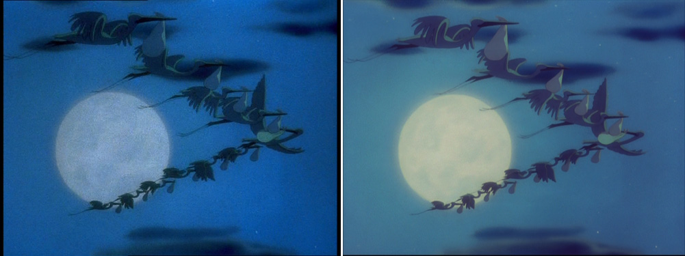
On the left, we have standard night time. The whole picture is blue like in many day-for-night scenes. This is clearly optical color grading at work which of course is common in live-action films. It might have been that way in re-release prints yet I doubt that the original was planned as a two-color scheme (blue and pale yellow) and then optically reduced to blue. The 2010 version is a lot brighter, though, showing more subtlety and supporting the thesis that for normal TVs concepts had to be pushed to the extreme to be understandable.


Conclusion: All quibbles aside, this restoration is the one looking best on today's equipment regardless of historical accuracy. Had the 2001 edition been transferred more carefully (no boosting and edge-enhancement) or from the consecutive-exposure-negative (more subtle colors and less grain) rather than from a contemporary print, it might have stood the test of time next to the aseptic Bluray.

I myself prefer the strict historical approach. Wouldn't it be marvellous to have access to the 35mm version as well? Maybe someday resemblance to the original becomes fashionable enough to be a selling point. I can dream, can't I?

the left-hand screenshots are taken from this Special Collection DVD from October 2001,
the right-hand screenshots from the 70th anniversary Bluray + DVD edition from March 2010 (Screenshots taken from the DVD which is identical to the BD except for resolution and compression). Unfortunately, neither of them includes John Canemaker’s great commentary track that is on the American 2006 Big Top Edition which I do not own.

Sunday, April 12, 2009

Sleeping Beauty - A perfect introduction to Blu-ray?

It no longer looks like a great DVD folks - it looks like film. The sharpness becomes an added bonus - one that can actually distract from the narrative - it is so distinct. Be careful not to swoon too much!

If something looks like film, it distracts from the narrative? The irony of this is almost unbearable. Yet I think, not all hope is lost.

The distancing effect of technological novelties
There has been a lot of moaning about 3-D being a distraction as well. Had it simply been accepted as the minor narrative advancement that it really is, I’m sure no one would complain, because a well-used device should go unnoticed by the average viewer (how many people complain about intensified continuity or too many close-ups in current Hollywood cinema?). But with ridiculously overinflated marketing campaigns and the need to wear glasses, our whole attention is deliberately misguided to a minor storytelling device that works a lot better when not noticed consciously. Maybe it is supposed to detract from the other deficiencies of some of the films.

In other words, the more unobtrusive possibilities of 3-D could only be exploited if 3-D became normal. But since it seems impossible to get rid of the glasses in the near future, this won’t happen any time soon. So it is beyond all question that 3-D is a fad once again. There are technical and financial reasons for this as well, of course.

Unless you have to wear glasses and pay more, adaption to technical novelties and different media is usually pretty fast on the condition that the immediate benefit of it is obvious. Nowadays, easy handling, availability and low costs are generally more important than technical quality. On this ground it is not surprising that Blu-ray Disc is not yet the mass medium it was designed to be. It speaks to the same diminishing group of people who care about the quality of the movie going experience in general.

But – to come back to the DVDBeaver quote – how can sharpness “distract from the narrative”, if it doesn’t when we see the same movie in a cinema on superior 35mm? Because we are used to a certain quality in cinemas but not on our TV screens. There’s another reason: if you’re picky about image quality, you positively want to see the improvement over DVD. So I’m sure this distracting side effect wears off as soon as we are used to watching HD.

Adaption can be your friend
Do you remember what it felt like the first few time you watched a movie on DVD – or for that matter on a laptop or even an iPod, if you care for such an imbecility? I was so impressed with the “improved” picture and sound quality (compared to the much loathed VHS) that I was paying more attention to technical issues than to the storyline. Needless to say that the emotional experience suffered regardless of the movie. I’m sure this technical awareness was the same when sound, color and widescreen were introduced. For example, it’s no co-incidence that countless showcase movies with no substance accompanied these changes (This Is Cinerama, anyone?).

Now I have the same feeling with BD again. I know people who buy movies just because they look good on Blu-ray, no matter what they think of the content. One can enjoy picture and sound quality like one enjoys caressing satin or fur. Reviewers sometimes even mention the “tactile qualities” of digital eye candy.

For me, a 2K transfer can never substitute for a 35mm print. But I’m excited that it has the potential to reproduce images a lot closer to their original appearance than any electronic format before. (Well, theoretically that is. I won’t digress into the many ill-fated paths the studios are taking with this potential, because Robert A. Harris has already done that here (The Great Grain Debate) and here.)

The perfect introduction to Blu-ray
As long as watching films on Blu-ray is still the exception with many people only slowly converting to the new format, it was probably Disney’s best move to pick Sleeping Beauty as their first BD release, because it actually benefits from the circumstances: it is loaded with detail to an almost nauseating level, it was shot in Super Technirama 70 and it doesn’t work on an emotional level anyway.

I don’t approve of the restoration methods, because the movie now looks like it was made on CAPS during the Katzenberg era. The new restoration has warmer colors (by the way, whatever happened to Lou Romano’s self-explanatory screenshot comparison?) but I don’t think at this point anybody not having an IB-Tech print for reference can tell what they were supposed to look like. In the 14 years since its last theatrical re-release we have seen all kinds of variations.

It is a wide-spread belief that you don’t see the advantages of hi-def in animation as much as in live-action. Thankfully Sleeping Beauty proves this wrong. One of the wonders of high-definition is the possibility to keep lines unharmed by compression and reduce color bleeding substantially.

As a real bonus some of the special features, especially Grand Canyon, are included in HD as well. This half-hour showcase presentation (no dialogue, just music) once again benefits immensely from the novelty of the format. I’m sure it wouldn’t have found its audience in 1959 hadn’t it been for the relative novelty of Cinemascope. For good measure it is well restored and you can actually see that it was shot on film.

Well, Sleeping Beauty was the first movie I have seen on Blu-ray and I have to admit that this was the first time I really liked it. For the first time I wasn’t disappointed by its many shortcomings. I like films for many different reasons, not just for their emotional impact, but with Beauty I’ve always had this overwhelming feeling of a great missed opportunity with a few brilliant scenes. Somehow I’ve come past that and I think it had a lot to do with being distracted from the story. I can simply enjoy it now for what it is: a manneristic “moving illustration” with strong 1950s American overtones.

However, my copy of The Searchers is sitting on the shelf until I’m used to HD. After all, enjoying John Ford’s flawed masterpiece simply on a technical level wouldn’t do it justice.

For more screencaps see DVDBeaver (there was no DVD attached to the European BD of Sleeping Beauty, so I'm not yet able to do my own screencaps. Fortunately, this omission has been corrected on Pinocchio.)