Showing posts with label one shot. Show all posts

Monday, October 17, 2016

FROM HERE TO IMMORTALITY

One of the short films I worked on is officially available online! FROM HERE TO IMMORTALITY had quite a long and sometimes exhausting production history, but writer/director Luise Hüsler showed an extraordinary amount of perserverance and kept the project on track with her positive and collaborative spirit.

From the distance of a few years, I think a lot of her initial ideas actually came through in this mockumentary interview with two aging cartoon stars who never really reflected on their violent relationship. But see for yourself - and share it if you like it:


I animated about 80 seconds of the hand-drawn final act: 6:10 - 6:18 and 6:40 - 7:55 and did some effects animation (smoke and fire) for the cut-out part. All the other hand-drawn animation is by the great Simon Eltz. We approached the hand-drawn part (from 5:55 on) the old fashioned way with bar sheets which we then turned over to Jorge Riesenfeld who - in addition to lending his voice to Jeremiah - did all the music.

Besides doing the layouts and painting all the backgrounds I worked on the final compositing in close collaboration with Luise to preserve the hand-held single-take look she originally envisioned for the interview. On the right, you can see some of the very fast whip pans from one background to the other.

Sunday, July 5, 2015

Roy Andersson Reklamfilmer and the Complex Image

Falcon Bayerskt Commercial by Roy Andersson
With his trilogy on "being human" (SONGS FROM THE SECOND FLOOR (2000), YOU THE LIVING (2007) and A PIGEON SAT ON A BRANCH REFLECTING EXISTENCE (2014)), Roy Andersson has made a name for himself as one of Sweden's most original film auteurs.

While his first two narrative features from the 1970s already explored similar themes, the establishment of his signature style of one shot scenes (dubbed "the complex image") is usually traced back to his 1991 short film WORLD OF GLORY. For Swedish tv viewers it might be obvious however, that Andersson was working in this peculiarly funny style for many years as a director of commercials.

As Andersson himself wrote in 1995:
"I have not only worked on feature films, but also commercials, and there too I have worked with the complex image. I would like to suggest that it is during this work with commercials that I have realised the advantages, even superiority, of the complex image. I can find no reason to communicate something in several images if it can be done in one. I enjoy both watching and describing someone within a room - in the widest meaning of the word."

In the following two compilations of his commercials (two more are available on youtube) you can see many of his signature traits such as:
  • one-shot scenes
  • exclusive reliance on deep focus long shots
  • sickly greenish gray colors
  • the importance of offscreen sounds
  • relationship between inside and outside action and doorways
  • absurdist humor
  • and most of all disrespectful behaviour towards one's fellow human beings, especially older people and spouses.


Monday, November 10, 2014

Lukas Moodysson revisited: LILJA 4EVER


During my research for an introductory lecture on Lukas Moodysson's VI ÄR BÄST! (WE ARE THE BEST!) I couldn't help marvelling about the recurring color schemes in his first three features. Even LILJA 4EVER (2002) which most people remember as particularly grim and bleak is full of carefully chosen colors.

From warm to dingy
To make up the lack of in-depth posts I will have a superficial glance at the color coding of Lilja's three apartments during the course of the film:

Initially Lilja lives somewhere in Russia in a world of warm colors that go quite well with her blue and lilac clothes.


But when her mother is leaving for America and dumping her for good, her aunt Anna forces her to move to a dirty room with hardly any heating or electricity.
She always carries with her a framed religious picture.
 Now her pink and blue clothes support the already cold bluish-green feeling of her new home...

...while Anna has secretly usurped the warm apartment of Lilja's mother.

Lilja's friend Natasha still lives in her cozy family environment...

...after Lilja has been lured to Sweden where she is locked up in an empty but nevertheless dingy apartment.

There, the furniture is almost exclusively brown and gray and thus reflects the appearance of Lilja's tormentor.

Her daily routine now oscillates between equally brown and gray/white clients' homes and the cold blue back seat of a shabby Mercedes 190 E...

...until her face looks as pale as her future.

If you have not seen LILJA 4EVER yet, go for it! It is one of the rare occasions of an important movie that is actually great and accessible for a late teen audience and thus highly recommended.

Thursday, August 8, 2013

One-Shot: The Kite Runner (2007)


Years after seeing Marc Forster's adaptation of THE KITE RUNNER I mostly remembered the costume colors. So when I revisited it last week in the course of studying Forster's personal film making style I still found the colors to be most attractive. Considering that they are based on the now well-worn drama cliché of blue against sandy brown this is saying a lot. There is so much variation throughout the film that I cannot possibly do justice to the color design in this short "one-shot" post. But since Marc Forster is very deliberate and particular when it comes to colors in his films I would like to highlight two facets that I liked in THE KITE RUNNER.

From two-colored present America back to three-colored Afghanistan
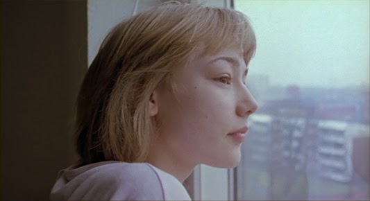
Having just received the specimen copies of his first novel, Amir (Khalid Abdalla) gets a phone call at home that triggers memories of his youth in Kabul. Both he and his wife wear dark blue clothes against more or less monochrome sandy colored surroundings.
When one of his late father's friends calls, a flashback to Amir's happy childhood days in Kabul sets in. At first the color scheme is basically the same but the blue is more vivid, less repressed.
Then suddenly a second kite brings orange and green into the frame. The lighting seems naturally golden. Then we see a young boy whose clothes are orange, blue and sandy brown.
These are no doubt the quintessential 1970s colors (a title overlay states the year 1978). And although this story is set in an Oriental desert, we soon learn that the Afghans are indeed influenced by American fashion (movies and cars).
Young Amir's (Zekeria Ebrahimi) best friend Hassan (Ahmad Khan Mahmoodzada) is clad in blue in this expository scene of their close friendship and interdependency.

Soon we meet Amir's Baba (Homayoun Ershadi) and his best friend Rahim Khan (Shaun Toub). Rahim's orange shirt and tie against a gray suit, by the way, was the color scheme that I remembered most vividly:
Although the apartment looks very warm and golden, DOP Roberto Schaefer managed to keep the gray suits from looking muddy. It is this slight contrast of gray against sandy brown that makes this color scheme stand out from the many sepia toned, nostalgically warm stereotypes I have seen over the year (just think of interior scene in any recent Woody Allen film). In many ways, it is equal to the color design of FANTASTIC MR. FOX which is also reminiscent of the 1970s.
Marc Forster's scenes are usually very tightly composed in matters of color design but not as obviously flashy as in Jerry Bruckheimer or James Cameron movies.

[Note: Later on in present Pakistan the overall color scheme is still based on sand and blue but feels a lot colder.]

Green stands out
The one color that seems to have a special significance to Marc Forster is green (J.M.Barrie's apartment and the park in FINDING NEVERLAND, 2004; the fatal green apple in STRANGER THAN FICTION, 2006). I have found it to be very deliberately used in all of his features except QUANTUM OF SOLACE (2008) (although Forster mentions a green door in an interview), where at least the villain was named Dominic Greene.

I have not yet found out if there is a recurring symbolic meaning to it or if Forster uses it in a new context in every film. In THE KITE RUNNER, Amir stand on green Californian meadows in the beginning and end, but in Afghanistan (and later Pakistan) there is hardly a green piece of cloth except in two connected scenes.

After Amir has abandoned Hassan he schemes how to get rid of his too loyal friend. During the preparation for his birthday party he asks his father to send Hassan's father away. Soon after he comes up with a more effective plan to betray Hassan. He lies to Baba - who now wears a green jersey - telling him that Hassan has stolen Amir's watch.
Amir's plan works out when Hassan loyally takes the blame on and his father decides to leave for good.

I have yet to look at the film more closely to see if there is another instance of Amir or his father wearing green and if there is a connection to Amir's betrayal that serves as his narrative backstory wound that motivates the film.

Friday, May 31, 2013

One-Shot: Dr. No (1962)

Whenever I feel the urge to write about some detail that stood out to me in a movie, my impulse to only write about it within an appropriate context often leads to my not writing about it at all. To counter this habit, from now on, I try to post such observations every now and then as "one-shot" articles unrelated to the more indepth analyses.

The other day, I was examining the parallels of DR. STRANGELOVE (Kubrick, 1964) and DR. NO (Young, 1962). During the first act, Bond (Sean Connery) meets a Jamaican called Quarrel (John Kitzmiller) who wears a red T-shirt one cannot help but notice.
The original color as seen in the film.
Everything else in the shot is muted and in the same range of blue-grey-green. Next to Quarrel's red shirt, Bond looks like a part of the scenery. It just occured to me how different this first encounter would have come across, had Quarrel worn a less conspicuous color.
Digitally desaturated T-shirt: just an average guy whose appearance goes largely unnoticed.
Then I asked myself, why red, the most alerting color of them all? Well, the answer the rest of the film seems to suggest is as simple as unpleasant:

1.) The simple one: We have to recognize him in later scenes. The film makers may have been afraid that the audience would have a hard time distinguishing various Jamaicans if not for their clothes. After all, Quarrel always wears the same red T-shirt throughout the film while the Brits and Americans are allowed to change their clothes. In fact, Quarrel is so important to the story that we do have to recognize him even at night.
2.) The unpleasant one: Quarrel is a walking stereotype. He is the typical good guy who follows instinct instead of intellect and thus is shown as inferior (even childlike in his superstition about a dragon) to all the white men in the film. And what better color than red to symbolize a person who only acts impulsively ?

He also shares the common fate of black actors (until the end of the 1960s when Blaxploitation movies started to reverse the formula): Quarrel proves a worthy subordinate partner to the white hero and therefore has to die in order to make way for his British friend to save the day.