Showing posts with label technique. Show all posts

Friday, March 30, 2018

ISLE OF DOGS Exhibition in London

The three quarter view we never get in an Anderson film.
If you happen to be in London, try to squeeze in a visit to The Store, 180 The Strand to see and feel the sets of Wes Anderson's glorious new stop motion feature ISLE OF DOGS from a different perspective. The exhibition is free, so even if you don't have enough time to really dive into it, have a look at it.

During the ten minutes I had in there, I tried to take a few pictures that open up an alternative view on the familiarly flat Wes Anderson signature shots: three quarter views and a stereoscopic image to see what the scientists' set looks like in 3D (which obviously goes very much against the grain of Anderson's style but is great fun).

See it in 3D! Propably best viewed on a cellphone.
And that's how the lighting effects in the tunnel were achieved.

That's an advertising campaign I like!


Monday, June 26, 2017

Annecy 2017 Impressions

Annecy always reminds me how thriving the animation community is and this year's edition was no exception. In the end, I may not have seen as many films as I would have liked but the combination of wonderful people, sunshine and two pedalo rides more than outweighed that, especially looking back eight days later.

As always, I also discovered bandes dessinées I have never heard of and was introduced to the works of inventive animation directors that had previously slipped under my radar. For example, I wouldn't have chosen to go to a screening of Crystal winner LU OVER THE WALL (Yoake tsugeru Rû no uta) if my friends had not already had tickets and knew what they were in for with Masaaki Yuasa.
Overwhelming water animation in LU OVER THE WALL.

Some 2017 Favorites

My favorite film was certainly MIN BÖRDA (Niki Landroth von Bahr, 2017) from Sweden in which a couple of lonely animals "sing" about their isolation. If you're not sold after seeing the singing fish in the trailer below (how could anyone not be), then surely the prospect of an animated Roy Andersson short film will get you interested.

The Burden (Min Börda) - trailer from Niki Lindroth von Bahr on Vimeo.

MIN BÖRDA was one of several stop motion films that included a long shot showing the whole set from an outside perspective. In contrast to the more meta-level versions (akin to Fellini's E LA NAVE VA, 1983) in several other puppet films, in MIN BÖRDA it actually was a diegetic shot, though.

NEGATIVE SPACE (Ru Kuwahata/Max Porter), another stop motion short, stood out to me not only because the tone of the storytelling was just perfect but also because I really admired the careful animation, especially the make-believe wave on the beach.

Negative Space - Trailer from Tiny Inventions on Vimeo.

With the advent of digital cinema, the once extravagant cinemascope aspect ratio (1:2.39) is available to even the most underfunded film maker and therefore increasingly popular. What does not automatically come with a wider frame are the skills it takes to make such compositions work (as has been already proven during the 1950s in live-action cinema). Thankfully, Michelle and Uri Kranot mastered the format in NOTHING HAPPENS, a film "about watching and being watched". And as I have learned on vimeo, the film that with all its fixed camera setups looked so non-digital on the big screen is also a virtual reality experience:

Nothing happens- an animated virtual reality experience from Michelle & Uri Kranot on Vimeo.


Being always alert to color trends, I noticed how many of the films I liked made heavy use of blue either in conventional terms of cold v warm, orange - teal or more boldly like in MATERIAL WORLD (Anna Ginsburg) that won the Annecy Crystal for best commissioned film.
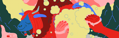
The beauty of instructional videos: MATERIAL WORLD
In that light, it certainly fitted perfectly well that in the very same commissioned film program a CNN explainer addressed the very color:

Blue - CNN from Moth on Vimeo.

The commissioned films program was a real delight because it provides a nice usually give you a nice overview of current styles popular in the more inventive sections of advertising. And for me, getting an overview is one of the things that also draws me to internationally renowned annual short film competitions like Annecy.

Some concerns about short film compilations

The programming of this section, however, is highly problematic. If you saw only one or two screenings instead of all six, you would come to an extremely distorted conclusion about current trends in animation. Because:
A) not only are many of the more experimental films lumped together into one single "off-limits" program (which both makes it harder to process them all and turns away many a viewer who normally would not mind a challenging experiment in between more easily accessible films), but also
B) the films in the five "normal" competition compilations seem to be increasingly segregated as well by style/technique and even content (I wasn't alone with the impression that I saw a program full of meta-stop motion films and one full of either handpainted or pixilation/live-action-animation combinations). It may make sense from a critic's point of view to compare three similarly themed stop motion films that feature invisible imaginary walls, but to the audience the effect is more like "oh, another one of those" which does not do the individual films justice.

Brush strokes and the power of voice acting

But to close on a more positive note: a packed Bonlieu, Grande Salle is still the most exciting place to see a film on the big screen simply because it produces the most enthusiastic audience I have ever seen. And this, of course, was the case on my first day, when I thoroughly enjoyed the first "public" screening of LOVING VINCENT and contributed to a ten minute standing ovation that made it into Variety.


Writer-director Dorota Kobiela had the crowd on her side right from the beginning when she emotionally dedicated it to her grandmother. What most surprised me - and ultimately convinced me despite the film's many flaws - was the fact that the concocted mystery plot worked so smoothly. Maybe a bit too smoothly and certainly too rushed at times when everything that vaguely resembled a reflective moment was plastered with Clint Mansell's far too obtrusive score before I had time to catch a breath.

But - and that is a much more serious problem - the film, well-acted as it is by the likes of Chris O'Dowd and Soairse Ronan, would easily work as an Irish radio play which literally means that apart from a few imaginative scene transitions the filmmakers failed to make use of the visual potential of a feature film consisting exclusively of oil paintings and simply illustrate talking heads. For sure, the paintings are expertly executed, the flow is a lot better than in almost any rotoscoped feature I have seen and the colors alone are a fantastic treat. But narratively, there is nothing gained from the brush strokes, no new insight into the characters that is not already in the dialogue. Stylistically, despite the unifying rotoscoping, the well-proportioned actors walking through off-perspective backdrops often reminded me of the Dali dream sequence in Hitchcock's SPELLBOUND where Gregory Peck stumbles through deliberately unbalancing expressionist/surrealist sets.
LOVING VINCENT: live-action v rotoscoped in oil.
But still I enjoyed it and I warmly recommend seeing it. Even if mostly for pulling this feat off and hopefully making people all around the world re-discover an artist who is so popular today that we take him for granted. And if that comes through a combination of eye candy and tv style murder mystery, so be it. I'd rather see that one again over yet another superhero origin story.

Speaking of origin stories: the basic parent - child relationship inherent to any origin story seems to have replaced the love story as the primary emotional trajectory of mainstream films from BEAUTY AND THE BEAST (Condon, 2017) to LOGAN (Mangold, 2017) or ROGUE ONE (Edwards, 2016). Thus, it came as no surprise that many films in the shorts competition dealt with remembering a recently deceased parent. A special treat was PÉPÉ LE MORSE (Lucrèce Andreae): a prime example of fluid, atmospheric storytelling - at 15 minutes it never dragged - and strong voice acting which I am very partial to yet which is not so easily found in animated short films.


Pépé le morse - Teaser from Lucrece Andreae on Vimeo.

Monday, May 8, 2017

THE LEGO MOVIE: Creative Imitation of a Brickfilm (Video Essay)

There are many reasons why you should watch THE LEGO MOVIE (Lord/Miller, 2014) at least once (and I am certainly not talking about the worn-out "special one" fantasy formulas). 
Some things that I keep being fascinated by are A) the film makers' total commitment to make their computer generated blockbuster look like a real brickfilm, and B) how they adapt techniques and stylistic devices of hand drawn cartoons into three dimensions in order to compensate for a conceptual lack of motion blur. And C) there is an annoyingly jolly unicorn-kitten called, well, Unikitty.

So without further ado, my latest animation analysis video essay:
(works best in full screen)
Note: All the video, images and sounds in this animation analysis are the property of their respective copyright holders. They are displayed for educational purposes only with no commercial intent.
This video essay was first published (and is also available) with German voice-over narration for "film bulletin" here: filmbulletin.ch/full/artikel/2017-5-2_brickfilm-meets-tex-avery/

Introducing the Animation Rules

THE LEGO MOVIE does a really great job in establishing not only its setting but also its basic animation style and premise. After a classic pre-credits scene introducing the main villain, the super weapon and the prophesy about an average Joe becoming the great saviour, we enter the main story on an extreme close-up on Emmet's eyes. Emmet is said average Joe, of course.

Here, we clearly see that Emmet's face is two-dimensionally animated and basically flat on the yellow surface of a typical minifigure head piece. In the next shot, we see a close-up of Emmet's rigid hand that tries to turn off the alarm clock which shows us right away how in this film the materiality of plastic LEGO pieces will not be digitally bent. After that, most of us will - subconsciously, at least - assume that this is a concept the film adheres to. Especially after we see that Emmet's flexibility is restricted by the available joints in his body parts...
...which work exactly like the trademark LEGO instruction manual demonstrates.
During Emmet's morning exercises, he jumps a few times:
And now we come to an observation that did not make it into the video analysis: the interesting thing here is how the briskness of the jumping motion is achieved by abstaining from inbetweens during the up and down movements. As you can see from the timecode of the GIF below, the character just goes from anticipation to the up-position and after a few cushion frames back to the down position with a "falling" inbetween.
You can also see that despite this being a computer animated film the film makers tried to animate the characters on twos whenever possible like in a real stop motion film. Most often, the characters are even animated on twos during camera movements which are naturally animated on ones:

2 poses held for 2 frames each.

Friday, November 18, 2016

PAPRIKA Animation Analysis: Opposing Forces Within One Body

Satoshi Kon had a unique way of telling stories on parallel levels of reality. While this is most obvious in the editing and scene transitions, the actual animation by Madhouse is certainly worth analyzing as well. 

One scene from PAPRIKA (2006) I find particularly interesting from an animator's point of view is about two characters with opposing goals that share one single body. While the superficially realistic animation of many Madhouse films is sometimes mistaken for rotoscoped live-action reference material, here the animators' mastery of expressing weight and forces within an acting scene are fairly obvious. It is in fact a very sophisticated example of how to successfully apply all the basic animation principles.
many simultaneously interconnected movements in different speeds; squash and stretch on the heads.

Analyzing Animation
When I analyze an animation sequence, I ask myself what the objective of a each shot is, i.e. what story point (or "beat" in McKee's language) we learn from a shot, and how this is visually communicated through animation (= movement).


[NSFW] Animation Analysis of a Scene from PAPRIKA (Kon, 2006) from Oswald Iten on Vimeo.

What we can learn from analyzing the work of master animators, storyboarders and layouters for our own work are answers to questions like:

Storytelling
  • Which movement is best suited for the story point we want to get across?
  • Which shot size is necessary to communicate this movement?
  • How do we make sure that the audience gets the story point and is not distracted?
Acting/Animation
  • When do we need to hold a movement?
  • What body part leads a movement and to what effect?
  • How can we use counter-movements to emphasize strength and energy?
  • How do we organically time struggle and bursts of energy?
  • When does it make sense to switch from "twos" to "ones" or "threes"?
But the most important inspiration for any character animator should always come from observing reality and human behaviour around us.

If anyone knows the names of the animators who worked on this sequence, please let me know, I would like to list them here.

[Update 2016-12-23] Thanks to reader "ibcf", we now know that the animators were: Ei Inoue and Toshiyuki Inoue!


Friday, April 29, 2016

Simulating a projector shutter in HUGO 3D

Martin Scorsese's HUGO (2009) is a real compendium of film and animation techniques. In a pivotal scene, the film even simulates the one device that is most often taken for granted but is essential for the illusion of motion in mechanical film projection: the shutter.

If you pull a film strip through the gate of a projector past the lamp, you simply see a fast moving strip in a blur. In order to fool the eye into perceiving motion within the frame (due to persistence of vision) the images on the filmstrip have to stand still for us to register. Then the strip has to be transported without the viewer noticing. This is achieved by an intermittent mechanism consisting of a Maltese cross for transportation and a revolving shutter (see below) that shuts out the light exactly at the time the film strip is transported to the next frame.
(Image from English Wikipedia)


As we all know, a flip book does not need a shutter because the pages flip out of sight (or rather past our focus). Due to its nature, in a book as opposed to consecutive frames on a filmstrip the images stay in place.

In a key scene near the mid-point of HUGO, while Méliès' pre-production art floats around the room due to clumsiness on behalf of the investigating children Hugo and Isabelle, Martin Scorsese shows us two animation sequences based on sheets of paper:
I like to add a time code* so that the scene is easily found within the film and we also see how long each image is on screen.


The Fire-Breathing Dragon
The seven animation drawings slightly aligned.
In the first one of a fire-breathing dragon, Scorsese's film basically simulates the action of flipping (or rather rolling) through a stack of animation drawings. This is the same mechanism as a flip book. But in addition to that, Scorsese simulates a visual shutter:

Whenever an animation drawing is floating away, another piece of paper zooms through the frame (in roughly the same direction, and closer to us in 3D) obscuring the actual transition like a rotating shutter in a film projector. In the video excerpt above you can hear that this is matched by a chattering sound. Note that the animation artists even included a "hold" of two identical drawings (#5 and 6) to accent the animation.

This scene is based on a Méliès drawing (above) for the film LE PALAIS DE MILLE ET UNE NUITS (1905). A variant of this scene is later used in an extensive flashback sequence to show how Méliès shot his films (below).
In the real film, the dragon scene looks slightly different with a less elaborate dragon on display.

The Magical Thaumatrope
The butterfly lady animation in the second part of the video above plays a trick on the setup of a Thaumatrope (see a Thaumatrope in action). When we turn a piece of paper around its horizontal axis, the transition to the next image, i.e. the flipside, is "invisible" because the paper is visually contracted and then expanded. We do not need a shutter to mask the transition.

Because we focus on an object close to the imaginary turning line, we see it long enough to register. This also works so well because of the strong contrast between the moving object (the bright fantasy character) and the muddy background. The impossible "magic" trick here is obviously that, every time the page turns, a new animation frame is visible resulting in a continuous motion whereas a Thaumatrope only combines two images into one.

* The time code refers to the Blu-ray3D version of HUGO.