Showing posts with label miyazaki. Show all posts

Friday, September 6, 2013

Miyazaki's homage to an imperturbable St. Bernard


Now that Miyazaki's retirement plans seem to be more definite than ever (unlike the three times before), it is a good point in time to dig deeper into what made his storytelling so different from mainstream animated features and yet so universally appealing.

His 1989 children's book adaptation KIKI'S DELIVERY SERVICE is a film that grows on me everytime I see it. Recently I have started to compare it to another blockbuster that came out in 1989: THE LITTLE MERMAID (Clements/Musker). As soon as I have figured out how to organize my thoughts and analyses, I will write a series of articles about these two films. But more on that later.

For the moment, I would like to guide your attention to a significantly more superficial observation that always makes me smile: The imperturbable St. Bernard.

If you have ever seen Takahata's ARUPUSU NO SHOJO HAIJI (HEIDI - GIRL OF THE ALPS, 1974) you will remember the grandfather's sleepy St. Bernard called Josef (or "Josefu" in Japanese). In the beginning the five year old girl does not know what to make of him as you can see in the following clip from episode 2:
I have chosen this clip because Josef's musical leitmotif (more like a fully rendered theme) is heard for the first time. To me, the dog's character is as much defined by this lumbering tune as it is by his cumbersume and phlegmatic appearance.

In episode 4, after it is implied that Josef is naturally chasing birds, he unexpectedly saves Heidi's pet bird Pitchi:

St. Bernards used to be called "Saint Dogs" because they were traditionally used for Alpine rescues and often depicted with a barrel of brandy around their necks in contemporary paintings. It is therefore only natural for Josef to be in the life-saving business as well.

Most often however, we see him dozing somewhere (see below).
St. Bernard Josef does not seem to be attentive but never misses anything that goes on around him.
15 years later, Miyazaki pays homage to Josef in KIKI'S DELIVERY SERVICE: Kiki's sidekick Jiji is forced to substitute for a stuffed cat that Kiki lost on the way to a boy called Ketto. Now Ketto not only has a pet bird that goes by the name of Pitchi, there is a sleepy family dog as well. Of course, the black cat Jiji is instantly afraid to be alone with the large dog. But Ketto's dog does not seem to be interested in following its instincts to chase the cat.
Ketto's family dog in KIKI'S DELIVERY SERVICE shares most of Josef's characteristics.
Although this dog is drawn much more realistically and does not really look like a St. Bernard, it shares most of Josef's characteristics in personality and appearance. Joe Hisaishi even paraphrases the recurring musical theme albeit more sophisticated as you can hear in the following montage of the three dog scenes:
Josef's reincarnation finally (1:11) saves the heroine's pet in a similar way. Here, however, it is not played for suspense but for laconic humor that derives from the dog's imperturbable motion.

Thursday, January 10, 2013

Japanese Haiji vs. German Heidi


The visual difference between a faded 16mm print used for TV broadcasting and a remastered Blu-ray is obviously striking. But when a show is released with two different soundtracks by two different composers, faded colors become irrelevant. Even if you don't understand a word of Japanese or German, these clips will speak for themselves.

Arupusu no shôjo Haiji (1974 aka Heidi, girl of the alps) is probably the most well-known Japanese TV series in Europe. It has been a real breakthrough not only for Nippon Animation's "World Masterpiece Series" but also for director Isao Takahata and "scene designer" Hayao Miyazaki - who drew every layout of all 52 episodes himself.

After so many film and TV adaptations (American, German and Swiss) it is safe to count Takahata's version among the most faithful - if not THE most faithful - retelling of Swiss author Johanna Spyri's 1880 "Heidi" novels about the surfacing town-country conflict of industrialized societies. Of course, alterations had to be made and incidents had to be added in order to keep 52 21-minute episodes (not counting credits and episode previews) interesting.

But this enormous running time leaves room for a leisurely pace that allows the audience to experience the many faces of nature. Needless to say that even in such a tightly budgeted show the founders of Studio Ghibli squeezed in many shots of animated weather (especially wind and changing seasons).

So if you are able to look beyond the very limited animation and stereotyped character design you will discover a well researched and touching tale of a girl who learns to love nature only to be sent away to a German city that has "no wind and no trees".

The sound of music
Of course, the melancholy atmosphere is greatly influenced by the soundtrack - Takeo Watanabe's music in particular. Although there are only five or six themes used in the first 18 episodes that take place on the mountain pastures above Maienfeld (Graubünden, Switzerland) the cues fit the action perfectly. These tunes range from jaunty (for Josef, the dog) to elegiac, but the underlying emotion is always one of longing. At times, Heidi's music seems to come straight out of an Italian film of the era.

But - and this is an enormous but - you only hear these tunes in the original Japanese language version (and the feature-length version released to US theaters in 1975). In German speaking countries most people associate Heidi with tunes by Gert Wilden.

Since I couldn't bear watching anime series as a child (they always looked like a series of badly drawn and dubbed still images to me and had nothing in common with my conception of animation) I have never seen more than a few minutes of Heidi. Although now I have learned to accept this Astroboy-as-a-little-girl design approach (thanks to a "fan sub project"), I doubt that I would have been as taken with this series had I been forced to watch it in German.

Before the days of high definition
Before talking about the soundtrack let me remind you that Heidi was conceived and broadcast as a TV series. It is therefore not surprising that the German DVD box set uses a print that seems to be too high on brightness and contrast and displays some color cast.

TV screens used to be quite different and very small in the 1970s, black was a middle grey at best and around Europe some people still had black and white monitors. For all we know, the picture we get on the German DVD may represent the original viewing conditions much closer than the meticulously remastered transfer of the Japanese Blu-ray.


left: German DVD - right: Japanese BD
Pushing the brightness in dark scenes so that TV spectators could at least see what was going on was not uncommon...
...the greenish cast and the bleaching outlines, however, are hardly there in the original negative.

Contrast is much higher on the left, but actually Heidi's clothes look more natural. The interior around the old woman is definitely colder (closer to blue) in the left and warmer (closer to brown) in the right image.


Heidi's colors are warmer and more harmonious on the left (A-F) but the color contrast between her shirt (C) and her skin tone (D) is stronger on the right. While overall contrast is lower, the greenish sleeve (C) seems to stand out a little too much.

In a different mood

While the Swiss are quite used to hearing Swiss characters on TV not talking in their native Swiss German but the standard version of the language as spoken in Northern Germany, it is fairly unusual however that when a German producer decides to rebuild the whole soundtrack from scratch including the music he does not substitute the Japanese score with a Swiss score. Instead Moravian-born German composer Gert Wilden who was at the time best known for his music for erotic films was hired to rescore the entire series.

My comparison starts after the credits sequence because the catchy title songs can be easily found on youtube. So let's listen to the very beginning of episode 1:

Note: all examples Japanese first, German second.
The Japanese opening is full of tension and foreboding. The lonely girl Heidi is introduced with a lyrical accordion. After that we only hear the silence of a village at dawn and a girl waiting in anticipation. Wilden's music (starting at 1:43) seems like a rhythmical stock track that just fades in. It is already jaunty and sounds more like the background in a commercial for a Bavarian resort than a score to a deserted early morning scene. Moreover, the music does not change when Heidi is introduced and goes on even during the rooster scene until the first line of dialogue. No matter what style of music one prefers it is obvious that the different approach to scoring changes the scene far more than the differences in color.

It sounds as if the German producers went to great lengths to undermine Takahata's basic mood of slow pacing (long silent moments) and longing (melancholy themes without a constant drumbeat). And to be honest, it seems strange that Heidi's voice sounds so much older in German.

As the next clip demonstrates, the notion of a female narrator that clearly reflected the novel's female author has been replaced by a standard male narrator as well (the same had been done to Cinderella when it was partially re-dubbed around the same time, as you can hear here):
In addition to the narrator, again the elegiac tune with the small sentimental changes is replaced with an alpine oompah oompah tune (0:38) that doesn't even sound Swiss to me. During the narration the music at least seems to be explicitly scored to the film.

The next example consists of two sets of clips that show how both the dramatic/scary and the sentimental scenes are toned down by Wilden's score:
The Morricone-like tension of the argument is de-emphasized and the sad good-bye sounds a lot more down-to-earth in the dub.

Occasionally, the Japanese version includes a genuine Swiss song like "jetz wei mer eis jödele":
In the German version however any reference to Swiss German is carefully omitted (even the word "Dörfli" which means "little village" is treated as if it was the name of the village) and replaced by narration.

Just to show that this is common throughout the series, here's another moment where story takes a backseat to mood:
It seems that Western television always had this urge to move the story forward. Somehow, Japanese children seem to have been considered more patient. It's interesting, by the way, that the music (behind the narration) of these later episodes resembles the Japanese score more closely.

Early on, Heidi has a dream which is a good example of the differences in relying on music, silence and soundeffects in an eerie and touching scene:
Again the power of silence and "time standing still" is minimized by the German score. And again a song (this time Japanese) is replaced by narration.

In following example the Japanese version is scored during the pan down from sled to the children (0:10) while the German soundtrack contains music during the pan down along the fir trees (0:55) and vice versa!

There is a strong indication that the sound effects have been rebuilt as well:
Is it just me or did they simply paste one single "moo" about four times on the German soundtrack?


The reason of this comparison is not to deride Wilden as a lesser composer than Watanabe - for all we know, he was only following the producers' directions. The reason of this post is to demonstrate how much music can change the way we experience a film even if the pictures are identical.

The German soundtrack may have been put together with utmost care and really good intentions - maybe they didn't want to upset or bore German children with storytelling that was deemed too Japanese, and certainly sentimentality wasn't very popular in those days. After all, Wilden's music is crucial to the way generations of German speaking children have experienced and loved Heidi.

Ultimately it is a matter of taste which scoring approach one prefers but only one of them is true to Takahata's vision.

Note: Up to date, there is no DVD available that includes both language versions simultaneously. There's not even an official release that features English or German subtitles yet.

Friday, December 14, 2012

Laputa - Castle in the Sky: Red Pirates, Green Soldiers

This will be the first post in a series about complementary contrast based on red and green with this post. Over the course of the next few months, every now and then I try to come back to different examples of color schemes that are built around red and green (mostly film scenes, but also paintings or illustrations). Since we have already been looking at costume colors in Miyazaki's LAPUTA for some time now, my first example will deal with the uniforms of two opposing groups in that same movie.

Analogous color schemes
Let us first look at the pirates who are travelling in a bronze, goose-shaped airship:

As the image above proves, this bronze color is a lowly saturated shade of medium dark red.

The pirates' clothes are dyed in shades of different reds. Among the various reds there is contrast of value (light and dark) as well as saturation (highly saturated headgears vs lowly saturated controls).
The slightly different hues are balanced by dark yellow which is also rather close to red and brown on the color wheel. The harmony in these following images is therefore based on analogous colors:
12-part color wheel according to Johannes Itten (1961)

These analogous colors look warm and fresh in contrast to the blue sky against which they are often seen during flying scenes. Here, they wear gloves, guns and headbands that are closely related to the sky color:

Inside the ship, however, green is used to balance the predominantly red and yellow scheme. It is noteworthy that the green leans towards yellow rather than blue and thus emphasizes the warmth inside the ship.


To simplify orientation, Pazu's side of the table (where the pirates sleep) is still in the darkness while Sheeta's side (she comes from the bright and warm kitchen) is in the light. Because of the curtains there is no outside light leaking in.

Before Sheeta enters Dola's bedroom, her beige nightgown distinguishes her from the pirates. After she comes out, her highly saturated pirates' dress visually ties her to the pirates.

It is worth looking at Dola for a moment: In terms of color, the pirates' mother and outspoken leader is singled out by her dignified dark blue dress that fits her age and maturity far better than the boys' candy colors. Her salmon colored "Pippi-Longstocking" braids not only fit her flamboyance but also connect her to the rest of the pirates. Compared to the boys' clothes there are not only strong contrasts of value and saturation but also of hue (yellow headgear, blue dress) in Dola's clothes.

Unsurprisingly, her room reflects all the colors of her appearance and from the painting on the wall we can assume that Sheeta gets to wear the very harem pants that Dola wore as a young buccaneer.
So far, green has been kept to a minimum, used only in unobtrusive spots to balance the compositions. The whole pirate color scheme is based on neighboring colors - generally dominated by red (and magenta and blue in Dola's case). 

Camouflage and Identification
The less agreeable opponent in the children's race to find the flying city is the army. Before WWI, uniforms were brightly colored for identification and display in the field. Since Laputa takes place in a fictitious Wales around 1900, the uniform design is inspired by such full color tunics that were common before utilitarian camouflage uniforms came into fashion.

Nevertheless, these soldiers look familiar to contemporary audiences because their tunics are "military" green which fulfills modern camouflage requirements quite well. In many of these green-dominated shots and scenes, red spots are used for balance as well as identification of rank.
Camouflage: both the soldiers and their fortress are painted in shades of green and bluish grey. In the image below the red insignia on the general's uniform stand out even more than the yellow parts partly because red spots appear brighter when juxtaposed with the complementary green.

Not only medals but also colored epaulettes indicate different ranks and types of soldiers. Regardless of military hierarchy, the lack of contrasting colors on the lighter green uniforms of the soldiers behind the general makes them seem less important (though also mustached) than the bald general who is obviously reporting to Musca who in turn is characterized by brown throughout the film:

As we have seen in a previous post, Musca's henchmen often blend in with dark bluish grey (and often shady) areas of the background.

But back to the colored epaulettes: the low-rank infantry soldiers's uniforms are balanced by red epaulettes:

As you may have noticed, mustard-colored yellow features prominently on the general's uniform as well. Towards the end of the film, this color is linked to the earthly treasures of Laputa. Visually, the army is very much at home in Laputa's treasure chest:
Military green, mustardy yellow and earthy brown are relatively close on the color wheel. So like the pirates, the army is characterized by analogous colors that are however contrasted by spots of red. 

Complementary Antagonists
Because of their predominately green uniforms we recognize the soldiers even in extreme long shots:

And like differently colored armies on past battlefields, the antagonists are most clearly distinguished by silhouette and color from a distance:

Conclusion
The juxtaposition of red and green uniforms fulfills different functions: Although similarly organized and both pursuing the same objective of finding the flying city, the army and the pirates are clearly antagonists which is visually accented by uniform colors that are diametrically opposed on the color wheel.

Moreover these colors seem "right" on a more intuitive level since we are used to green military uniforms and flamboyantly vested pirates (from Gene Kelly and The Crimson Pirate to Captain Hook). Within the narrative it is no surprise that the pirate colors look more attractive and in keeping with their carefree childlike behaviour Dola's boys are surrounded by candy colors.

Basically, this post was all about contrast of hue. Neither value nor saturation are relevant to discerning pirates from soldiers. Overall, no lighting situation or color cast is visually favoring either red or green. Within the general color scheme they seem to be treated equally (neither the pirates nor the soldiers look foreign to the rest of the film).

Friday, December 7, 2012

Laputa - Castle in the Sky: Strange Reflections

Studying an obvious color scheme in great detail can be very rewarding because it raises one's awareness of how the details influence our perception. It is always important to bear in mind that film unfolds over time. So changes from shot to shot can bring out information that cannot be inferred from seeing only one of the shots.

After having looked at how costumes and skin colors change according to the time of day and from interior to exterior night scenes let us go into detail analyzing a scene that takes place entirely in the dark underground but during the day.

1.
The color reference: these are the characters' colors in natural light before (left) and after (right) the scene in the cave (screenshots further below).
If you skim through the following screenshots, two impressions prevail: warm vs. cold colors and natural vs. supernatural light sources.

2. 
Color Sketches as reproduced in the "Art of Laputa" book. Unfortunately I cannot tell you whose color work we are looking at since I can only decipher the two Japanese characters for the word "Miyazaki". If someone reads Japanese, please tell me in the comments what these captions say!
I will now chronologically analyze the effect of these visible light sources on character and background colors and what extra information we might derive from these reflections.

Pazu and Sheeta have just landed in a cave. Thanks to Sheeta's powerful aquamarine crystal they have been slowly floating down instead of falling to their death. As Pazu has learned upon meeting Sheeta, the crystal is turning itself off slowly after its services are no longer needed. So in order not to be lost in the complete darkness he is preparing his lantern and is able to light it just as the crystal stops radiating.

3
There is a noticeable shift in the children's clothes here (image 3) compared to daylight conditions (image 1): The aquamarine (blue-green) light is obviously very strong. This is also indicated by the harshly differing values in the light and shadow areas.

The interesting thing is the relatively small degree of change in the characters' skin colors. In reality a light that changes brown to turquois would also change skin color to something like aquamarine. Skin color usually serves as a reference against which we judge surrounding colors. Since it is the one thing that stays relatively steady here, the blue-green clothes are more noticeable because our brain does not color correct the image automatically.

The background is monochromatically dark blue and therefore does not distract our attention from the characters yet adds to the overall feeling of a cold dark cave (in reality, a dark cave would hardly look blue).

But then the only light source is the small lantern which emits a warm orange light. As a result, the rocks around them and actually the whole monochrome background now look brown and considerably warmer. Costume colors are closer to their normal hues because, after all, sunlight is much closer in hue to a fire than to the crystal's radiation. Skin tones are also slightly warmer and more natural again:
4
Pazu's clothes (A,B,D) and skin tone (C) in image 3 vs. Pazu's clothes (E,F,H) and skin tone (G) in image 4.
If we compare Sheeta's coat in image 3 and image 4, we notice that the light part was much brighter in image 3 (Pazu's quasi-white shirt is not a good indicator). From this we feel that the lantern is a much weaker light source than the crystal.

Then they enter a wooden mine shaft. In comparison to the rocks the wood seems warmer also in shadow areas. The stronger reflections imply narrower walls.
5

6
Then they arrive in a larger hollow again. Its vastness is indicated by the fact that the lantern isn't strong enough to light the walls or river.Although still dark and basically blue-gray, there is now some valuable information in the background highlighted by a slight difference in hue between rocks and river.

The light of the lantern is still warmly reflected on the characters eating their fried eggs, but not on anything else:
7
Visually, the characters are quite isolated from the cold surroundings. In several longshots their loneliness is emphasized. The addition of cast shadows on the walls emphasizes both size relations and the creepy mood - just before someone appears in the dark.

I have omitted the part where they meet uncle Pom and just cut right to his explanations about the stones around them:
8
With the old man's lamp as the only light source, we have the same setup as before with the tent and the rocks in dark blue. It looks like the obvious choice that the old man wandering around the mine wears clothes in different shades of brown. But within the context of this scene it not only fits into the cold vs. warm contrast of characters against background but also underlines the lighting change that is about to happen.

When the old man blows the flame out we have relative darkness:
9
Uncle Pom's clothes and skin in the light (A-D) and in the darkness (E-H).

All character colors including skin tone are darkened and desaturated but not much changed in hue. It is crucial that we still recognize those clothes as basically brown.
10
Then the stones around them begin to glow in the same aquamarine light as Sheeta's necklace crystal. Of course, the lighting affects all clothes again and hardly changes the skin tones:
11
Just look at the moody underlighting in these images that reminds us that the light is coming from the floor, before we see that the walls are also glowing:
12
Additionally, the dark turquois of the tent is coming in handy.
13

14
The hard lighting during this scene is very carefully planned as can be seen from the shadowlines on the hand in these two images.

Finally, Sheeta is bringing her own glowing crystal out and the lighting changes again:
15
These color swatches represent those parts that are in light: the crystal not only increases saturation and brightness of the clothes (A>E, B>F) but also affects Sheeta's skin and hair (C>G, D>H).

Now the saturation is increased even in the shadow parts and the contrast of the light and shadow parts becomes stronger. Now the light is so powerful that even the skin tones become greenish.
16: In the close-up we even have three layers of light and shadow.
This visual climax is visually accenting the narrative climax of the scene: There is no doubt that the light is too strong even for uncle Tom who can only scarcely resist touching the crystal.
17

18
He finally bows down in pain and upon hiding the crystal, the lighting changes back to glowing stones first (18, on the right) and then finally to "normal" (19, on the right):
19
While the costume colors change according to what we expect, the background (rocks and tent) are now also seen in "natural" light for the first time, as either the lamp seems to be closer to them or emitting a stronger light than before. Visually, the background is bright enough to bring to change the character-background relationship from light on dark to almost dark on light with the characters in silhouette (we are facing their shady side).

Then in the reverse shots the background behind the characters is dark again and their costumes and skin are seen in "normal" light again with the "plain daylight" colors. In other words: the whole séance is over and the old man exhausted.

20
One might feel that I have overstretched it by now. But what I personally gain from analyzing such masterful color work (or any great scenes that stick in my mind) is a keen eye for the details that make visual storytelling work. Because ultimately, no matter whether someone applied them consciously or unconsciously, I'm more interested in finding the underlying concepts that transport information through color than simply attempting to copy what has already been done successfully. Especially in animation where everything has to be communicated to numerous collaborators, it is good to know in advance how to achieve a desired effect.

All screenshots have been taken from this gorgeous Studio Ghibli Bluray Collection by "universum film". It seems to me that this is the way to see the film unless you have access to a 35mm print.

Saturday, December 1, 2012

Laputa - Castle in the Sky: Characters in Different Lighting Situations

Miyazaki's 1986 adventure film is probably one of those movies that everyone with an interest in animation should see at least once. In my opinion it is one of Studio Ghibli's most entertaining features and ranks right behind Spirited Away, one of my all-time favorites.


In a promotional video color designer Michiyo Yasuda explained that they used a lot more different colors on Laputa than on Nausicaä. She also stated that Miyazaki was very particular about the colors he wanted for his films.

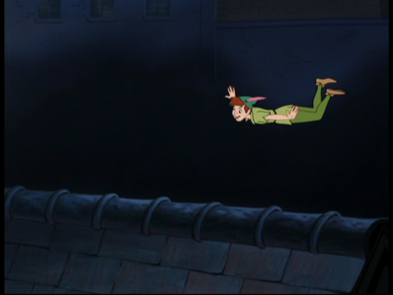
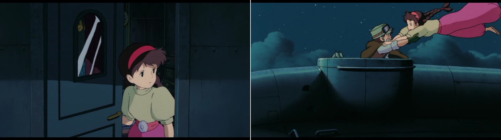
In many scenes, Laputa has the feel of an early Technicolor adventure film or a Disney feature like Peter Pan. One of Technicolor consultant Natalie Kalmus' most conspicuous rules was her demand for natural skin colors (what she believed to be the chief indicator of realism). By keeping the faces in natural tones color constancy perception made the saturated object colors of everything else in the picture stand out even more (which I believe highlights the constructedness of props and sets) and actually defined that glorious look that we generally associate with three-strip Technicolor films.

A perfect example of Technicolor lighting: Night scene from India's first Technicolor film The River (Jean Renoir, 1951) which helped launch the career of Satyajit Ray. In reality, skin tones would look rather different on the ocean in the dark.

In animation, lighting is not bound to real lighting equipment and can therefore be purely imaginative. Nevertheless most narrative films of the classic era still adhered to the simulation of "natural" lighting - at least when it comes to character colors and especially skin tones. I'd say that normally skin tones mostly varied in value. Even in night scenes, faces were seldom blue or grey altogether.

In fact, animation has one advantage over live-action: sets can be bathed in real expressionist lighting while the characters' faces can still look natural. Films like Cinderella and Peter Pan used to benefit from such unrealistic but very beautiful color schemes.


Day is bright, night is blue
Let us now look at how character colors are affected by different lighting situations in Laputa:
As we expect it from a movie: full color in daylight - the brown goose is blue in the absence of light.

The same goes for characters even in areas not directly affected by sunlight: daylight with full colors on the left, night time and no light inside the cockpit on the right.
While we automatically recognize the left image as daylight, the color of the drawers on the right is giving our subconscious perception the hint that these are not just dark cogwheels but that there is hardly any light - at least if our brain is able to adjust white balance according to the fact such drawers are usually much lighter (if in fact the brightest spot in the picture is that dark, there obviously seems to be no light source around). We therefore assume that this is not a night shot but a shot of somewhere within where there are no windows or other light sources.

Indoor, daytime

If you compare this image to the one above of the cockpit (with the blue-green pirates), you'll notice that we are in the dark but inside (there is no dark blue sky reflected on anything). Background colors are merely darkened and slightly desaturated (brown and bluish-gray are still distinguishable). These could as well be object colors in plain light, though.

The purple buttons are a strong indication of the atmosphere to me. We probably expect red buttons. So if we see them in purple (like red objects in blue light) we assume that it is rather dark down there.

Character hues do not seem to be affected by this same blue light but their values are certainly darker than in daylight and since we have neither shadow lines nor any pool of light there seems to be no visible light source in the machine room.

The characters read exceptionally well not only because they are so much brighter and in a different hue (complementary?) but also because value contrast is very low in the rather detailed background.
Here I have changed to purple to red, raised the skin color (left) and tinted the whole picture in blue-green (right) just to demonstrate how different the mood of this shot could have felt without breaking the "light character on dark background" concept.
The concept of full color characters against dark a dark low contrast background is taken one step further in this next scene where Pazu is waking up inside a prison tower. Now we have darkness, hardly any contrasting values and finally a monochrome blue background:


There is a slight pool of light and character and prop colors aren't affected by the darkness, not even in the shadow parts which are only darker but not reflecting anything blue. Unless we suppose that this whole dungeon was painted dark blue, this color combination is completely unrealistic. Yet, it looks beautiful and tells us intuitively that it's day daytime outside. Had it been a nightscene, the background might have been the same but Pazu might have been darkened or tinted blue (the light could as well be moonlight, for all we glimpse of it.)

This very strong contrast that makes Pazu's colors look rich and saturated resembles the old Technicolor aesthetics that emphasizes colors by surrounding them with deep blacks.

Indoor vs. outdoor at night
After all these daytime scenes, let us look at how character colors are affected by the darkness of the night:
While the blue background in the dungeon scene suggested a cold stony environment, here we have dark brown wood that feels slightly warmer. There is a lot of green to balance the brown. But character hues are not changed, they simply look like the shadow parts in other scenes (the lighted edge on Pazu's face on the left is a clear indication of this).

The same seems to be true in Dola's bedroom:

Sheeta's vibrant pirate's costume is just darkened with unchanged hues.

So how did they achieve that the outside feels colder than the inside although it is dark in both places?
Outside all hues are affected by the blue of the night sky, but not all to the same extent:
  • Background colors are once again monochromatic (the brown ship is blue like the sky).
  • Costume colors on the other hand are changed by the blue light (coral gets purple, beige gets light blue, warm yellow looks greenish).
  • Skin tones however are least affected by these changes.

An unusual light source
Towards the end of the film there is another scene that conveys mood by changing costume colors:

As Musca and Sheeta approach the crystal core of the flying island, we have three different lighting situations:
First there seems to be natural lighting against a dark monochromatic background. While Musca and especially his henchmen blend in with the cold stone walls, Sheeta's flamboyant costume stands out so that she visually becomes the center of attention.

Then the two last descendants of Laputa pass a dark hallway without daylight. Skin tones are again like in the shadow but now costumes are strongly affected by the cold darkness so that Sheeta's clothes are seen in shades of lilac and purple.

Ultimately, this color change not only gets the chilly feeling across but also prepares the following change of lighting: The piercing wan yellow glow emitted by the crystal core really stands out so much stronger against Sheeta's lilac shirt than had it been yellow already.

We now also see that this light source is much brighter than anything we have looked at so far: Costumes and skin tones are lighter than in plain daylight.

So far, we may have seen how masterful the film makers adjusted character colors without drawing attention to it. Next we will look at a scene that blows my mind every time I see it.

All screenshots taken from this gorgeous Studio Ghibli Bluray Collection by "universum film". It seems to me that this is the way to see the film unless you have access to a 35mm print.