Wednesday, May 26, 2010

Brown Bears

Originally planned as a possible follow-up to Dumbo, Bongo is one half of the 1947 package film Fun and Fancy Free. Bongo’s circus scenes are of interest in connection with Dumbo but are not the subject of this post. Here, I investigate artistic choices in superficially realistic background colors.

Studying background paintings I often wonder why certain colors were chosen and not others. The obvious answer would be: because they make the picture look good. But why does it look good, what thoughts could have led the artist to favor certain colors? The artist might have followed his intuition, but it's still possible to deduce underlying concepts. There are color schemes of all kinds, some of them expressionistic, some impressionistic. But even realistic looking backgrounds are not composed by simply copying nature. The thinking behind these color choices is just not as obvious.


When I revisited Bongo I noticed how much more expensive the artwork in this film looked compared to Dumbo. Although it is still essentially an overlong cartoon, the backgrounds are painted in a more realistic style. The funny thing is that Bongo dreams in a slightly more stylized way. Once he is free, the forest backgrounds are drawn more realistically. There are cast shadows throughout, though.
dream vs. reality

Brown bears and grey trees
Bongo himself is plain brown with red clothes (balanced by primary yellow and blue).

The subdued background colors are based on yellow, green, blue and grey, leaving room for both brown and red. There are hints of warm red (and therefore brown) in many colors (as always we don’t really know what the original prints looked like), but the absence of full warm brown becomes evident especially in the tree trunks. In front of these grey trees the saturated brown bears and squirrels are easily distinguished. Basically the characters are more saturated than the backgrounds. Note that Disney's 1940s and 1950s backgrounds almost always have a strong pool of light and some very dark receding areas with little detail that provide the picture with a sense of depth.
original frame as it appears on the DVD
oversaturated frame in order to distinguish the hues more clearly

warm colors (Bongo) against colder colors (tree)

Grey trees also provide a desaturated backdrop for the more saturated characters and blend in with the rest of the neighboring background colors.
Note that the tree trunk in the foreground is brown in contrast to the grey unimportant background parts. The contrast to Bongo is merely a case of value and saturation. It’s not important how well we see his feet here, the interesting part is his sad overall expression with the focus on the face.

The more blue the grey contains the colder and more distant does it feel.
In shots without visible blue sky this aerial perspective separates the planes beautifully. The blue background also provides better contrast of hue to the surrounding brown bears.

In the end when the bully Lumpjaw (according to Borge Ring via Michael Barrier a caricature of Dave Hand) is conquered, the forest is depicted in warm evening light that is far more saturated.
In the end, blue mountains and the sky provide the image with cold-warm hue contrast. Color-wise Bongo and Lulubelle are united with the warm trees. This is the first time Bongo succeeds in climbing a tree - with the help of his little forest friends, of course. On the right, the darker Bongo is on the brighter side of the tree making for nice contrast of value.

Since pink is the color associated with Bongo's love dreams there is one instant where pink is part of a background:
When Bongo sees Lulubelle for the first time, he is not sure if he's dreaming. It also makes sense that a girl wearing a pink flower is first seen framed by such flowers. The yellow and white flowers are everywhere but they don't stand out the same way because of their closeness to the general background hues.


Variations on a theme
There are many mass scenes with assorted bears. Their design varies to a certain degree but is never consistent from shot to shot. Essential in giving the impression of a large variety of bears is their different coloring. To unite them they are all different shades of brown ranging from Lumpjaw’s cliché darkness to Lulubelle’s salmon color.
It goes unnoticed that the colors change in every shot because they are always in the same range. Although the middle and right image are shots from the same scene the bears differ greatly.
Sometimes the darker bears are those in the shadow that shouldn’t attract our attention (see further above where they circle Bongo and Lulubelle), sometimes the darkness is a means of separating dance groups. 
When Lumpjaw is not in the shot they are often intermingled for balanced variety. They are male or female according to what’s called upon. Males seem to be darker.


If you are interested in the thinking that went into "naturalistic" backgrounds of Bambi and Lady and the Tramp I suggest you visit Hans Bacher's Animation Treasure Blog

All screenshots taken from the 2003 DVD edition

Friday, May 21, 2010

Dumbo: Voice Over Narration

By now, Hans Perk has posted all available Dumbo drafts and Mark Mayerson is already busy doing the mosaics. Michael Sporn has started reposting earlier Dumbo storyboard and frame comparisons. Work is currently absorbing me more than I expected limiting my time devoted to joining this Dumbo celebration.

In Dumbo, the first few lines spoken by an off-screen announcer trigger many associations yet seem to be there simply to play a trick on our expectations.
Like later Disney movies that begin with a few lines of voice over narration, Dumbo never resumes this framing narrator during the rest of the film. The delivery of the opening lines works as a gag rather than as a narrative device.

Through the snow
And sleet and hail
Through the blizzard
Through the gale
Through the wind
And through the rain
Over mountain, over plain
Through the blinding lightning flash
And the mighty thunder crash
Ever faithful, ever true
Nothing stops him
He’ll get through!


The words themselves don’t contain any information essential to the story (note that the word “flying” isn’t mentioned at all). But their delivery in the manner of a commercial or trailer sets the tone. Or in other words: it sounds like someone announcing a circus act.
And based on what audiences of the time have learned from posters and trailers in advance, they probably expected: A FLYING ELEPHANT and not a flock of storks.

Frame of reference
The circus announcer voice also triggers other associations: the arrival of a superhero, for example. While it’s true that the first Fleischer Superman cartoon premiered only about a month before Dumbo on December 26, 1941 and the 2nd draft of this Dumbo sequence as posted by Hans Perk dates from May 26, 1941 I still believe the connection to Superman’s famous opening lines is no accident.

In fact, the highly influential radio series of the same name premiered on February 4, 1940 with Bud Collyer as Bruce Wayne. The classic announcement was normally delivered by Jackson Beck, as can be heard in this first episode of the original radio series: The Baby from Krypton

Faster than a speeding bullet!
More powerful than a locomotive!
Able to leap tall buildings at a single bound!
[different in this first episode]
Look! Up in the sky!
It's a bird!
It's a plane!
It's Superman!


There are also the wind sounds in both versions. But in Dumbo right after the last word we hear an airplane motor that evokes the arrival of a daredevil pilot like Geoff Carter (Cary Grant) in Only Angels Have Wings (Howard Hawks, 1939) or Jim Lane (Clark Gable) in Test Pilot (Victor Fleming, 1938). The weather conditions here do have a lot in common with those in Only Angels Have Wings where a series of post delivery flights from Barranca over the Andes is perturbed by equally bad weather.

Aircraft themed adventure films were en vogue back then. The famous line “Calling Barranca” even made it into a Tex Avery Warner Bros. cartoon from 24.08.1940 (Ceiling Hero) that parodies the then current airplane craziness. It is available on youtube here.

Although such pop culture references were quite common in short cartoons, Walt Disney was always careful not to let them slip into his features so they wouldn’t feel dated when re-released. Dumbo - being more of an extended cartoon than a “normal” feature film - contains unusually many of them (the quintuplets, the war in Europe, the strike even). It is also Disney's first full-length feature set in the present and in the US.

Plant and Payoff

Images from the 1941 Dumbo trailer
 
But back to the airplane sound: In the 1941 trailer we see Mr. Stork in front of a background that doesn’t hint at the bad weather. Later, when Dumbo is falling from the tall red building the sound of a descending airplane is drowning out Timothy’s dialogue about the magic feather (announced as “the most sensational climax ever filmed”). What’s more, we never actually see Dumbo fly with his ears.
In the finished film the payoff to the plant (or set-up) of the airplane sound comes indeed during the climactic scene when Dumbo falls off the red building. Dumbo has been flying before with the help of the magic feather. But only after he has lost the feather and gained confidence in his own abilities (or superpowers as Harvey Deneroff puts it). So it is only consistent that he doesn’t sound like a soaring aircraft until he spreads his ears and starts to fly all by himself.

For a different perspective on Dumbo as a superhero read
Harvey Deneroff’s controversial 2009 article.

Thursday, May 13, 2010

The Milky Waif – cheating continuity – part 4: screen directions

Let’s start on a detour: The Axial Cut
An axial cut is defined as a connection of two camera setups with identical camera-object-axis. The difference between shots is then, how close the camera is to the object. This device has been used heavily in the early silent years but has been relegated to special occasions in later years (just think of Alfred Hitchcock’s The Birds or Stanley Kubrick’s 2001).

The Birds: Jessica Tandy finds farmer Dan Fawcett killed by birds. This is not a truck or zoom in but a series of three shots without any sound at all.

In animation the axial cut is useful because there is no perspective change, so it isn’t necessary to draw a new background. Classic cartoons have very clear and simple screen directions, so axial cuts hardly noticed at first view.

There is a special kind of axial cut that is motivated by the nature of the hand drawn animation medium. I usually call it:

The Cheat Cut

Here we have a standard zoom on Jerry (left and middle image) which ends with a “cheat cut” (an axial match cut that is intended to go unnoticed) to a closer BG and cel setup of the same room that is more practical (right image). In the first setup the details have to be drawn and animated smaller which causes large fuzzy, wiggly lines when optically enlarged. As everything can be drawn in larger proportions the lines are clearer and steadier in the second setup.

This seems to be standard practice for golden age shorts and can be observed in cartoons of any studio of the time. The transition would be smoother with a cross-dissolve but this usually implies a leap in time.

Cheating On Screen Directions
The light source is on the left. The perspective on the room and on Jerry is three-quarters. Jerry’s face is already to the right.
Waking up because somebody was knocking he looks to the right. We then see the green door on the right.
It is revealed as the outside door. Gazing straight into the camera is fairly common for both Tom and Jerry without ever distracting from the story.
Remember the light source inside is on the left, so light from the artificially lit kitchen seems to illuminate Jerry’s apartment. From the outside the door is brown working better with the basic cold-warm setting. In contrast to the cold outside world, Jerry’s apartment is seen as warm from the outside…
…which must be quite attractive for Nibbles in the nutshell. So here it comes: Jerry looks back in but what he sees is a different part of the room. In this supposedly warm part of the apartment the carpet has a large yellow part which is not existant in any of the round carpets in dark/nighttime backgrounds.

Jerry then runs around Nibbles so that he is again on the left side. But when they go to the right, the green outside door has been substituted with a mousehole to the kitchen as we see in one of the very few point of view shots.

Flat Panels
In spite of backgrounds that almost always imply diagonal camera angles, the action is basically staged on a flat right to left axis on a right angle to the camera. A concept that has already become evident in the long pans (previous posts) is also applied to most of the other shots.

In other words: the characters’ perspective is not congruent with the perspective of the background but it works because we are only paying attention to the characters’ eyes.

There are some obvious advantages there: the characters don’t have to be drawn from different angles, they don’t have to increase or shrink in size within shots and more important from a storytelling point of view, it’s easier to show the line of action on these silhouettes than on almost full frontal characters in over-shoulder-shots.

As can be seen from numerous Tom and Jerry poses these silhouettes work best when the body is depicted in 3/4 with the head in profile. Very often the ears are slightly cheated into ¾ as well so as to prevent the head from appearing overly flat. It’s not always as extreme like in these examples. Many times the head itself is not completely shown in profile. Eye (pupil) positions are always very clear so that there is no question if a character is looking to the left, the right, up or down or straight at us.

Preston Blair educational poses from the first edition of “Advanced Animation” 1945.

This basic spatial disposition (Jerry’s safe harbor on the left, Tom’s realm on the right) is maintained throughout the whole film. So although rooms and backgrounds (and the position of the bowl of milk) change according to the film makers’ convenience the once established 180° rule is never violated, at least superficially.
So whenever Jerry is running to the left he is running away from Tom. This is even maintained when Nibbles has hit Tom with a hammer and they are running away from the mousehole. Tom himself is mostly kept to Jerry’s right.

This is different with Nibbles whose interest in milk is stronger than that in survival.

Short Cuts
Although the distance from the mousehole to the bowl of milk has been thoroughly established, Jerry obviously takes a short cut when he is trying to rescue Nibbles. There is no time (and therefore no space) inbetween these two shots whereas we have seen a long pan just prior to that connecting the to places.

 This is also the case when Nibbles is blown back to the mousehole.

On Jerry’s way back from Tom, however, the path seems to be dangerously long. This not only heightens the tension, but also exaggerates the concept of right to left as an easy progression and left to right as harder.

Breaking The Flatness
Special camera angles and difficult perspectives on characters are reserved for the climactic fight. Forced into the corner, Nibbles suddenly becomes aware of his vulnerability.
 Jerry again comes from the left to the rescue. Most often Nibbles is inbetween Tom and Jerry…
…although Jerry tries really hard to stand between Tom and Nibbles at all times.

In the end, Jerry is triumphing over Tom by being located both higher and on his right. In fact, Tom sits now between Jerry and Nibbles.

Friday, May 7, 2010

Dumbo: Baby Mine

In my opinion, the key to Dumbo’s success with children of all ages lies in its believable depiction of the protagonist’s most basic relationships: the one with his mother and the one with his friend Timothy. Playful sequences like the “pink elephants on parade” are only the icing on the cake.

While Mark Mayerson is doing a chronological analysis in connection with his famous mosaics I’m trying to put together a more thematic analysis examining character relationships and uncovering underlying narrative structures. In contrast to 101 Dalmatians color is not the hook for the analysis. It will occasionally be the subject, but not exclusively.

Let me start with a favorite scene, the one that everybody remembers: "Baby Mine". It’s also one of the most sentimental Disney scenes ever – manipulative in its sentimentality even, one might say. Clearly designed as a hiatus in all the turmoil that surrounds Dumbo it serves as a moment of rest and longing for the audience as well. Like the whole film, this scene is very simple yet so beautifully constructed.


Life goes on
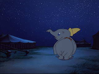
Initially Dumbo and Timothy come from the left. After the song they go off to the right. They don’t go back to where they came from. Life must go on as Dumbo is led by Timothy who doesn’t believe in drawing back. Like this scene, much in this film is organized around straight forward movements which are generally translated into left to right screen directions. The extreme point is reached when Dumbo and Timothy wake up in a tree way out of their own environment. From then on, they go back to the circus where everything is resolved in the end and the train seems to move back home to the left.

The prison coach is staged cleverly both in design and lighting. It has barred windows towards both directions. The side facing the approaching friends is lit by the moon as it represents a gleam of hope for Dumbo who longs to see his mother. The side facing to the right is in the shadow. After all, saying goodbye isn’t easy.
In order not to disorient unexperienced viewers (small children), screen directions have to be very cautiously prepared. I have already written about how the panning camera bridges larger gaps in distance in 101 Dalmatians. There is also an even easier, more basic, approach to connecting disparate backgrounds into one set.

Matching eyelines

In fact, it’s the most basic filmic device that distinguishes film from theater: first we see a character looking at something off screen, then we see what the character sees. The eyes are most important to that concept. They tell us not only where someone looks but also the emotion the object triggers in the viewer. From a visual point of view, we’re lucky that human (and cartoon) eyes are surrounded by white (or another bright color), so they even draw our attention in very stylized designs. In animation, if you get the eyes right, you can get away with many shortcuts elsewhere.

While Dumbo is swaying in his mother’s trunk Timothy looks at the other animal families sleeping happily in their wagons. We would probably understand the meaning of these shots anyway, but establishing a spatial connection with Timothy and the prison coach is a very elegant solution. It helps to make sure that this is no montage sequence.


above: the other animals during "Baby Mine", not so different 
from their establishing in the prologue (below).

The other circus animals are practically non-characters. They are not vital to the story other than to have a template for “normal” family life. Thus they are introduced in the very beginning as happy families and are only used for comic relief in later scenes but never as part of a circus performance. The “Baby Mine” scene features their last appearance in the film providing both cuteness and comic relief culminating in the kangaroo’s feet gently creaking like a rocking chair.

It is intuitively comprehensible that this is the film’s reality and not some dreamlike association because we clearly see rational Timothy turn his head from left (Dumbo) to right (other animals) and back again after the last animal (kangaroo). It also shows us that even a tough and controlled guy like Timothy is touched by so much sweetness and Dumbo’s longing to be with his mother.

On a larger scale
Despite the obvious difference that the Mrs Jumbo doesn’t actually sing, “Baby Mine” is reminiscent of the “some day my prince will come” scene in Snow White in that it also provides a welcome point of rest before the final act unfolds. Moreover, although both songs would have allowed for elaborate dream sequences, the makers resisted the temptation and let the eye rest for a while. We just get reaction shots of the surroundings. Both scenes are very intimate and quiet. But unlike Snow White’s longing dream “Baby Mine” is a lullaby that is concerned very much with the present, not the future. Dumbo is a child who lives in the present and not an adolescent dreaming about “some day”.

It’s interesting that neither Dumbo nor Bambi are built around their protagonists’ dreams like Snow White, Pinocchio, Cinderella or Sleeping Beauty. I don’t think this is because animals or male protagonists don’t dream. I simply think this is due to the fact that, unlike its three predecessors, Dumbo is definitely a children’s film.

It is only concerned with maternal love and friendship, never romantic love. And it explores situations and relationships that every child experiences. Growing up always involves steps of learning to let go. Adolescents strive for independence, children are more reluctant to accept change. Thus, Dumbo’s story is all the more powerful by having a separation from his mother forced upon him that early. And unlike Bambi he doesn’t have to cope with her being dead but with her being there, although he can not be with her.

All these emotions are set free in this very simple scene of temporary happiness. And although we wish with Dumbo that this moment would last forever, we also understand Timothy (a street-smart cousin of Jiminy Cricket, it seems) reminding him of saying goodbye. This, by the way, is the only instant where the two most important characters in Dumbo’s life meet: Mrs Jumbo has to leave Dumbo in the custody of a stranger; not easy for her to say goodbye, either.

from Mrs Jumbo's point of view Dumbo looks lonely in the open space.