It has become a pleasant tradition to see the latest Studio Ghibli production and most often also a new French feature at the International Animation Festival Fantoche in Baden, Switzerland. This year, I was in Baden only one day and I have to admit it was rather a feel-good program I put together: Two Belgian-French features, one reel of shorts in competition, a casual inauguration party on a nearby lawn and finally Goro Miyazaki's nostalgic high school romance Up On Poppy Hill which was advertised exclusively under its original title kokuriko-zaka kara and thus was almost overlooked by many.
Stop Motion Impressionism
 |
| Emma De Swaef receiving her Fantoche award. |
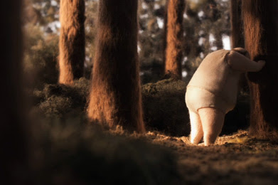
Even though it lasts for almost 17 minutes and is as slowly paced as Richard Wagner's "Rheingold-Vorspiel" that accompanies Willy's final redemption, these characters and sets made entirely of wool and cloth kept my attention throughout. As you can see in the trailer below, the sets of Oh, Willy come to life through impressionistic lighting that makes full use of the objects strange tactility.
There is a short interview with Emma De Swaef on the Dragonframe Blog (from which I have lifted some of the making-of photos below).
Simulating Soft Watercolor Illustration
The highly anticipated children's film based on Gabrielle Vincent's beloved picture books about the bear and mouse Ernest & Célestine translates the illustrator's warm drawings into a slightly more animation friendly style of open lines and watercolor textures combining hand drawn animation with the possibilities of digital 2D-technology.
Although the character outlines feel a little too sterile at times, the resulting technique has its own charm. Imaginative underground worlds and a whole bouquet of visual ideas serve a gentle story directed by young Benjamin Renner with help from Panique Au Village creators Vincent Patar and Stéphane Aubier who demonstrate that they can handle less frenetic material with equal grace.
 |
| Gabrielle Vincent's original style... |
 |
| ...compared to film stills. |
A Threedimensional Painting
Although not as good a film as Ernest & Célestine, Le Tableau (Jean-François Laguionie, 2011) intrigued me more than I had expected. The story of a class struggle among fully painted, half painted and just roughly sketched characters within an unfinished and apparently abandoned painting turned out to be all about color.
It might have worked better if the characters would have been traditionally animated instead of the cel-shaded 3D animation (so painfully telling of a low budget production). The characters themselves would have remained one-dimensional nonetheless since all except one were mainly defined by their state of painting and not much more.
But even so the unfinished characters' desire to meet their creator combines themes of Solaris or Prometheus with reflections on the creation of art and matching colors. Le Tableau has apparently been picked up by GKids for a theatrical release in the United States. A reasonably priced Blu-ray is also available on Amazon France.


1 comment:
A really nice post! "Oh, Willy..." is a true revelation for me!
Post a Comment