 |
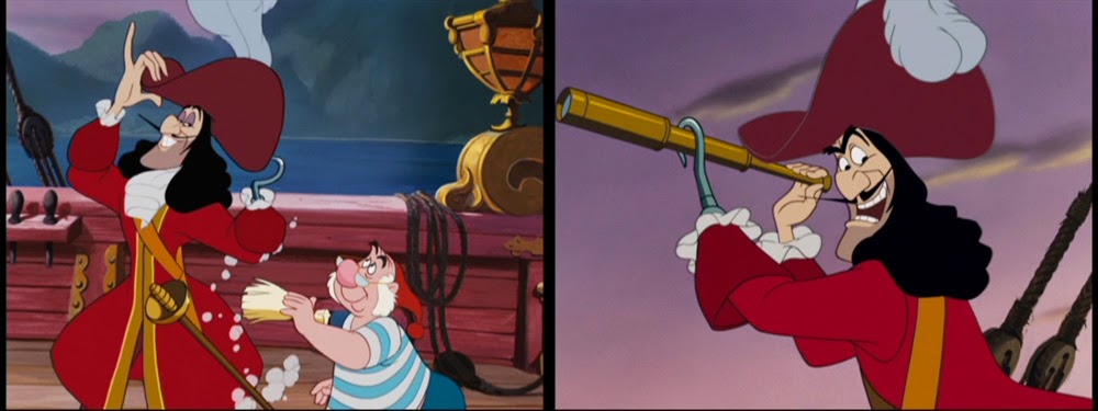
| Hook surrounded by red planks and purple sky. |
Hook's next appearance (08.0 "Skull Rock") is preceded by sequence 07.0 "Mermaid Lagoon". I am including it here because of the temporal color contrast between the two:
The sky over the mermaid lagoon is slightly greenish-yellow which at first suggests that Peter is very much "at home" (as I like to call it when background colors reflect character colors).
It also sustains the basic magenta-green concept (actually a triad with blue) of the mermaid lagoon. And is a perfect backdrop for the mermaids' vitriolic jealousy attacks against Wendy. In the 1950s, unnaturally stinging magenta and purple almost always indicated strange or unsettling situations (unlike later when those same colors were used for love scenes in THE LION KING, 1994, and POCAHONTAS, 1995). As can be seen further below, the unusual color of the rocks also serve as orientation guides since only those around the mermaids are eerily magenta while the rocks in other locations are neutrally gray.
One of PETER PAN's basic concepts in both Barrie's play and Disney's visualization is the ambiguity of light and shadow. The theatricality of Barrie's play is often emphasized by recreating wholly artificial lighting situations that are grounded in theatrical traditions rather than location filming.
In this analysis, I will only touch upon it when it comes up in combination with a color change in connection with Captain Hook - as is the case in the following shot:
Suddenly a shadow falls over the lagoon for no apparent reason. But Peter immediately knows that Hook is coming. Technically the shadow cannot emanate from Hook who is passing in the distance in a small boat. It could probably come from a looming change in weather, i. e. a dark cloud that accompanies his appearance.
As we see in the reconstructed pan below, there is indeed a bank of clouds approaching from the left:
 |
| Pan reconstructed from three separate frames, which is quite easy since we are basically looking at the quasi-CAPS version of the film. |
 |
| This is one of the frames that matches Mary Blair's sense of color quite good with the red sun against the greenish yellow sky: completely unnatural but easy on the eye. |
 |
| "Looks like they're heading for Skull Rock!" |
For the remaining shots outside Skull Rock the initial background color triad of magenta, green and blue is basically down to violet and blue balanced by neutral grays.
 |
| Pan reconstructed from three different setups (with deliberately visible overlapping rims). |
 |
| Mary Blair concept art lifted from Jim Hill Media. |
To me, the resulting long shot is one of the most iconic images of my childhood since the "Skull Rock" sequence has always been one of my all time favorite scenes ever put on film.*
 |
| Contrast inside - outside: violet vs green. |
It is in fact the first time, that Hook seems to be completely out of his element. Magenta and emerald green make for a strangely artificial contrast we often associate with the supernatural. What I particularly like about the lighting setup of this first part of the sequence is the expressionist lighting on the two characters:
Hook is coldly illuminated from up above resulting a highly saturated upper surface of his pirate's hat. Everything else is in the shadow showing him as a rather dark figure with slightly boosted skintones. Tiger Lily, however, is depicted as an almost radiating light character with clothes that are darker then her skintones.
When Hook is momentarily scared by Peter's imitation of a supernatural voice his face is completely in the shadow so that the frightened eyes stand out even more. As soon as the shock has worn off and he guesses who was behind the eerie voice, Hook's face is bright again so that we can see his facial expression much better.* Note also the glint on his hook that not only reflects the cold spotlight from above but also helps distinguish the hook from the blending in with the background:
 |
| Left: emphasis on the eyes; right: emphasis on the whole facial expression. |
The basic red - green complementary contrast of Peter and Hook is strongly visible against the colorless rocks outside.
The heart of the sequence is one of those beautifully designed set pieces that intersperse dramatic action and soaring flight scenes with cartoon swashbuckling. After the transition back inside, Hook is no longer seen in frightening magenta light as before. Now he is fighting a fearless boy who does not recognize him as a real threat. But still Hook is wearing both his hat and his strong red coat. The characters stand out against very dark and quite desaturated backgrounds.
Although the light and shadow pattern is still maintained for strong dramatic effects (the source of the pale light still seems to be high above), the green water is only visible in cutaways to Smee and Tiger Lily.
 |
| Again a perfectly matched Mary Blair color concept (by way of Jim Hill Media). |
But then Hook is forced onto the defensive by Peter who first destroys his magnificent hat and then lures him (in the most controversial cartoony move) away from the rock so that he is only falling when he realizes it (like in a WB cartoon).
 |
| There goes the first part of the "strong and evil" Hook: his hat. |
And the first thing the crocodile eliminates is - of course - Hook's red coat...
...so that he looks mainly magenta/purple when he is screaming like a little girl. Needless to say that this outfit works perfectly within the green-magenta color scheme of the crocodile that more than ever is at home in this emerald green water.
Captain Hook's Lair
After Hook has been chased into sunset, the next sequence fades in on an establishing shot of the silhouetted pirate ship against the moon:
The only other source of light is a small yellow bull's-eye in the captain's cabin. Inside the lighting is seemingly white insofar that all the objects and costumes look natural without a basic color tint: we see an almost bluish white chair and green garments against a ginger wooden interior (below left).
As is often the case in Disney features, the first time we see a room, all the props are painted in clearly distinguishable colors so that we get a sense of the stuff that surrounds a character. When the emphasis is on the characters in subsequent shots (above right), however, either everything outside the pool of light is less conspicuous or the background details are painted in hues closer to each other than in the establishing shot (as can be seen in the kitchen backgrounds in 101 DALMATIANS, 1961).
As is expected from a broad cartoon character, Hook's clothes have magically been mended. But he is still without his red coat and purple hat. Instead he is covered with a green blanket and wearing a red hot-water bottle on his head. Both colors are slightly pastel. At this moment he is probably at his weakest - and wearing green.
 |
| Unfortunately, Blogger somehow changed the color of this JPG. The blanket does not look as different from the shots above as it seems here. |
 |
| "Get me best coat!" |
In The Red Hot Lion's Den
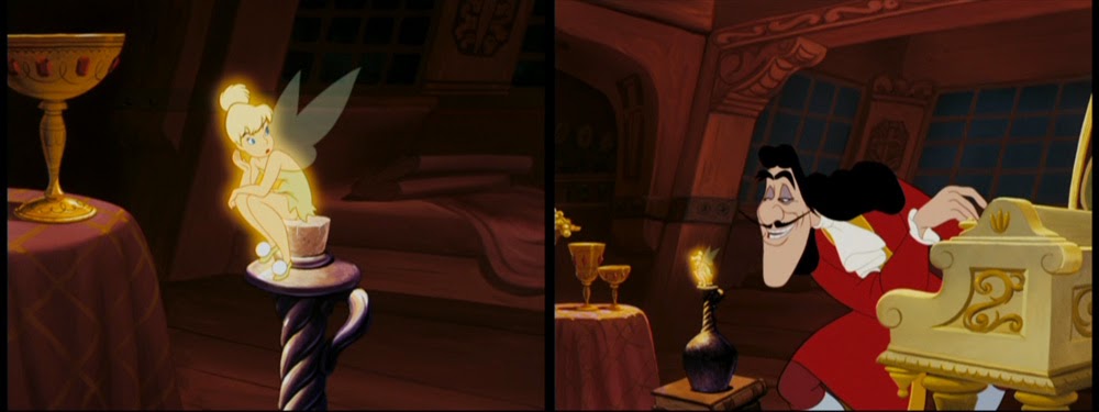
After Smee has captured Tink, the next Hook sequence (No. 11 "Hook tricks Tinker Bell") is again taking place within the captain's cabin. But unlike the previous scene that only showed a weak light and a room that was evenly lit color-wise...
 |
| Introduction to sequence 09.0 "Hook has a cold". |
 |
| Introduction to sequence 11 "Hook trick Tinker Bell". What looks like a candle is none other than the jealous fairy. |
Then Hook offers Tink his soft lilac handkerchief.
The hot intimate mood is slightly broken when Hook pretends to leave the cabin which is reflected in the background painting that balances the reddish wood with the blue outside the door and the blue globe in the back. About to leave, he also wears his hat again.
But compared to sequence 09.0 the lighting is still not evenly white. This is most easily visible by the color of the floor boards:
 |
| Left: seq. 09.0 light wooden floor; right: seq. 11 ginger wooden floor. |
 |
| Even within the red cabin Hook's coat stands out mainly because of its saturation and not its brightness. |
In the third and last installment of this series I will examine Hook's final confrontation with Peter Pan and the crocodile.
* If only I was able to see it one more time in Technicolor on a 35mm print... If only to see to what degree the meticulous digital restoration heightened the color concept. Although I have some reservations with all the de-grained 1950s Disney restorations (from CINDERELLA to LADY AND TRAMP), I certainly believe that they increase our awareness of the artists' original color concepts by eliminating the slightly shimmering quality of the original prints in favor of clinically clean images that match the digitally composited direct-to-DVD sequels.


3 comments:
I've had problem with Bloggers uploader distorting colour images too.
Look at the saturated mess it made of this fine piece of art I uploaded and compare it to the original.
Fantastic analysis once again!
I would suggest that the establishing shot of skull rock is a clear reference to the famous skull island matte painting in the original King Kong.
Post a Comment