Thursday, January 10, 2013

Japanese Haiji vs. German Heidi


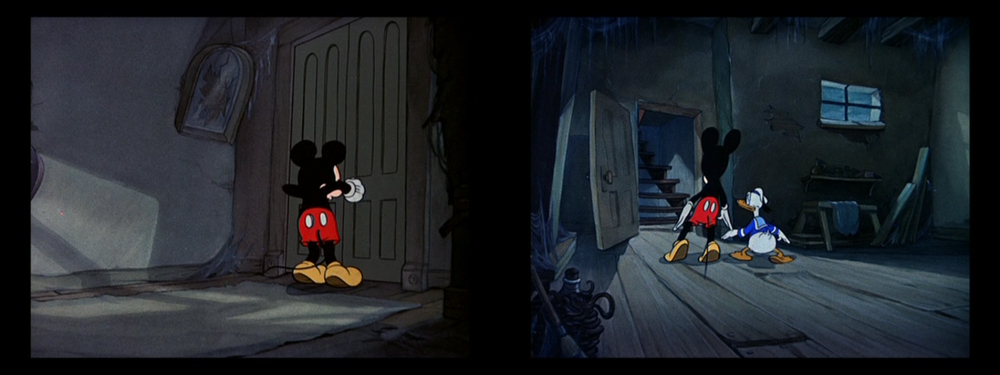
The visual difference between a faded 16mm print used for TV broadcasting and a remastered Blu-ray is obviously striking. But when a show is released with two different soundtracks by two different composers, faded colors become irrelevant. Even if you don't understand a word of Japanese or German, these clips will speak for themselves.

Arupusu no shôjo Haiji (1974 aka Heidi, girl of the alps) is probably the most well-known Japanese TV series in Europe. It has been a real breakthrough not only for Nippon Animation's "World Masterpiece Series" but also for director Isao Takahata and "scene designer" Hayao Miyazaki - who drew every layout of all 52 episodes himself.

After so many film and TV adaptations (American, German and Swiss) it is safe to count Takahata's version among the most faithful - if not THE most faithful - retelling of Swiss author Johanna Spyri's 1880 "Heidi" novels about the surfacing town-country conflict of industrialized societies. Of course, alterations had to be made and incidents had to be added in order to keep 52 21-minute episodes (not counting credits and episode previews) interesting.

But this enormous running time leaves room for a leisurely pace that allows the audience to experience the many faces of nature. Needless to say that even in such a tightly budgeted show the founders of Studio Ghibli squeezed in many shots of animated weather (especially wind and changing seasons).

So if you are able to look beyond the very limited animation and stereotyped character design you will discover a well researched and touching tale of a girl who learns to love nature only to be sent away to a German city that has "no wind and no trees".

The sound of music
Of course, the melancholy atmosphere is greatly influenced by the soundtrack - Takeo Watanabe's music in particular. Although there are only five or six themes used in the first 18 episodes that take place on the mountain pastures above Maienfeld (Graubünden, Switzerland) the cues fit the action perfectly. These tunes range from jaunty (for Josef, the dog) to elegiac, but the underlying emotion is always one of longing. At times, Heidi's music seems to come straight out of an Italian film of the era.

But - and this is an enormous but - you only hear these tunes in the original Japanese language version (and the feature-length version released to US theaters in 1975). In German speaking countries most people associate Heidi with tunes by Gert Wilden.

Since I couldn't bear watching anime series as a child (they always looked like a series of badly drawn and dubbed still images to me and had nothing in common with my conception of animation) I have never seen more than a few minutes of Heidi. Although now I have learned to accept this Astroboy-as-a-little-girl design approach (thanks to a "fan sub project"), I doubt that I would have been as taken with this series had I been forced to watch it in German.

Before the days of high definition
Before talking about the soundtrack let me remind you that Heidi was conceived and broadcast as a TV series. It is therefore not surprising that the German DVD box set uses a print that seems to be too high on brightness and contrast and displays some color cast.

TV screens used to be quite different and very small in the 1970s, black was a middle grey at best and around Europe some people still had black and white monitors. For all we know, the picture we get on the German DVD may represent the original viewing conditions much closer than the meticulously remastered transfer of the Japanese Blu-ray.


left: German DVD - right: Japanese BD
Pushing the brightness in dark scenes so that TV spectators could at least see what was going on was not uncommon...
...the greenish cast and the bleaching outlines, however, are hardly there in the original negative.

Contrast is much higher on the left, but actually Heidi's clothes look more natural. The interior around the old woman is definitely colder (closer to blue) in the left and warmer (closer to brown) in the right image.


Heidi's colors are warmer and more harmonious on the left (A-F) but the color contrast between her shirt (C) and her skin tone (D) is stronger on the right. While overall contrast is lower, the greenish sleeve (C) seems to stand out a little too much.

In a different mood

While the Swiss are quite used to hearing Swiss characters on TV not talking in their native Swiss German but the standard version of the language as spoken in Northern Germany, it is fairly unusual however that when a German producer decides to rebuild the whole soundtrack from scratch including the music he does not substitute the Japanese score with a Swiss score. Instead Moravian-born German composer Gert Wilden who was at the time best known for his music for erotic films was hired to rescore the entire series.

My comparison starts after the credits sequence because the catchy title songs can be easily found on youtube. So let's listen to the very beginning of episode 1:

Note: all examples Japanese first, German second.
The Japanese opening is full of tension and foreboding. The lonely girl Heidi is introduced with a lyrical accordion. After that we only hear the silence of a village at dawn and a girl waiting in anticipation. Wilden's music (starting at 1:43) seems like a rhythmical stock track that just fades in. It is already jaunty and sounds more like the background in a commercial for a Bavarian resort than a score to a deserted early morning scene. Moreover, the music does not change when Heidi is introduced and goes on even during the rooster scene until the first line of dialogue. No matter what style of music one prefers it is obvious that the different approach to scoring changes the scene far more than the differences in color.

It sounds as if the German producers went to great lengths to undermine Takahata's basic mood of slow pacing (long silent moments) and longing (melancholy themes without a constant drumbeat). And to be honest, it seems strange that Heidi's voice sounds so much older in German.

As the next clip demonstrates, the notion of a female narrator that clearly reflected the novel's female author has been replaced by a standard male narrator as well (the same had been done to Cinderella when it was partially re-dubbed around the same time, as you can hear here):
In addition to the narrator, again the elegiac tune with the small sentimental changes is replaced with an alpine oompah oompah tune (0:38) that doesn't even sound Swiss to me. During the narration the music at least seems to be explicitly scored to the film.

The next example consists of two sets of clips that show how both the dramatic/scary and the sentimental scenes are toned down by Wilden's score:
The Morricone-like tension of the argument is de-emphasized and the sad good-bye sounds a lot more down-to-earth in the dub.

Occasionally, the Japanese version includes a genuine Swiss song like "jetz wei mer eis jödele":
In the German version however any reference to Swiss German is carefully omitted (even the word "Dörfli" which means "little village" is treated as if it was the name of the village) and replaced by narration.

Just to show that this is common throughout the series, here's another moment where story takes a backseat to mood:
It seems that Western television always had this urge to move the story forward. Somehow, Japanese children seem to have been considered more patient. It's interesting, by the way, that the music (behind the narration) of these later episodes resembles the Japanese score more closely.

Early on, Heidi has a dream which is a good example of the differences in relying on music, silence and soundeffects in an eerie and touching scene:
Again the power of silence and "time standing still" is minimized by the German score. And again a song (this time Japanese) is replaced by narration.

In following example the Japanese version is scored during the pan down from sled to the children (0:10) while the German soundtrack contains music during the pan down along the fir trees (0:55) and vice versa!

There is a strong indication that the sound effects have been rebuilt as well:
Is it just me or did they simply paste one single "moo" about four times on the German soundtrack?


The reason of this comparison is not to deride Wilden as a lesser composer than Watanabe - for all we know, he was only following the producers' directions. The reason of this post is to demonstrate how much music can change the way we experience a film even if the pictures are identical.

The German soundtrack may have been put together with utmost care and really good intentions - maybe they didn't want to upset or bore German children with storytelling that was deemed too Japanese, and certainly sentimentality wasn't very popular in those days. After all, Wilden's music is crucial to the way generations of German speaking children have experienced and loved Heidi.

Ultimately it is a matter of taste which scoring approach one prefers but only one of them is true to Takahata's vision.

Note: Up to date, there is no DVD available that includes both language versions simultaneously. There's not even an official release that features English or German subtitles yet.

Tuesday, January 1, 2013

Happy New Year!

2013 Preview: A Bob Clampett Year
Bob Clampett (May 8, 1913 - May 4, 1984)
Last April, I have tried to revive this blog by increasingly writing about live-action films. Since analyses of Japanese films have become such a large part of this blog lately, I have decided to add a table of contents as a separate page at the top. I also hope that this listing will finally get some of the more labor-intensive articles about lesser known masters like Kore-eda the attention they deserve.

In the meantime, thanks to my preoccupation with Studio Ghibli films animation is once again central to Colorful Animation Expressions. This year I intend to continue my series of analyses of red - green complementary contrasts. But I also intend to make 2013 a Looney Tunes year: In one way or another I plan to celebrate Bob Clampett's (and to some extent Frank Tashlin's) 100th birthday by dedicating roughly one post a month to his (and occasionally Tashlin's) films.

But first I feel obligated to guide you to Steven Hartley's audacious attempt to review EVERY Warner Bros. cartoon ever produced: Likely Looney, Mostly Merrie! 


2012 Review: Impressive Motion Pictures
Digital drawing inspired by two production stills from Anna Karenina.[O.I.]
Of all the new releases I have seen in 2012 the following few were not necessarily the "best" films I have seen but the ones that left the deepest impression (in alphabetical order):

  • ANNA KARENINA (Joe Wright, 2012): Tom Stoppard's English stage melodrama adaptation of Tolstoy's epic novel playfully staged by Joe Wright combining 1930s Technicolor esthetics with 19th century ballet choreographed to Dario Marianelli's sweeping score.
  • BRAVE (Brenda Chapman/Mark Andrews, 2012): for all its shortcomings and compromised vision I found it to be the most tactile CG-feature coming out of Hollywood yet.
  • DRIVE (Nicolas Winding Refn, 2011): Visceral, vibrating, self-contained. A strong central relationship and a most pulsating interplay of sound and pictures make up for a slightly lightweight story.
  • HALT AUF FREIER STRECKE (Andreas Dresen, 2011): Eastern German kitchen sink realism at its best. The most impressing of three strong films about slowly dying family members (the others being Haneke's masterpiece Amour and David Sieveking's Vergiss mein nicht).
  • KISEKI - I WISH (Kore-eda Hirokazu, 2011): Not Kore-eda's best but one of his warmest and most easily accessible. Undramatically emotional.
  • LE PRÉNOM (Patellière/Delaporte, 2012): A French comedy with so many twists and turns that it surmounts last year's Carnage in every particular.
  • THE DESCENDANTS (Alexander Payne, 2011): Great acting and a human story that struck a chord with me although living in Hawaii is about as alien to me as living on the moon.
  • TINKER TAILOR SOLDIER SPY (Thomas Alfredson, 2011): One of the most sensual 1970s spy thriller adaptations: crammed with details, engaging, puzzling, dense as well as calm and impenetrable at the same time.
  • WE NEED TO TALK ABOUT KEVIN (Lynne Ramsay, 2011): A disturbing masterpiece that delivers on every level. Highly topical in a year of so many nihilistic massacres.

I have also enjoyed Wes Anderson's Moonrise Kingdom, Stephen Chbosky's coming of age drama The Perks of Being a Wallflower and the two beautiful silent films The Artist (Michel Hazanavicius) and especially Blancanieves (Pablo Berger), a contemporary retelling of "Snow White" in the style of Spanish films of the 1920s. But ultimately, none of them left a lasting impression.

The Joy of Revisiting Favorite Films in a Different Context
Although the new releases still outnumber the older movies I have seen during 2012, it was once again a lot easier to compile the list of (re-)discoveries. This is probably due to the fact that I have been analyzing the works of several directors including Terence Davies, Clint Eastwood, Kore-eda Hirokazu, Kurosawa Akira, Miyazaki Hayao and Takahata Isao as well as historical subjects like horror films around 1960 or three-strip Technicolor films.

Many films have probably resonated with me more deeply than new releases simply because I have already seen and liked them before while gaining new insight by seeing them within a larger or different context. I also like to revisit interesting or favorite movies for the sake of reliving the emotions and discovering how my focus changes according to my growing older. As a matter of fact, I keep seeing many more facets every time I revisit a film.

My top ten (re-)discoveries of 2012 in historical order (* marks films I have never seen before):
  • Brief Encounter (David Lean, 1945)
  • High Noon (Fred Zinneman, 1952)
  • Le Notti Bianche* (Luchino Visconti, 1957)
  • Nashville* (Robert Altman, 1975)
  • The Outlaw Josey Wales (Clint Eastwood, 1976)
  • Il Casanova di Fellini* (Federico Fellini, 1976)
  • Once Upon a Time in America (Sergio Leone, 1984)
  • Distant Voices, Still Lives* (Terence Davies, 1988)
  • Ju Dou* (Zhang Yimou, 1990)
  • After Life/Wandafuru Raifu* (Kore-eda Hirokazu, 1998)

All roads lead to Italy
Chalk drawing from a Casanova still
[O.I.]
I have made it a tradition to sum up my foray into Italian cinema at this point and although I did not ostensibly focus on any specific Italian director's work, connections to Italy popped up anywhere from Clint Eastwood to Takahata Isao whose depictions of everyday life (from Haiji, 1974 to Omohide Poro Poro, 1991) strongly remind me of Italian neorealism. On the other hand, Miyazaki's least rationally coherent excursion into intuitive storytelling, Howl's Moving Castle (2004), prompted me to revisit Fellini's underrated Giulietta Degli Spiriti (1965) which, in turn, overwhelmed me more than ever in terms of color design.

In anticipation of Django Unchained (Tarantino, 2012) I have also been catching up on some lesser-known Spaghetti Westerns. Coincidentally, this year's Locarno Film Festival held a screening of Sergio Leone's opus magnum Once Upon a Time in America. As an almost four hour long collection of imaginative set pieces it left a considerably stronger impression than when I first saw the same cut years ago.

Finally, two of the films in the list above were photographed by Giuseppe Rotunno, one of my favorite cinematographers: He handles the black and white of Visconti's dreamlike Dostoevsky adaptation Le Notti Bianche as gracefully as Fellini's inventive color extravaganza about the adventures of Casanova.

A more refined understanding of Technicolor
After looking at so many American Technicolor films Fellini's Giulietta and Casanova served as a welcome shakeup that put conventional color schemes into perspective. I have been lucky enough to see Fantasia (James Algar et al., 1940) twice this year, once with live orchestral accompaniment in a brutally oversaturated digital projection and once as part of a Technicolor retrospective in glorious 35mm! The projected print of the 1990 restoration looked a lot darker (like a real Technicolor film) and less sterile than the current BD.

Still from Technicolor's live-action debut La Cucaracha.
In connection with this retrospective (which included Lloyd Corrigan's legendary 1934 short La Cucaracha), I have also stumbled upon the book "Color Design in the 1930s: Harnessing the Technicolor Rainbow" (Scott Higgins, 2007) which not only provides detailed color analyses of carefully selected color films but also proves my point that the rules appointed in the 1930s still govern our color perception to this day. Actually, it puzzles me how I managed to not notice this study before.

For those interested in the technical history of color film Barbara Flückiger's "Timeline of Historical Film Colors" is an online database to bookmark.

Contemporary Color Concepts
This year's only animated feature that stood out to me in terms of color was Le Tableau/The Painting (Jean-François Laguionie, F 2011)which I will probably get back to in a future red-vs-green post.

In some live-action fantasy films, however, the prevalent blue-yellow scheme of past decades was refreshingly forsaken in favor of combinations of red, blue and white as seen in Hugo (based on a variety of historical concepts as is expected from Scorsese), Andrew Stanton's John Carter (a movie otherwise best forgotten) and some segments of Cloud Atlas (Tykwer/Wachowski, 2012).
Unfortunately, I don't have a HUGO BD at hand and therefore have not found a good illustration of this fresh red and blue contrast (I have been able to closely analyze the DCP, I'm not just assuming).

Hugo (2011) along with Life of Pi (Ang Lee, 2012) also made the most imaginative use of 3D, even if neither of those movies excited me as much as seeing Hitchcock's Dial M for Murder (1954) in 3D.

Tuesday, December 25, 2012

Red and Green: Merry Rockwell Christmas!

Merry Christmas to all of you!

Typical Rockwell Santa before Sundblom's Coke ads. 
Norman Rockwell is well-known for many a Christmas cover painting featuring Santa Claus. However, he also liked to compose his other pictures around complementary contrasts. To mark the occasion I have compiled ten Christmas covers without Santa Claus that are nevertheless based on red and green.

In Christian color canonization green stands both for mercy and hope. It is therefore no surprise that Christians brought green christmas trees into their homes to celebrate the anniversary of their Redeemer's birth. Especially during the 20th century, red and green have become associated with Christmas to such an extent that any product logo composed of these complementary colors reminds us of christmas.

Nowadays most Americans are aware that their conception of Santa Claus as a red dressed man hearkens back to a series of Haddon Sundblom's ad paintings for Coca Cola starting in 1931 that referred to Thomas Nast's earlier Santa depictions.

If you mix red and green (pigments, not light, that is) you usually end up with a muddy brown that leans toward either of the two colors depending on which dominates the mixture proportionately. For easier study of the color combinations I have added three swatches at the bottom of every painting indicating the tonality of the defining areas of red, brown and green.

Rockwell Christmas Paintings Beyond Santa In Chronological Order

Norman Rockwell seems to have organized his paintings mainly on tonal values and not around the combination of different hues. When it came to color however, it looks like he favored complementary contrasts (possibly because they were less prone to printing deficiencies than analogous color schemes). Many of his magazine illustrations are composed around blue-yellow or red-green complementary contrasts.

In celebration of his Christmas covers, I have gathered ten of his Christmas paintings without Santa Claus that are mainly composed of red and green.

All of these composition are relatively flat and graphical, just look at the three full frontal characters from the 1930s. Before WWII the characters are vividly modelled with strong contrast of values and thus read equally well in black and white. However, he employs high-key lighting in all of the post-war paintings below. Thus, the flat staging is even more conspicuous.

Note: There are always two "originals": the oil paintings and the first print covers (reproducing colors differently). Most of these digitized pictures (below) look probably very different in reality. I didn't adjust white balance or any such thing because I don't have enough knowledge of the printing techniques or paper used for these covers.


1923

1928

1931

1932

1938
1948

1950

1951

1955
1956
This inferior reproduction (above) demonstrates how different colors can influence our perception of an artwork: Gone is the red-green contrast and thus the Christmas allusion. The heightened saturation also minimized the contrast between the brown drawers and the red dress

Friday, December 21, 2012

Dramatic Colors in a Mickey Mouse Cartoon (1/2)

RUNAWAY BRAIN was a Mickey cartoon in the style of 30s monster films and cartoons animated in France. In terms of color this 7-minute short is noteworthy for its use of strong color casts and expressionist lighting that was to become a recognizable feature especially of the French studio's segments for Disney features like THE HUNCHBACK OF NOTRE DAME or FANTASIA 2000. [UPDATE: the second part of this post is HERE]

There is a certain color sensibility to the Brizzi brothers' work that stood out to me in most of their contributions to feature films ever since I stumbled upon their names in the credits of The Hunchback of Notre Dame (1996). Somehow, I have never got around to blogging about it.

But when I saw Andreas Deja's post on Runaway Brain (Chris Bailey, 1995) last week, it dawned on me that this odd little test run for the newly renamed Walt Disney Feature Animation Paris studio was in fact an ideal example to showcase the strongly expressionistic lighting style that came into fashion during Disney's renaissance in the 1990s. The most obvious example of strong monochromatic color schemes for dramatic scenes is probably Pocahontas which was released in 1995 as well.
Highly saturated blue light that affects skin tones and takes a lot of getting used to (Pocahontas, art direction Michael Giaimo).


It turns out that what I perceived as the Brizzis' color sensibility did not originate with them. In fact, Paul and Gaëtan Brizzi were not personally involved in Runaway Brain although it was animated in their former Paris studio they had previously sold to Disney. However, their "sense for the grandiose" resulted in their assignment to highly dramatic scenes that were destined to get the "color cast treatment" as I like to call it.

Pocahontas' visual development artist Ian Gooding served as art director on Runaway Brain while Dave Bossert who is the main force behind Disney's digital restoration process was in charge of the visual effects and overall artistic coordination.

Runaway Brain is mainly inspired by 1930s mad scientist fantasies, the ape villain in Floyd Gottfredson's "Blaggard Castle" and the old body switch routine. For my taste, the pacing is still too fast. Everything reads clearly for sure, but the tempo is not supporting gags in the way of a Looney Tune, instead it just feels like a fast-forwarded conventional story.

This however allowed for a degree of exaggeration in the animation that wouldn't have been attempted in a 1940s Mickey cartoon (from which these character models are borrowed). Although nowhere near as original or specific as in a Clampett cartoon the animation is extraordinarily fluid, polished and expressive. In my opinion, it is highly reminiscent of the animation style taught at GOBELINS.

Consistent Character Colors
Although colored lighting has been in use ever since the 1930s as can be seen in this analysis of the Fleischers' Superman debut, color casts on characters (including skin tones) were relatively rare in Disney features before the 1990s because the Disney color model department apparently adhered to Technicolor guidelines for a longer time than any other studio (as can be seen in this post on character-background color relations).

Once the Mickey Mouse cartoons changed from black-and-white to full color in 1935 creepy scenes and horror spoofs like The Mad Doctor (Dave Hand, 1933) were mostly gone. In fact, the only one that comes to mind is Burt Gillett's Lonesome Ghosts (1937). Thus, I will draw on Ghosts and Brave Little Tailor (Bill Roberts, 1938) for comparison of lighting situations.

No matter whether Mickey is seen in the warm light of his office or in the darkness of a haunted house his clothes and skin tone are hardly affected. Even values are fairly consistent:
Just look how well these characters read against the dark background even though Mickey's "fur" is completely black (Lonesome Ghosts). I really like this so-called "restraint color mode" with primary color accents:

And no matter whether Mickey is relating dramatic events or feels really sad - hue and saturation remain practically identical throughout. Only values are affected by cast shadows:
The sun always shines on Mickey, no matter what happens to him (Brave Little Tailor).
The only expressionist take in these life-threatening situations are looming shadows that are wholly motivated diegetically.
Even within the giant, the hues of clothes and skin are intact. The yellow glow on white gloves is merely a symbolic touch to telegraph rather than simulate the lighting conditions.

It is safe to say that colored lighting was hardly ever used in regular Mickey Mouse cartoons of the Technicolor era. Even dramatic films of the golden age that featured human characters like Snow White (1937) limited expressionism to backgrounds and special effects with very little effect on costumes or skin tones as can be seen in the following screenshots from The Sorcerer's Apprentice (Fantasia, 1940):
The moment Mickey's magic animates the brooms, the lighting changes from cold and dark to warm and bright. The shadows are cast in the same direction, however.

Moody Color Casts

By the mid-1990s, strong color casts were quite common in live-action films. Instead of carefully designing the colors of every single object in a setting, overall lighting and color correction were adjusted to tinge whole shots in shades of one single (primary) color. As can be seen here, these color schemes - often yellow (warm, day) vs blue (cold, night) - resemble silent film toning. Red color casts were (and are) usually reserved for climactic scenes. In contrast to the lighting changes in the Fantasia images above, these color casts affected skin tones as well as anything else within the frame.
Harry Potter and the Philosopher's Stone (Chris Columbus, 2001)
Generally speaking, these same principles can be found in the color design of Runaway Brain where red, magenta and blue color casts enhance the dramatic mood of scenes:


A closer analysis of these scenes will follow  in early January. In the meantime, I try to put up a year-end post about the films that impressed me most in 2012.

Friday, December 14, 2012

Laputa - Castle in the Sky: Red Pirates, Green Soldiers

This will be the first post in a series about complementary contrast based on red and green with this post. Over the course of the next few months, every now and then I try to come back to different examples of color schemes that are built around red and green (mostly film scenes, but also paintings or illustrations). Since we have already been looking at costume colors in Miyazaki's LAPUTA for some time now, my first example will deal with the uniforms of two opposing groups in that same movie.

Analogous color schemes
Let us first look at the pirates who are travelling in a bronze, goose-shaped airship:

As the image above proves, this bronze color is a lowly saturated shade of medium dark red.

The pirates' clothes are dyed in shades of different reds. Among the various reds there is contrast of value (light and dark) as well as saturation (highly saturated headgears vs lowly saturated controls).
The slightly different hues are balanced by dark yellow which is also rather close to red and brown on the color wheel. The harmony in these following images is therefore based on analogous colors:
12-part color wheel according to Johannes Itten (1961)

These analogous colors look warm and fresh in contrast to the blue sky against which they are often seen during flying scenes. Here, they wear gloves, guns and headbands that are closely related to the sky color:

Inside the ship, however, green is used to balance the predominantly red and yellow scheme. It is noteworthy that the green leans towards yellow rather than blue and thus emphasizes the warmth inside the ship.


To simplify orientation, Pazu's side of the table (where the pirates sleep) is still in the darkness while Sheeta's side (she comes from the bright and warm kitchen) is in the light. Because of the curtains there is no outside light leaking in.

Before Sheeta enters Dola's bedroom, her beige nightgown distinguishes her from the pirates. After she comes out, her highly saturated pirates' dress visually ties her to the pirates.

It is worth looking at Dola for a moment: In terms of color, the pirates' mother and outspoken leader is singled out by her dignified dark blue dress that fits her age and maturity far better than the boys' candy colors. Her salmon colored "Pippi-Longstocking" braids not only fit her flamboyance but also connect her to the rest of the pirates. Compared to the boys' clothes there are not only strong contrasts of value and saturation but also of hue (yellow headgear, blue dress) in Dola's clothes.

Unsurprisingly, her room reflects all the colors of her appearance and from the painting on the wall we can assume that Sheeta gets to wear the very harem pants that Dola wore as a young buccaneer.
So far, green has been kept to a minimum, used only in unobtrusive spots to balance the compositions. The whole pirate color scheme is based on neighboring colors - generally dominated by red (and magenta and blue in Dola's case). 

Camouflage and Identification
The less agreeable opponent in the children's race to find the flying city is the army. Before WWI, uniforms were brightly colored for identification and display in the field. Since Laputa takes place in a fictitious Wales around 1900, the uniform design is inspired by such full color tunics that were common before utilitarian camouflage uniforms came into fashion.

Nevertheless, these soldiers look familiar to contemporary audiences because their tunics are "military" green which fulfills modern camouflage requirements quite well. In many of these green-dominated shots and scenes, red spots are used for balance as well as identification of rank.
Camouflage: both the soldiers and their fortress are painted in shades of green and bluish grey. In the image below the red insignia on the general's uniform stand out even more than the yellow parts partly because red spots appear brighter when juxtaposed with the complementary green.

Not only medals but also colored epaulettes indicate different ranks and types of soldiers. Regardless of military hierarchy, the lack of contrasting colors on the lighter green uniforms of the soldiers behind the general makes them seem less important (though also mustached) than the bald general who is obviously reporting to Musca who in turn is characterized by brown throughout the film:

As we have seen in a previous post, Musca's henchmen often blend in with dark bluish grey (and often shady) areas of the background.

But back to the colored epaulettes: the low-rank infantry soldiers's uniforms are balanced by red epaulettes:

As you may have noticed, mustard-colored yellow features prominently on the general's uniform as well. Towards the end of the film, this color is linked to the earthly treasures of Laputa. Visually, the army is very much at home in Laputa's treasure chest:
Military green, mustardy yellow and earthy brown are relatively close on the color wheel. So like the pirates, the army is characterized by analogous colors that are however contrasted by spots of red. 

Complementary Antagonists
Because of their predominately green uniforms we recognize the soldiers even in extreme long shots:

And like differently colored armies on past battlefields, the antagonists are most clearly distinguished by silhouette and color from a distance:

Conclusion
The juxtaposition of red and green uniforms fulfills different functions: Although similarly organized and both pursuing the same objective of finding the flying city, the army and the pirates are clearly antagonists which is visually accented by uniform colors that are diametrically opposed on the color wheel.

Moreover these colors seem "right" on a more intuitive level since we are used to green military uniforms and flamboyantly vested pirates (from Gene Kelly and The Crimson Pirate to Captain Hook). Within the narrative it is no surprise that the pirate colors look more attractive and in keeping with their carefree childlike behaviour Dola's boys are surrounded by candy colors.

Basically, this post was all about contrast of hue. Neither value nor saturation are relevant to discerning pirates from soldiers. Overall, no lighting situation or color cast is visually favoring either red or green. Within the general color scheme they seem to be treated equally (neither the pirates nor the soldiers look foreign to the rest of the film).