Sunday, October 30, 2011

The Colors of Sleepy Hollow (Part I/II)

As most of you may have learned from Google, color stylist Mary Blair would have been 100 years old a few days ago. She is most famous for her work on the “small world” ride and on Disney’s 50s features Cinderella, Alice in Wonderland and Peter Pan. Her personal style however seems to have been more closely adapted in the preceding package features of the 1940s.

With Halloween only two days away, I’d like to commemorate Mary Blair’s centennial with an analysis of the color styling of Disney’s retelling of “Sleepy Hollow” in The Adventures of Ichabod and Mr. Toad (1949).

Since there were usually as many as four artists credited for “color and styling”, it’s not always clear who did what sequence. In the case of Mary Blair, a lot of her concept art has been published. As always, I do not attempt to attribute any decision to one individual artist but solely like to analyze what is in the film (or the low quality DVD*, in this case).

Autumn leaves
Autumn colors are used as accents rather than overwhelming whole forests like a tourist magazine would have them. This is once again a good reminder that the impact of a color is mostly based on the relation to its neighboring colors.
Introductory pan as recreated by Hans Bacher
left: strongest leave colors (introductory pan, above); right: muted autumn colors (closer pan, below) with violett hills and tree trunks.

Warm autumn lighting is emphasized by long shadows and a green meadow that leans towards olive and thus is a lot closer to yellow than to blue.

Coming into the village, there is still a large amount of purple present but on the whole the autumn leaves look more candy colored like in a John Hench Golden Book painting.
Later on, the desaturated green trees are clearly outnumbered. Although this image seems to be fairly colorful, a large portion of the image is covered by earthly browntones subtly contrasted by grey stones.

Likewise, the brown treetop in the picture above comes off as colorful only because the tree trunk is painted in a bluish grey.
But these two pictures mainly show us the difference in appearance of antagonists Ichabod Crane and Brom Bones. While Ichabod wears cool magenta and green tones, Brom’s clothes and complexion are more on the warm side although based on the same hues.

Magenta and Green
Although among painters it is common to call red and green complementary colors, physically speaking green and magenta are opposite on the color wheel and therefore complementary colors that provide a strong contrast. They also work well together considered that mixed traditionally both violet and green contain blue and are therefore already closely related. This particular color contrast (and art deco pastel colors in general) was rather popular around 1950 as can be seen in many illustrations and color films of the era.
Many of the minor characters are also either green or magenta and usually shown against muted blue.


It goes without saying that when the middle lady in fact wears a blue dress (positioned in color wheel order), the background is either grey or brown or both to make the soft colors come off clearly.
Ichabod himself is many times seen against even more muted backgrounds (cold and warm).
Then Katrina Van Tassle is introduced in radiant magenta/pink against a dark and very desaturated background. We see her full figure accompanied by the most flamboyantly red leaves yet.
She smells a red rose and we see her father dressed in cool purple/magenta which has also become a villain convention in many Disney films. But here the father is only rich.
While Katrina is followed by a bunch of lover minions (again colorless tree trunks), Ichabod and share a picnic and actually more than that: judging their relationship by their clothes’ colors, one would assume that they somehow belong together.
It may be that the opposites attract and Katrina certainly is a good opposite as the inverted images below show, but as we all know, Ichabod will not end up getting Katrina.
The whole scene seem to be dominated by Katrina's colors with the wall being muted mauve rather than the blue it used to be. Later on, at the ball the whole room will be dominated by muted green/earthly yellow, as Ichabod is about to dominate the scene.
For a short moment, Ichabod’s red shirt appears when he courts the voluptuous damsel. Later on, when Katrina seems to like him, his complexion is considerably darker than hers like in standard Hollywood romance movies. But compared to Brom, he is still a little pale-faced.

The whole house is decorated in magenta and turquoise, balanced only by brown furniture which is either on the green or on the magenta side. If Katrina wouldn’t look so curvaceous and sassy, these last two frames could as well be mistaken for a scene from Cinderella, in fact the studio’s subsequent feature.

Ichabod dreaming about Katrina (his bright shirt is visible in the end)...
...and about her father's money.
Ichabod has always dreamed of the Van Tassles’ wealth in yellow and blue, so it is only natural that he prepares himself to woo Katrina in front of a mirror with a yellow and blue frame.
In his dreams, Ichabod imagines himself in Van Tassle's clothes of purple and gold. At least colorwise, he would make a better suitor for Katrina, even if the heavy, saturated colors make him look old and sleazy like Mr. Winky from the "Wind in the Willows" segment.
Mr. Winky
In the ballroom with green furniture, Brom who is wearing a brownish purple suit and the all pink Katrina contrast well with the background. Ichabod on the other hand is dark enough to stand out.

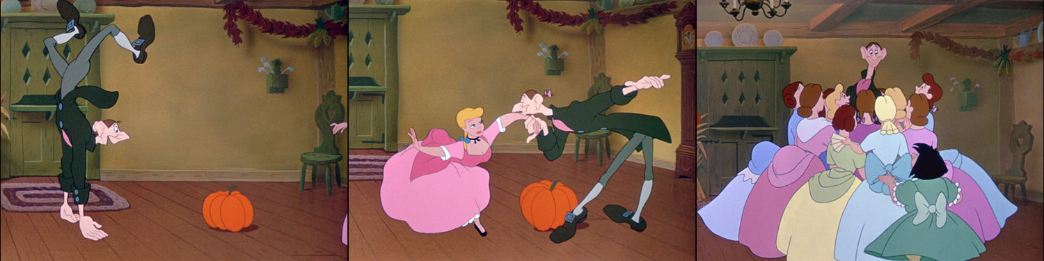
The dancers are all either green/turquoise or violet/magenta/purple that leans towards pumpkin color.

First, it's opposites...
...then close matches...
... dancing together...

...and back again.
Now Ichabod almost blends in with the scenery and only the pumpkin stands between him and Katrina (foreshadowing not only Brom's scary Halloween story but also the headless Hessian horseman who might or might not be Brom in disguise who actually ends up getting the girl). But for now, Ichabod is the main attraction and surrounded exclusively by soft pastel colors.


The second part of this analysis will focus on the following scary portion of the film, so stay tuned.

By the way, even the depicted food is red/purple and green more often than not.
* this looks like a standard transfer of a release print. Not too vibrant, but at least not digitally overcooked.

Friday, September 23, 2011

Links

Reflections on Light and Color
Italy is always worth a trip, especially during fall when the beautiful landscapes glow in autumnal colors. For those interested in computer animation there is another reason to go to Torino (Turin) in October:
The Computer Animation Festival VIEWFest (21st to 23rd October 2011) and
VIEW Conference, "the premiere international event in Italy on Computer Graphics, Digital Cinema, 3D Animation, Gaming, VFX and Interactive Techniques" (25th to 28th October 2011).

There are a number of interesting speakers at VIEW Conference including Randy Thom, one of those sound designers who helped shape our expectations of what fantastical worlds in movies sound like (Wild at Heart, The Empire Strikes Back, Mars Attacks, Coraline).

But for readers of this blog, the most interesting event might be Sharon Calahan's workshop:
Sharon Calahan: Ediza Afternoon, 30x24, Oil on Linen

Pixar's Director of Photography/Lighting Sharon Calahan

Reflections on Light and Color

This workshop is intended as discussion about using light and color to create memorable images that support the story. Sharon will talk about her favorite images and why they captivate.
Sharon Calahan joined Pixar Animation Studios in 1994 as lighting supervisor on the studio’s first feature film, Toy Story. She then served as director of photography on Toy Story, A Bug’s Life, Toy Story 2, Finding Nemo, Ratatouille and Cars 2.
Sharon knew at the age of three that she wanted to be an artist for Disney. She went on to study graphic design, illustration and photography. Following art school, she began her career as an art director for broadcast television and video production.
Prior to joining Pixar, she was a lighting director at Pacific Data Images completing commercial work, longer format television, and graphics packages.

Date: 24 Oct  |  Time: 11:00-13:00  |  Location: Centro Congressi Torino Incontra
Registration: http://viewconference.it/?p=3745
In addition to that Enrico Casarosa, director of Pixar's upcoming short La Luna, will "deliver a workshop open to aspiring filmmakers, scriptwriters and animation artists. Saturday 22 October from 10.30am to 12.30am – Sala 1, Cinema Massimo"

More Information here.

It also looks as if legendary Italian animation veteran Bruno Bozzetto (Signor Rossi, Soda and West, Allegro non troppo) will be appearing at the VIEWFest.

VIEW Conference Press Release (English).

----------------------------------------------------------------------

A Miyazaki Treat by Way of the Ghibli Conversations Blog

And now for something completely unrelated:
Daniel Thomas McInnes' Studio Ghibli Blog is a place of constant inspiration to me. 

One article I have come back to quite a few times recently is his posting of Miyazaki's complete original Mononoke Hime Storybook. What an amazing visual storyteller!

Be sure to also check out the sweet and poetic "Imoto He - For my Sister".

Friday, August 26, 2011

The World's a Stage in "Cape Feare"

Episode 9F22 – originally planned as the final episode of season 4 but ending up as Ep. 2 / 5 – is one of the most popular Simpsons episodes and much has been said about the fact that this was the farewell episode of the show’s original writing team. I believe that this alone is enough of a pretext to study the storytelling and how they got the scarier moments across and told a “serious” story between slapstick rake gags, Itchy and Scratchy and a grampa missing his hormone pills.

Note: I won’t write in detail about the particular references since there are already a DVD commentary and an extensive wikipedia page full of valuable information about the making of this episode and the many different “movie connections”.

The Simpsons, a series of half-hour (or more precise 22 minute) episodes, consists of quite a lot very short scenes, some of them no longer than 15 seconds consisting of only one or two shots. So a lot of the character based humor is only possible because we’ve grown accustomed to a great many recurring Springfieldians besides the title giving family.

There is a wealth of narratively unrelated parodies, pop references and side gags in each episode, but – like “Cape Feare” – there are whole episodes based on famous movies. In the case of Cape Fear there are already two adaptations (J. Lee Thompson 1962, Martin Scorsese 1991) of the same J.D.MacDonald novel available. The Simpsons episode is closer to the more recent Scorsese version where Bobby DeNiro is hiding underneath a driving car.

One reason why a two-hour movie plot works as a 20-minute scary-comedy-operetta lies in the casting. Because we expect a certain behavior from Homer, Chief Wiggum or Lisa, it is simply entertaining to watch how these characters react to a well-known madman trying to kill Bart. And casting Sideshow Bob (Terwilliger) as the killer, we don’t even need character exposition, just a little brush-up about the townspeople’s previous encounters with Bob.

Suspense
A parody only works for people who know about or have actually seen the spoofed film. But a Simpsons episode (and every good parody for that matter) should also work as a story on its own. In contrast to many other episodes the main storyline starts right at the beginning and not on a detour.

The first third of the story is also a whodunnit.

Not even a minute after the opening credits, Bart gets his first death threat letter. This starts the game of suspense and surprise that structures the narrative emotionally. We know that Bart is really frightened because he doesn’t laugh at the violence of Itchy and Scratchy. For the next three and a half minutes he is first paralyzed by paranoia, then after learning that the police won’t be of any help in this matter he tries to reveal the killer with Lisa’s help.

About a third into the episode it is revealed that Sideshow Bob was the originator of all the death threats and that he’s about to leave the penitentiary. The suspense now lies in our expectations of how soon they will meet. After the first confrontation/chance meeting in the cinema, Bob is seen steeling his body while the Simpsons (and the audience) are given two minutes of rest when they are introduced to the Witness Relocation Program.

Even during the happy trip to Terror Lake Sideshow Bob is never far. The last third of the episode takes place in Terror Lake and again echoes the first third with Bart being frightened by Homer bursting into his room with a knife and a chainsaw.

The final confrontation on the houseboat only lasts for about two and a half minutes with Bob’s singing the “H.M.S Pinafore” taking up more than a minute. Nevertheless, within the 21 minute episode the sequence feels quite long and memorable. The suspense plot arguably loses momentum when Bart outsmarts Bob with his last request (a classical countdown suspense scene that somehow doesn’t create the tension it should). But the police capturing Bob because the boat passed by a brothel and Abe Simpson turning into a woman end the episode on such a funny note that we forgive the otherwise squibbed climax.

Expressionist Lighting
As we have seen, much of the suspense comes from the anticipated confrontation of Bart and his pursuer. These scenes work because of the way they are written, therefore they are mostly staged in standard TV show style (high key lighting, no extravagant angles).

The Scorsese topshot (left); Bart is scared, doesn't this cage remind you of The Birds? (right)
Surprises and scary situations on the other hand benefit greatly from – or are even generated by – audiovisual elements and effects. So it’s no wonder that “Cape Feare” employs subjective lighting and other horror clichés more heavily than the average Simpsons episode.

Whether someone seems scary is largely based on a subjective perspective. Consequently, people who look threatening to Bart also appear in a different light and from more unsettling angles.
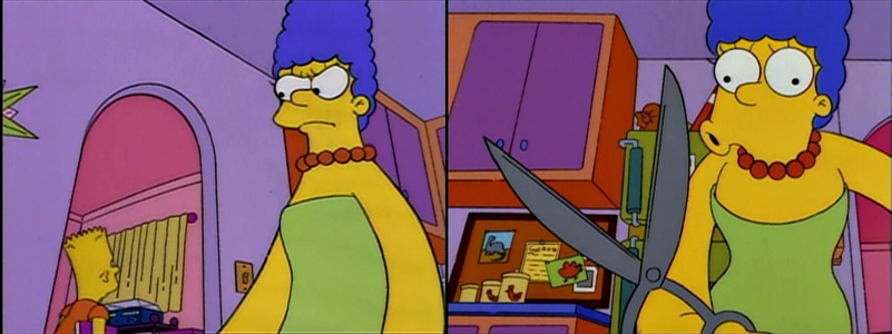
The first subjective scary moment: Marge depicted from an extremely low angle.
Ned Flanders also from Bart's low point-of-view; There's an additional backlight effect as Bart gets tenser.
After all, there is an clear-cut open villain at work, not some mystery killer who is only revealed in the last act like in a whodunnit.
Tilt angles and strong low-key lighting to make Bob's entrance scarier (and more campy).
When Bob gets angry in the parole board room, the lighting changes like on a theater stage...
...and back again, before he talks to the board.
Later in the cinema, Bob only turns green when scaring Bart (or trying to).
Bart does not seem to be scared by Bob lying in the streets (no shadows). At the Bates Motel (tilt angles) there's low-key lighting all around while Bob is writing a diabolical note.
Again extreme angles, low-key (cast shadows), a Hitchcock/Scorsese topshot (god's eye view) from where we see that it is Homer after all...

...but Bart sees it much more expressionistic.
Now that all devices are used, the progression is in the way Bart's reaction is animated.

When Bob comes aboard, he is not scary (straight angle, another rake gag), but soon afterwards he's back in villain mode and tilt angle/shadows.

This time it's not Bart's imagination playing a trick on him. It's the real thing, there are no subjective colors.

Comedy: flat, no shadows...

...threatening again: tilt and low key lighting.

A Stage Show
There’s no question that such lighting looks artificial and theatrical, especially in a cartoon where ambient light and cast shadows are generally absent. In addition to spoofing and exploiting our knowledge of horror films, the theatrical staging is a recurring theme on many levels.

As if foreshadowing* the “final curtain” Bob refers to after singing the complete score of a Gilbert and Sullivan operetta, the episode starts with an elaborate broadway show couch gag that has been heavily critized because it was re-used from an earlier episode.

The TV show the kids are watching before Bart gets his first letter opens with so many curtains that it’s hard to miss the staging reference here.


The nature of a staged TV show is later parodied during the Witness Relocation Program when the Simpsons become the Thompsons and there is an all-new couch gag. Parallels to the popular film-within-a-film or musical-about-staging-a-show genres could be drawn here.


The stage and acting theme is also referenced when Martin is wearing women’s clothes in order to play a murderer in a school theater production (and yes, we see the Bates motel later on). It visually foreshadows not only Homer’s disguise as Jason but also Gampa’s hormone problem.

So it doesn’t come as a complete shock when Bob and Bart put up an full-blown operetta performance with obvious props and improvised costumes and all. Visually, the final curtain falls in the form of a Union Jack (see images above).

The visual representation of the dramatic/theatrical theme is supported by a memorable soundtrack that incorporates Bernard Herrmann’s Cape Fear leitmotif for Sideshow Bob, the Thompson family singing in the car and an abridged Gilbert and Sullivan score performed by Kelsey Grammer.

* There is one favorite instance of foreshadowing that is only marginally related to the staging theme: When Bob tells the parole board that “Die, Bart, Die” is German for “The Bart, The”, a board member says under her breath that “no one who speaks German can be an evil man”. Only minutes earlier we have been reminded of Germany’s violent past in one brief shot of a TV announcer in uniform (who introduces a homophobic TV host with a German/Austrian accent talking about the “music guy’s” costume).