Saturday, October 25, 2008

A Comprehensive Terminology for Visual Storytelling

I finally found time to read The Visual Story – Creating the Visual Structure of Film, TV and Digital Media by Bruce Block. The main point of this highly normative book is to remind aspiring film makers of the importance of controlling every visual aspect of their movies.

Without getting bogged down in technical details Block offers a comprehensive overview of all the aspects that can and should be controlled in the creation of visual media content. In less than 300 pages he introduces a basic set of visual components and their respective categories that can be used to create contrast or affinity within shots, between shots or between whole sequences.

Thanks to the many pictures and diagrams (in full color for the first time) the text is reduced to a minimum that nevertheless is completely sufficient to get the concepts across clearly. At the end of each chapter Block suggests a couple of films to study.

“The wonderful aspect of studying pictures is that there are no secrets. The ingredients in food, for example, can be hidden. You eat a delicious meal but can’t guess the secret recipe. A picture’s visual structure can’t hide because everything is visible on the screen. The more times you watch a film, the more the visual ingredients will reveal themselves.” (page 83)

Although targeted primarily at film makers this book comes in handy for film scholars as well. After the tools are laid out, it is made clear that (in narrative media) the story structure should be the basis for every visual decision a director makes. In the end Block offers some case studies to show how successful movies make use of all these aspects to communicate their story visually.

The one thing that annoyed me a little was the lack of captions for frame enlargements. I found myself constantly browsing the index for precise information about the example pictures. Also there are some minor printing issues regarding the gray scale.

Granted, there are more academic and elaborate books on film analysis and many a thing about visual composition is illustrated more beautifully in the Famous Artists Course series, but I haven’t yet seen another book that unites all the aspects of visual storytelling in one coherent concept. Moreover, Block does not need to explain the technical processes or conventions of editing, cinematography and so forth to make his point.

My favorite chapter was – no, not the one about color (which is great, of course) – the one about movement which, in my opinion, is one of the most cinematic of all aspects and one that has often been neglected in film studies because the additional dimension of time can hardly be analyzed by looking at just one frame of a shot.

Of course, you could discover most of these concepts by analyzing a lot of movies on your own (which I, for my part, find very important and rewarding), however this book not only saves you a lot of time but also offers a useful terminology to describe what you’re looking for.

Monday, October 20, 2008

Peregoy and Léger

In honor of Walt Peregoy’s recent acknowledgment as a Disney Legend, I’d like to write about a subject that has been on my mind for some time now.

Two months ago, I attended an exhibition of Fernand Léger’s work that explored, among other things, his influence on American artists:


“Léger had a strong retroactive influence on American art. The exhibition investigates this interesting phenomenon for the first time, by including major works by American artists who were inspired by Léger – Roy Lichtenstein, Robert Rauschenberg, Ellsworth Kelly, and others. Léger can be rediscovered as a predecessor of Pop Art and a model for a range of contemporary artists.”

Information sheet FERNAND LEGER Paris – New York by Philippe Büttner, transl. by John Gabriel

But his influence can also be seen heavily in American animation of the 50s, particularly in some of Bob McIntosh’s Magoo backgrounds, for example:

Les disques (Léger, 1918)

Ever since I took an interest in Walt Peregoy’s works of the 50s and 60s, I wondered how much his style was still influenced by Léger at that time.

A short bit of history

Prior to being rehired at Disney in 1951, Walt Peregoy “spent three years in Paris studying painting. His sketchbooks at the time reflect the strong influence of Fernand Léger, and in fact, Léger offered to sign one of Peregoy’s sketchbooks because he was so impressed with the young artist’s work.” (Amid Amidi in Cartoon Modern). Unfortunately, I don’t know if any of these sketches are available anywhere.

There is not much known about Peregoy’s time studying under the great French Modernist except that he got to France aboard the “Queen Elizabeth” in 1948/49. He also met his future wife Madeleine Arneau shortly after he arrived in Paris. A few years before, (1940-45) Léger lived and worked in the United States, where he reportedly started painting free form color areas influenced by the light of neon signs around Times Square. Back in France he joined the French Communist Party and began to paint clearer silhouettes and heroic figures.

Contemporary influences?

Asked by Imagineer Julie Svendsen if he was influenced by artists like Mark Rothko and Nicolas de Stael, Peregoy replied:
“I’ve never been influenced at any time ever by anything that’s contemporary or otherwise. The one that I really admire and I’ll be presumptuous... I like to think my work looks like Goya. I think my work looks like his, not because I draw like him, but because he was politically aware and he drew from his soul. And I don’t mean it superficially like the ones that dribble paint or ones that paint the canvas one solid color. No. I was raised in the Depression and I mean I was aware of artists from the time that I was 9 years old, because I went to professional art school on Saturdays. I remember the artists at that time, the ones who painted murals in the Post Office. And then there were a couple... I think they were Jewish. I don’t remember their names. They were New Yorkers. They painted scenes on the beach, the boardwalk and the ghettoes. They were an influence on me in the sense that they painted what they saw, what they felt and the times. I don’t know what their education was but their work showed who they were more than what they were learning.”

Like Legér, Peregoy also limited himself to simple shapes, painted in strong colors. Moreover, technical objects and machines are featured prominently in the films he worked on. Although his personal style is clearly visible in all of his films, he always tried to find a completely different style for each new production. One can only speculate what The Jungle Book would have looked like, if Peregoy hadn’t been replaced by Al Dempster.

Look at some of his backgrounds from Windwagon Smith (he is said to have painted all of them himself, but I’m not sure about the clouds in the final shots) and you can see why the animators supposedly have been complaining about his “foregrounds”. Interestingly, in many of the earlier Léger paintings, the human body is just another technical object that doesn’t look more important than the tubes and discs around it.

I’m aware of the fact that at that time it was quite common in the field of animation to dissociate color areas from outlines (e.g. see Maurice Noble’s Warner designs) and many studios experimented with flatter styles and more contemporary stories and designs. I don’t want to overestimate Léger’s influence, but I still think it's interesting to compare the works of artists who at some time have been working together (I have also included paintings by Rothko and Stael).

The Saga of Windwagon Smith (1958)

Les constructeurs (Léger, 1950)


color key 101 Dalmatians

The City (Léger, 1919)

The Land mural (Peregoy, EPCOT)


color key 101 Dalmatians

Untitled (Mark Rothko, 1947)
[Update: for more on Mark Rothko, also see this excellent website]

The Saga of Windwagon Smith (1958)

Figure by the Sea (Nicolas de Stael, 1952)

color key 101 Dalmatians

Nicolas de Stael

Adieu New York (Léger, 1946)

Julie (Léger, 1945)

Trois femmes (Léger, 1927)

The Shooting of Dan McGrew (1965 all backgrounds by Peregoy; posted on Youtube by Jerry Beck)


Sunday, October 12, 2008

The dark side of theaters

No, I haven’t forgotten about the 3rd Indy post, nor have I forgotten about and Walt Peregoy101 Dalmatians, or the countless other subjects I wanted to blog about. But…
…ever since the Filmpodium, my favourite repertory programming movie house, started its great Hitchcock retrospective, I have found myself racing there whenever time permits, so in a way, this guy Hitchcock is largely responsible for the latest decrease in blogging here. Fortunately, work does not allow me to become a true cinemaniac (although sometimes, I find myself secretly wishing to be able to organize my life around movie theater showtimes).

Well, anyway. I wanted this to be a column about all the unknown people who sit around me in the dark during many a screening, in short: my fellow audience members. Well, not all of them, just some of them actually… those who kindly prevent me from immersing myself too much in a movie.


I adhere to the notion that the best way to see a movie is by light projected through celluloid onto a large screen in front of a sizable audience that gives it their full attention.
It is one thing to point out Hitchcock’s cameo appearances. And by pointing out I mean – apart from uttering things like: “There he is! Everybody, I have seen Hitchcock!” – literally pointing a finger at the screen. Thankfully these cameo appearances are usually during the first act and they channel all the people with an urge to speak up to one specific scene. Besides, this is not wholly unintended.

Identifying actors can even become a tricky game, intended or not by the director, as I have recently learnt during a perfectly matched double feature. It started with Robert Altman’s The Player (about a sleazy movie exec getting away with murder), one of these Altman movies with overlapping dialogue and long tracking shots, where you meet half the personnel of 1992’s Hollywood. I had the joy of having a young couple behind me with the guy whispering most of the big shots’ names to his audibly impressed girl friend. He did a great job, got it right all the time, so I really can’t complain, can I? Near the end, when Susan Sarandon appeared briefly but prominently, the now familiar female voice behind me proudly cried out: “I know her, there’s Meryl Streep!” Well, needless to say, the screening was part of a series devoted to Tim Robbins and Susan Sarandon

I know, I know, Sarandon’s face is probably not that well known and after all, the poor girl meant no harm and I better stop being such a smart aleck… At least these people were paying attention to what happenend on the screen. So I didn’t think there would be any guessing games necessary during the second film that night, the Coens’ Hudsucker Proxy. Until shortly before the film ended, I witnessed women (and this was no multiplex-teen-crowd) asking each other if the old villain (one of the main characters) could possibly be Paul Newman. Was I accidentally attending a screening for people with agnosia? Hadn’t Newman been all over the papers lately, I guess even the prominent screen credit in the beginning would have escaped the attention of these audience members.

But I’m digressing… all of the above was simply comedy continuing beyond the boarders of the screen. This here is about people talking when they really shouldn’t. During a movie, for example.

"Attention" means silence, however, when the film deserves and earns it.

I may be a little old fashioned but I like visual storytelling and that’s why I go to the movies a lot.
Sometimes I believe there is a strong minority of people living among us who honestly believe that all that constitutes a movie is dialogue and only dialogue. So when they spot moments without dialogue they step into the breach and provide their own chatter. Now, as you know, there are long stretches without dialogue in almost any Hitchcock film. The rest is silence... or rather the lack thereof...

Sometimes I ask myself: “Do people actually think that movies will become interactive by talking to them?”

A subcategory of "attention" may apply to the modern annoyance caused by moronic narcissists who use cell phones or do text messaging during a film. This is growing more common, and recently the Answer Man reprinted an eyewitness movieweb.com account by a writer who sat next to a newly famous film critic who used his cell and processed text messages during virtually an entire movie.

Receptive observers will have noticed that, very sporadically, there are people who don’t believe in the concept of paying attention at all. To them a darkened auditorium seems to be nothing more than an airport waiting hall. In fact, they have found it to be an ideal place to attract attention more than anything else.


Usually I feel like Bob Clampett’s suicidal cat (“now I’ve seen everything!”) having witnessed people picking up their cel phones during The Trial, 80 year olds beating each other with sticks and handbags over a favourite seat (Monty Python meets Cinemania), not to forget the rather clumsy man who was looking for his wife (asking around in a very polite, hushed way “have you seen my wife?”) and then for his coat, the whole procedure twice during Notorious. The Cave of the Yellow Dog in my memory will always remain connected to the marriage problems of two 40-somethings even if I don’t remember what the movie itself was about. By the way, have you ever seen a bald headed man hitting himself over the head with his flat hand every time he accidentally snorted? To me it is Suspicion. You can see, the beautiful thing about paying full attention is that one is very receptive to whatever goes on around him. Moreover, only one single occurrence might trigger an acquired reflex. A learning success only dreamed of in most other situations.

A few weeks ago I had a glimpse of what Tex Avery’s Cat Who Hated People must have been going through: It wasn’t until a recent screening of Fritz Lang’s Fury – yes the one about vigilante justice – that I discovered a secret impulse to take the law into my own hands and strangle a senior citizen who had already made such a racket that a woman had left the auditorium in protest. He not only broke out in laughter every two minutes, he “unconsciously” fumbled with some plastic bag for almost a whole hour until he had to go to the bathroom and never returned. It was the first time I actually screamed at a complete stranger and my pulse was so fast I almost fainted. Needless to say, it took me some time to calm down and concentrate on the movie again. After all, this is about emotions. I'm sure the next time I see Spencer Tracy my pulse will be accelerating.

Don’t get me wrong, I love going to the movies for many reasons, a receptive audience is certainly one of them. There’s nothing like 400 people laughing at Little Miss Sunshine’s final reel or children screaming “NO!” when Snow White is about to eat the poisoned apple. It’s part of the experience and – like the “I have seen Hitchcock” whisper – it is an intended reaction.

And I don’t intend to let a few chatterboxes ruin that for me or anybody else. Come to think of it, it might actually be interesting to make a documentary about what goes on in the mind of someone who is talking during a movie. Or at least such a person would make a believable villain.

Wednesday, September 24, 2008

Indiana Jones: Red objects (2 of 3)

Indy: “There’s a big snake in the plane, Jock!”
Jock (pilot): “oh, that’s just my pet snake, Reggie.”
Indy: “I hate snakes, Jock, I hate them!”

The first red object we see in Raiders is the red furnishing of the waterplane in which Indy escapes his pursuers. As we identify with Indy whose goal is to reach the plane in time, we focus on the red cockpit that is clearly noticeable against the gray and green background. Once inside the plane, Indy discovers something rather unpleasant: Jock’s snake Reggie. This way, we learn about Indy’s irrational fear of snakes that sets him apart from a lot of movie heroes (and works as a running gag in all four films). I think, it is no coincidence that the snake is found inside a red environment. In our culture, red is often associated with warnings, alerts, or more directly danger and threats. Keep that in mind when reading on, because many of the red props we are about to see can be interpreted that way. Besides, it is characteristic of this movie that means of transport (that connect set pieces and action sequences) are containing new threats (Germans on the plane, explosives on truck).

As I have mentioned in the last post, the overall production design is based on naturally desaturated colors (sandy desert, stony caves, dull university halls where even the most colourful student wears only muted pastels, lots of washed-out browns and grays) with occasional spots of muted greens and strong reds as accents. Although a lot of the movie plays out in plain sunlight, low-key lighting (generating high contrast) is used a lot.

Emblems
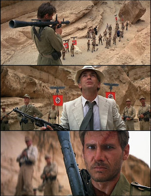
When Indy travels to Nepal to meet Marion, he is secretly being observed by a man who hides behind a copy of LIFE magazine. Not only does this attract the audience’s attention right away (the rest of the plane is almost confined to the gray-scale) but it also establishes a visual connection between the observer and a red and white emblem. Remember, we haven't seen any Nazis at this point in the story; they have only been mentioned during the discussion about the ark. Even later, when we hear the bad guys speak German (or with a German accent), we never see a swastika on red ground. This image is thoughtfully saved for a later surprise moment:
Almost exactly halfway into the film, after Indy has found the exact spot to dig for the ark and calls for Sallah, someone is lowering a cord made of flags. The first flag Indy sees is the familiar red one. For a brief moment he – and we, the audience, who have seen Sallah being distracted by Germans – thinks he might have been already discovered.
What I especially like about this scene is that Spielberg doesn’t explain anything, he just cuts to the next scene showing Indy with Sallah on the way to the digging site. This kind of elliptical editing at a major turning point of the main storyline is something, I think, you would never see in an contemporary animated feature, even though it keeps the picture moving.

We see the emblem again right after the Nazis have taken over the ark, when Indy and Marion are crawling out of the pyramid. It gives the planes in the “Flying Wing” scene the necessary sinister touch.
It isn’t seen fully saturated until the big guy’s blood is spilt theatrically.

Now that the Nazis have the ark, red swastika flags are constantly seen around it.
Next to the flamboyant red flags, the subtlety of the scene’s color scheme really pays off here. While the muted green uniforms are emphasizing the complementary red of the flags, they help us tell who is who even in long shots (at least in a theatre or on a reasonably sized TV): Toht is always dressed in black, Marion wears a white dress, while Belloq’s beige/grey suit is still lighter than the rest. Indy of course is again darker than the background and is kept apart by staging.

Disguises
Belloq, the great opportunist who is collaborating with the Germans only to get a hold of the ark himself, has bothered to learn various Indian and Arab languages, thus approaching the people along his way as a “friend” adapting to their needs. Indy on the other hand is simply focused on the treasures and has to rely on benevolent people around him (Sallah, Marion, the children in the market place), just because he's the good guy in their book. In a way, he is more like a rebel working underground, whereas Belloq sides with the powerful. This way, Indy is forced into superficially disguising himself more than once, first as an Arab, ultimately as a Nazi.

Cairo (ext. day)
Nearly all of Act II is set in Cairo. The first sequence (roughly 8 minutes) almost plays like an independent action movie that ends with Marion’s apparent death. I will come back to this “production number structure” when discussing Temple of Doom. But back to Raiders:
Cairo is established by our new “tour guide” Sallah as the “city of kings”.
After the dark bar in cold Nepal, Cairo is seen in bright sunlight that washes out almost all the colors except for some red and green accents provided by props and plants. Most of the people are dressed in white with the occasional red fez or belt.

Sallah warns Indy again about the powers of the ark
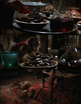
Then suddenly a monkey wearing a red waistcoat spills red liquid and takes an interest in Marion. By the end of this sequence, the monkey will have played a critical role in the kidnapping of Marion. However, it isn’t perceived as a threat yet (despite its color, I'm tempted to add).
Then we cut immediately to the teeming streets of Cairo. Among all the white robed people Marion’s glaring red trousers are easy to locate at all times.
Look at the many colors these facades come in. They are so desaturated, though, that we tend to ignore them.

During the chase, points of focus are marked by red props in order to make them stand out - or even read if they are on screen only for a short time.
Indy’s sword bearing opponent in the notorious shooting scene actually looks like a “boss” of a jump-and-run game (black/red and big among average white extras). But as we – unlike Indy – can see, the biggest threat (purely red explosives, heightened effectively by dull green boxes) is still to come. At the end of this sequence it seems as if Indy had lost this game, though.
Until his interest in the ark prevails over his grief, he is completely passive, letting outer forces do the decisions for him (first he is following one of Belloq’s men, then a group of children saves him).
By the way, Sallah wears an outfit similar to Belloq’s, except for his red flower in the button hole.

Cairo (int. night)

The first suspense moment (where the audience knew more than Indy) led to Marion’s apparent death. So we don’t expect too good, when witnessing somebody poisoning the dates. The red threat here comes in three guises within the same scene: the poison vial, the drink and the monkey’s vest. Only this time, the monkey traitor has to die to save Indy. This scene plays like a dark version of the monkey's first scene (seen above).

Meanwhile, a wise old man is deciphering Marion’s amulet. While he – but not Indy – is lighted slightly blue, the red and blue lamp hanging above his head matches the “heaven’s light” pattern mentioned earlier. At the words “Hebrew god” a sudden wind gust makes the lamps and curtains jingle.

Out in the desert, while Belloq frees Marion to give her the white dress, Indy and Sallah are about to discover the ark, hence the blue lighting outside the tent. Belloq "would very much like to see" her in the white dress he hands over to her (this kind of turns her into the plain white surface onto which he projects his desires).
Marion hides the fruit knife under her red trousers before she indulges in Belloq’s drinking game.

Marion as a threat?
Red, of course, is also linked to love and passion in most cultures. So it's no surprise, that Marion is enveloped in red before she kisses Indy. Interestingly, the lighting is not too different from her scene with Belloq (she's also wearing a white dress given to her by the captain), only the stripes on the wall are horizontal instead of vertical now.

But, to come back to my adventurous interpretation of red designating threats: Is it possible that Indy sees Marion as a threat? If we look at his behaviour towards her (he cannot forget her and doesn't want to fall for her again), it could be (I don't want to get into the snake/woman analogies, because this, as Bart Simpson would put it, "is gonna be biblical!"). She is also threatening to undercut his mission, because he starts worrying about her more than about the treasures. In the end he's better off with her, of course.
Except for some red lipstick her whole appearance is in keeping with the desaturated university. They both look rather domesticated.

Interpretations aside - as they may not represent the filmmakers' intentions at all - it is obvious that this movie's color scheme has been planned very carefully. Although it may not look this way in these posts, red is only used sparingly for accents within the big picture.