Saturday, March 12, 2011

Gray Balance

Contrast of saturation
A color is always perceived in relation to its neighboring colors. So basically the more saturated of two colors will stand out by contrast of intensity. Therefore, a spot of color that is surrounded by less saturated colors attracts our attention. It helps if the emphasized color is red as in the following picture, because human perception reacts most strongly to this hue.
Der heilige Christophorus by Konrad Witz

If completely desaturated, Christophorus' coat is receding while his face and the child he carries are emphasized.

The surrounding colors are so much less saturated that they tend towards the neutral. We can sense their basic hue, though, and the depiction looks fairly natural color-wise with the muddy water reflecting a slightly overcast sky and the stones and rocks in sand colors and bluer in the back as a result of aerial perspective.

In the four swatches on the left, the red of Saint Christophorus’ coat is surrounded by the neutral tones of the water, stones and rocks directly as they appear in the painting. On the right side, I have surround the same red with fully saturated versions of these formerly neutral tones. Suddenly, the hierarchy isn’t as clear anymore and we have competing colors that are only different in hue and value and all more saturated than the red that looked so intense on the left side. The red would still stand out because the other three hues are closer to each other.

Neutral colors
Theoretically, really neutral colors would have to be completely desaturated – which would leave us only with the gray scale. But thanks to our ability to perceive even the slightest tint of a color if seen against a different hue and the brain’s seemingly counteractive urge for color constancy, all dull colors can be used as neutrals.
Photograph by Niklaus Rüegg taken from his website.

Gray with a tint of blue is perceived as cold (like the paint pot above) while gray with a tint of red, orange or yellow is perceived as warm (like the sand color above) and would actually be called brown or beige depending on its value.
left: cold neutral, middle: gray, right: warm neutral.

As you can see in the following screenshot from Bambi*, all the colors are more or less subdued, yet it is a colorful image that is carefully structured by different degrees of saturation and value.

If you look at the desaturated version you can see the basic hierarchy of values. It’s very subtle, but Thumper is dark on light (in the pool of light), with the flowers – the closer the darker – surrounding the stone.

The interesting part to me is in this part of the picture, though:

We have a gray rabbit on a gray stone, or so it would seem. At least in this specific picture, Thumper is slightly tinted brown but is perceived as warm gray.
Thumpers body colors

The stone on the other hand is made up of many different hues that are similar to those used for the flowers. Only that on the mossy stone they are generally less saturated. We have complementary contrasts of red and green. If you look at the top plane of the stone, the gray looks cold compared to the other colors on the rock, when in fact it is a shade of brown (see swatches: bottom row, second from left) and not blue.
left: stone colors, right: flowers in the foreground, highly saturated
left: stone colors, right: flower buttons in the background (the petals are brighter)
Color Constancy

This effect of perceived color constancy is used in many paintings and movies to evoke the impression of a certain mood.
Heavily overcast sky at dusk. It somehow feels warm.

If we look at this still from Fantastic Mr. Fox (above) we perceive the upper part of the sky as gray in contrast to the salmon lower part and the orange-brown landscape. The gray clouds also serve as a balance to the rest of the picture preventing it from looking monochrome (more about this in the final Mr. Fox post).

But if you look closer or examine the gray in photoshop with the “eyedropper tool” you will see that in reality it is brown as well. But since the whole picture has a warm brownish tint, the least saturated color is perceived as gray by our brain that is constantly adjusting the white balance.

For comparison: Here we have another still from Mr. Fox that transports a different mood and daytime. Here the gray looks much more neutral, even colder:
The contrast to the lanscape is much stronger, the light seems to be whiter. The atmosphere is more sober and cold.
left: the brown dusk sky; right: the grayer afternoon sky.

This color constancy effect is much stronger in a cinema because there are no other objects and lighting situations than what we see on the screen, thus we have no reference to compare the colors to. At the start we may notice the color cast strongly, but over time our brain adjusts to it all the more. It still has the intended impact of emphasizing certain colors and evoking a certain mood (you can see this in David Fincher’s (dingy yellow tint) and Clint Eastwood’s more recent films (gray-green tint).

Therefore, color casts in movies can be really extreme without the audience noticing (If you leave the theater during projection and return soon afterwards, you’ll see the color cast much stronger). Seen on a computer or TV screen, the effect is much stronger because our eyes and brain have a frame of reference from the colors surrounding the monitor.

Sometimes we notice a strong color cast that went unnoticed in cinema only when seeing the same film on DVD. I remember the DVD of Three Kings (1999) having a disclaimer that the colors were meant to be unnatural and oversaturated because viewers would complain about “bad” picture quality which never happened when the film was in theaters (and looked more or less the same).

It seems that every frame of Sylvain Chomet’s Les Triplettes de Belleville (2003) is heavily tinted either brown, yellow or green. At times the compositions look almost uni-colored/monochrome. It has derogatorily been described as pee- and poo-colored (which in fact says more about the tastes of the reviewer than the quality of the color concept itself).

All these screenshots are in their original appearance on the left, and automatically white balanced on the right (with photoshop sometimes rather leaning towards light blue):
Without the yellow tint one can see a variety of hues.
The newspaper which appears to be gray is olive green on the left and blue on the right.
The street is still slightly brown on the right.

It’s not only important to keep the value of neutral colors in mind but also that the whole concept of cold vs. warm colors is relative as well.

 * I’m analyzing a screenshot of the 2005 digitally restored DVD as is. I cannot say how close this comes to what the original Technicolor prints looked like regarding tints and colorcasts.

Sunday, March 6, 2011

Fantastic Mr. Fox: Prolific Limitations: Understated Acting (5/5) Part I

It was a last-minute decision to divide this final chapter on Fantastic Mr. Fox into two parts (I like to refer to it as a Deathly Hallows decision) because I didn’t want it to become as long as the last one. This first half is entirely concerned with acting while the next one will be about the limited color palette. 

Nevertheless, let me start with an addendum to Mr. Fox post (4/5): Now that The King’s Speech has won the Academy Award for best picture, chances are even more people are going to see it if they haven’t already (at least around here it is still playing in theaters). Anyway, if you happen to see it (again): Inkeeping with stern royal protocol, the film contains a good share of central perspective shots with Geoffrey Rush sometimes almost looking at the audience (e.g. the film’s closing shot). There’s an early dinner table conversation in the 90° style (without the whip pans, of course). Also note the patterned wall paper in the therapist’s apartment and a few “chameleon” effects. Slightly to heavily distorted wide-angle lensing is visible in many scenes, especially the ones that transport the reluctant king’s uneasiness with his new “profession” of “kinging”, as they say. (No pictures to back that up since I don’t have access to a DVD and the publicity stills show nothing of this, I’m afraid.)  

Regardless of these superficial similarities, the film’s overall style does not even remind one of an Anderson film. I just brought up this example to make sure that these stylistic devices are in no way exclusive to Anderson’s films and in a more conventional drama their use is hardly noticed. 

Understated Acting
I didn’t think of Fassbinder when I started writing about acting in Anderson films, but thanks to a lucky co-incidence, I’ve just seen Fassbinder’s two-part science fiction drama Welt am Draht (World on Wire, 1973) the other night and a couple of influences/similarities suddenly became clear to me (e.g. I can see now why Wong Kar-Wai claims to be influenced by Fassbinder). Michael Ballhaus’ manierist camera choreographies are among his most elaborate even measured by the standard of his works for Scorsese

So as a starting point, look at the following Youtube-Clip from Welt am Draht that not only anticipates part of the camera move from Life Aquatic (excerpted in Mr. Fox post 4/5) but also includes some of the more static and artificially understated acting and dead pan dialogue delivery:

Within this movie about virtual reality and deceptive appearances the acting style works very well. The actor playing “Fred Stiller” is the same Klaus Löwitsch whose acting I’ve analyzed here before.

We have already seen that characters in Anderson’s films are often emotionally paralyzed and have difficulty breaking out of their habits and, visually speaking, their geometrically organized environments. This is reflected in how Anderson directs his actors. Part of the comedy comes from characters who deliver their zany lines nonchalantly even in moments of great turmoil or in deeply emotional situations.

Whether they are melancholy like all those played by Bill Murray or rather optimistic like the Owen Wilson characters, they hardly raise their voices and are usually speaking rather slowly. His films have been described as “slowed down farce or souped up tragedy”. Either way, Anderson has a great, unique sense of timing that grows on you with repeated viewing.

Watching the following excerpt from Life Aquatic, keep in mind that Steve Zissou (Bill Murray) has just met a man who claims to be his son (Owen Wilson).

By the way, one reason among others why Life Aquatic never really lifts off, I believe, is the fact that the one-note Murray character for once is the protagonist who is so full of self-pity that there’s not even dramatic tension in the confrontations with his antagonist played by Jeff Goldblum. 

Animating internal conflicts
A lot has been written about Anderson’s decision to take the actors to a farm and record the dialogue “on location”. That’s the part most “making-of” features and interviews cover, so there’s no need for me to recycle it here. What’s interesting from an analytical point of view is the further development of Anderson’s trademark style with the unique tools of animation.

The voice acting style of Fantastic Mr. Fox is closer to Anderson’s live-action films than to the average animated feature. If anything, the dialogue pacing is slightly faster, in fact, George Clooney talks pretty fast for an Anderson film at times. This is picked up in Mr. Fox’s movements which are often a little faster for comic effect, like a film projected at a slightly quicker speed. The voices themselves sound relatively close-miked and thus pretty intimate while still being firmly embedded in the sonic environment of the locations.  

Henry Selick who served as animation director in Life Aquatic (and was cast as animation director of Mr. Fox before being replaced by Mark Gustafson due to scheduling conflicts) once talked about the challenge for the animators to adjust to Anderson’s vision. As can be seen in Mr. Fox, the director wanted the characters to be animated rather differently from the prevailing standard of organic pose-to-pose style.

When you look at scenes from Mr. Fox, strong line-of-action changes are rare. Although animated expertly with attention to subtle details, the puppets themselves remain relatively stiff and upright, which sharpens our perception for the subtle motions possible with this kind of puppets. This not only reminds me of the Eastern European stop motion tradition that Anderson cited as a key influence, it also translates his understated acting into animation while taking it even a step further by incorporating the characters more naturally into the geometrical compositions.

Since the story is mainly driven by Mr. Fox’s internal conflict between domestication and animal instincts, the animators have found a brilliant way of visualizing these “wild animal” outbursts contrasting the domesticated acting. Animal instincts prevail whenever the animal characters are eating, digging or fighting. These outburst erupt suddenly and not without comic effect as you can see in the following clip:

Interestingly, the “wild animal” movements are even more stylized than the understated acting scenes. It’s clearly neither a case of natural animal movements vs. restrained domesticated gestures, nor are the animators applying the Disney technique of smoothly combining natural animal movement with exaggerated human behaviour.

The digging especially is rather iconic: instantly readable without a hint of realism. Just look at the following frame grabs:
Nine consecutive frames of digging.
The arm movement is a mechanical loop which is performed by all the characters behind Mr. Fox without a physical effect on the wall. It is just a symbol for digging, not an actual depiction.

One of the advantages of the iconic digging movement is that it doesn’t get in the way of the conversation. Because it appears so mechanical we focus on the dialogue delivery. Note how the dirt in front of Ash is vanishing although he is busy blocking his ears with dirt:
Six selected frames of a digging close-up.

Overall the animation style is so different from what we expect from American animation that the animators couldn’t hardly revert to clichée acting and poses. Once you get past the initial “awkward animation” feeling you’ll see that the animators have done a very fine job of specific acting – also on the human characters.

Sunday, February 27, 2011

Two Links

Before posting the last part of the Wes Anderson series later this week I’d like to guide you towards two Disney related pieces:

Fantasia mosaic
Steven Hartley is literally in the middle – he has just reached the intermission – of posting a Fantasia mosaic using the drafts to comment on who animated what on Walt Disney’s ground breaking third feature. Steven seems to be a bit disappointed that he doesn't get too many reactions from readers. In any case, these mosaics come in very handy as a starting point for researching an animator's particular work.

Walt Peregoy in his own words
Most of you might have already seen this as it was on cartoonbrew last week, but as someone who is interested in animation backgrounds and 101 Dalmatians in particular I feel obliged to mention it here as well:
Steve Hulett has just posted a new interview with Walt Peregoy over at the TAG blog in two parts (here and here). It’s always interesting to hear the veterans tell their story in their own (in this case explicit) words. While recounting the facts and putting them into context is better left to the researching historians, such interviews reveal more about the way these people think and how they see themselves within their working environment and society.

However derogatory Peregoy’s remarks about his fellow employees may be, he does show great respect for the fans – the people who research animation history - and he knows that he is famous among them. If anything, he likes Amid Amidi’s book Cartoon Modern an awful lot, especially the comparison of his and Eyvind Earle’s backgrounds for Paul Bunyan (see Amid’s online version here).

From the interview, we do not get too much insight into Peregoy's artistic point of view other than that he is very proud of his unique work. I would have loved to hear him talk about the thinking behind his color concepts or how he approached work on a new film.

There’s one instance where he questions one of the “trite clichés” as he calls them: According to Steve Hulett, on Jungle Book, his father (Ralph Hulett) wanted the characters to read light on dark, because he thought that jungles were dark, but Woolie wanted them the opposite way, dark on light backgrounds. Walt Peregoy: “your father was wrong in this sense. I did most of the key Jungle Book backgrounds, they were colorful. And here’s the thing: your father suffered from the ancient “reading them characters”. […], anything that moves reads."

Light characters on dark background: Cinderella's pastel colored characters were often staged against shadow areas - day (left) or night (right).
Dark characters on light background: with little exception all the Jungle Book characters are seen against lighter backgrounds - day (left) and night (right).
While this is basically true and you could get clear silhouettes across easily by strong outlines and such, this was the opposite of Disney’s intentions to minimize the outlines around the characters. Woolie had his way and Al Dempster finally did the conventional key backgrounds for the version of The Jungle Book that got made (after Walt Peregoy was fired und Bill Peet left the studio).
One of the few Jungle Book color keys by Walt Peregoy found in Pierre Lambert's book.

Later on, Peregoy referred to this again saying: “If it reads, the thinking is, it’s a flat inked and painted image over a flat background. But that’s not necessary and I know this”, because of his work on The Lone Ranger series and The Shooting of Dan McGrew.

Thursday, February 24, 2011

Bill Justice's White Rabbit

Today, the 60th anniversary BluRay edition of Alice in Wonderland hits the stores around here. I'm already curious how different the colors will be compared to the recent "un-birthday edition" that was already very different from the previous DVD release. 

If ever I have time to write about the color design of a whole Disney feature again, it will be Alice. I particularly like the whole Mary-Blair-haircut-house scene with the bordeaux grass and the balancing gray.

In remembrance of Bill Justice who passed away two weeks ago, here is a whole animation scene (31 drawings altogether, all exposed on twos):


The White Rabbit is witnessing the burning of his own house. The beginning of this shot has him cheering along with the Dodo who sets the straw on fire. The turning point comes when the Rabbit realizes again that he must do something against it in order to save his house. Bill Justice accents this turning point with a take that takes the rabbit beyond the frame edges (just look at the shadow - probably by the effects department - that appears only when necessary and without connection to the overall lighting scheme).

Saturday, February 19, 2011

Fantastic Mr. Fox: Flat Staging and Camera Moves (4/5)

Over the years, Wes Anderson has found a way to translate his visions into pictures as rigid as if they were drawn with a ruler and a spirit level. Since he obviously likes to control every single detail in his films it’s astounding how long it took him to finally end up in animation.

As we have already seen, many of his distancing trademarks translate very smoothly into animation, others can even be exaggerated due to the stylized nature of the medium.

If you look at any Anderson film from Rushmore on you’ll notice the many top shots (or “God’s eye view” as used by Scorsese and Hitchcock) and slow tracking shots. Already quite distinct in the beginning, Anderson and his director of photography on all live-action films, Robert Yeoman, have perfected their system of preferred framings into a very rigid concept.
top shot inserts (left TRT, right TDL).
TRT: from relative close-up on detail (left) to top shot of characters (right).

left (TRT): god's eye view like point-of-view of a character, right (TDL): no character could see this perspective.


Note: On Fantastic Mr. Fox, Anderson worked with DP Tristan Oliver for the first time. While all the style choices seem to be straight Wes Anderson, there’s hardly any wide-angle distortion visible and it’s his first film since Rushmore that is not filmed in cinemascope. 

Top row: top shot inserts aka rostrum camera shots; bottom row: god's eye view on characters.

Central perspective
Anderson’s preference for central perspective first cropped up in a few right-angled top shot inserts in his debut Bottle Rocket. In Rushmore, he started to favor flat setups with the camera perpendicular to the background.
left: The Royal Tenenbaums (TRT), right: The Darjeeling Limited (TDL)
central perspective and symmetry in TRT.

He kept shooting most of the dialogue scenes in standard overshoulder style. There are a few instances of point-of-view shots, though, that are straight on. In later films (starting with The Royal Tenenbaums (TRT)) these straight-on point-of-view shots become independent from the actual characters so that there is a feeling that the camera is an additional character in the room. Henceforth, virtually all the conversations are filmed either full frontal or in profile with the camera always horizontally perpendicular to the background or the speaking character. This way, the characters often seem to speak almost directly into the camera. 
shot - reverse shot in Life Aquatic with Steve Zissou (LAWSZ)
TRT: The camera usually stands on the axis, and makes 180° turns during conversations.
LAWSZ: The characters looks slightly to the side of the camera although they sit in the middle of the frame. This way they avoid breaking the fourth wall.
Conversation over a very long dinner table.
Ozu often used such setups for his dialogue scenes as in Late Autumn (1960), just look at the trailer:


To achieve something of a standard shot – reverse-shot continuity with the characters to the left and right side respectively, he still places the camera perpendicular to the background, but the characters are not sitting or standing in the middle.
one of the rare overshoulder shots in TRT
TRT: The background is in central perspective, the second character is not centered, however.
LAWSZ: The same, only with Bill Murray even more on the edge.
LAWSZ: The off-center character can have overshoulder shots without blocking his opposite.
Same here with Kylie and Fox.
This flat staging also emphasizes the lightness and comedy potential of the story as opposed to the more angular deep focus staging of more dramatic films. Mark Kennedy has extensively written about it here. Especially the central perspective wide-angle long shots are reminiscent of theatrical staging.

We either get the characters in profile...
...or full frontal.
upper row: profile and full frontal in same frame, lower row: the same, but there's a 90° turn from lower left to lower right so that profile and frontal are reversed. This also shows us that we're not looking at the stage from outside but can assume positions within.

There seems to be an exception to this strange 90°-rule: on the vertical axis, the camera can assume almost any angle, low or high.
high angle shots.
low angle shots to make the characters look more powerful to limit of distortion (upper left).
Doll house aesthetics
Some of the right-angle shots are not connected by a cut but by a whip pan of approximately 90° (sometimes 120° if characters are blocked in a triangle). This can be seen most often in The Darjeeling Limited (TDL) when the three brothers (sometimes including the mother) are having three- or fourway conversations. Speaking of whip pans and Indian movies: there is a similarly turning whip pan from one setup of a face to a central perspective framing of a doorway in Satyajit Ray's Pather Panchali (1955).

While it’s nothing unusual to have the camera follow a character throughout a scene (think of Scorsese’s GoodFellas or Raging Bull), Anderson often organizes his camera moves in straight lines, horizontal and vertical (dolly as well as steadycam shots). Like the fixed camera setups, the tracking shots are increasingly limited to 90° angles. Again, the feeling that the camera is a very limited character itself or is carried by an omniscient narrator is emphasized.

Especially since TRT, Anderson often shows sets in cross-section so that we can see how the characters’ environments relate to each other. The outer circumstances are always straightforward and easily manageable, yet the characters’ inner life seems to be confused to the point that they are paralyzed emotionally. Anderson also likes to frame his characters within the frame.

These cross-sections involuntarily remind me of a doll-house. So it’s not surprising that this rather mechanical, distancing effect works best in Fantastic Mr. Fox, where the sets actually are doll-houses.
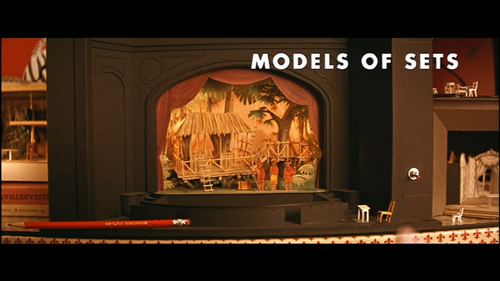
TRT: like mocking his own concept Anderson shows us a stage model with pencil to get the size relations.
In LAWSZ we see the whole ship in cross-section. There's no way we believe this to be a true ship out on the see.
TRT: Like the windows of an advent calender we see the separately framed characters in one frame.
TRT: left: Margot is framed by curtains; right: the children are framed by the bench under which they lie.
TRT: here the characters are less obviously framed, left: by the door, right: by the background wall. The "chameleon concept" enhances the effect.
Most often the characters are framed by windows or door frames.
left: windows and doors, right: cooking area as framing device.
left: the resulting pattern effect is also picked up in this split screen top shot; right: geometrically patterned split screen.
Screens in the back provide split screen effect and frame-within-frame.


Flat staging to the max
While classically hand-drawn animation often tries to painstakingly simulate depth by way of multiplane devices, it is fairly easy to create natural depth out of a stop-motion set by just filming it from a natural angle. Yet, there have always been artists who favored flat staging to compress the filmic space into a relatively two-dimensional world. In this context, Anderson’s basic approach doesn’t stand out as much as in his live-action films. However, he is able to expand his concept.

The evolution of the doll house cross section in four examples (many more in the actual films) from TRT, LAWSZ, TDL and Fox. I have removed the sound so it doesn't distract from the camera moves.

Depth cues can be altered by using different lenses to photograph a set, but in puppet animation the set can also be built to the desired specifications. While there are sets that expand far into the background, others are more compressed. Especially in doll-house scenes and tracking shots the sets are built increasingly flat. Sometimes they are hardly distinguishable in style from Mrs. Fox’ paintings (which are allegedly painted by Wes Anderson’s brother Eric Chase Anderson who also voices Kristofferson in the film [UPDATE: according to Christian De Vita, the storm paintings were done by Turlo Griffin (see comments below)]).

Here we have depth by having two planes of action, one in the background, one in the foreground.
This is one of the rare examples of deep staging with a real horizon that is far away.
Usually, even in spatially deeper sets, the view is limited by objects in the near background that prevent us from seeing the horizon. Most often these are walls or houses.

Here we have walls and mountains to limit the space. Nevertheless this is about as deep as it gets in this movie.
Most of the interior scenes are staged really flat (theatrical again).
Also this exterior looks rather flat because we have no real depth cues except for the train size in background.
This top shot is from a helicopter and looks similar to the paintings of Mrs. Fox.


These three-dimensionally constructed long shots look rather flat/two-dimensional
These are all framegrabs from the same horizontal camera move to the right.
As soon as the animals start digging, Anderson resorts heavily to cross-section dollhouse shots.
With this being the most extreme. The set looks almost like a two-dimensional painting.
In the end, the sewer system is revealed to us in a mechanical camera move.
Speaking of these paintings: we’re in England and it never rains, there’s not even a hint where she gets the inspiration for her thunderstorm depictions.

By the way, there are some point-of-view camera setups, some of them reminiscent of ego-shooter game mode:
The one on the right is technically no POV, as we see the character's head in the picture, it looks more like a camera mounted to a dog.