With the current Mickey Mouse shorts revival on the horizon and the lighting orgy that is MONSTERS UNIVERSITY in theaters, this seems to be the right time to look at the colors of Mickey's last theatrical comeback in RUNAWAY BRAIN (1995). Unlike the most recent Mickey shorts, this was a production that showcased all the richness of full animation dressed up in lavish colors. Like in A TALE OF TWO KITTIES (Clampett, 1942) the lighting and mood of exterior scenes is heavily determined by changes of weather and time of day.
Personally, I am not very fond of this short but it does showcase the extreme changes in color tastes between Disney's Golden Age and the late Renaissance period in the 1990s. Saturation seems to be much higher with character colors much more integrated into the overall image by what I call the "color cast treatment". Of course, this again only adapts live-action mainstream conventions of its time. Strong colors are not emphasized by earthly browns and greys so much as by less saturated versions of their own hue.
Instead of composing this post thematically, for once I will follow the storyline chronologically, merely providing captions to a sequence of very colorful screenshots.
Personality Change: Establishing the Theme
However garish this first exterior shot looks, it establishes the mood of the first scene with this green vs. violet-blue setting. Inside the house the cold blue tv screen is the only source of light and therefore the whole room is affected by its color. As we have seen in the
first part of this color analysis, the hue of Mickey's skin had never been affected by lighting situations in the Technicolor days.
The brightest spots (faces and eyes) reflect the videogame coldness best. Even if we'd adjust the white balance to more or less neutral lighting conditions (the point of reference being Mickey's outfit and Pluto's fur), the background is still blue/green.
 |
| This is just a quick Photoshop estimation of white balance. Its high saturation is by no means accurate. |
Obviously, it would not do to just take a warmly lit "normal" background with a blue overlay on top to achieve the strong blue cast on the walls.
As a side note: With Minnie digitally erased by Rob Richards of
"Animation Backgrounds", we can see the whole pan background.
 |
| A-D: Minnie in shadow; E-H: Minnie in light. |
We are used to shadows that look colder because they contain less warm light (normally reflections of blue sky or absence of direct sunlight). In this setup, Minnie in backlight is correctly depicted as warmer than when she is facing the cold blue light source. It is hard to believe that although both images look completely right, Minnie's red dress is actually slightly lighter in the shadow (D) than in the light (H). Light is just simulated by higher contrast within the character while the red is toned down because it is hardly reflecting the blue light.
Mickey and Minnie even have different skin tones (above).
When the TV is turned off, the background changes accordingly. Since it does not seem to be an objective change of lighting (Minnie turning on the living room lamps), the whole scheme is revealed as psychologically motivated or in other words: expressionist colors.
In the beginning (left), Mickey was dominant and we shared his experience. As a gamer his world was limited to himself and the TV screen. After Minnie has wakened him, the surroundings are more dominant (just compare the values of skin and wall in both pictures). Now we also see the "real" colors of the living room.
It is painted in a restraint triad that consists of less saturated versions of the characters dark yellow and red and is balanced by a turquoise-blue carpet. Skin tones are creamy and still slightly different
The contrast of yellow and blue is especially beautiful in this Pluto shot (below right):
The cast shadow on Pluto's head in this single shot makes the eyes stand out and feels absolutely right even though there are no such shadows in the other shots of this scene.
In the Monkey's Den
The same contrast of yellow/beige and blue is maintained but considerably less saturated when Mickey applies for the job that Pluto was "suggesting".
Before Mickey knows what is happening, he is finding himself in a contraption that looks like an electric chair under a huge laser cannon. The long shot establishes the cold blue metallic atmosphere. This seems to be the real color of this place and not just Mickey's expressionist take on it: His skin tone is hardly affected by the blue which probably just reflects from the water. This is the part of the film the mostly reminds me of the first
Fleischer SUPERMAN cartoon.
All the special effects seem to be lit from unterneath in saturated colors. The surrounding water as well as the pink smoke look like light sources. Then when we see Pete emerging from the perspective of Mickey, he is all cast in red light.
When we see him from afar, the colors are more "realistic". I doubt that this objective vs. subjective thing was planned consciously here.
Above we have the first red vs. green complementary contrast.
Then Dr. Frankenollie turns on his machine and the room seems to get hotter until everything is dangerously red.
Only the bright blue lightnings provide constant contrast:
These violet-blue sparks are almost white and seem to cut the air.
After everything explodes the broken machine is cooling down again with only a faint glimmer of red from underneath. The room now seems predominantly violet (blue with a tinge of red) as opposed to the earlier blue that leant towards green.
Again the scary creature is illuminated from below like in a horror film. The bad Mickey has yellow eyes usually associated with cartoon predators.
 |
| Such cartoony deformations (right) would have been out of place in a Mickey cartoon of the Golden Age. |
The Colors of Dusk
Then the bad Mickey (his brain not affected by a video game but exchanged with that of a brute) in search of Minnie climbs the building and emerges against a purple/salmon sunset.
The colors surrounding him are highly saturated. He just catches sight of Minnie entering a surfer's shop that is bathed in the last warm rays of a
setting sun. Against the dominant yellow/beige and red, neon green objects stand out strongly. All the other beige bikinis disappear within their surroundings. Only the neon green really shines. To heighten the contrast Minnie even holds it in front of her dark red skirt.
Then, as usual, the monster is backlit, the dame in distress in full light.
As long as Mickey's personality is inside Pete's body, he is blue over all in contrast to hot Mickey and Minnie.
A low angle reveals that it is now almost dark. While the highest building still reflects the last ray of sunlight, the overall cast is dark purple.
After the brains are reversed again by an electric shock, the sun is finally down and the light has become expressionistically magenta. In the artificial light of the Hawaii billboard the characters are seen without a color cast but still a bit dark.
Pure Expressionist Colors
The final scene on top of the building starts out with realistic colors (grey buildings, no cast on Mickey) and suddenly turns into an expressionist fantasy while the camera flies towards Mickey.
Now everything is hot, even Mickey's outlines are not black but affected by the fierce red light. These next few shots showcase a variety of color schemes based on the characters' excitement and hot or desperate atmosphere:
The low angle of Pete's crushing fist breaks the red-yellow scheme and contrasts the fist with saturated blue. Then the reverse angle reveals a less red light source that brings back green.
The red and blue scheme of this second stage of the fight is clearly expressionist when compared to the objective version of the Hawaii sign from a few shots earlier against the same blue sky.
Now Mickey stands out against the blue - red background by his natural colors. (I like that shot very much). Is it possible that he is only affected by expressionistically colored light when he is raging with anger or fear?
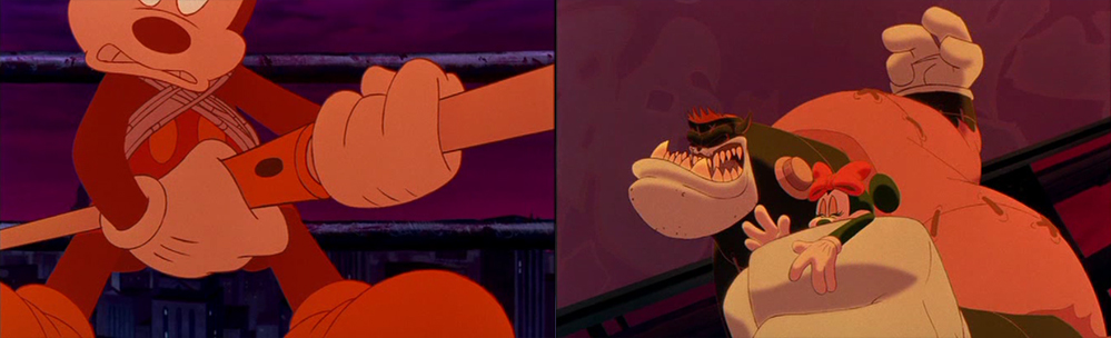
Then the well-known "rope-around-the-giant" scene is taking us back to THE BRAVE LITTLE TAYLOR (1938).
And with the whole background fiercely red, Minnie stands out in cold fear (magenta looking like blue because of the red surroundings).
And Mickey is all red again. When he finally catches Minnie's hand, the two characters again have slightly different colors so that we can read the shapes of the intertwined hands more easily.
And as soon as fear and anger have gone, the character colors are back to normal while the expressionist backgrounds are replaced a shot later.
The lighting remains neutral...
...until the very end when the glowing sun affects the whole image.
Learning From History
While most films draw upon the contrast of warm (yellow) and cold (blue) colors, not many films dare to use red so excessively as a pure expressionist device. It is interesting that the level of expressionism does not extend beyond colors, there are no distorted shapes, not even real expressionist lighting with oversized, distorted shadows.
With its garish purples and saturated reds and blues it is closer to POCAHONTAS (released that very same year) than to Mickey cartoons of around 1940 from which it borrows the protagonists' designs.
I may well have grown accustomed to such saturated color excesses, but I still do not feel comfortable with them any more than in 1995. But in hindsight this kind of experimenting within mainstream animation has probably only enabled artists to develop such masterpieces of illumination like TOY STORY 3 or MONSTERS UNIVERSITY (unfortunately not a masterpiece of storytelling or originality).
And last but not least, it is
easier to understand underlying principles in extreme examples of color design. Whatever one takes away from studying these films should by no means prevent them from
incorporating these ideas into more subtle color schemes.