As most of you may have learned from
Google, color stylist
Mary Blair would have been 100 years old a few days ago. She is most famous for her work on the “small world” ride and on
Disney’s 50s features
Cinderella, Alice in Wonderland and
Peter Pan. Her personal style however seems to have been more closely adapted in the preceding package features of the 1940s.
With Halloween only two days away, I’d like to commemorate Mary Blair’s centennial with an analysis of the color styling of Disney’s retelling of “Sleepy Hollow” in
The Adventures of Ichabod and Mr. Toad (1949).
Since there were usually as many as four artists credited for “color and styling”, it’s not always clear who did what sequence. In the case of Mary Blair, a lot of her concept art has been published. As always, I do not attempt to attribute any decision to one individual artist but solely like to analyze what is in the film (or the low quality
DVD*, in this case).
Autumn leaves
Autumn colors are used as accents rather than overwhelming whole forests like a tourist magazine would have them. This is once again a good reminder that the impact of a color is mostly based on the relation to its neighboring colors.
 |
| Introductory pan as recreated by Hans Bacher |
 |
| left: strongest leave colors (introductory pan, above); right: muted autumn colors (closer pan, below) with violett hills and tree trunks. |
Warm autumn lighting is emphasized by long shadows and a green meadow that leans towards olive and thus is a lot closer to yellow than to blue.
Coming into the village, there is still a large amount of purple present but on the whole the autumn leaves look more candy colored like in a John Hench Golden Book painting.
Later on, the desaturated green trees are clearly outnumbered. Although this image seems to be fairly colorful, a large portion of the image is covered by earthly browntones subtly contrasted by grey stones.
Likewise, the brown treetop in the picture above comes off as colorful only because the tree trunk is painted in a bluish grey.
But these two pictures mainly show us the difference in appearance of antagonists Ichabod Crane and Brom Bones. While Ichabod wears cool magenta and green tones, Brom’s clothes and complexion are more on the warm side although based on the same hues.
Magenta and Green
Although among painters it is common to call red and green complementary colors, physically speaking green and magenta are opposite on the color wheel and therefore complementary colors that provide a strong contrast. They also work well together considered that mixed traditionally both violet and green contain blue and are therefore already closely related. This particular color contrast (and art deco pastel colors in general) was rather popular around 1950 as can be seen in many illustrations and color films of the era.
Many of the minor characters are also either green or magenta and usually shown against muted blue.
It goes without saying that when the middle lady in fact wears a blue dress (positioned in color wheel order), the background is either grey or brown or both to make the soft colors come off clearly.
 |
| Ichabod himself is many times seen against even more muted backgrounds (cold and warm). |
Then Katrina Van Tassle is introduced in radiant magenta/pink against a dark and very desaturated background. We see her full figure accompanied by the most flamboyantly red leaves yet.
She smells a red rose and we see her father dressed in cool purple/magenta which has also become a villain convention in many Disney films. But here the father is only rich.
While Katrina is followed by a bunch of lover minions (again colorless tree trunks), Ichabod and share a picnic and actually more than that: judging their relationship by their clothes’ colors, one would assume that they somehow belong together.
It may be that the opposites attract and Katrina certainly is a good opposite as the inverted images below show, but as we all know, Ichabod will not end up getting Katrina.
The whole scene seem to be dominated by Katrina's colors with the wall being muted mauve rather than the blue it used to be. Later on, at the ball the whole room will be dominated by muted green/earthly yellow, as Ichabod is about to dominate the scene.
For a short moment, Ichabod’s red shirt appears when he courts the voluptuous damsel. Later on, when Katrina seems to like him, his complexion is considerably darker than hers like in standard Hollywood romance movies. But compared to Brom, he is still a little pale-faced.
The whole house is decorated in magenta and turquoise, balanced only by brown furniture which is either on the green or on the magenta side. If Katrina wouldn’t look so curvaceous and sassy, these last two frames could as well be mistaken for a scene from
Cinderella, in fact the studio’s subsequent feature.
 |
| Ichabod dreaming about Katrina (his bright shirt is visible in the end)... |
 |
| ...and about her father's money. |
Ichabod has always dreamed of the Van Tassles’ wealth in yellow and blue, so it is only natural that he prepares himself to woo Katrina in front of a mirror with a yellow and blue frame.
In his dreams, Ichabod imagines himself in Van Tassle's clothes of purple and gold. At least colorwise, he would make a better suitor for Katrina, even if the heavy, saturated colors make him look old and sleazy like Mr. Winky from the "Wind in the Willows" segment.
 |
| Mr. Winky |
In the ballroom with green furniture, Brom who is wearing a brownish purple suit and the all pink Katrina contrast well with the background. Ichabod on the other hand is dark enough to stand out.
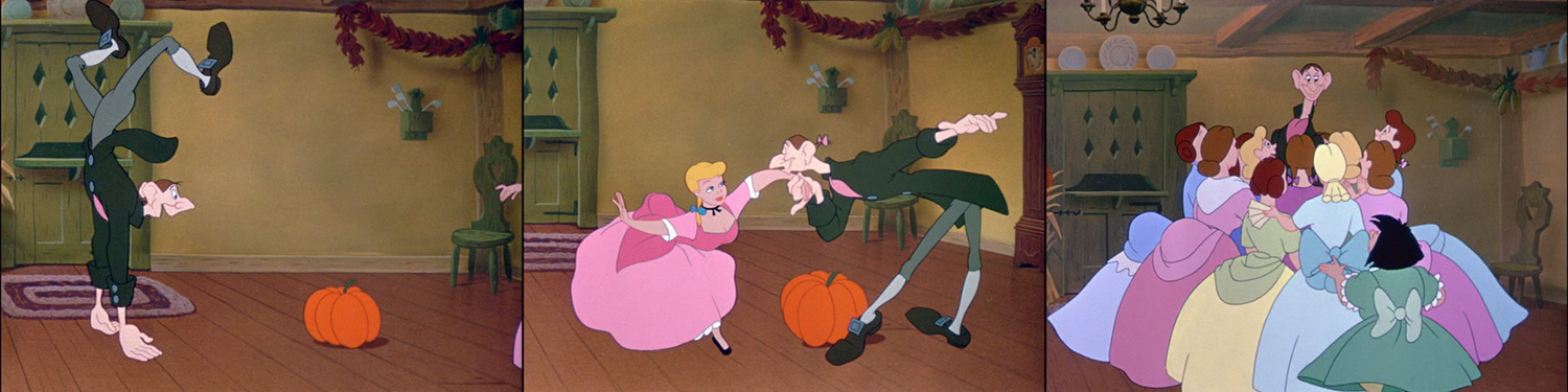
The dancers are all either green/turquoise or violet/magenta/purple that leans towards pumpkin color.
 |
| First, it's opposites... |
 |
| ...then close matches... |
 |
| ... dancing together... |
 |
| ...and back again. |
Now Ichabod almost blends in with the scenery and only the pumpkin stands between him and Katrina (foreshadowing not only Brom's scary Halloween story but also the headless Hessian horseman who might or might not be Brom in disguise who actually ends up getting the girl). But for now, Ichabod is the main attraction and surrounded exclusively by soft pastel colors.
The second part of this analysis will focus on the following scary portion of the film, so stay tuned.
 |
| By the way, even the depicted food is red/purple and green more often than not. |
* this looks like a standard transfer of a release print. Not too vibrant, but at least not digitally overcooked.


