Wednesday, August 28, 2013

First Shots: The Dollars Trilogy

A short analysis of what Sergio Leone's first shots in each of his three Eastwood movies reveal about the films they open. The scenes that follow these shots have already been analyzed to death, so here I just try to squeeze out as much information from these first one or two shots about the films and Leone's developing style of storytelling.

Opening scenes or first pages are usually some of the most interesting parts of movies or books. Especially upon second viewing/reading, expository scenes reveal a lot of information to prime us for a narrative's main themes and characters. Most often, they basically contain the central conflict of the story.

Sergio Leone - like Kurosawa whose YOJIMBO (1961) he shamelessly remade as A FISTFUL OF DOLLARS in 1964 - was fond of very long takes and elaborate tracking shots which he contrasted with frenetic cutting in action scenes. 

The Triangular Composition
After a rotoscoped credits sequence, his first Italian western fades in on a low angle shot of rocky desert sand. Before we see the "man with no name" (actually called "Joe" in this one), we see the hooves of his mule. The small size of the animal is immediately recognized because the rider's feet are dangling very close to the ground.

When zoom lenses became widely available in the 1960s, the practice of opening a scene on a detail followed by zooming out to the actual establishing shot came into fashion. Classical Hollywood producers preferred to open on an establishing shot and then cut ever closer to the actors. Of course, Sergio Leone was by no means the first director to reverse this practice - he might have lifted it from Kurosawa as well. In contrast to numerous Italian westerns of the era, however, Leone resisted the obvious zoom-effects and relied mostly on elaborate dolly and crane shots.

The camera then pans up and slowly trucks in to reveal the back of a man wearing a poncho. Remember, this is Clint Eastwood's first appearance in Italy and his first in a theatrical western at all. And at that time, nobody expected the star to be stubbly and dirty. This first shot continues until the following composition is achieved:

The basic conflict is visualized in this single composition: two warring parties live across the road from each other, Eastwood "smack in the middle" checking them out before playing them off against each other. Him standing closer to the right house may be simply a matter of balancing the composition. However, we will eventually learn that morally he is closer to the people living in the right house.

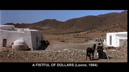
In form and content, all three films are based on triangles. Aside from the visual triangle that is formed between the two houses and Eastwood (and his mule), the well is also constructed in a triangular shape.

Then Leone cuts to a reverse medium close-up of Eastwood drinking and observing. I will not go into any more detail about the rest of the opening scene that basically sets up the iconic "man with no name" as a stoic western version of Mifune's unkempt animal-like YOJIMBO character Sanjuro.


The Man With A Rifle
Moving on to the very first shot of FOR A FEW DOLLARS MORE (1965), we can see how Leone started to get more confident with the vast widescreen of the Techniscope frame (a non-anamorphic grainy version of Cinemascope).

After a title card reading "Where life had no value, death sometimes had its price. That is why the bounty killers appeared." the film opens on a blinking point of light that is reminiscent of the white burnout at the end of the first films credit sequence:


But upon closer examination, this blinking point guides our attention to the only spot of interest in the otherwise empty long shot of a gritty desert location. We already look at the middle of the frame when a far off rider appears during the dissolve.


Supported by the artificial representation of spatial acoustics on Italian soundtracks, the whistling and gun loading may very well emanate from the rider in the distance. In fact, even in 35mm the grain will not allow the audience to read the silhouette clearly. It is not even clear if the rider in the distance sits on a horse or a mule.
These compositions are obviously made for theatrical exhibition and not for cellphone screens.

From all we know from the first film and the posters, this might be Clint Eastwood approaching. But then (0:55) the sound is clearly located offscreen since we see smoke and hear a gunshot after which the rider falls off in the distance. But who are these two people? To make matters worse (in a film that first came out with all the voices dubbed by Italian actors), the offscreen humming and whistling was reportedly done by Sergio Leone himself.

This rigid long take sets up several key aspects of the following film: we shared the point of view of a sniper. In a traditional western this must be the villain because no honorable western hero ambushes another man. But with this film Leone introduced the bounty killer as a professional and thus motivated a whole sub-genre of bounty hunter westerns.

From the whistling it becomes clear how emotionless the bounty-hunting business is executed. We also see an action while the director withholds vital information to the scene - in this case the identity of killer and victim. Of course, everybody knew from the advertisements, that this time Eastwood was supposed to be meeting his match in the person of a man in black. With FOR A FEW DOLLARS MORE Leone introduced his fragmented flashback technique that was unheard of in western storytelling.

The cynic key to successful bounty-hunting lies in the choice of weapons as Lee Van Cleef's character Col. Mortimer proves a line of dialogue from FISTFUL OF DOLLARS: "When a man with a .45 meets a man with a rifle, you said, the man with a pistol's a dead man"
Mortimer usually kills with a long-range rifle just from outside his opponents shooting radius.


Going The Distance
By the time he did his internationally funded masterpiece THE GOOD, THE BAD AND THE UGLY (1966), Leone had perfected his directing style to the point where he was able to successfully defy all conventions, be they visual or content-wise.

Ever since FISTFUL OF DOLLARS it has become one of his trademarks to cut from extreme long shots to close-ups without cushioning medium range shots inbetween. The camera framed the actors' faces increasingly closer until there was barely more to see than the actors' eyes (the now famous "Italian shot").

THE GOOD, THE BAD AND THE UGLY was again based on the concept of three (visual triangles galore) but also on the concept of surprise. There is hardly a scene that is no built around a surprise revelation. Moreover, the concept of withholding information is not only central to the narrative, it is also central to the visual realization. This leads to a highly stylized setting that does not extend beyond the frame edges.

Even the few suspense scenes (the natural opposite of surprises) turn out to be achieved by a visual trick that is revealed in a surprise ending.

So with these two concepts (juxtaposing extremes and withholding information) in mind, the first two shots of THE GOOD, THE BAD AND THE UGLY constitute one of my favorite opening scenes:

Again the empty long shot. But before we are able to find something interesting in the distance, Leone surprises us with an extreme closeup of a face (the startling effect on a scope cinema screen cannot even be guessed from this micro representation here). But he is not cutting from extreme long shot to extreme close-up; he is doing it within the same shot! Two hours later we will understand why it is crucial that this particular face (Al Mulloch) is imprinted in our memory.

Then we get the reverse shot. We share the point of view of this gnarly character. Now the searching for information begins. What is he looking at?
Is it the dog that crosses the plain? (The dog appears again hours later to momentarily consternate a frenetic Tuco).

No, there are two specs approaching from the distance. Leone cuts back to Al Mulloch, then back to the approaching silhouettes on horsebacks. Will they have a stand-off? Will he shoot the two with a rifle? We haven't seen anything else than his face, so he might as well carry a long-range rifle.

Of course, the situation turns out to be a wholly different one.

After opening ONCE UPON A TIME IN THE WEST with a few short close-ups, Leone came back to the FISTFUL OF DOLLARS approach in his Mexican revolution western GIU LA TESTA (DUCK YOU SUCKER, 1971) with a long take that fades in on a close-up followed by a tracking shot into the establishing composition.

Note: all screenshot and excerpts from THE GOOD, THE BAD AND THE UGLY have been taken from the impeccable Italian restoration (IL BUONO, IL BRUTTO, IL CATTIVO) (un)available on Blu ray which is visually far superior to the American one but unfortunately does not contain the English language soundtrack.

Thursday, August 15, 2013

Bob Clampett: Heighten The Impact


The easiest way to heighten the impact of a punch is adding a stronger sound effect to it. In silent comedies editors often cut out a few frames before the impact or substituted the frame that shows the actual contact by a white frame (or left it out altogether). These techniques are still quite common in character animation these days (see Preston Blair or Richard Williams on the elongated inbetween).

However, playful film makers have been experimenting with more campy (or obvious) effects, especially in cartoons or trash action movies. In the opening sequence of MACHETE (2010), for example, Robert Rodriguez heightened the many blows delivered by Machete (Danny Trejo) by either adding fake projector issues (the scene in question is too gory to present here) or shaking the whole frame (adding to zoomed in frames) when the door hits the bad guy as you can see in the animated gif below:

In Clampett's films extreme distortions and inflating body parts in the moment of impact are fairly common. In BABY BOTTLENECK (1945/46) the rubbery transformations are supported by written letters and color changes. This cartoon is a prime example of how Clampett incorporated so many characteristics of silent rubber hose cartoons that have been lost during Disney's quest for realism.
The warning letters above are jumping out of the panel.

Below, Clampett has added the word "BOOM" which is completely redundant in a sound film but reminds the audience of the cartoon's origins in comic strips.

In his Danny Kaye parody BOOK REVUE (1945/46), Clampett has already been messing around with color changes to heighten the impact of an accent. On the word "Cucaracha" the whole background behind Daffy is exchanged for a flamboyantly red color card. This momentary dive into fantasy sets is a staple of musical comedies. Once again, Clampett uses the lower frame edge as an imaginary floor. But in contrast to what we have seen in KITTY KORNERED, perspective is strongly indicated by the animation alone.


In BABY BOTTLENECK the backgrounds are as sparse as can be, often just gradients without any other detail than grain. Expressionistic color changes are not part of a musical parody but emphasize the impact of a hammer blow. But the colors do not cease to change. Instead they seem to reflect Daffy's mental state after being hit. The following panel of screenshots illustrates the succession of colors:
In this slowed down animated GIF one can see that each color is held for a different amount of frames.


Thursday, August 8, 2013

One-Shot: The Kite Runner (2007)


Years after seeing Marc Forster's adaptation of THE KITE RUNNER I mostly remembered the costume colors. So when I revisited it last week in the course of studying Forster's personal film making style I still found the colors to be most attractive. Considering that they are based on the now well-worn drama cliché of blue against sandy brown this is saying a lot. There is so much variation throughout the film that I cannot possibly do justice to the color design in this short "one-shot" post. But since Marc Forster is very deliberate and particular when it comes to colors in his films I would like to highlight two facets that I liked in THE KITE RUNNER.

From two-colored present America back to three-colored Afghanistan
Having just received the specimen copies of his first novel, Amir (Khalid Abdalla) gets a phone call at home that triggers memories of his youth in Kabul. Both he and his wife wear dark blue clothes against more or less monochrome sandy colored surroundings.
When one of his late father's friends calls, a flashback to Amir's happy childhood days in Kabul sets in. At first the color scheme is basically the same but the blue is more vivid, less repressed.
Then suddenly a second kite brings orange and green into the frame. The lighting seems naturally golden. Then we see a young boy whose clothes are orange, blue and sandy brown.
These are no doubt the quintessential 1970s colors (a title overlay states the year 1978). And although this story is set in an Oriental desert, we soon learn that the Afghans are indeed influenced by American fashion (movies and cars).
Young Amir's (Zekeria Ebrahimi) best friend Hassan (Ahmad Khan Mahmoodzada) is clad in blue in this expository scene of their close friendship and interdependency.

Soon we meet Amir's Baba (Homayoun Ershadi) and his best friend Rahim Khan (Shaun Toub). Rahim's orange shirt and tie against a gray suit, by the way, was the color scheme that I remembered most vividly:
Although the apartment looks very warm and golden, DOP Roberto Schaefer managed to keep the gray suits from looking muddy. It is this slight contrast of gray against sandy brown that makes this color scheme stand out from the many sepia toned, nostalgically warm stereotypes I have seen over the year (just think of interior scene in any recent Woody Allen film). In many ways, it is equal to the color design of FANTASTIC MR. FOX which is also reminiscent of the 1970s.
Marc Forster's scenes are usually very tightly composed in matters of color design but not as obviously flashy as in Jerry Bruckheimer or James Cameron movies.

[Note: Later on in present Pakistan the overall color scheme is still based on sand and blue but feels a lot colder.]

Green stands out
The one color that seems to have a special significance to Marc Forster is green (J.M.Barrie's apartment and the park in FINDING NEVERLAND, 2004; the fatal green apple in STRANGER THAN FICTION, 2006). I have found it to be very deliberately used in all of his features except QUANTUM OF SOLACE (2008) (although Forster mentions a green door in an interview), where at least the villain was named Dominic Greene.

I have not yet found out if there is a recurring symbolic meaning to it or if Forster uses it in a new context in every film. In THE KITE RUNNER, Amir stand on green Californian meadows in the beginning and end, but in Afghanistan (and later Pakistan) there is hardly a green piece of cloth except in two connected scenes.

After Amir has abandoned Hassan he schemes how to get rid of his too loyal friend. During the preparation for his birthday party he asks his father to send Hassan's father away. Soon after he comes up with a more effective plan to betray Hassan. He lies to Baba - who now wears a green jersey - telling him that Hassan has stolen Amir's watch.
Amir's plan works out when Hassan loyally takes the blame on and his father decides to leave for good.

I have yet to look at the film more closely to see if there is another instance of Amir or his father wearing green and if there is a connection to Amir's betrayal that serves as his narrative backstory wound that motivates the film.

Thursday, August 1, 2013

Bob Clampett: Black Cats in Technicolor (3/3)

Near the end of his career at Warner Brothers Bob Clampett confronted Porky with four hostile felines in one of his most garish and shrill cartoons. In this third and last installment of "Black Cats in Technicolor" I focus on layout and lighting experiments. A closer look at KITTY KORNERED (made in 1945, released 1946) reveals surprisingly restraint color palettes behind the crowded and ugly compositions.


The cartoon starts out fairly common with a blue winter night setting contrasted by spots of yellow. This has already been established in the title sequence.

Basically, yellow stands for artificial light within the houses. It also highlights the clock on the church tower that corresponds to the narrator's claim that the cats are put out at nine o'clock every night.

As can be seen in this desaturated version of the pan contrast and sculpting on the buildings is mostly achieved by hue instead of value. The walls facing the camera are all blue because they are in the shadow which is indicated by the cast shadows on the snow. The object colors are indicated on the side walls of the buildings. When robbed of the hue it is harder to see which walls are in the shadow (see especially the reddish house, second from right).

Likewise, the clock does not stand out from the tower when robbed of its hue (yellow).

Within seconds red and green are also introduced. On the traditional color wheel green lies between primary colors blue and yellow and fits well into the overall scheme.

It is probably no coincidence that Porky wears dark red in the title card (top image). In the actual film, an extra wears that color while Porky himself is in his white pijamas.


Fully saturated
All of these "black cat" Clampett cartoons stage colorless characters against colorful backgrounds. THE HEP CAT (1942) applied a tastefully muted night time palette with spots of primary colors. In A TALE OF TWO KITTIES (1942) the colors have been determined by different times of day and thus consisted of natural earth tones and strong sky colors rooted in reality.


The choice of garish neon colors in KITTY KORNERED, however, takes the concept of colorless characters against colorful backgrounds one step further. Gone are most of the earth tones. Flamboyant hues prevent the backgrounds from receding and feel much more expressionist than realist. The room colors also seem to change occasionally for no other reason than variety.
The characters however are even less colorful than before. Skin tones are limited to the "human" pig Porky. Details like eyes and noses are fully saturated. [Note: Part of this is probably due to digital restoration, but judging from the overall appearance the image might not have been that bright on film but fully saturated with even more contrast.]

Lighting experiments
Porky's house is in keeping with the already established blue-yellow color scheme with blue leaning towards green (the fence) and towards red (blinds and right walls).

In the close-up that follows the glass-less window is not illuminated by yellow artificial light. Instead we can see that the wall inside is green. Porky and the cats' tails are in strong silhouette that looks great but is not consistent with the rest of the frame image.
All the silhouettes in the film coincidentally read against a green background. The most expressionist (non-realist) version is in the one where the cats' eyes are even visible in silhouette.

The threshold between exterior and interior color scheme is rendered rather expensively: On the outside the door is seemingly white and therefore reflects the light of its surroundings. When it is opened the inside lighting affects it strongly. Since any gradient from blue to yellow (reflecting artificial light and yellow walls) includes green in the middle, the door changes gradually on each frame from light blue to green to yellow.
Background perspective is already a little forced, the closed door however is wonky and outright wrong!
Looking at the single frames the supposed lighting effect does not seem natural because the colors - especially neon green - are far too heightened. As an experiment of integrating inside light sources and connecting the exterior and interior by its common denominator (green), this very brief effect is an astonishing experiment.Of course, it could have all been achieved by simply having a door that is green inside and outside. But the saturated color change adds a lot to the impact of opening or closing this door (as can be seen below).
It is typical of Clampett's way of rushing through productions that a lot of energy is devoted to slamming the door but the lighting on the snow does not change and we still see Porky in the pool of light created by an open door when he hammers against the close door.
Again opening the door results in a harsh change from a monochrome background to a momentarily gaudy one:

Expressionist perspective experiments
The rest of the "pig and cats" games take place inside Porky's house. Analyzing the following screenshots I will focus 1) on the warped perspective and 2) on the different color schemes of the four chase scenes.

Before Porky enters the house through a pane-less window, Clampett overstrains us with a cluttered composition of all four cats without visual hierarchy. As if this wasn't enough, the room seems to lean towards the spectator. The background colors look random (probably because of the dominant lavender-blue drapes). Upon closer inspection the underlying color scheme seems to be magenta (wall and floor) vs green (couch). Size relations vary a lot in Clampett's expressionistic cartoons as can be seen when Porky's oversized head enter the frame from behind the cats.
While all the other backgrounds of this scene adhere to the magenta-green contrast, there is a glitch in the beginning when the smallest cat jumps into the "old-man" jug (blue walls).

Green and magenta
In this strange bedroom the the floor is green and polished:

Perspective on the wall is wonky and supports the pan to the right with vertical lines leaning to the right.

Here the background perspective is from slightly above while the cat is seen from the side.
In the room where the alcoholic cat is hiding the colors are reversed. But even in the fishbowl, the magenta-green contrast is maintained.

Green and blue
Just in case you thought that room colors were consistent in order to garantuee orientation, think again... As soon as Porky arrives on the scene, the floor has changed from green to dark blue and from polished to carpet.
Probably the higher angle on the left was chosen to not give away the green walls just yet - to make the change more gradual.
Again the perspective of background and character in motion are inconsistent. After the cut, however, there is a relatively flat pan that ends in a tilt wall:
To emphasize the tension of dragging cat and mice across the room, we cut to a visually elongated room (below left) and then to a tight corner that once again features characters that are aligned straight in front of a tilt (or wonky) wall.
The camera again pans several times across a geometrically flat background that completes the triad of neon green, dark blue and purple.
It does not matter whether these are the same rooms we have seen before. And it does not matter that the lighting effect only applies to the shadow dog and nothing else in the picture, either. With all the garish green and expressionistic changes of color schemes, this cartoon seems to scream: I am hysterical and I am eager to inflict the same on you!

Red, yellow and neon green
Interestingly, the doorway colors are indeed consistent with the beginning of the film: red floor, yellow walls, green door.
Although perspective is warped in every background, the angles seem to be chosen carefully. Once again the characters are consistently seen from the side while the entrance area is seen from a different angle. Skew vertical lines support the dynamics of anticipation and jump.
John Kricfalusi has analyzed this scene in great detail and has been pointing out the following cut on action (or rather impact):
"right in the middle of the action Clampett changes the background to the more extreme angle of the door.
This gives the crash way more impact than if he had done the logical thing and used the same background." (John K.)

In my opinion this cut not only gives the crash more impact but is completely necessary for two reasons: 1) the mismatching character and background angles of the jump could not result in a convincingly drawn crash. 2) After the crash, the cat's fall is limited by the frame. Although its lying position is by no means consistent with the angle of the crash, at least this background makes it look like the cat was lying on the floor. This landing on the edge of the frame would be completely off in the first high angle background.

Both backgrounds are wonky but not in the same way. Note also that Porky still seems to stand in the last scene (or in an upstairs room?).
Pink and green, magenta and yellow
Then after the cats have conspired to disguise themselves and play an "Orson Welles" (re-imagining his famous "War of the Worlds" radio drama) on Porky, we see Porky's bedroom that combines purple walls with a green blanket and a dark blue floor.

The "martian" characters are depicted in fully saturated colors. Two in hot pink and green and two in magenta and yellow.

Porky's take is once again limited by the upper frame edge.
When Porky runs upstairs to get the gun, the wall behind him is blue. During the following showdown the staircase however combines a magenta carpet with slightly muted yellow walls. As can be seen above (Porky's take and blanket in the air) and below, Clampett (or his layout person) often cuts from low-angle to high-angle shots in this dramatic final confrontation.

Perspective is increasingly forced in order to make the distance between the opponents seem huge.

Upstairs the floor and walls look like in Porky's bathroom. For dramatic reasons the outside lighting conditions are reversed when Porky runs towards the window...
...and are finally back to the beginning with a pool of light that is completely inconsistent with the window Porky just jumped out of. Dramatically the glowing red behind the victorious cats feels right although the walls behind them has been shown to be of a different color just seconds before.

Inconsistent by nature
If this cartoon proves anything then it is the fact that inconsistent backgrounds are not consciously noticed as long as the audience is busy following the foreground action. If even a loose continuity of character action is maintained, film makers can get away with almost anything in the background (many a movie trailer makes good use of this effect). There is no doubt however, that perspective and colors subconsciously have a strong effect on how we perceive the action.

In most of these backgrounds there is nothing receding and no muted tones the eye can rest on. Instead the colors seem to jump forward adding to the claustrophobic feeling of this cat-infested house.

I am sure that many inconsistencies in Clampett's cartoons could have been avoided by handling these scenes more carefully. But that, it seems, was not what Clampett was after. He wanted to entertain and also see what he could get away with.

Whoever chose those colors could have gone completely random. But as my breakdown into scenes has proven, they did not. Some of the dominant colors may look unpleasant but they have been applied very restrictively within clearly defined color palettes. There seems to be a long way from the subtle color effects of THE HEP CAT to the outrageous color design of KITTY KORNERED. As you may have guessed I favor the earlier approach. But I also like to study artistic growth and that is what these three posts have been about.