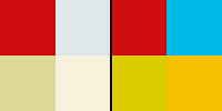
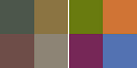
A color is always perceived in relation to its neighboring colors. So basically the more saturated of two colors will stand out by contrast of intensity. Therefore, a spot of color that is surrounded by less saturated colors attracts our attention. It helps if the emphasized color is red as in the following picture, because human perception reacts most strongly to this hue.
 |
| Der heilige Christophorus by Konrad Witz |
 |
| If completely desaturated, Christophorus' coat is receding while his face and the child he carries are emphasized. |
The surrounding colors are so much less saturated that they tend towards the neutral. We can sense their basic hue, though, and the depiction looks fairly natural color-wise with the muddy water reflecting a slightly overcast sky and the stones and rocks in sand colors and bluer in the back as a result of aerial perspective.
 In the four swatches on the left, the red of Saint Christophorus’ coat is surrounded by the neutral tones of the water, stones and rocks directly as they appear in the painting. On the right side, I have surround the same red with fully saturated versions of these formerly neutral tones. Suddenly, the hierarchy isn’t as clear anymore and we have competing colors that are only different in hue and value and all more saturated than the red that looked so intense on the left side. The red would still stand out because the other three hues are closer to each other.
Neutral colors
Theoretically, really neutral colors would have to be completely desaturated – which would leave us only with the gray scale. But thanks to our ability to perceive even the slightest tint of a color if seen against a different hue and the brain’s seemingly counteractive urge for color constancy, all dull colors can be used as neutrals.
 |
| Photograph by Niklaus Rüegg taken from his website. |
Gray with a tint of blue is perceived as cold (like the paint pot above) while gray with a tint of red, orange or yellow is perceived as warm (like the sand color above) and would actually be called brown or beige depending on its value.
 |
| left: cold neutral, middle: gray, right: warm neutral. |
As you can see in the following screenshot from Bambi*, all the colors are more or less subdued, yet it is a colorful image that is carefully structured by different degrees of saturation and value.
If you look at the desaturated version you can see the basic hierarchy of values. It’s very subtle, but Thumper is dark on light (in the pool of light), with the flowers – the closer the darker – surrounding the stone.
The interesting part to me is in this part of the picture, though:
We have a gray rabbit on a gray stone, or so it would seem. At least in this specific picture, Thumper is slightly tinted brown but is perceived as warm gray.
 |
| Thumpers body colors |
The stone on the other hand is made up of many different hues that are similar to those used for the flowers. Only that on the mossy stone they are generally less saturated. We have complementary contrasts of red and green. If you look at the top plane of the stone, the gray looks cold compared to the other colors on the rock, when in fact it is a shade of brown (see swatches: bottom row, second from left) and not blue.
 |
| left: stone colors, right: flowers in the foreground, highly saturated |
 |
| left: stone colors, right: flower buttons in the background (the petals are brighter) |
This effect of perceived color constancy is used in many paintings and movies to evoke the impression of a certain mood.
 |
| Heavily overcast sky at dusk. It somehow feels warm. |
If we look at this still from Fantastic Mr. Fox (above) we perceive the upper part of the sky as gray in contrast to the salmon lower part and the orange-brown landscape. The gray clouds also serve as a balance to the rest of the picture preventing it from looking monochrome (more about this in the final Mr. Fox post).
But if you look closer or examine the gray in photoshop with the “eyedropper tool” you will see that in reality it is brown as well. But since the whole picture has a warm brownish tint, the least saturated color is perceived as gray by our brain that is constantly adjusting the white balance.
For comparison: Here we have another still from Mr. Fox that transports a different mood and daytime. Here the gray looks much more neutral, even colder:
 |
| The contrast to the lanscape is much stronger, the light seems to be whiter. The atmosphere is more sober and cold. |
 |
| left: the brown dusk sky; right: the grayer afternoon sky. |
This color constancy effect is much stronger in a cinema because there are no other objects and lighting situations than what we see on the screen, thus we have no reference to compare the colors to. At the start we may notice the color cast strongly, but over time our brain adjusts to it all the more. It still has the intended impact of emphasizing certain colors and evoking a certain mood (you can see this in David Fincher’s (dingy yellow tint) and Clint Eastwood’s more recent films (gray-green tint).
Therefore, color casts in movies can be really extreme without the audience noticing (If you leave the theater during projection and return soon afterwards, you’ll see the color cast much stronger). Seen on a computer or TV screen, the effect is much stronger because our eyes and brain have a frame of reference from the colors surrounding the monitor.
Sometimes we notice a strong color cast that went unnoticed in cinema only when seeing the same film on DVD. I remember the DVD of Three Kings (1999) having a disclaimer that the colors were meant to be unnatural and oversaturated because viewers would complain about “bad” picture quality which never happened when the film was in theaters (and looked more or less the same).
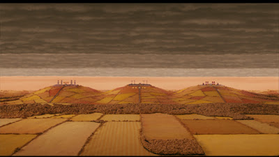
It seems that every frame of Sylvain Chomet’s Les Triplettes de Belleville (2003) is heavily tinted either brown, yellow or green. At times the compositions look almost uni-colored/monochrome. It has derogatorily been described as pee- and poo-colored (which in fact says more about the tastes of the reviewer than the quality of the color concept itself).
 |
| Without the yellow tint one can see a variety of hues. |
 |
| The newspaper which appears to be gray is olive green on the left and blue on the right. |
 |
| The street is still slightly brown on the right. |
It’s not only important to keep the value of neutral colors in mind but also that the whole concept of cold vs. warm colors is relative as well.
* I’m analyzing a screenshot of the 2005 digitally restored DVD as is. I cannot say how close this comes to what the original Technicolor prints looked like regarding tints and colorcasts.


5 comments:
Hi Oswald, I have a question about this. I don't know a lot about colour perception, but I just wondered what the point of using a colour cast is if the audience gets used to it and thus ignores it? Or is it a case of them still being subconsciously aware of it?
Hi Andy, I figure it kind of works like wearing sunglasses of a certain tint other than just gray (brown, for example). When you put them on, everything looks brown, after some time you grow accustomed to the brown and believe you're seeing the full spectrum. Yet when you take it off, you see how certain colors were emphasized by the brown cast.
Subconsciously color casts are able to evoke a certain mood. Just think of golden hour lighting or a red sky. This light (in nature) is cast upon everything you see and the reflected sky influences even the shadows. Yet you don't see the grass as brown, red or yellow, you still think it is green but you feel the atmosphere.
I hope this answers your question more or less. The getting-used-to-it is something I've discovered as a projectionist when going in and out of a theater as opposed to seeing a movie and staying there for the whole duration.
Hey Oswald. I just wanted to let you know I love your blog. Color is something that I love to learn about. Thanks for keeping up this sick blog!
Thanks a lot for your response Oswald! It helped a lot :)
Hi Oswald, thanks for such great articles. I'm new to color grading (for photography). I would like to learn more about interactions between local colors (objects) and colored lighting. I always end up confused on how to mantain a certain palette with local colors that may and may not be part of the palette, and how does light adds up to the equation. Can you give me any advice? Or mention me some good resources, articles or books that focus on this? thanks in advance.
Post a Comment