
 |
| Click on the image for a larger version. |
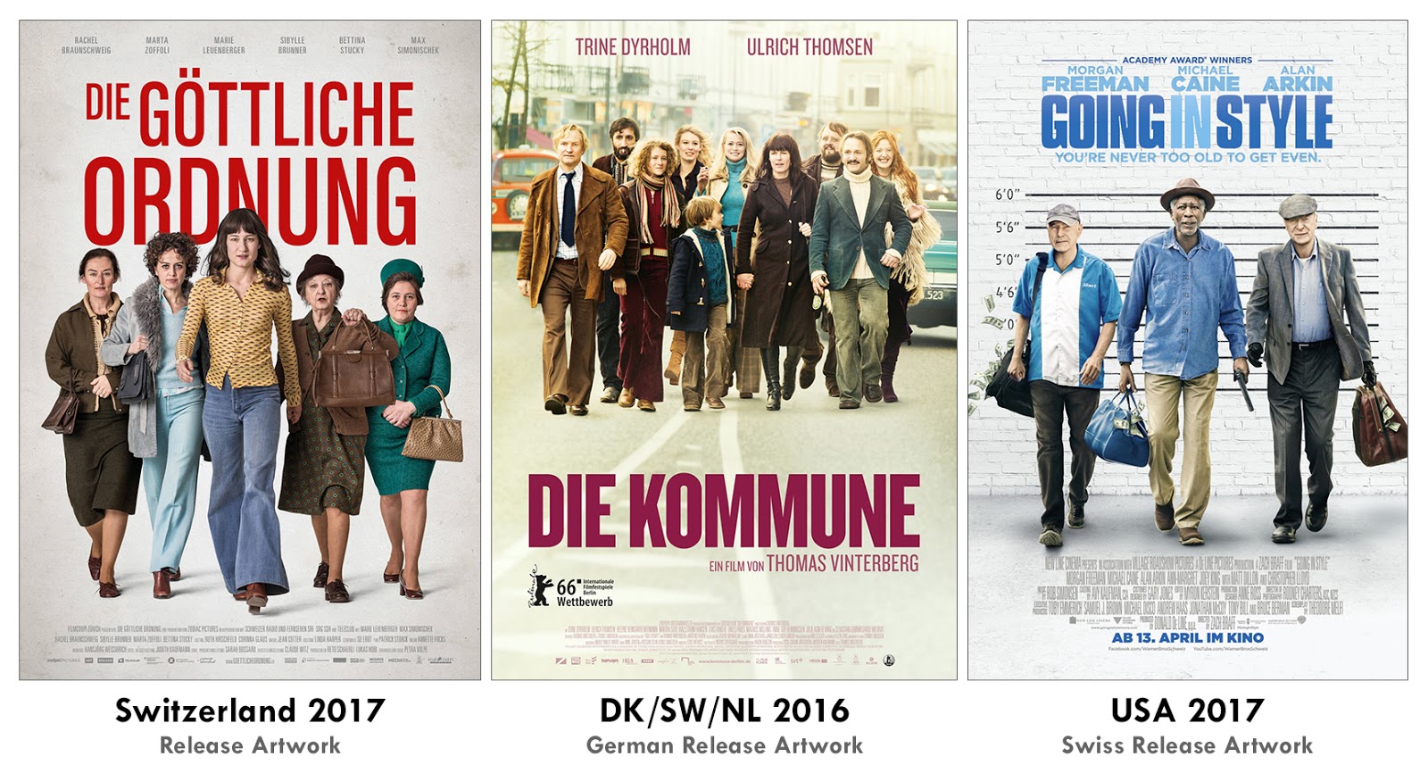
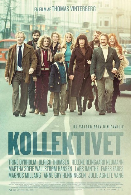
It has become a bit of a cliché to stage nonhierarchical groups flatly walking towards the viewer. As can be seen above, the lack of a strong focal point is often compensated for by a washed out, receding or even non-existent white background. Considering the equality concept, this staging makes perfect sense in the case of the two 1970s stories DIE GÖTTLICHE ORDNUNG ("the divine order" about the fight for women's vote in Switzerland) and KOLLEKTIVET ("the commune" about a married couple inviting their "friends" to live with them). That also dictates the muddy costume colors.
In contrast to the Swiss poster, the others two look much more color coordinated and restricted to two or three basic colors (this is even more obvious in the original Danish version of the poster in the middle). In my opinion, the blandest one also primes us for the blandest concept which seems to be GOING IN STYLE. Like seemingly 40% of all movie poster (even beyond Hollywood), it entirely draws on the old blue v yellow contrast.
When I see a poster like this, especially the one about fighting for equality, I am usually reminded of THE WARRIORS. As you can see below, this has a lot more going for, in fact: a more interesting angle, the blue background, the reflections and a less in your face attitude. Besides the typeface is much more interesting.
 |
| Click on the image for a larger version. |


No comments:
Post a Comment