
 To my knowledge HORTON HATCHES THE EGG (the first Horton story written in 1940) is the first animated adaptation of a book by Ted Geisel with whom Clampett worked together the following year on some of the SNAFU shorts.
On the surface Clampett's HORTON is the visually most faithful Dr. Seuss adaptation - practically "faithful one hundred percent". The ten minute short (with only a few lines of dialogue added) takes roughly the same time as reading the book from cover to cover.
However, HORTON HATCHES THE EGG also serves as a perfect introduction to a whole variety of Bob Clampett characteristics some of which I will elaborate on in future posts. Rather than breaking it up into three shorter parts I have decided to publish this overview in one single entry that can be linked to more easily.
Composition
Color
Clampett's promotion to color cartoons triggered mainly production-related progress. He wasn't really able to handle color as a means of expression in ways comparable to what Chuck Jones did with Maurice Noble and Philipp DeGuard. But HORTON has always stood out to me as one of the very few Clampett cartoons with good color design most of which were made right after he inherited Avery's color unit including background painter Johnny Johnsen. Johnsen however was soon replaced by Michael Sasanoff who allegedly painted these uncredited HORTON backgrounds.
As a prime example of pink - green color relations I will soon examine these backgrounds in more detail. For now, just look at how different amounts of garish and warm yellow are used to balance the pink - green complementary contrast:


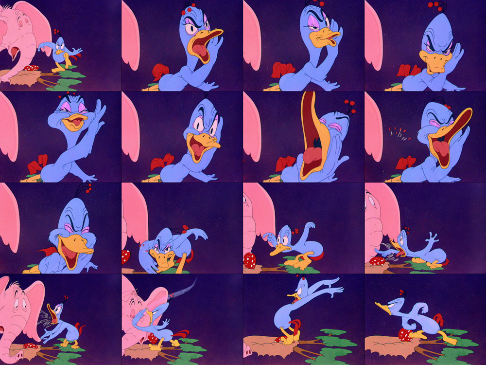
With a few notable exceptions the only instance of Clampett using color as a storytelling device is when faces turn green due to sickness or anger or white/pale due to shyness or fear:

Framing
Some of the fixed camera setups are composed with the frame edges in mind. We do not just happen to see an excerpt of a larger environment. In fact, sometimes it looks as if this world only exists within this particular frame. These compositions that were - largely inspired by the confined space of a theater - still popular in 1940s live-action films often resemble the compositions of semi-modern paintings.

 In the frame above the background is arranged to encircle Horton's huge back (with a circle of its own). Even the clouds are painted following this circular pattern. If this were a pan, the clouds couldn't possible be composed that way because if you extended them they would point vertically into the ground.
The same principle can be seen in some of Ferdinand Hodler's landscape paintings where the clouds often frame a mountain or a lake rather unnaturally:
More often however, the foreground is used as a framing device. It also invokes depth within the picture by contrast of size and lightness.

Silhouettes:
Darkened silhouettes as framing devices and "quasi over shoulder shots" are a device Clampett seemed to be fond of during this transitional phase. In the image on the right the animals soon leave the frame and we are left with the strongest of all "foreground-along-frame-edges" compositions of the film.

Characters
Clampett Characters
While most of the animals are based on Dr. Seuss' original designs, now and then there is a character who seems to have fallen out of an earlier Clampett cartoon. Most obviously miscast is the big-eared mouse from FARM FROLICS (1941) that kept "heeeearing things".
 |
| The large ears make no sense in HORTON (left) but belong to a paranoid mouse in FARM FROLICS. |
The three hunters on the other hand are already part of the original book but their design is pure Looney Tunes. As always, one of them is extremely tiny and they all have widely different facial features. In addition, they are sneaking with the same exaggerated butt motion as Clampett's hounds in pursuit of Bugs Bunny:


Animal Suit
In many Clampett cartoons - and Looney Tunes in general - the anthropomorphized animals look like humans wearing an animal suit. This is certainly the case with Daffy and it is also quite obvious in these drawings of Mayzie, the lazy bird:

Hollywood pop references
Obviously not in the book are the allusions to some of the era's most well-known stars. Mayzie is going through her Katherine Hepburn impersonation routine twice...
 |
| "reh'ly I won't!" - "reh'ly I will!" |
...while Clampett's popular suicide gag is performed by a Peter Lorre fish:

Animation
Twinning
Against Disney's mantra to not use visual "twins", symmetrical arm motions are a very distinctive trait of Clampett's cartoon acting. This can be seen in both Bob McKimson's and Rod Sribner's widely different animation.

Perspective
In medium close-ups, Clampett's animators favored forced perspective to indicate depth and proximity to the fictitious camera:

The characters' awareness of performing for an audience is often highlighted by explicitly addressing the audience and thus breaking the fourth wall:

Specific Expressions
Clampett seemed to favor exaggerated facial proportions. He like to have vertically elongated eyes and horizontally expanding mouths and cheeks. Even faced with well-rounded Dr. Seuss designs he managed to sneak in his relished broad smiles and large teeth on any kind of animal:


Especially in sadly or angrily distorted faces we see a lot of form-defining details like wrinkles and overlapping flesh:

The next to last scene of the film contains a good example of the acting style that defined Clampett's string of groundbreaking masterpieces from a TALE OF TWO KITTIES (1942) to THE GREAT PIGGY BANK ROBBERY (made in 1945 but released in 1946). As the incredibly well constructed and wrinkly Mayzie close-up suggests, this is probably Rod Scribner's work. Just look at the free-flowing proportions and the many specific expressions conveyed by sophisticated distortions of her beak!
Distinctive Locomotion: Silly Walks
Within Clampett's universe, Horton fits into the tradition of silly characters ranging from wacky ducks to shy buzzards who are often characterized by distinctive walks. Horton is introduced bouncing happily to a popular nonsense song. Not only is the animation suggesting a very light elephant (his huge body is not dragging him to the ground), Horton's hind legs are also skipping half as fast as his forelegs. Although there is no sign of exaggerated distortion like in Mayzie's acting scene above, Horton feels rather rubbery and silly just by the way his looser parts overlap:

Distinctive Locomotion: Specific Flight CyclesWhile one could get away with having the cone eating Mayzie simply move one wing instead of two, the animator infused this scene with personality and entertainment by having her struggle with the unnatural motion. It takes 36 different drawings to complete the cycle. Some of the later flapping animation is even exposed on ones.


When Horton refuses to budge even when the whole frame is flooded, his trunk is assuming the mouth's lip sync completely with overlong tongue. While intuitively this makes sense with an elephant, in a Clampett cartoon any kind of tube - especially guns - can be animated with the flexibility of a human mouth. This odd phenomenon is definitely worth a closer look!

 |
| For today, that's all, folks! |


4 comments:
Great post. Even though this version may not be the loyalist to Seuss's story, I much prefer it over the Horton film that Blue Sky released. Bob Clampett certainly new how to make his cartoons attractive by using contrasting colors (and, of course, wacky humor).
Hi Oswald,
I really loved this post! This was Bob Clampett's first cartoon with his new unit and he was really determined to impress not just his colleagues but his own underlings who were a little disgruntled that the young, brash guy who'd been knocking out the Porky Pigs for years was now their superior. And boy, he sure did! Now you're making me sad I parted with my film print of it last year. The color was phenomenal on that thing - almost as good as the restored DVD.
Hi Thad,
I've always wondered how these colors looked on film, especially the rather garish yellow and green when Horton comes out of the bushes (that, like many colors on the Golden Collection releases, looks very un-Technicolor to me).
I don't recollect having seen such "neon" colors in any of the WB 16 and 35mm prints I have seen over the years. However, I have never seen HORTON or KITTY KORNERED on film.
Lovely color in this cartoon. I think Blue Sky should've approached the movie with a pallet closer to this cartoon.
Post a Comment