

In a promotional video color designer Michiyo Yasuda explained that they used a lot more different colors on Laputa than on Nausicaä. She also stated that Miyazaki was very particular about the colors he wanted for his films.
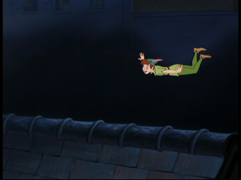
In many scenes, Laputa has the feel of an early Technicolor adventure film or a Disney feature like Peter Pan. One of Technicolor consultant Natalie Kalmus' most conspicuous rules was her demand for natural skin colors (what she believed to be the chief indicator of realism). By keeping the faces in natural tones color constancy perception made the saturated object colors of everything else in the picture stand out even more (which I believe highlights the constructedness of props and sets) and actually defined that glorious look that we generally associate with three-strip Technicolor films.
 |
| A perfect example of Technicolor lighting: Night scene from India's first Technicolor film The River (Jean Renoir, 1951) which helped launch the career of Satyajit Ray. In reality, skin tones would look rather different on the ocean in the dark. |
In animation, lighting is not bound to real lighting equipment and can therefore be purely imaginative. Nevertheless most narrative films of the classic era still adhered to the simulation of "natural" lighting - at least when it comes to character colors and especially skin tones. I'd say that normally skin tones mostly varied in value. Even in night scenes, faces were seldom blue or grey altogether.
In fact, animation has one advantage over live-action: sets can be bathed in real expressionist lighting while the characters' faces can still look natural. Films like Cinderella and Peter Pan used to benefit from such unrealistic but very beautiful color schemes.
Day is bright, night is blue
Let us now look at how character colors are affected by different lighting situations in Laputa:


The same goes for characters even in areas not directly affected by sunlight: daylight with full colors on the left, night time and no light inside the cockpit on the right.

Indoor, daytime

If you compare this image to the one above of the cockpit (with the blue-green pirates), you'll notice that we are in the dark but inside (there is no dark blue sky reflected on anything). Background colors are merely darkened and slightly desaturated (brown and bluish-gray are still distinguishable). These could as well be object colors in plain light, though.
The purple buttons are a strong indication of the atmosphere to me. We probably expect red buttons. So if we see them in purple (like red objects in blue light) we assume that it is rather dark down there.
Character hues do not seem to be affected by this same blue light but their values are certainly darker than in daylight and since we have neither shadow lines nor any pool of light there seems to be no visible light source in the machine room.
The characters read exceptionally well not only because they are so much brighter and in a different hue (complementary?) but also because value contrast is very low in the rather detailed background.
 |
| Here I have changed to purple to red, raised the skin color (left) and tinted the whole picture in blue-green (right) just to demonstrate how different the mood of this shot could have felt without breaking the "light character on dark background" concept. |


There is a slight pool of light and character and prop colors aren't affected by the darkness, not even in the shadow parts which are only darker but not reflecting anything blue. Unless we suppose that this whole dungeon was painted dark blue, this color combination is completely unrealistic. Yet, it looks beautiful and tells us intuitively that it's day daytime outside. Had it been a nightscene, the background might have been the same but Pazu might have been darkened or tinted blue (the light could as well be moonlight, for all we glimpse of it.)

This very strong contrast that makes Pazu's colors look rich and saturated resembles the old Technicolor aesthetics that emphasizes colors by surrounding them with deep blacks.
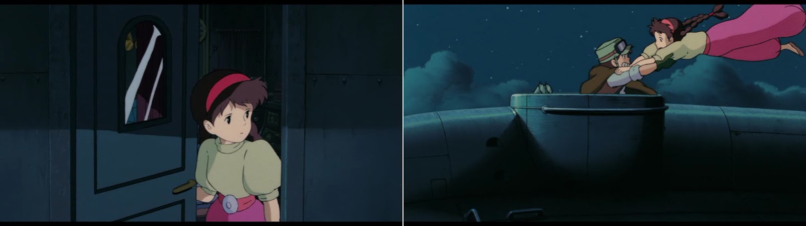
Indoor vs. outdoor at night
After all these daytime scenes, let us look at how character colors are affected by the darkness of the night:

The same seems to be true in Dola's bedroom:

Sheeta's vibrant pirate's costume is just darkened with unchanged hues.
So how did they achieve that the outside feels colder than the inside although it is dark in both places?
Outside all hues are affected by the blue of the night sky, but not all to the same extent:
- Background colors are once again monochromatic (the brown ship is blue like the sky).
- Costume colors on the other hand are changed by the blue light (coral gets purple, beige gets light blue, warm yellow looks greenish).
- Skin tones however are least affected by these changes.

An unusual light source
Towards the end of the film there is another scene that conveys mood by changing costume colors:

As Musca and Sheeta approach the crystal core of the flying island, we have three different lighting situations:
First there seems to be natural lighting against a dark monochromatic background. While Musca and especially his henchmen blend in with the cold stone walls, Sheeta's flamboyant costume stands out so that she visually becomes the center of attention.

Then the two last descendants of Laputa pass a dark hallway without daylight. Skin tones are again like in the shadow but now costumes are strongly affected by the cold darkness so that Sheeta's clothes are seen in shades of lilac and purple.

Ultimately, this color change not only gets the chilly feeling across but also prepares the following change of lighting: The piercing wan yellow glow emitted by the crystal core really stands out so much stronger against Sheeta's lilac shirt than had it been yellow already.
We now also see that this light source is much brighter than anything we have looked at so far: Costumes and skin tones are lighter than in plain daylight.

So far, we may have seen how masterful the film makers adjusted character colors without drawing attention to it. Next we will look at a scene that blows my mind every time I see it.
All screenshots taken from this gorgeous Studio Ghibli Bluray Collection by "universum film". It seems to me that this is the way to see the film unless you have access to a 35mm print.


No comments:
Post a Comment