Note: by analyzing and outlining these concepts I do not infer that all of those colors were consciously assigned on a theoretical basis. I rather believe that the responsible artists did have a strong innate sense of what looked good and fit the mood in addition to what was acceptable or even sought after by Walt Disney. Naturally, the actual implementation of concepts and moods in sketches and color keys must have been carefully thought and talked over (like everything else in these productions).
Rare Expressionist Experiments
During the early years of three-strip Technicolor, live-action cinematographers were discouraged from overtly using colored lighting on actors' faces by all-powerful Technicolor advisors like Natalie Kalmus. Although exotic or fantastical sequences (apparently including anything animated) were exempted from most of the rules in Kalmus'
"Colour Consciousness", Disney's striving for romantic realism and sincerity encumbered expressionist use of color in his animated films following the failure of FANTASIA (1940).
 |
| Unusual skin tones were mainly reserved for fantasy creatures (FANTASIA). |
Thus during the 1940s, the package features seemed to remain the only playground for color experiments. Especially the Donald cartoons in the studio's South American anthologies offered a welcome break from naturalism. In both films, deliberately exotic depictions of Brazil and Mexico climax in flurries of color and wild dance music.
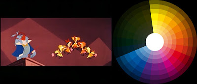
Colored lighting
In SALUDOS AMIGOS (1942), the seemingly expressionistic colors of different layers of silhouettes add depth cues to an otherwise graphically flat composition. In addition to creating overlap, the values in these dark-on-light compositions draws on our unconscious knowledge that darker silhouettes are more closely to the camera. Therefore, the resulting images look rather impressionistic than expressionistic. In one scene, musicians' hands that look like silhouettes at first glance, turn out to be highly detailed drawings painted in very similar shades of orange. Overall, these colors convey the illusion of a red filter or red lighting.
 |
| Values simulate depth (darker objects appear to be closer). |
Further experiments with color filters in live-action and colored lighting simulation in animation are on display in the second "South of the Border" film THE THREE CABALLEROS (1944). All the colors in the frame - including skin tones and the woman's
multicolored dress - are unified by one single hue resulting in a
succession of analogous color schemes. In some shots, the effect is
enhanced by animated objects in contrasting colors, e.g. green spots
that intensify the impact of the blue light on the character.
 |
| The costume colors (left) and seen through a blue filter with animated spots of green. |
The frenzied dance that eventually turns into a stylized cockfight obviously got past Natalie Kalmus who is credited as Color Director for the live-action segments. Although in her influential dogma of
"Color Consciousness" she does mention colored lights for special effects in regard to background lighting, Kalmus stresses the need for "natural" colors and flesh tones.
 |
| Color casts (probably added in post production): yellow (left) vs green (right). |
 |
| The same dancers in red light before the transition to an animated cockfight in silhouette with glowing rims. |
Subsequently, Donald is seen in a yellow spotlight rendering his white "skin" (plumage most likely) muted yellow and his blue sailor suit green. Without the context of the lighting effect, Donald's colors look almost psychedelic.
 |
| Donald in yellow light: blue turns to green. |
 |
| If the yellow light affects the background, too (left), the skin tone appears more natural than against an unaffected background (right). |
This impression is further enhanced by staging Donald against contrasting colors. Now his colors - different shades of only one basic hue - are NOT justified by overall lighting and therefore feel purely expressionistic. Donald's face and beak really ARE green, there is no way
color constancy could make us believe that they were any other color.
 |
| Again, overall shapes of characters and objects are clearly visible because each element has shades of only one basic hue. |
 |
| The yellow light version of Donald (left) vs the monochrome green version that makes the skin look really green. |
Such complete elimination of realism is very rare in Disney films. Still, these shots adhere to the same basic concept of structuring a composition by contrasting different elements that are each unified by colors, a concept that also governs most of Disney's naturalistic depictions.
 |
| Analogous green character against analogous red characters and surroundings (left) vs analogous red character against green character and surroundings (right). |
The shot (above right) from the penguin segment of the film does not seem to have anything in common with the crazy Donald hallucination. Yet, like the all-green duck that contrasts with his red friends and orange surroundings, the colors of the penguin in the hammock that is set against an all-green turtle in an equally green environment are surprisingly based on the same narrow range of red and orange:
 |
| Top row: actual Penguin/Hammock colors; bottom: corresponding hues. |
The road not taken
 |
| GERALD MCBOING BOING (UPA, 1950) |
From here, Disney's color design could have taken off to more daringly abstract concepts. That obviously did not happen. Indeed, it took the studio almost ten years to overthrow natural skin tones in educational shorts and only at a time when more progressive rivals like UPA had already popularized it.
Instead of the strongly restricted color schemes of "cartoon modern" films like
Bobe Cannon's GERALD MCBOING BOING (1950), Disney opted for the more lavish and harmonious path in MELODY and TOOT, WHISTLE, PLUNK AND BOOM (both 1953) that experimented with 3D (MELODY) and cinemascope (TOOT).
MELODY takes place in a class room full of birds. Their design takes the analogous color scheme to new heights. Even most of their beaks - Disney beaks were usually painted yellow or orange, no matter what - are in analogous colors. This way (and with the benefit of very unobtrusive background colors) the art direction manages to cram all the colors of the rainbow into one shot.
 |
| The sheer amount of character colors called for a very muted background. |
Organic diversity is achieved by a varying range of hues. The pink girl (below), for example, is based on one single hue whereas the green girl is based on an analogous triad of yellow, green and blue. In analogous triads, there is usually a dominant and a supporting hue (yellow and green, in this case). The third (blue) is used as a spot color. On a narrower scale the same goes for the blue bird with closely related violet as spot color.
 |
| Four birds in analogous colors including beaks. |
On the one hand, reinforcing contrast is provided by props and abstract "paintings" on the walls. These colors separate the planes (foreground vs background).
If a character is to be clearly distinguished from objects around him, they are often painted in many different hues except the one associated with the character: we immediately understand what shapes are part of Donald because there are no blue books around him.
 |
| Blue Donald behind red, green and yellow books in SALUDOS AMIGOS. |
The same works with contrasting saturation and brightness, as the pale bird in between the dark books demonstrates:
 |
| The pale bird surrounded by saturated books. |
On the other hand, characters are singled out by contrasting spots of color within their design. The protagonist, a blue owl teacher, has an orange beak that is not analogous to any of his other colors. I find it very interesting that the owl was not blue in the color script/colored storyboards. The singled out green girl has orange hair and most of all pink bows to balance the green dress.
 |
| Preliminary artwork (left) vs finished frame. |
 |
| Contrasting spot color: magenta on the left, orange on the right. |
One particularly small boy who is the focus of the shots he is in (but is wholly unimportant to the story) stands out because of his "natural" colors of high saturation: red, pink, yellow and a large green book as opposed to a larger but far more receding boy in monochrome blue with a blue book. The small character is singled out by a wider variety of hues and by a stronger warm/cold contrast in regard to the background.
 |
| The blue boy looks like part of the background while the tiny boy stands out by saturation and variety of hues. |
Skin TonesAlthough at first sight, human skin tones look equally expressionistic as in GERALD MCBOING BOING, their use is far more closely related to the classical Disney style. While Gerald's face adopts the background color and contrasts with other distinct colors of the composition, the human faces in MELODY are only in the same hue as the background, because the overall composition is based on this hue. With closely related colors, the compositions look much more tone-on-tone than those in the UPA film.
 |
| Faces match background colors, costumes clash with them. |
 |
| Both faces and costumes match background colors in hue but not in brightness and saturation. |
Based on the idea that our eyes are attracted to the strongest contrast within a composition, there is always a visible discrepancy of values between background and human face, though. As usual with Disney, a basic sense of lighting is achieved by painting characters on bright backgrounds considerably darker and vice versa, so they even read perfectly as black and white still frames.
 |
| The compositions are mostly tinted by one single hue and thus highly harmonious. |
 |
| Contrast is only achieved by values (relative brightness). |
There are some instances of really expressionist (and not just unicolored) skin tones. For instance, the decline from middle aged to old man is primarily told through color changes of his face from orange to grayish blue.
 |
| Changing skin tones communicate the aging process. |
Such harmonious transitions of hues according to the rainbow are an overarching storytelling principle of MELODY that is introduced when the school children re-arrange according to their color to present the short's title. Even pre-schoolers can see that the birds are now floating in the correct sequence.
 |
| Random colors (left) arranged in rainbow order (right). |
The aging process mentioned above is also part of a man's development from the cradle to the grave which itself is structured as a succession of hue transitions across the rainbow.
 |
| Contrasting hues are only employed against a green background. |
 |
| The cycle starts with soft pink (the baby) and ends with empty outlines against sky-blue. |
As soon as we leave the human family and enter the realm of abstract cartoon animals, more playful color schemes are on display again. But even here, the artists refrain from clashing colors in favor of deeply harmonious ones.
 |
| Warm and cold analogous color schemes unify these abstract designs. |
Real forays into more modern, clashing colors are extremely rare but not entirely absent, however:
 |
| Unusual color combination against an almost colorless background. |
Sophistication By Narrowing The Color Range
In the cinemascope sequel TOOT, WHISTLE, PLUNK AND BOOM, the color palette is basically restricted to warm analogous colors from yellow to red against cold analogous colors from blue to purple. This may sound simple, but narrowing the range of colors to two-thirds of the color wheel (with blue, purple and orange as dominant colors) leads to a much more sophisticated look.
 |
| TOOT, WHISTLE, PLUNK AND BOOM covers a range of cold and warm colors from yellow to blue. |
 |
| All the birds are painted in warm colors with plumage that resembles human skin tones. |
Most of the characters are painted in narrow analogous or monochrome colors schemes. Therefore, the backgrounds do not have to be as gray and brown as in MELODY:
 |
| A very pale green skin tone balances the dominant red and purple. |
The fundamental simplicity of red against blue results not only in analogous color schemes to unify and contrast different elements within the widescreen shots, it also leads to more interesting combinations that actually deserve the label "expressionism":
 |
| Interesting blue skin colors and strong primary contrasts look most flashy. |
Again, in opposition to the clear and flat style of GERALD MCBOING
BOING, these abstract shapes and bare backgrounds above are saturated with
textures and gradients to make them look more sumptuous despite the
deliberately simplifying drawing style.
At least in some orchestra scenes, UPA's "empty" skin tones are imitated. Naturally, these are embedded within sumptuous analogous color schemes (every drum is painted in a different shade of red or orange, for example).
 |
| Disney's color design is luxurious and excessive... |
 |
| ...compared to the economical approach in UPA's GERALD MCBOING BOING. |
Since realism and therefore natural skin tones prevailed in the features, the next installment will focus on costume colors again in package features like THE RELUCTANT DRAGON (1941), SALUDOS AMIGOS (1942), THE THREE CABALLEROS (1944) and FUN AND FANCY FREE (1946).
 |
| The end of experimenting: MELODY vs TOOT, WHISTLE... : all in the range of yellow, red, blue, without green. |


