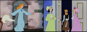
This fourth installment in a series about analogous costume colors in Disney films deals with how the concept of analogous costumes is used in CINDERELLA (1950) and PETER PAN (1953).
The mid-century Disney features that I analyze in this entry have been subjected to
heavy digital restoration. In the case of CINDERELLA, the complete removal of film grain and any traces of texture that hinted at manually painted cels did not only diminish the colored outlines but gives the impression that it was painted and composited in the 1990s with Disney's proprietary CAPS software.
Regardless of whether you prefer historically correct presentations or not, such an impression influences reception in dangerous ways. If a film like CINDERELLA that is so much the product of conservative post-war escapism is perceived as contemporary (or maybe from the 1990s ? all production dates have been omitted from DVD packages) the dated acting and attitudes towards women become problematic.

If its genuine Technicolor look would remind us of the proper historical context (making kids aware of the fact that it was made long time ago and still holds up as entertainment), it would be clear that its attitudes are not contemporary any more. Thus, the film could still be appreciated as the tightly plotted, gorgeous looking gem it really is. One can only hope that the original successive exposure negative or at least some IB prints are still existing in the archives and will not be replaced by a digitally "enhanced" internegative.
The basic color concepts, however inaccurately pushed to extremes to match contemporary tastes, are still clearly visible ? or even more so, now that characters and backgrounds are not unified by the organic quality of film stock any more. So when analyzing any of these films, we have to keep in mind, that saturation, values and color temperature might have looked differently (just compare the two DVD editions of SLEEPING BEAUTY).
But in our digital age, it is also important to recall that each Technicolor print (not to speak of "normal" prints for re-issues) looked slightly different, even though there was a basic aesthetics to them that was easily recognizable. Compared to what we get on DVD and Blu ray nowadays, they did look rather dark with rich blacks and probably warmer overall because of different lamp temperatures.
Color Connotations: Cinderella
With that out of the way, let us start with animals again. Somewhere in between the woodland creatures in SNOW WHITE (1937) and the clothed mice and ducks of the cartoons, Cinderella's little helpers are composed of a barking dog that looks and behaves like a dog, a few sparrow-like birds with minimal clothes and a cast of fully anthropomorphized talking mice on two legs.
The plumage of these birds is painted in closely related shades of one single hue each, like slick prototypes of the analogous color scheme. The more interesting part of their design lies in the strange pieces of clothing that a) connect them to the mice (why would birds wear shoes that stop them from clasping branches?) and b) add individuality to the most generic design imaginable. Contrast is provided by scarves and caps in soft pastel versions of complementary colors red and green.
 |
| Top row: actual costume colors of blue birds; bottom: respective hues. |
The animals most people remember, though, are the mice Jacques and Gus. From what we have seen in previous films, their costume colors reveal quite a lot about their personalities and roles: like Mickey (or Doc in SNOW WHITE), Jacques must be the leader because he is wearing saturated warm red that overall leans towards orange rather than purple (the designated villain color, but more on that later)
 |
| Warm red (leaning towards orange) is often shown as the color of leaders: SNOW WHITE (left) and CINDERELLA. |
 |
| Purplish red is most often reserved for hostile characters: SNOW WHITE (left) and CINDERELLA. |
Gus on the other hand is the more simple-minded, confused Goofy type with more disparate colors one of which is green, a complementary to Jacques' red. Among the rest of the male mice who all wear blue and yellow (or green in between), he stands out because of the warm yellow shirt Cinderella gave to him.
 |
| Jacques is easily identified by his orange-red clothes... |
 |
| ...as opposed to the other mice's colors ranging from yellow through green to blue. |
The leading female seamstress mouse is wearing quite an elaborate dress in different shades of pink/magenta with a lilac hat.
CINDERELLA's most obvious stylistic departure from its golden age predecessors SNOW WHITE, PINOCCHIO (1940), DUMBO (1941) and BAMBI (1942) lies in a
new dominance of art deco pastel colors. These soft colors of higher value and mid-saturation are most evident in costumes and still determine how children imagine princess dresses today.
 |
| Contrasting cold blue (Cinderella, water) with warm brown (horse, father, puppy). |
While color temperature is an overarching structuring element with light blue against brown/beige (above), predominant costume colors are light blue, light green and pink with an overall emphasis on pink/green contrast as can be seen within groups of mice as well as Cinderella's wealthy stepsisters:
 |
| The stepsisters are distinguished by magenta/green contrast. The same concept is used for the singing seamstresses. |
Both these contrasts, brown/blue as well as magenta/green, are complementary colors in the additive RGB system. I usually call them "negative colors" as opposed to complementary colors like red/green in the painterly red/blue/yellow subtractive color model (more on confusing
complementary colors here). If you want to see the negative colors of an RGB image, just invert it:
 |
| Magenta and green are opposites or "negative colors" in the additive RGB system. |
 |
| The same goes for light blue and brown. |
The magenta/green contrast is slightly more interesting than the cold-warm concept because neither of these hues is receding. Because of their opposing overall colors, we can not only distinguish these otherwise similar stepsisters, but also store them in our brain as the green and the magenta sister without having to attach their appearance to their names. But the excessive lushness of their gowns illustrates Cinderella's blatant discrimination in the household after her father's death. After all, the prologue shows us that Cinderella once wore a lavish but far less garish and therefore purer princess dress as well.
 |
| The sisters in the prologue, reconstructed from two screenshots. Together with Cinderella's dress they form a triad of pastel red (pink), blue and yellow. |
Although the colors feel vastly different with excessively patterned fabrics that would have been a nightmare to animate, the 2015 live-action remake adhered to the basic concept of single-hue dresses in clearly distinguishable colors:
 |
| A similar triadic color scheme in the 2015 live-action remake. |
So while her stepsisters are properly dressed in artificial colors, Cinderella is clad in warm earthly browns of discrete values balanced by a light gray shirt (leaning towards cold teal). Cinderella might be the one held captive in an ivory-tower, but based on her costume she looks less one-dimensional and certainly more down-to-earth than her aloof stepsisters.
 |
| Even on identical costumes, Cinderella's color make the first "Anna" look more down-to-earth than the other two. |
Color schemes like this often reflect the notion that supporting characters are more one-dimensional compared to the protagonist. Hence, more interesting character means more variety in its color design.
 |
| Protagonist Pedro (right, from SALUDOS AMIGOS, 1942) is less monotonous than his supporting character parents. |
Sumptuous vs Simple: Peter Pan
I have already written extensively on complementary red and green in PETER PAN (see
Captain Hook's Red Coat: Part I, Part II, Part III). Peter Pan and Captain Hook are complementary opposites and like all the characters above can be described by their analogous color schemes: Hook is all red and purple (he a leader AND a villain, after all), Peter is all green (leaning slightly towards warm yellow and cold blue, depending on the scene). Tinkerbell is actually wearing green as well and therefore is visually connected to Peter. But her strong glow makes her look like a yellow light source.


There is one additional concept to gather from this film upon which I have not written yet: communicating simplicity. So far, it has become clear, that in order to make costumes look rich and sumptuous, they are broken into many different parts with closely related colors (e.g. Cinderella's stepsisters). On the other hand, to make clearly distinct pieces of clothing go together well, the same principle can be applied with more closely related shades of the same color (e.g. Jacques) or contrasting colors from two different hues (e.g. Cinderella) or one hue but strong contrast of value and saturation (e.g. the boy).
 |
| left to right: Jacques (CINDERELLA), the boy (RELUCTANT DRAGON), Cinderella herself. |
To show the simplicity of a costume such as a nightgown or a pyjama in contrast to fancier dresses, these garments are often painted in only one color even though the design would allow for different colors (Wendy's sleeves, for example).
 |
| Simple clothes are in one color only (two, if we count the darker shade of Wendy's belt and bow). |
 |
| The same triad as above. |
 |
| Nightgown triad of blue, green and magenta. |
 |
| The gauchos in THE THREE CABALLEROS, top row: actual soft colors; bottom row: respective hues reveal the primary triad of yellow, blue and red. |
As these screenshots prove, the simple gowns are not new to PETER PAN, but here it is probably the first time that the protagonists (Wendy, John and Michael) keep it on throughout the whole film. More often, pyjamas are only seen for brief moments like when the gauchos in THE THREE CABALLEROS (1944) are undressed by a draft. Not surprisingly, their pyjamas are in muted versions of the primary triad yellow, blue and red that dominated so many of 1940s Disney characters.
In the concluding chapter of this series I will finally return to SLEEPING BEAUTY (1959), Disney's crowning achievement when it comes to analogous colors.
 If its genuine Technicolor look would remind us of the proper historical context (making kids aware of the fact that it was made long time ago and still holds up as entertainment), it would be clear that its attitudes are not contemporary any more. Thus, the film could still be appreciated as the tightly plotted, gorgeous looking gem it really is. One can only hope that the original successive exposure negative or at least some IB prints are still existing in the archives and will not be replaced by a digitally "enhanced" internegative.


No comments:
Post a Comment