 "I never made love in Technicolor"
Before I take off for Annecy later this afternoon I’d like to do a short post about the use of realistic lighting using examples from two late Fleischer cartoons in Technicolor, both made down in Florida.
A longer article about the “imitation of lighting” in American animation will hopefully follow after the festival later this month.
Aladdin and his wonderful lamp (1939) is not only the last but at 22 minutes also the longest of the three Technicolor Popeye two-reelers. It isn’t the most imaginative though and there’s not a single shot done in the Fleischer’s then trademark “Stereoptical Process”.
I’d like to focus on one single scene that features colored light emitted by gems and diamonds:
 First we see princess Olive’s room in natural high key lighting, similar to live-action color epics of the time.
 Then Olive opens several boxes each holding a different colored gem inside. To emphasize the glowing effect of the stones, her whole room reflects each stone’s color. This may be unnatural but is a fairly accepted convention.
Let’s have a closer look at Olive in the red and especially the green picture: as expected, there is some modeling (light and shadow areas) on her body. But when in reality the side closer to the gem (her front) would have to be reflecting the stone’s color more strongly, it is exactly the other way round (especially in the green picture). Olive’s shadow side that in reality wouldn’t be green because her body would block out the green light is all green like the rest of the room. Of course, this goes unnoticed because it makes for a more readable image than had it been handled realistically. Not only is there more contrast of value in Olive than in her immediate surroundings, but she’s also the only thing in the picture that contrasts with the room’s overall color, most notably the spots of red, and she’s also wearing different colors. Her skintone is more or less “natural”.
I personally think that this unrealistic lighting effect makes for a far more interesting picture. Note that the white light in the third picture only bleaches out the surroundings and doesn’t affect colors too much. Here the framing bed looks even stronger than Olive. Naturally, seeing the scene in movement, Olive would still be the center of attraction.
Just to prove that unrealistic lighting must have clearly been a conscious artistic decision, let’s look at how the same people handled light sources and modeling in Superman a.k.a. The Mad Scientist (1941):
 Right from the beginning, there is modeling on the characters. People working on these Superman shorts have repeatedly talked about how they tried to keep in mind where the principal light sources were located in every shot. And going through this first entry in the series shot by shot, you can see that they stick to it probably to a higher degree than anybody before them.
I will discuss the amazing color work and production design of these short in more detail later, because there really is a lot to admire in these films. But for now, just look at how realistically the lighting is handled in the following screen shots. The low key lighting itself is rather influenced by expressionistic live-action crime films of the time and therefore not realistic in the sense that it resembles the real world, but within the shots everything is totally coherent.

 Now here we have the counterpart to the Olive scene from above: in Superman, even skintones are deeply affected by lighting changes, something that was quite uncommon in the early 40s.


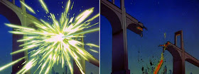
 Near the end of the short, there are several lightning flashes and explosions. With the characters already lit in colored light and shadow, the flashes had to really stand out. It’s amazing to see how the cel painters obviously painted on top of the cels in what looks like dry-brush or some frosted cel technique.
 Of course, in the end the warm evening (or morning) colors take over again.
After managing to reserve most of the desired screenings despite the traditional breakdown of Annecy’s online ticketing system, I’m now really excited about the following week. I hope to see all of the shorts in competition and as many features as possible.

Great observations! Especially from the Popeye stills. I like to use unconventional/unrealistic color and lighting myself. So I'll be sure to table these ideas.
ReplyDelete