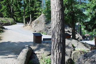
 Here are some color studies based on a photo I took in a nature park last year. This setting intrigued me because the tree in the foreground kind of divides the picture into two separate framings.
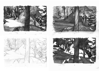 These value sketches are all based on the pencil sketch (bottom left). As you can see, I'm far more comfortable with a pencil than a brush...
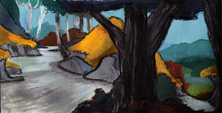 acrylic and pastels
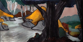
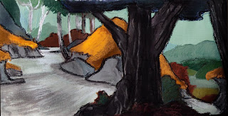 sky color adjusted in Photoshop
Although I have always been interested in studying color and painting, most of the time I’m shying away from actually trying my hand at painting. So these studies didn’t quite turn out the way I imagined them, I sure need some more exercise with brushes and pastels.


I actually really enjoy just seeing the variety and scope of your studies more than anything- it's very inspiring to see the original photo of the location, and then the way you played with the values and tones through various medias... I really love seeing the ways you pushed and pulled parts of the composition and played up different medias for color, saturation and value... lovely!
ReplyDeleteThe pencils are all beautiful.There alive and have mood and texture.The pastel alone is very good.It still contains certain elements that the pencils have but at points has a tendency to go flat.The acrylics are interesting but lose a lot of volume. I would think that was intended.Some of the colors you chose remind me of
ReplyDeleteVan Gogh. Your a very gifted artist.
Tony, you're right about the acrylics. The flatness was intended, but I don't really manage to make them real flat or keep the volume, so everything comes out about the same.
ReplyDeleteI like the updates Oswald.Very cartoony.I can envision Daffy in the foreground!
ReplyDelete