In plain daylight
Before we leave “the married couple’s house” for good, I’d like to fill in the blanks of the last couple posts: Enter Cruella and her companion – the color red.

For once we share Pongo’s point of view peeking through the living room window. The outside world surrounding the white pigeons looks quiet and peaceful. Bright daylight reveals neutral greys and browns. In the greenish shadow area we are inconspicuously reminded of the existence of cars in this story’s world (a first in a Disney feature, excluding package features).
So out of this scarcely saturated green shadow comes a flamboyantly exaggerated sports car whose rich burgundy body makes the red pillar box in front of the window look pale by comparison. The high contrast tires, radiator grill and headlights draw our attention away from the dark cockpit.
 Perdi is promptly hiding when the car arrives, instinctively or because she (as Anita’s dog) knew her already. Upon seeing her car (“must be Cruella, your dearly devoted old school mate”), Roger closes the curtains to visually shut her out (the lighting doesn’t change, but we feel more protected). After Roger has started singing, he too hides, leaving Pongo and Anita to deal with the excentric woman. This always reminded me of the introduction of Monstro the Whale. It always works to generate anticipation of a character’s awfulness by having other characters hide at the sound of his/her name.
Of course Nanny has to get the door. After she is squeezed for the first time (this is gonna be a running gag), she also must be hiding somewhere, as she’s never seen during Cruella’s rant.
The first we see of Cruella is her silhouette perfectly framed by the front door glass window. The first time, the door area is a little on the green side, in the next shot of the same BG it is almost earthly brown. The important thing here is, that the door is in the shadow and the outside is brighter than the inside, yet parts of the walls are in a faint pool of light. In spite of all that, Cruella is not seen in silhouette (darker than the surrounding background area) but brighter than anything else.
So the first time we see her, we learn that she likes a theatrical entrance. There is nothing of the sinister dignity of, say, Cinderella’s stepmother or Maleficent. Cruella always has to stand in the spotlight. She herself is very much like an angular and skinny version of Nanny with black and white hair and a black dress. But her massive, heavy beige fur almost obscures her grey skin, so she actually looks like a walking fur coat with red hands and feet. The grey outside behind her is slightly on the green side.
 As if to make way for her, yellowish green cigarette smoke precedes her in bullying Anita and Pongo. It’s interesting how Roger’s white (therefore not nasty) smoke never bothers anybody during the film. We see immediately that Cruella is into fashion (from the car to the cigarette) and not humble about it. She must have money to fulfil her selfish needs. She is not the family type and therefore no good by the other characters’ standards.
Like the red of her shoes and gloves, acid green is completely absent from the rest of the films color palette.
 It’s very interesting how Cruella is always in the pool of light pushing everybody else out of it. From the moment she arrives, Anita is pushed to the side, making her reside on the sofa (her favourite spot). Yet Pongo cannot go back to his spot on the window sill and is driven into the corner by her. Sitting in the shadow he is considerably darker than Cruella. Although the Dalmatian is still perceived as white (and much lighter than the background), he is considerably darker than Cruella’s hair and even than her coat. The ring on her finger really stands out (bottom left).
 In this beautiful, digitally re-created pan (taken from the old DVD version) by Rob Richards (Animation Backgrounds) we can not only see how the sofa and the armchair are highlighted by value, but also, that the different sides of the living room are strictly distinguished by color, making orientation easier for the viewer. Inkeeping with Anita’s general appearance, her favourite spot is rather sober with clear design, whereas the Dalmatians (and obviously Roger’s) chair is warm, orange and padded. The sofa reads because of its high value even if it’s in the shadowy area of the living room. Opposites are further strengthened by a green and dark orange pillow respectively. This is the pan used for the couple’s dancing after Cruella’s exit.
I generally think that it is paramount to include characters in analyzing background styling or composition, because that’s what these pictures were designed for and the only way audiences will ever see them on screen. However, Rob Richards’ excellent re-constructions are invaluable because it’s always a special treat to see those backgrounds (especially the larger pans) as only the artists could have seen them previously.
 But back to Cruella, because wherever she’s at, it’s all about her, no doubt. To enhance the stage entrance experience she not only stands in the spotlight but is also framed by the burnt orange curtain. She actually behaves like on the catwalk. There’s always some slightly green object next to her, making the red stand out even more. Be it a book, her ring, often a plant or a pillow.
I think it’s especially clever to just make the interior of the coat red, so she can be high contrast and keep her fury under the hood, too. Whenever she makes sudden rushes, we see flashes of red. Usually this concurs with specifically selfish behaviour, like when she says: “[furs are] my only true love, darling, I live for furs, I worship furs”. She’s totally engulfed by her coat, it’s like her second skin. I love how they gave it two different reds to achieve depth without further shading.
 In terms of saturation, Anita has simply become part of the background, we don’t even notice her at first. Cruella is so much stronger. The cigarette is held in negative colors: turquoise and purple, while the turquoise ring looks almost blue compared to the green pillow (it’s always the context that defines our perception of a color.
 The black and white version not only reminds us how close in value all of the background is compared to the high contrast Cruella, but also how much effect the hues have. The curtain, gloves and cigarette are only distinguishable by their red.
 Here Pongo is still hiding behind the (now much darker) sofa while Cruella passes by in the pool of light. Her shoes appear to be much more saturated than everything else.
On her way out, again Cruella slams the door and is framed by the front door window (the same BG with the plant on the left). In fact, she really had to stand out to make an impression, considering that she was only on screen for almost exactly two minutes.

Not long after my last post in this series, Michael Sporn pointed out these layout plans for “the married couple’s house”, apparently approved by Ken Anderson:


It partly solves the mystery of Cruella’s entrance to the kitchen, even if it raises more questions about a room supposedly lying between the living room and the kitchen, which doesn’t seem to be existent in the movie.
At night
Cruella’s next appearance is also limited to little over 2 minutes. Of course, this economy of screen time helped Marc Davis to be able to animate her all alone through the film.
In sequence 3 the windows are repeatedly illuminated by lightning. Yet as a kind of anticipation to Cruella’s surprise visit, the lights inside the room go down a little and a lightning followed by an immediate voltage drop makes all the characters (Pongo first, as he is our narrator) turn their heads to a previously unseen door on the right behind Roger’s chair.
 This is about the only shot that almost falls out of the theatrical setup as the camera is on a much lower angle. Yet contrary to the front door, we just see one solid color behind Cruella, so we’ll never know what’s outside this backdoor.
 The special effects in this sequence are quite imaginative. During the lightning flash for a few frames only, we see Cruella as a complete silhouette while the BG is just darkened in. Apart from that, Cruella is again completely in the light (the fixed lighting from before has been adjusted to spotlight the backdoor). Her beige coat stands out even more against the blue surroundings.

 Now the wall behind her is a lot darker than before. There is simply no pool of light anymore. Again Cruella looks more like a walking fur coat, as her grey skin color doesn’t contrast too well with the rest. These three frames show some strong lines of action by the way. The red lining is mostly concealed now.
It’s also interesting how the beige clothed puppy is much less saturated than before, because again, Cruella is dominating everything.
 The inside of Cruella’s purse is also red. Her head is always in the shadow part of the BG. Her beige coat makes her look much stronger than Roger who with his bleak green and brown is closer in value to the background. But Roger has to face her this time. With the ink spots, he even looks like a human equivalent of Pongo as he is reluctantly articulating what Pongo would say to Cruella, could he speak. Like so many times in this movie, Roger seems almost paralyzed.
 After Cruella has taken in that Roger indeed is not going to sell the puppies (“that’s final”) she gets really angry and completely loses her temper. Look at her coat and her hair. The red lining flashes while tearing the cheque.
 The only hint at a different lighting in the kitchen at night is (apart from the usual shot to shot variations), that Cruella’s skin tone is measurably darker than in sequence 2. Her ring and cigarette are bluer. This might be an adjustment because now she is facing a green Roger, while she was performing opposite a blue clad Anita earlier, or it may have just happened during color correction. Like always, we can only guess why certain things came out the way they did.
After that, Cruella smashes the door off screen and Pongo is barking at her until lightning strikes again. After that, Roger and Anita never see the “Devil woman” in person again.
All in all, her second appearance can be seen as an escalation of the first. She not only gets more out of control (she’s contradicted by a “sir gallahad”) but also breaks the glass (foreshadowing the many broken windows of Hell Hall). Colorwise, her fur is contrasting the blue stronger than the brown of the living room. Her appearance in front of a black plane is also more dramatic than in front of the pale grey outside. This time she didn’t even ring the bell before she entered.
the flipside of the coin (hiding in the dark)
In sequence 5 we are introduced to the Baduns out in the street. Although they come by car and are silhouetted by the front door window similar to Cruella, their intruding is quite different from Cruella’s. As we have already seen in post 02, they are much less self-assured and basically sneak and hide avoiding every spotlight.
 This time it’s night with considerably more light outside. We see their size relations in silhouette. Again Nanny has to get the door and gets squeezed behind it.
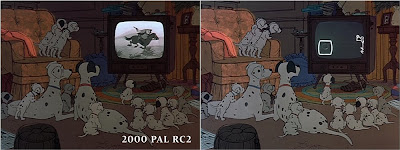
 Now there I am comparing again: I’ve been stating on different occasions that the skin colors (saturation/general hue) remain relatively unaffected by different lighting (there have to be obvious differences in value, of course). Now look at the frame from the old DVD: it looks as if it were either lit by blue light or more likely was color timed and tinted blue in postproduction. In this analysis I go with the restoration, but we never know if this color timing (on the left) was planned all along or just occurred in later re-release prints. It is also possible that some color concepts have been exaggerated/”corrected” by the restoration team.
 Anyway, the point I want to emphasize here is, that whereas Nanny’s skin remains fairly saturated, the Baduns’ complexion is much more affected by lighting. Their eyes are white, grey, green, yellow, salmon, whatever suits a shot.
 Note how the curtain now frames Nanny. While her dress in the dark and shadow (the pool of light is not extending to that part of the room) are more or less the same, in the 2000 edition everything looked more or less blue, with little subtlety in the grey/brown dichotomy.
 To make sure, Nanny’s skin looks rosy in the upstairs music room, similar to her complexion seen from outside the door. But Jasper is dark, almost grey. Nanny’s achromatic clothes make the desaturated room look subtly blue.
A villain's natural environment
 In sequence 6, a female voice rambles about the stolen puppies in a mock empathic voice. Only the yellowish green smoke (Cruella’s Leitmotiv) tell us that this is Cruella, who subsequently laughs her head off about Roger and Anita. We see her for the first time in her “natural environment”. She’s now wearing a black fur coat with purple ribbons to make her grey skin stand out more. Moreover this is completely in keeping with the general black and white concept of sequence 6. Now her surroundings are unsurprisingly painted in shades of red.
 The framing red curtain of the four-poster bed looks quite heavy, whereas the ugly pink sheets and cushion combined with the salmon colored pillow look pretty eccentric. Combine this with a few lilac stockings and other laundry carelessly hanging all around and you’ve got the perfect single diva bedroom. Again the props around the bed tell us that she’s a chain smoker and that fashion and decadence are what her life is all about. This really is a departure from similar shots of Cinderella’s stepmother in her typically stylized violet room. Cruella looks more like a selfish human being than a cold menacing force. A heavy picture frame hanging tilted from the maroon wall gives the room an ancient heaviness. Again this is seen in natural light. The wooden posts, the nightstand and the papers are all grey. This balances the composition and makes the strong colors look even more saturated.
 Of course her telephone is glaring red (next to a green bottle for complementary balance). In a later shot, the eyes on the telephone are also red. This may be by accident but it also makes sense since the phone now is less important than Cruella’s dialling with her cigarette holder (which is very in character). Again she’s present for almost 2 minutes, with much less time (barely a minute) onscreen though, as half of the sequence we just hear her voice over the phone. We never get to see more than this single bedroom of her house.
 When the Baduns call her, we get a very constricted glimpse at their whereabouts. It gets tight for the Baduns and we sense this immediately. They even stand in the shadow at home. This is one of those rare instances where talking characters are silhouetted. They must be standing in the shadow because their eyes are much darker than at night. Additionally, even the shadow areas of the BG are lighter. Note that the silhouettes are never solid black in this movie. This BG is composed of warm and cold greys like the kitchen later in this sequence.
What’s most interesting to me is, that every room’s dominant color so far has reflected the inhabitant’s feelings or colors, yet the Baduns’ room is completely colorless even in these expository (and only) shots.
This not only ties them visually to the Dalmatians, it also leads to the assumption that they don’t have a color of their own. This room doesn’t represent anything at all. They simply blend in everywhere. They are shadow creatures who adapt to any circumstances. This is further supported by the fact, that their skin color is not as constant as the other human characters’. Earlier, we saw them drain color from a formerly warm living room, now they are where they live, in a completely colorless environment. We don’t get a hint at where they are!
Conclusion
It was nothing groundbreaking for a Disney film to introduce red with the clothes of a villain (think of the coach driver to
Cruella’s color model thus was quite a departure from those conventions. Like an eccentric diva, she always has to stand in the spotlight and (because of her fur coat) is always brighter than anybody else in the shot. She doesn’t have to be clad in red to make an impression. Red only dominates when she whirls around and we see the lining of her coat.
 It totally works that her skin is grey, since after she entered the Pongos’ lives everything gets grey and lifeless (in sequence 6). Except for Cruella’s bedroom, The living room is still the least grey and most hopeful location. It’s where life is, after all. It now makes sense that Anita is wearing green because that makes her the most distant from Cruella’s bedroom by complementary colors. She used to be blue in a beige surrounding, blue in a beige surrounding and now green in a red/pink surrounding (if you see it in the context of the sequence of course).
We have also seen that sequences 2 and 3 are split into two halves all which are symmetrically constructed.
The Baduns may be introduced similarly to Cruella (car, silhouette in door), but they are the antithesis of her in more or less every conceivable way. Where she is always standing in the spotlight, they prefer to stay in the shadow. There is no real color to represent them, they are just shadows themselves.
It’s interesting to see how much of the light and darkness concept is already there in Bill Peet’s story sketches. His boards of the first two encounters with Cruella are reprinted in John Canemaker’s Paper Dreams and can be seen online on Michael Sporn’s Splog (scroll down). While Peet doesn’t claim to have had a hand in the color styling, he always felt that Cruella was at least as much his creation as Marc Davis’, as can be witnessed in his sometimes bitter and provocative answers to John Province also published in Walt’s People Volume 3. There’s also a nice text about Cruella by Ollie Johnston and Frank Thomas in their book about Disney Villains, where Peet is mentioned right in the beginning. It’s funny how many of the stills in this book have been color corrected to make Cruella’s grey skin look more natural.
Color reference (not scientifically checked): http://en.wikipedia.org/wiki/List_of_colors
All screenshots are from Platinum Edition DVD, RC: 2, 2008 unless otherwise stated. All the pictures are the property of Disney, used here for educational purposes.
Sequences labelled according to the final draft (posted by Hans Perk) and Mark Mayerson’s mosaics

