Pages

Monday, January 31, 2011

Anne Trister - analogous colors and accents

Before the next Fox-installment, let’s look at a totally different film that seems to be related to Wes Anderson’s movies in regard of using color.

If we try to make an image instantly readable, we often increase contrast between character and background so that the silhouette gets clearer. In live-action films in particular, this isn’t always necessary because characters are easily distinguished from the background simply because there’s always some movement. In fact, some films make it part of their artistic design to blend character clothes in with their surroundings. In a future post we’ll see that Wes Anderson is often dressing his actors in this chameleon-like way.

Like a "trompe-l’oeil" painting
In Léa Pool’s Anne Trister (1986) this all makes sense because protagonist Anne Trister is a trompe-l’oeil painter in search of her roots. Hairstyles and heavy synthesizer music are so blatantly 1980s style that the timelessness and subtlety of the film might get overlooked at first.

Anne Trister seems deliberately to be one of the most colorless color movies since Tati’s PlayTime (1967). The art direction carefully constructed an all gray environment against which skin tones sometimes come off as warm accents or blend in when surrounded by warm grays/browns.
The contrasts are subtle, some of them only tonal, some of them in pattern, some of them in hue. This all makes sense since the film is about a trompe-l’oeil painter.

Nevertheless, the light looks fairly natural. There is a complex (and maybe principally intuitive) pattern of red and to a lesser extent blue accents. It doesn’t seem to be just a matter of warm or cold colors. The film's focus is on the growing relationship between Anne and her psychologist friend Alix. While the receding blue is often present in sweaters, red is the only color Anne Trister uses in her work. It is also the color a disturbed child uses to act out her violent excesses.

This is the first shot of the film showing Anne with her mother after the death of her father.
In the middle, Anne is seen in silhouette, at left and right her clothes match the gray walls more or less.
Sand is the central motive of the film, there are visual analogies with snow.

Anne paints her atelier with a sand-like structure using gray, white and red to create the illusion of a different room.

Thursday, January 27, 2011

Fantastic Mr. Fox: Inspiration (2/5)

Here, I try to assemble a fragmentary meandering on referenced sources, some of them cited as inspiration by the director, some of them my own guess-work. Down below I have included Google Video for the first time (just excerpts from music, though).


early depiction of vested fox
Unlike Jeffrey Katzenberg, for example, Wes Anderson does not believe in drowning his films in pop cultural references of the day. If you look for them, you can find a lot of references in his films, but you never have to recognize them to enjoy a scene and – at least, that’s what I think – all of them have stood the test of time and will not seem dated in future decades. I experience them rather as an extra layer of meaning beneath the surface.

Foxes wearing clothes and walking on their hind legs have a long tradition in illustration. The Story of ”Reineke Fuchs” or “Reynard the Fox” dates back to medieval European folklore, with even older origins in fables. In these stories the fox is a sly trickster and successfully plays the other animal characters off against each other – which he gets away with in the end.


Especially in the German-speaking part of Europe Goethe’s poem about “Reineke Fuchs” is well-known and has inspired many illustrations. During the 19th century, illustrators like Heinrich Kley, Gustave Doré, John Tenniel, John Swain or Wilhelm von Kaulbach have drawn anthropomorphic animals.

Wilhelm von Kaulbach (Reineke Fuchs, 1857)
John Swain (Punch, 1883)
When asked about inspiration for his stop-motion-feature Fantastic Mr. Fox Wes Anderson frequently cites Ladislas and Irène Starevitch’s 1930 feature of the French version of the story called Le Roman de Renard. With a length of 65 minutes it is one of the few pre-Snow White animated features. However, it hadn’t found its way into cinemas until the Nazis showed a German language version in 1937. It only hit French screens during the war in 1941.

The black and white stop motion film connects episodes of Renard’s bad deeds by having the aggrieved victims tell the lion king of their suffering. Compared to what we are used to see in children’s films today it has a real wild story including a extra-marital romance of the lion queen with a singing cat. In the end, the fox is even able to talk himself off the gallows so that the king decides to make peace and elevate the fox to become his minister. It is on youtube in full length with English subtitles.

Its creator, the then-renowned Ladislas Starevitch (or Ladislaw Starewicz), was originally Polish. Seeing the animation style in Wes Anderson’s film, it is not surprising that a lot of key inspiration was Eastern European stop-motion animation, especially Hungarian.

Burl Ives as Sam the Snowman
Anderson also mentioned the Rankin-Bass christmas special Rudolph the Red-Nosed Reindeer in which Burl Ives plays a singing onscreen narrator called Sam the Snowman. There are at least three Burl Ives songs playing during interior scenes of Fantastic Mr. Fox. All of them are from 1949 and can be found on a pair of records with songs for children (the same year Ives was nominated for an Academy Award for a song he sang as Uncle Hiram in Disney’s So Dear To My Heart). According to Wikipedia these children’s records coincide with the birth of his own song. It’s not unexpected that Burl Ives records can be heard mainly in Ash’s room and at the family table.

Two of the scenes accompanied by Burl Ives records
Jarvis Cocker as Petey
All of these songs were recorded before he was blacklisted by and then cooperated with the HUAC causing a rift with fellow folk singer Pete Seeger. Without thinking about this connection (and I’m really just guessing here) I’ve understood the banjo playing character Petey as a homage to Pete Seeger despite Jarvis Cocker being English like all humans are in contrast to the all-American animals. Yet making him an onscreen character who supposedly, at one point, was meant to become an onscreen narrator, too, there’s also a resemblance to Ives’ snowman character in Rudolph. Throw in cousin Kristofferson who is allegedly named after Kris Kristofferson and you get a blend of different folk musicians that probably doesn’t literally mean anything but nevertheless triggers a wide range of associations.


Talking about vested foxes one cannot ignore Woolie Reitherman’s Robin Hood (1973). Anderson, born in 1969, must have seen this as a child and he uses its song “Love” in an idyllic scene outside the treehouse. It’s barely audible, but it’s playing like a piece of mood music.
The record playing in this scene is from Robin Hood.
According to Robin Allan, “Ken Anderson wept when he saw how his character concepts had been processed into stereotypes for the animation on Robin Hood. By then, the film makers had eradicated any interesting character trait that might have been left over from the original Reynard character. All that was left were the clothes and hunter’s hat. But animating the real story of “Reynard” was in talks as early as 1937, even before Disney could have seen the Starevitch feature. According to Charles Solomon (The Disney that never was, p. 81ff), Disney
“expressed reservations about the personality of the title character: ‘Well, our main character is a crook, and there’s nothing about him having the ‘Robin Hood’ angle. […] He’s not to be a murderer under any circumstances. He shouldn’t take advantage of anybody but a stupid individual.’” 
He further cited his problems with the Hays Office because of Cock Robin. Later, it was to be combined with "Chanticleer" and under discussion until the 1960s. Its later character design “provided a jumping-off point for the artists when they made Robin Hood” (Solomon).
study for the Reynard feature (image lifted from 2619 Hyperion)
"Reynard attempts to woo a demure old hen", drawing for Chanticleer by Marc Davis (in Charles Solomon's "The Disney that never was", p.82)
See also: Chanticleer and fox by Jeffrey Pepper and Robin Hood confidential by Will Finn.


Musically, there is a wealth of references with Alexandre Desplat’s brilliant score weaving such disparate sources as Beach Boys, Burl Ives, Truffaut soundtracks and Morricone imitations together into one seamless fabric that is dominated by banjo and chimes.

As always with Wes Anderson, there is a Rolling Stones song playing during a key scene. Using songs of the late 1960s, early 1970s is one of the director’s trademarks. Here they fit perfectly, since the film seems to take place around the year 1970 when the book came out.

Mr. Fox’ confrontations with the farmers, Bean’s security rat and the wolf are successfully staged like Sergio Leone shootouts. Since these spaghetti western spoofs have become an annoying staple of so many comedies, it’s positively surprising when one is really working. A lot of its success is due to the perfect musical timing and scoring.

I have juxtaposed three of Desplat’s sound cues with Ennio Morricone’s originals they reminded me of.

All the Western-soundalikes are based on the film's signature tune, the children’s choir nursery rhyme about “Boggis, Bunce and Bean” (see/hear excerpt below): 

Coming soon: Wes Anderson’s visual style

Friday, January 21, 2011

Fantastic Mr. Fox: The Book (1/5)

Now that Fantastic Mr. Fox (2009) finally showed up on a few Swiss cinema screens (on Bluray, as there are no digital or 35mm prints available) I’ve been heavily digging into the works of Wes Anderson lately.

Since I don’t know too much about my readers, I’m curious how many of you have actually seen Fantastic Mr. Fox and if you liked what you saw. Please take a minute to answer the two questions on the right.


Roald Dahl’s children’s book “Fantastic Mr. Fox” came out in 1970 with Illustrations by Donald Chaffin. Nowadays most editions are illustrated by Quentin Blake (see picture on the left) whose style is rather different from Chaffin’s.

But Wes Anderson – claiming that “Fox” was the first book he owned – is very fond of Chaffin’s original illustrations and thus invited him to work on the production design.

As you can see in these 1970 illustrations, Chaffin and Anderson share a lot of stylistic preferences such as made-to-measure suits, central perspective, axially symmetrical compositions and cross-section views:

According to Wikipedia, this is the first edition cover (but it might as well be the one from 1978). Does somebody know about this?

The original cover illustration according to the film makers

Chaffin's concept art for the film
The actual title in the film
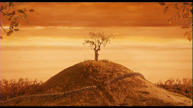
The tree and Mr. Fox in the beginning

Axially symmetrical and cross-section through Mr. Fox's hole
Cross-section through Mr. Fox's bedroom in the basement of the tree
Digging in cross-sectio
Central perspective
  
Chaffin's version of the farmers
On the left: the three farmers as puppets by Mackinnon and Saunders.

Concept art for the film...
...and actual framegrab.
Coming Soon: Inspiration from different sources

Tuesday, January 11, 2011

Miyazaki's 70th Birthday

I'd like to commemorate Miyazaki-san's 70th birthday (01/05/1941) with a few reconstructed background pans from his first feature as a director: Rupan sansei: Kariosutoro no shiro (Lupin III: The Castle of Cagliostro)

Although it looks like a less personal work than his later fantasy epics, Miyazaki's style is already visible. Despite its limited animation, Cagliostro is very entertaining even if one doesn't know anything about the whole Lupin III franchise. It's set in that lush, dreamy version of Europe - in this case the Riviera - that Japanese artists evoke so successfully.


Thursday, January 6, 2011

2010 film review

Looking back on 2010 I could rant about the recent conversion to digital cinema, the decline of cinema attendance or how Inception didn’t quite turn out to be the event I was hoping thought it would be. But 2010 is also the year I caught up with the last two Wong Kar-Wai movies I hadn’t seen, a 70mm screening of Tati’s PlayTime (1967) as well as a bunch of great Woody Allen comedies. So next to the list of my ten favorite new releases of 2010 I dig into what has become a habit by now: that the films that made the biggest impression on me were old ones. 

As far as movies are concerned, 2011 couldn’t have started better. Right on New Year’s Day I saw Des hommes et des dieux, a French film about a group of Trappist monks executed in Algeria in 1996. It is one of several French films that transcend the usual dialogue-heavy “je t’aime… …moi non plus” attitude we associate with French drama.

Of 2010’s new releases there was no single outstanding film so I just list my ten favorite films in alphabetical order:
  • Kûki ningyô/Air Doll (Kore-Eda, Japan 2009): As soft and light-weight as its wide-eyed sex-doll-come-to-life protagonist. With its musette score it plays like a Japanese version of Jean-Pierre Jeunet’s Amélie, but less flashy, subtler and certainly more enigmatically philosophical.
  • L’enfer d’Henri-Georges Clouzot (Bromberg/Medrea, France 2009): The thrilling tale of a movie that might have been, had it ever been completed. Romy Schneider with blue lips in a psychedelic phantasmagoria.
  • Die Fremde/When we leave (Aladag, Germany 2010): the first of two thoughtful and subtle films about the tensions of modern women suffering from religious traditions. Formally and emotionally superior to Na Putu/On the path.
  • Gainsbourg – vie héroïque (Sfar, France/USA 2010): A biopic that dares to leave blanks. What might have become a clumsy act of worship is transformed into a raw and at the same time polished piece of art by first time director Joann Sfar based on his own crudely drawn graphic novel.
  • L’illusionniste (Chomet, UK/France 2010): Less zany than Chomet’s earlier Triplettes de Belleville but ultimately more beautiful, this out-dated Illusionist roaming around Scotland combines Jacques Tati’s slow building visual gags with the melancholia of a dying art form. This year’s only animated feature without action sequences.
  • Nowhere Boy (Taylor-Wood, UK/Canada 2009): A polished period piece as decidedly British as they come. I have certainly seen better films in 2010 but this one will stay in my memory. After all, how could I resist a film about John Lennon’s youth, no matter how modest in scope?
  • Precious (Daniels, USA 2009): An emotional bulldozer that hits all the right notes. Gabourey Sidibe proves that a great actress is able to avoid the victim-trap even with a character that has to endure an almost preposterous amount of adversities.
  • Shutter Island (Scorsese, USA 2010): Scorsese even succeeds when reworking the 50s genre pictures he adores so much. Call it unfocused, even weak in comparison to his “auteur” projects, but it was one hell of a ride with a perfect soundtrack.
  • A single man (Ford, USA 2009): Can a western director succeed in bringing Wong Kar-Wai's style to a literary adaptation? A few lapses aside, yes, if he is fashion designer Tom Ford.
  • Winter’s Bone (Granik, USA 2010): Gut-wrenching, bone-chilling – this year’s Shotgun Stories, just stronger and from a female point of view. Lead actress Jennifer Lawrence is a natural.

What remains on the cutting floor
The Kids are all right, A serious man, and The Social Network almost made the list. Fantastic Mr. Fox is not included because I had to see it a second time to fully enjoy and appreciate it, so I went for Sylvain Chomet’s film instead. But why only one animated feature in a list of ten films? First of all, I wasn’t overwhelmed by any animated film this year like I was by Mary and Max, Ratatouille or Spirited Away in previous years.

The Toy Story 3 screening was ruined by several factors, so I can’t say much about that. Tangled was better than expected and far above last year’s The Princess and The Frog. The storytelling was floweing seamlessly, the zip-style animation was limited to a horse acting like a dog – which was surprisingly funny. All in all, it was a successful return to the tightly structured 90s features like Beauty and the Beast. The problem is that it’s just not the kind of picture I would want to see or the direction I would want a once inventive studio to take. Not that I have anything against fairy tales or screwball comedies along the lines of It Happened One Night. But frankly, I don’t need to see an average American teenager stumble through a set that looks like it was inspired by Disneyland, no matter how beautiful and impressive the animation – and believe me, it is impressive. Since they get the teenager characterization so right, why not do a story taking place in a real 2010 environment?

The good news is that I actually liked large parts of a Dreamworks feature: Hadn’t it been for the tedious action scenes, How to train your dragon could have been a masterpiece. I’m sure, the core relationship between the boy and his dragon would have been strong enough to carry the whole film. The other thing I liked was the fact that the final battle had a lasting effect on the boy. Why these films always resort to a scene where the hero is assumed to be dead remains a mystery to me, though.

Expanding the back catalogue
When I wrote about Italian cinema last year, I wouldn’t have thought that a year later I’d write about the same subject again. Then the musical Nine made me wish to see Otto e mezzo (1963) again. Not only was my wish granted, I was even given the opportunity of presenting it in a public screening. While the Fellini are part of the cinema italiano I've known for a long time – the director driven art house branch beginning with Rosselini and Neorealismo and ending with Antonioni, Visconti and Bertolucci Scorsese opened my eyes for the vital tradition of purely entertaining screen comedies of the 50s, 60s and early 70s by directors like Dino Risi and Ettore Scola. Last summer, I finally saw some of these films and I’ve become addicted to them ever since.

After seeing Otto e mezzo several times, Marcello Mastroianni was already my new favorite actor. But I only discovered his immense range of expressions in films like Dramma della gelosia (Scola, 1970) or Divorzio all’italiana (Germi, 1961), two gems I’d watch again anytime.

Another great discovery of 2010 was Swedish director Jan Troell, especially his monumental two-part emigrant saga Utvandrarna (1971) and Nybyggarna (1972) about a poor family who leaves Sweden to settle down in Minnesota. Doing his own (hand) camera work, Troell achieves a level of realism that transcends even Terrence Malick’s similar undertaking in The New World (2005). I don’t think I have ever seen such an intimate saga completely devoid of sentimentality or any insight into the characters inner life. The slowly paced experience takes a little less than seven hours but is worth every minute. Max von Sydow and Liv Ullmann act like forces of nature in their struggle against the harsh realities of a farmer's life.